Uncertain Gray reads as a light-to-medium cool gray on the wall, sitting at LRV 42.7, which means it reflects a solid amount of light without feeling stark or washed out. In a well-lit room you get that clean, foggy quality, a color that feels fresh and composed rather than heavy. It holds its own as a mid-tone, giving walls some presence while still keeping the room open.
Light changes everything here. In natural daylight, especially north or east-facing rooms, it blooms into a noticeably cool, almost crisp blue-gray. Under warm incandescent or soft LED lighting in the evening, it pulls back slightly and reads a little softer, even approaching a muted warm-gray depending on the bulb temperature. This sensitivity is part of its character and part of what earns it the name. Reviewers consistently note that you genuinely do not always know exactly what color you are looking at until you observe it through a full day of light changes.
At medium depth it avoids the pitfalls of very light grays, which can feel cold and clinical, and very dark grays, which demand more commitment. It gives walls a quiet, resolved quality that works in minimalist spaces and in more layered, traditional rooms alike.
The undertone story on Uncertain Gray is genuinely unsettled, and that is worth taking seriously before you buy a gallon. The dominant read from most reviewers is blue. Sherwin-Williams files it in the blue family, and on many walls that cool blue-gray quality is the first and most persistent impression, giving it an airy, slightly coastal feel without going nautical.
But a meaningful share of reviewers also detect a green cast, especially in rooms with natural light from trees, yards, or green-painted exterior surfaces nearby. In those conditions Uncertain Gray can shift toward a soft blue-green-gray, something closer to a seafoam or sage-adjacent neutral than a straight cool gray. Our own editorial read identifies cool, gray, and green as all present, so the green is not a fabrication or an outlier. It is a real component that surfaces in the right conditions.
What this means practically is that the undertone you see will depend heavily on your specific room. South-facing rooms with warm afternoon light tend to suppress the green and lean the color cooler and cleaner. North-facing or heavily shaded rooms with reflected green from outdoors are where the blue-green cast shows up most. Neither reading is wrong, but they are different enough that testing a large sample across a full day is not optional advice here, it is genuinely necessary.
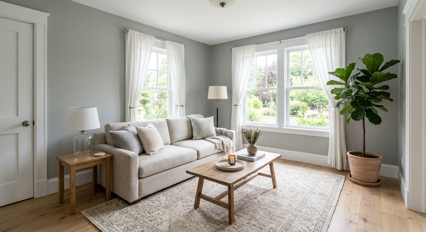
Uncertain Gray is a strong whole-house neutral because its mid-tone LRV of 42.7 holds up across different room sizes and orientations without going too light or too dark. Living rooms and bedrooms are where reviewers most commonly land on it, drawn to its calm, undemanding quality as a backdrop. In a bedroom it creates a restful, cocoon-like atmosphere. In a living room it gives you a sophisticated base that reads contemporary without being trendy.
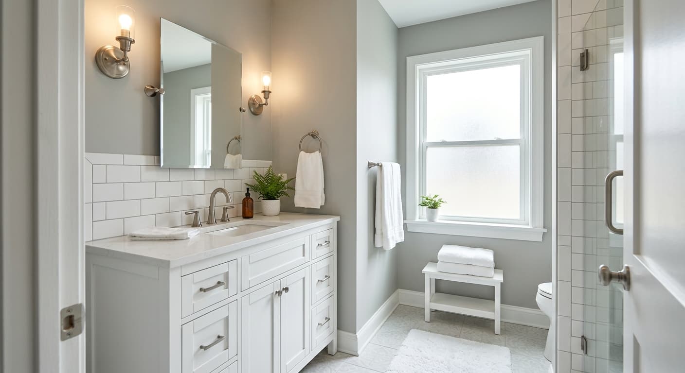
Bathrooms are another natural fit. The cool blue-gray quality feels clean and fresh in a space associated with water, and the LRV is high enough that a smaller bathroom does not feel dim. Kitchens work too, particularly in cabinets where the cool gray reads as polished and current. For exteriors and front doors, the color holds up well in shaded or north-facing exposures, though in full sun it can look a touch lighter and more neutral than it does inside.
Because it leans cool, the materials and furnishings you bring in matter. Warm natural wood tones, jute or wool rugs, woven baskets, and brass or warm-gold light fixtures counterbalance the coolness and prevent the room from feeling sterile. Without those warm anchors, especially in a room with cool north light, Uncertain Gray can veer toward feeling cold rather than calm. Get that balance right, and it functions as a clean, versatile backdrop from room to room.
Uncertain Gray gives a living room a calm, polished backdrop at LRV 42.7, light enough to keep the space from feeling heavy but with enough depth to read as intentional. Pair warm wood furniture and a jute or wool rug to counterbalance the cool undertone. Trim in Rock Candy (SW 6231) sharpens the edges and keeps the whole room feeling crisp.
The cool, quiet quality of Uncertain Gray suits a bedroom well, promoting a restful atmosphere without feeling stark. It works in both south-facing rooms, where warm light softens it, and north-facing rooms, where its cool character deepens into something more moody and cocoon-like. Warm bedding in linen or oat tones and a wood nightstand prevent the room from reading too cold.
The cool blue-gray feel reads as clean and fresh in a bathroom, and LRV 42.7 keeps the space from feeling dim even in smaller footprints. It pairs well with white tile and chrome or brushed nickel fixtures, though brass hardware adds a warm counterpoint that keeps the room from feeling clinical.
On cabinets, Uncertain Gray delivers a sophisticated, current look that sits between a true gray and a soft blue-gray. It reads cleanly against white quartz or marble countertops, and warm wood open shelving or a butcher-block section breaks up the coolness. Trim and upper walls in Origami White (SW 7636) keep the overall kitchen feeling light.
Because its LRV of 42.7 holds steady across rooms and orientations, Uncertain Gray is one of the more reliable whole-house neutrals in this gray family. Rooms that face different directions will each read the color slightly differently, with south-facing spaces warmer and north-facing ones cooler, but the color stays coherent throughout. Use consistent trim and ceiling colors throughout to unify the palette.
Uncertain Gray coordinates naturally with the colors Sherwin-Williams groups alongside it. Rock Candy (SW 6231) is a crisp, cool white that makes a clean pairing for trim and ceilings, reinforcing the color's fresh quality without introducing warmth that would fight it. Origami White (SW 7636) is a softer, slightly creamier white that works if you want the trim to feel warmer and less stark against the cool gray walls. For a tonal accent or a deeper statement on a feature wall or cabinetry, Foggy Day (SW 6235) steps the color family darker and adds contrast without breaking the cool-gray scheme.
Beyond paint, lean into natural materials that bring warmth without visual noise. Warm wood floors or furniture, linen upholstery in off-white or warm oat tones, and metal accents in brass or aged bronze all do the work of grounding the room. If you introduce additional color, muted dusty blues, soft terracotta, or warm sage work well as accent tones, echoing the blue-green thread already present in Uncertain Gray.
All comparisons are matched against Uncertain Gray at LRV 42.7.
If an adjacent room carries a warm yellow or golden paint, Uncertain Gray's cool blue-green undertone will read as jarring across the threshold, making both colors look off rather than complementary.
Heavily orange or red-toned hardwood floors, common in older pine or early-finish oak, intensify the blue-green cast of Uncertain Gray and create a color tension that reads as muddy rather than balanced.
Under cool or daylight-spectrum fluorescent bulbs, Uncertain Gray can push its blue-green undertone to an uncomfortable degree, making the room feel overly clinical and the walls look almost teal in some conditions.
It is a light-to-medium cool gray with an LRV of 42.7, sitting in the blue-gray family. Most people read it as a foggy, airy blue-gray, though in certain light conditions a subtle green cast surfaces and it shifts toward a soft blue-green-gray.
The primary undertone is blue, which is why Sherwin-Williams places it in the blue family. A secondary green undertone is also present and becomes more visible in rooms with cool natural light or reflected green from outdoor foliage. Some reviewers see it as a pure cool gray while others consistently read the green component, so your specific room and light sources will determine which undertone dominates.
It is a cool color. Its blue and green undertones keep it on the cool side of the gray spectrum, and it will read even cooler in north or east-facing rooms with indirect natural light. Warm artificial lighting pulls it slightly toward neutral, but it never crosses into warm territory.
The precise LRV is 42.7, which places it in the medium range. It reflects enough light to keep rooms feeling open and livable, but it has enough depth to read as a real color rather than a near-white.
The Sherwin-Williams code is SW 6234. The hex value is #A9B0B1 and the RGB values are 169, 176, 177.
For trim and ceilings, Rock Candy (SW 6231) gives a crisp, cool pairing and Origami White (SW 7636) offers a softer, warmer white alternative. Foggy Day (SW 6235) works as a deeper accent in the same cool-gray family. For materials, warm wood tones, jute and wool textiles, and brass or warm-gold metal finishes all counterbalance the coolness effectively.
Yes on all three counts, with some caveats. On exteriors it performs best on shaded or north-facing surfaces where its cool character reads as clean and crisp. In full sun it can appear lighter and more neutral than it does inside. On a front door it makes a sophisticated, understated statement. On cabinets it reads as a current, polished gray-blue that pairs well with white countertops and warm hardware.
