
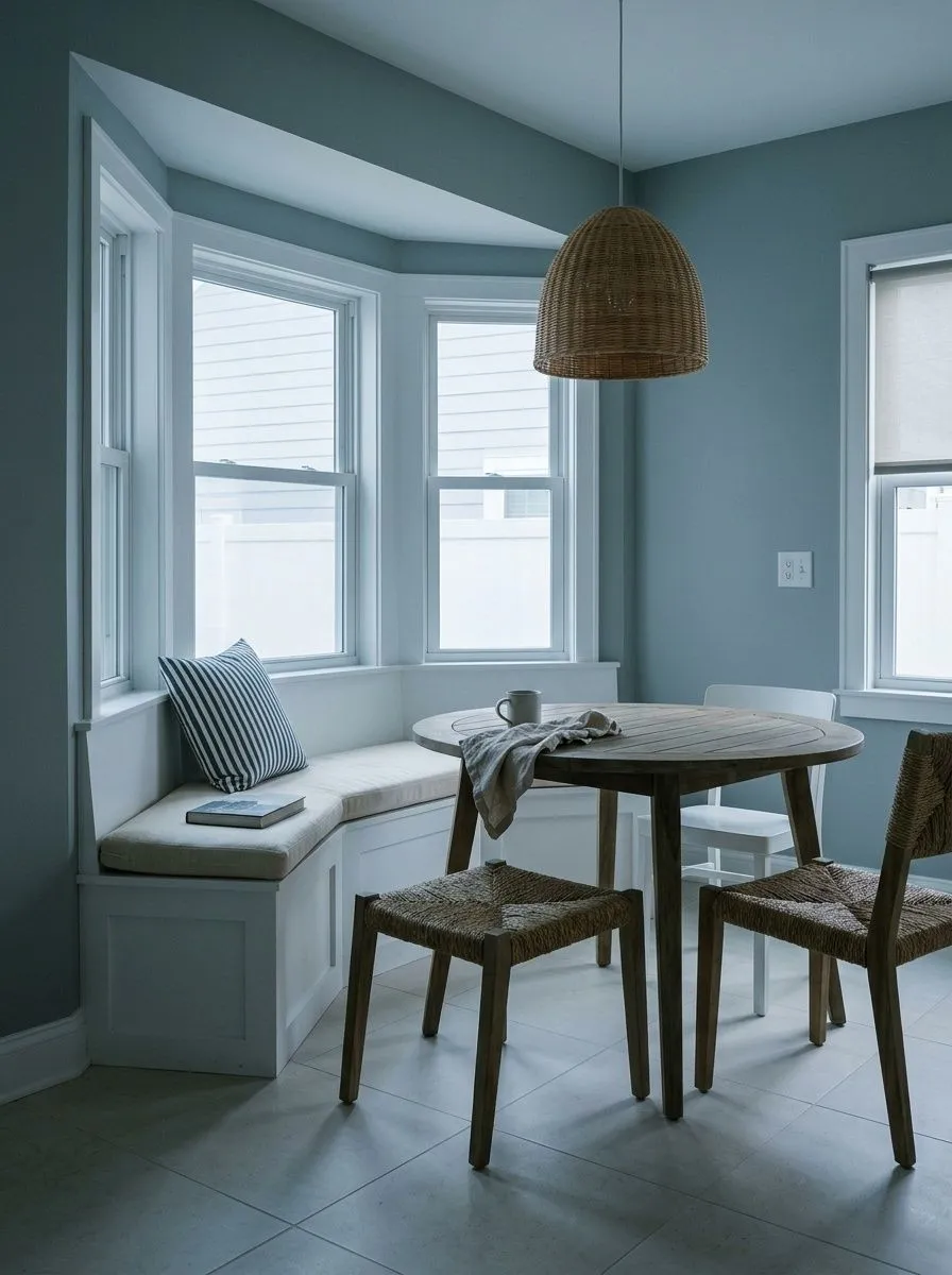
MorningCrisp · blue leads clearly
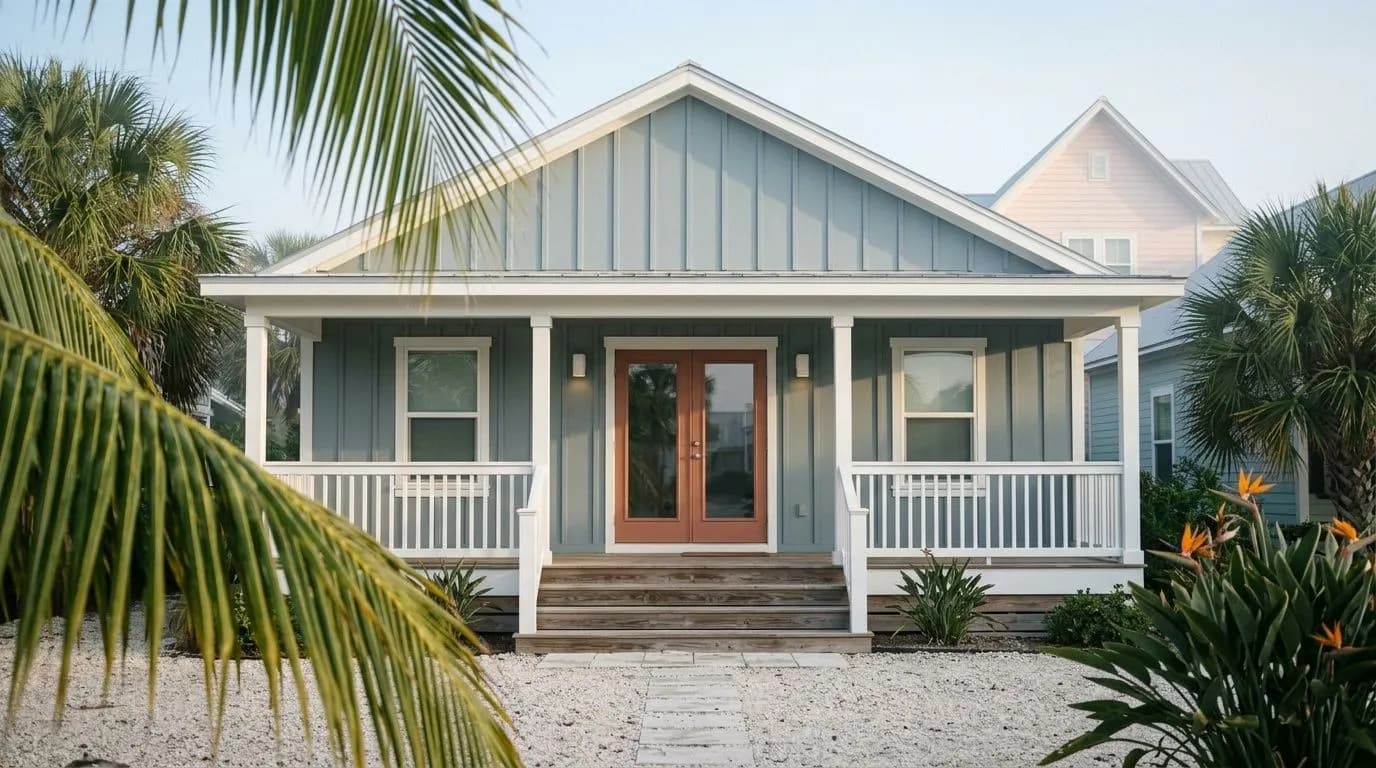
A medium-toned, muted blue-gray at LRV 43.1, Stardew holds its composure across warm and cool light without veering clinical or cold. Test it in your room before you commit.
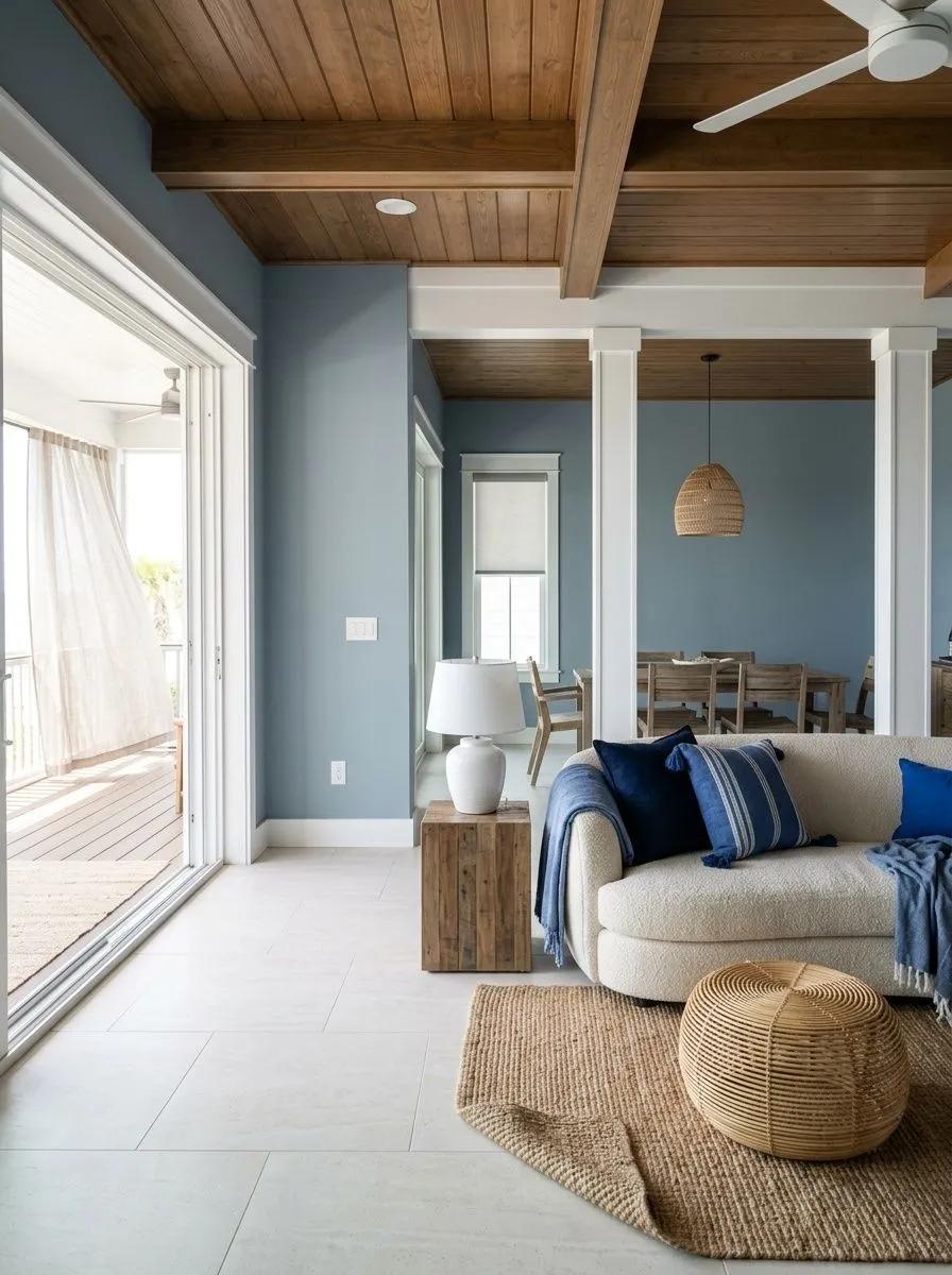
Stardew SW 9138 is a medium-toned, muted blue-gray that sits right in the middle of the value scale at LRV 43.1. That means it absorbs and reflects light in roughly equal measure, so it never bleaches out in bright rooms or swallows light in darker ones. On the wall it reads as a soft, composed blue-gray, the kind of color that feels genuinely restful rather than trying too hard to be a statement.
The muted quality is key to understanding why this color works in so many spaces. It is not a saturated blue, not a flat gray, and not a pastel. It lands in a middle zone that feels specific and intentional without being loud. In most interior conditions, the color comes across as calming and refreshing, which reviewers consistently note, not cold or clinical the way some blue-grays can veer.
What changes with the light is the emphasis, not the character. Stardew in bright natural light looks crisp and bluer. Stardew at dusk or under warm bulbs goes softer and slightly grayer. The overall impression stays cohesive through the day, which is part of why it translates well across room types and orientations, as long as you test it first on your specific walls.
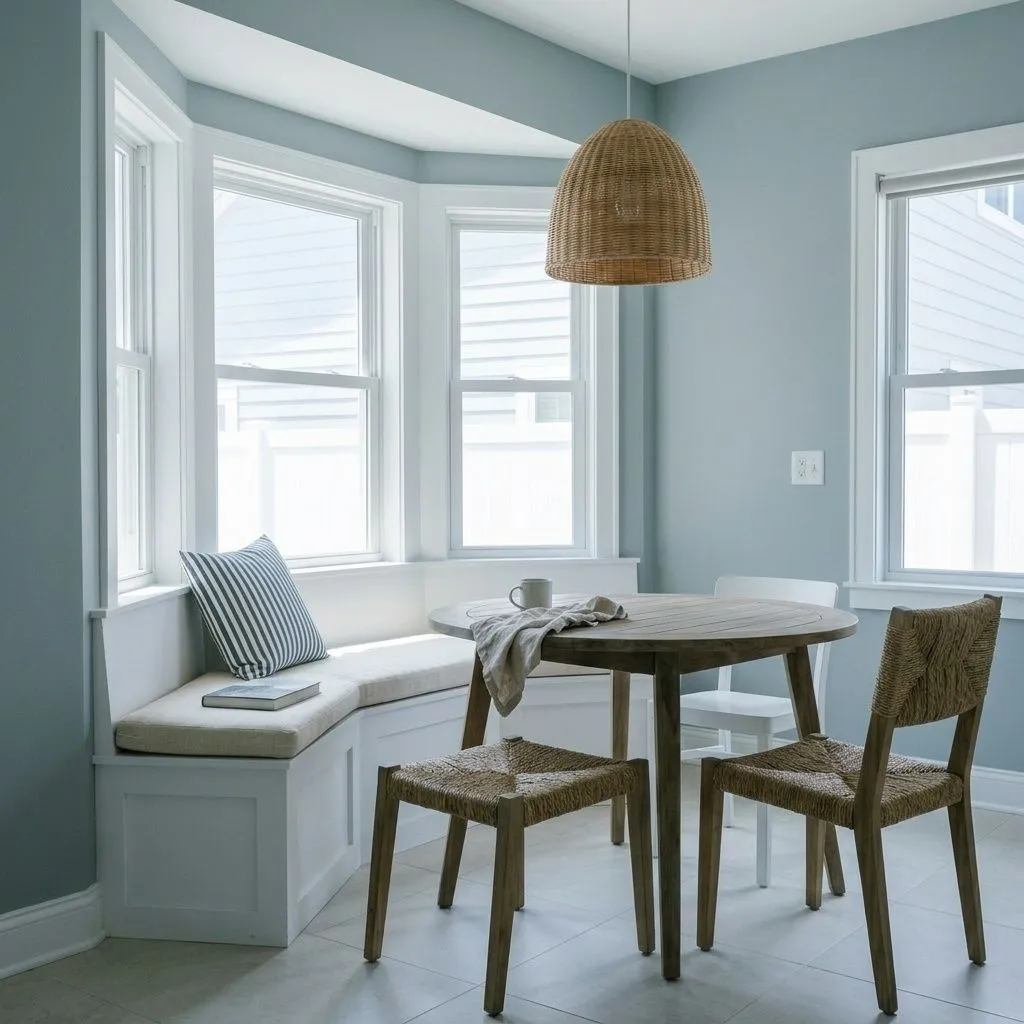
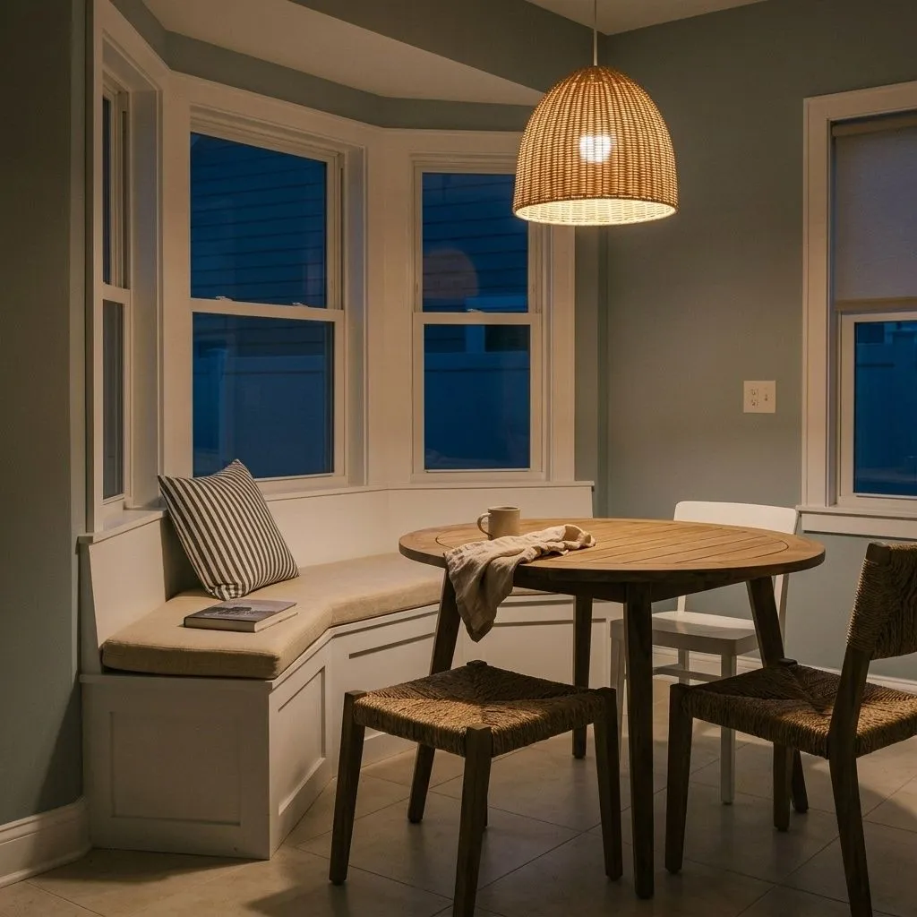

The undertone picture here is mostly agreed upon by reviewers but the emphasis shifts depending on who is looking and under what light. Blue leads. Gray is a strong secondary. A quiet green note sits underneath those two. No one reports purple or violet, which is a useful data point if you are comparing it to other medium blue-grays that can pull lavender.
Where reviewers split is on which of the three undertones takes charge in a given situation. Some say the gray is clearly dominant and shows most in warm light or on walls adjacent to warm wood tones. Others say the blue leads firmly and reads crisp and bright, especially in rooms with cool light sources or cool-toned flooring. A smaller group notes the green surfacing in specific conditions, particularly in rooms with warm afternoon sun or under warmer LED bulbs. That green undertone keeps the color from feeling clinical, but it can also read slightly blue-green rather than purely blue in those warm-light conditions.
For practical planning, think of it this way: cool light and north or east exposures push Stardew toward its crispest, bluest read. Warm light, warm neutrals nearby, and south or west afternoon sun pull the gray and green forward. That shift is not dramatic, but it is real, and it explains why two homeowners can describe the same color quite differently. Painting a large sample on your actual wall and checking it morning, afternoon, and evening is not optional with this one.
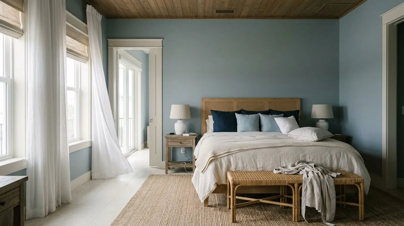
Stardew is most consistently praised in bedrooms, where its calming, mid-tone blue-gray creates the kind of atmosphere that genuinely supports rest. At LRV 43.1 it is not so dark that a bedroom feels heavy, and not so light that it reads as a pastel. Bathrooms are another strong use case, where reviewers point to its refreshing, clean character without the sterile edge of a cooler or brighter blue.
Beyond sleeping and bathing spaces, reviewers put Stardew to work in home offices, living rooms, entryways, and hallways. In an office it lends a composed, focused quality. In a living room or hallway it can anchor a space without demanding attention. It suits coastal, modern farmhouse, rustic, and contemporary interiors, which is a wider range than most single colors can honestly claim, because the muted saturation reads as neither trendy nor generic.
Light and orientation deserve real attention. In north-facing rooms Stardew can read moodier and deeper, and if paired with warm neutrals nearby it can look slightly dingy rather than crisp. South and west-facing rooms are more forgiving and tend to show the color at its most balanced. On cabinets, doors, and painted furniture it is a documented success, with reviewers recommending satin or semi-gloss finish for those surfaces to hold the color cleanly. Eggshell or matte works well on walls. In bathrooms, semi-gloss is the practical call.
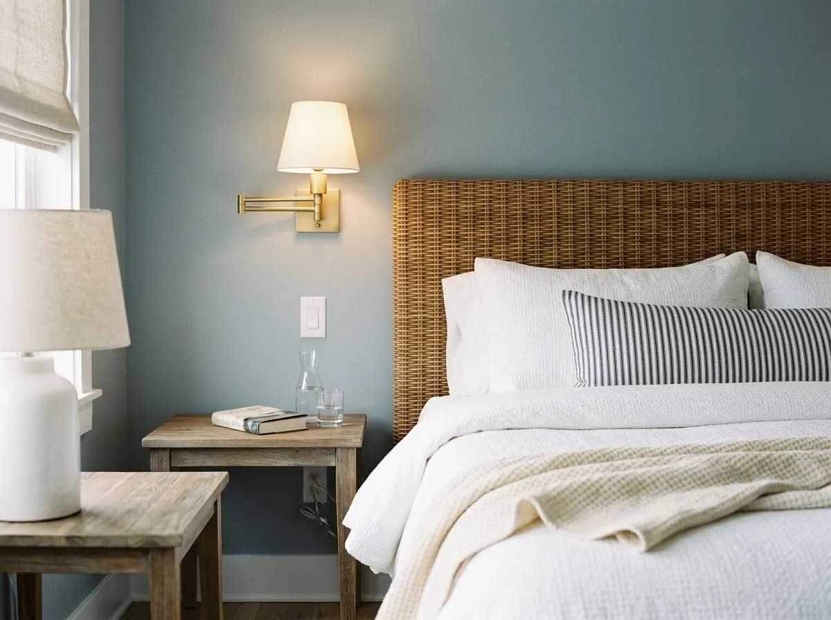
This is where Stardew earns its reputation. At LRV 43.1 it is substantial enough to feel enveloping without making the room dim, and the muted blue-gray tone genuinely supports a calm sleeping environment. Pair it with warm white bedding and natural wood furniture to keep the room from going too cool.
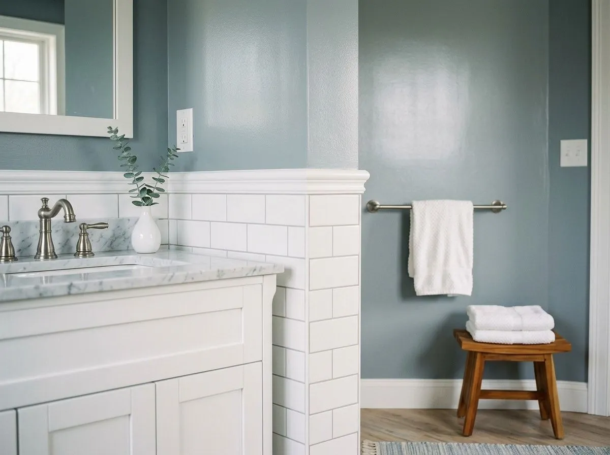
Stardew reads clean and refreshing in bathrooms without the clinical edge that sharper blues can bring. Use semi-gloss on walls to handle moisture and to give the color a slight depth. White tile and chrome or brushed nickel fixtures are natural partners here.
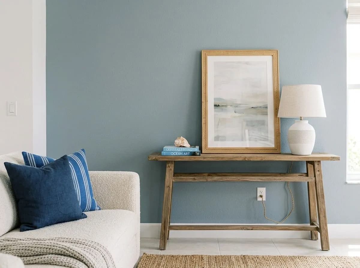
In a living room Stardew anchors without overwhelming, especially in spaces with natural light from south or west windows. It layers well with warm neutrals in upholstery and warm wood tones in flooring. In a north-facing living room, lean into warm accents to keep the color from going flat.
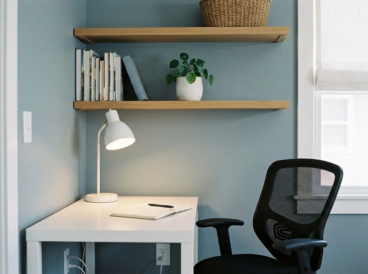
The composed, mid-tone quality of Stardew makes it a practical choice for an office where you want a sense of calm focus. It is not distracting, not stark, and not so dark that the room feels oppressive during long work sessions. Cool-toned task lighting will push it bluer and crisper, which many people find easier on the eyes.
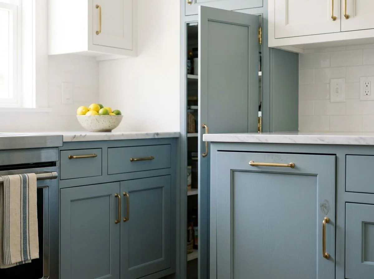
Reviewers regularly use Stardew on painted cabinets, island bases, front doors, and furniture pieces like dressers. In satin or semi-gloss finish the color holds well and reads polished. Against white upper cabinets and warm brass or black hardware, it sits in a range that feels current without being trend-dependent.
Stardew coordinates naturally with crisp and soft whites. Patience (SW 7555) is a reliable trim and ceiling companion, warm enough to keep the pairing from feeling cold but clean enough not to muddy the blue-gray. Mountain Air works alongside Stardew for a layered, airy palette that stays within the same cool-blue family. For a warmer accent that keeps things from feeling too monochromatic, Coral Clay introduces an earthy warmth that plays against Stardew's coolness without clashing.
Beyond the coordinating palette, Stardew responds well to deep browns and black in furniture and fixtures, navy in textiles, and earthy greens as accent colors. Warm whites like a creamy white or a soft warm white on trim prevent the color from feeling stark in lower-light rooms. Reviewers also pair it successfully with a soft, warm greige on adjacent walls or in open-plan spaces where you need a neutral to bridge the gap. The common thread in successful pairings is giving Stardew something with warmth to lean against, so the cool blue-gray reads intentional rather than chilly.
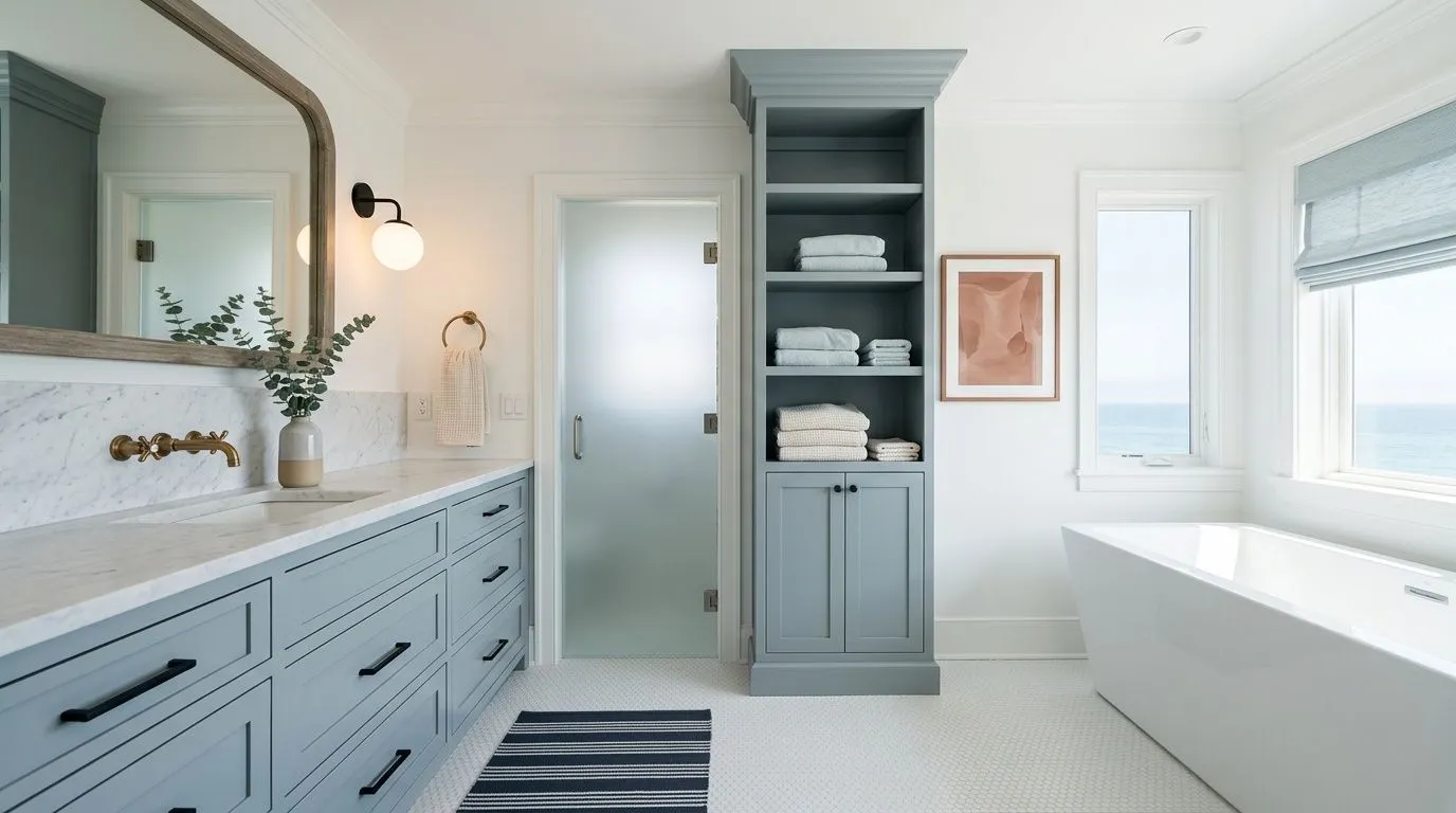
Every color you see here has a Sherwin-Williams match, so the whole room is traceable and shoppable. Two of the seven are actual paint: Stardew goes on the double vanity and linen tower, while Pure White covers the walls, trim, and ceiling. The remaining five colors represent the room's materials and furnishings, each mapped to its closest Sherwin-Williams equivalent. Hover any pin or swatch to explore them.
All comparisons are matched against Stardew at LRV 43.1.
Stardew's cool blue-gray reads poorly next to walls, cabinetry, or large furniture pieces with strong yellow or orange undertones. The contrast makes both colors look off, and Stardew in particular can read dingy or slightly greenish rather than crisp.
In north-facing rooms or spaces that get limited natural light, pairing Stardew with a stark, bright white trim can make the combination feel cold and a little harsh. The high contrast without enough light to warm the room up tips from crisp into sterile.
Stardew over cool gray tile or cool gray hardwood, with no warm accents in the room, can flatten the whole space. The color reads moodier and more blue-gray than expected, and the room loses dimension.
Stardew is a medium-toned, muted blue-gray. It is not a bright or saturated blue and not a flat gray. It sits in a composed middle ground with enough blue to read clearly cool and enough gray to keep it soft and versatile on the wall.
Stardew carries blue as the lead undertone, gray as a strong secondary, and a quiet green note underneath. Reviewers largely agree on that order, but some see the gray as most dominant in warm light while others say the blue reads clearly in charge in cool or natural light. The green can surface in warm afternoon sun. No purple or violet is reported.
Stardew is a cool color. Its blue and gray undertones place it firmly on the cool side of the spectrum, and it reads that way in most lighting conditions. That said, reviewers consistently describe it as calming and refreshing rather than cold or sterile, which distinguishes it from sharper or more saturated cool blues.
Stardew has an LRV of 43.1, which puts it in the medium range. It reflects and absorbs light in roughly equal measure, so it reads neither bright nor dark. That mid-tone placement is a big part of why it works in rooms with varied light conditions without feeling washed out or heavy.
Stardew's Sherwin-Williams code is SW 9138. The hex value is #A6B2B5 and the RGB values are 166, 178, 181.
Stardew pairs well with warm and crisp whites on trim and ceilings, including Patience (SW 7555), which is a coordinating color designed to work alongside it. Mountain Air extends the cool-blue palette for a layered look. Coral Clay adds earthy warmth as an accent. Deep browns, black hardware, navy textiles, and earthy greens all work in supporting roles. The consistent advice from reviewers is to give Stardew at least one warm element nearby so the cool tone reads intentional.
Yes on all three, with a few practical notes. Reviewers use it on front doors, kitchen cabinets, and painted furniture regularly, recommending satin or semi-gloss finish for those surfaces. On exteriors, Stardew's muted quality keeps it from reading too stark in sunlight and suits coastal and modern farmhouse styles well. Keep in mind that exterior light, especially on north-facing facades, will push the color toward a deeper, moodier blue-gray than you might see on an interior sample.