Stargazer reads as a deep, dusky blue-gray on the wall, the kind of color that evokes a hazy night sky rather than a saturated primary navy. At LRV 16.6 it absorbs a significant amount of light, which gives rooms a cozy, enclosing quality. This is not a bright or crisp blue. It is muted and smoky, sitting somewhere between a soft navy and a slate, with enough gray in it to keep it from ever feeling cartoon-bold.
Light changes its character considerably. Under warm incandescent or warm-toned LED bulbs and in evening light, Stargazer pulls richer and slightly warmer, leaning more into its navy depth. Under cooler daylight LEDs or in a north-facing room with flat, blue-white light, it can go flatter and more strictly blue-gray. Because the LRV is only 16.6, you will notice these shifts more than you would with a mid-tone color. Paint a large sample, at least 12 by 12 inches, and look at it morning, midday, and evening before committing.
The undertone picture on Stargazer is where most of the real-world debate lives. Our editorial read identifies navy, dark, and blue as the primary drivers, and that tracks with the majority of reviewer impressions. Most people who live with this color call it a cool blue-gray, sometimes with a faint smoky quality that gives it character beyond a flat slate.
Where reviewers diverge is on whether there is a green or teal cast present. A meaningful number of independent sources flag a subtle green-leaning, teal-adjacent quality in certain rooms, particularly in spaces with a lot of natural light or a green-heavy outdoor view reflecting indoors. Others, especially those working with warm lighting or warmer-toned furnishings, report no green at all and read it as a straightforward cool blue-gray or soft navy. Neither camp is wrong. Stargazer does sit in a zone of the color wheel where blue and teal are close neighbors, and its muted, smoky saturation means undertones shift with context more than a cleaner blue would. The green cast, when it shows up, is subtle rather than dominant, but it is real enough that you should test it alongside any existing green or teal elements in your space to make sure they play well together rather than clash.
Stargazer is an interior-use color built for rooms where mood and atmosphere matter more than brightness. Bedrooms are the most natural fit. At LRV 16.6, it creates a calm, focused, slightly cocoon-like feeling that many people find genuinely restful. It works particularly well in bedrooms that get warm evening light, since that light plays into the color's richer, deeper qualities rather than exposing its cooler, flatter side.
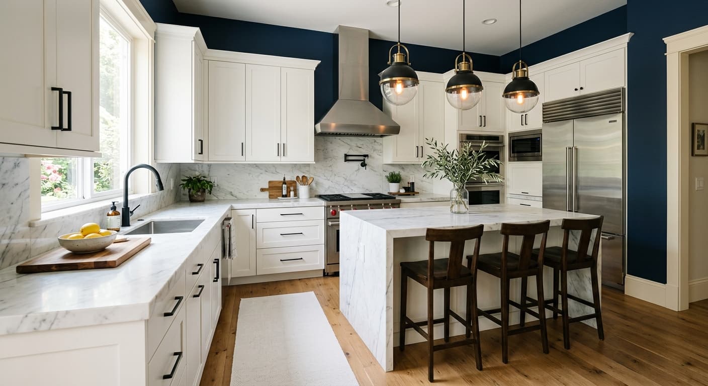
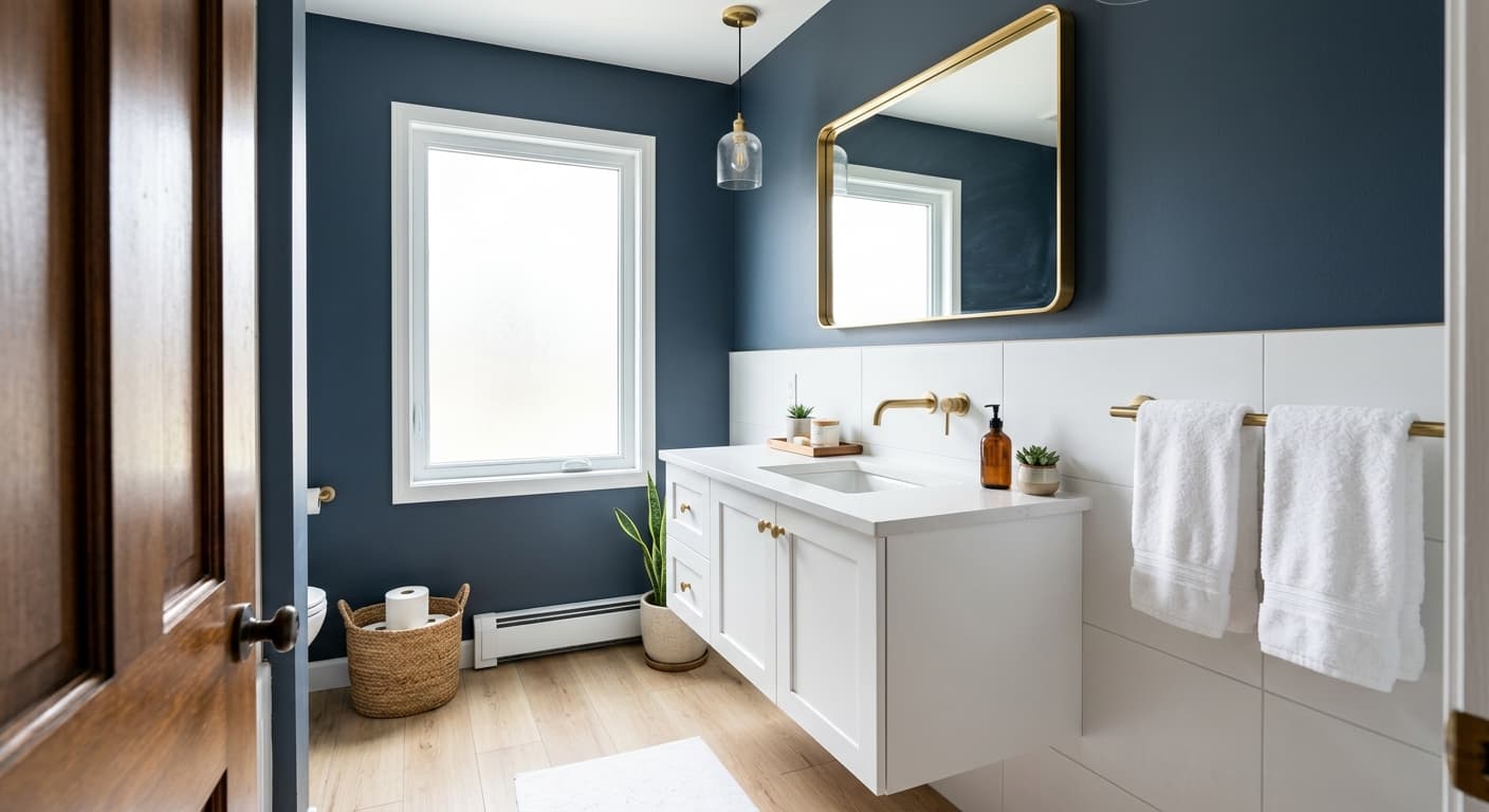
Dining rooms are another strong application. A deep, muted blue-gray is a classic choice for a space where candlelight and warm overhead fixtures do much of the evening work, and Stargazer rewards that lighting setup. It also reads well on accent walls in contemporary and modern spaces, where its smoky quality adds visual weight without the aggression of a saturated primary. Home offices where focus and calm are the goal are a natural fit too.
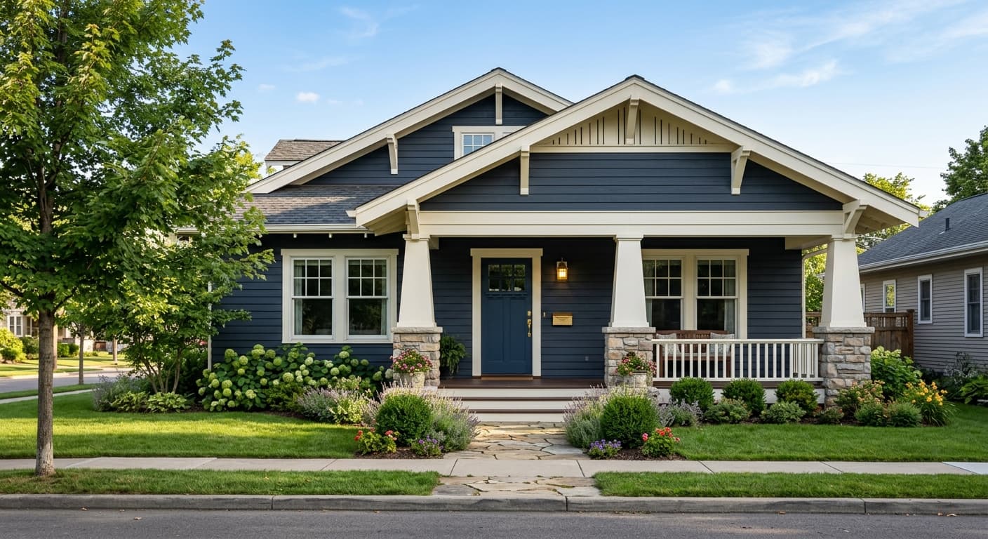
For exteriors, Stargazer brings the same dusky depth to siding and shutters, pairing cleanly with crisp white trim. Because it is muted rather than vivid, it tends to feel sophisticated on a facade rather than jarring. Just keep in mind that north-facing or heavily shaded elevations will pull it cooler and flatter, so warm-toned supplemental trim and accent colors help anchor it.
Stargazer is one of the more genuinely restful deep tones for a bedroom because its muted, smoky quality does not feel electric or stimulating the way a saturated navy can. At LRV 16.6, it wraps a room effectively. Layer in warm bedside lighting to bring out its richer side and keep it from going flat.
Candles and warm overhead fixtures are Stargazer's best friends in a dining room. The low LRV means the room gets intimate and atmospheric at dinner, and the blue-gray reads as sophisticated rather than cold when paired with warm wood furniture and metallic accents. Plan your lighting before you paint.
On a single focal wall in a living room or home office, Stargazer provides the kind of visual weight that gives a room structure without requiring a full commitment to a dark color scheme. Keep the remaining walls a clean or warm white to balance the depth and let the accent read clearly.
As an exterior body or shutter color, Stargazer reads as a distinguished, muted blue-gray that holds its character in most natural light conditions. Pair it with crisp white trim using White Snow (SW 9541) for clean contrast, and consider warm-toned hardware and door accents to prevent the overall look from reading cold.
Sherwin-Williams pairs Stargazer with White Snow (SW 9541) as the anchor crisp white, and it earns that pairing. The contrast between White Snow's clean brightness and Stargazer's deep blue-gray is sharp enough to make both colors read more confidently, especially on trim and cabinetry adjacent to a Stargazer wall or exterior body. Skipping Rocks and Storm Warning round out the coordinating palette, offering softer, more tonal companions for layered, less high-contrast schemes.
Beyond the official palette, the research backs using warm off-whites on trim and millwork. A warm creamy white or soft canvas-toned neutral softens the contrast for spaces where you want depth without a stark edge. For furnishings and textiles, natural wood tones, aged brass and bronze hardware, and warm linen or wool fabrics all work with Stargazer's muted coolness in a way that warms the space without fighting the color.
All comparisons are matched against Stargazer at LRV 16.6.
Stargazer's cool blue-gray can look jarring when it flows directly into a warm beige or honey-tan room because the undertone contrast between cool blue and warm orange-yellow is stark at these saturation levels.
Under flat, cool-white artificial light, Stargazer at LRV 16.6 can go dull and lifeless, losing the smoky depth that makes it interesting and reading as a flat, uninspiring dark gray.
Because Stargazer has a subtle teal or green undertone in certain light conditions, placing it next to vivid or saturated greens can amplify that undertone in ways that feel unintentional and muddy rather than coordinated.
Stargazer SW 9635 is a deep, muted blue-gray with a smoky, dusky quality that evokes a night sky. It sits in Sherwin-Williams' Warms and Neutrals family despite its blue character, and reads as a soft, hazy navy rather than a vivid or saturated blue. Its hex code is #60757A and its RGB values are 96, 117, 122.
Stargazer's primary undertones are navy and blue with a dark, muted base. Most reviewers read it as a cool blue-gray, and some, depending on the room's light and surroundings, pick up a faint green or teal lean. That green cast is subtle rather than dominant, but it is real enough to factor in if your space has significant green or teal elements already present.
Stargazer reads cool overall. Its blue and navy character keep it in cool territory, and under cooler light sources or in north-facing rooms it leans distinctly blue-gray. That said, under warm incandescent or warm-LED lighting it picks up a richer, slightly warmer depth, so the experience of cool versus neutral-cool can shift based on your fixtures.
Stargazer has an LRV of 16.6, which puts it firmly in the deep end of the color spectrum. At that reflectance level it absorbs a lot of light and makes rooms feel enclosed and cozy. Plan for good layered lighting, and test a large sample in your specific space before committing.
Sherwin-Williams coordinates Stargazer with White Snow (SW 9541) for crisp contrast, along with Skipping Rocks and Storm Warning for softer, more tonal pairings. For trim and millwork, a warm creamy white or clean bright white works well. In furnishings, warm wood tones, aged brass and bronze hardware, and natural linen or wool textiles complement Stargazer's cool muted depth without fighting it.
Stargazer's Sherwin-Williams code is SW 9635. Its hex code is #60757A and its RGB values are 96 red, 117 green, 122 blue. Its LRV is 16.6.
Newburyport Blue (HC-155) from Benjamin Moore is a widely cited comparable in the muted blue-gray family, sharing a similar smoky depth and cool character. Depending on the room and lighting, Newburyport Blue can lean slightly more purple-gray than Stargazer, so test both if you are switching brands mid-project.
