
MorningBlue steps forward · crisper read
A deep, mineral blue-gray with real visual weight, cool throughout and complex enough to shift between slate blue and near-charcoal depending on your light. Sample it morning, midday, and evening before you commit.
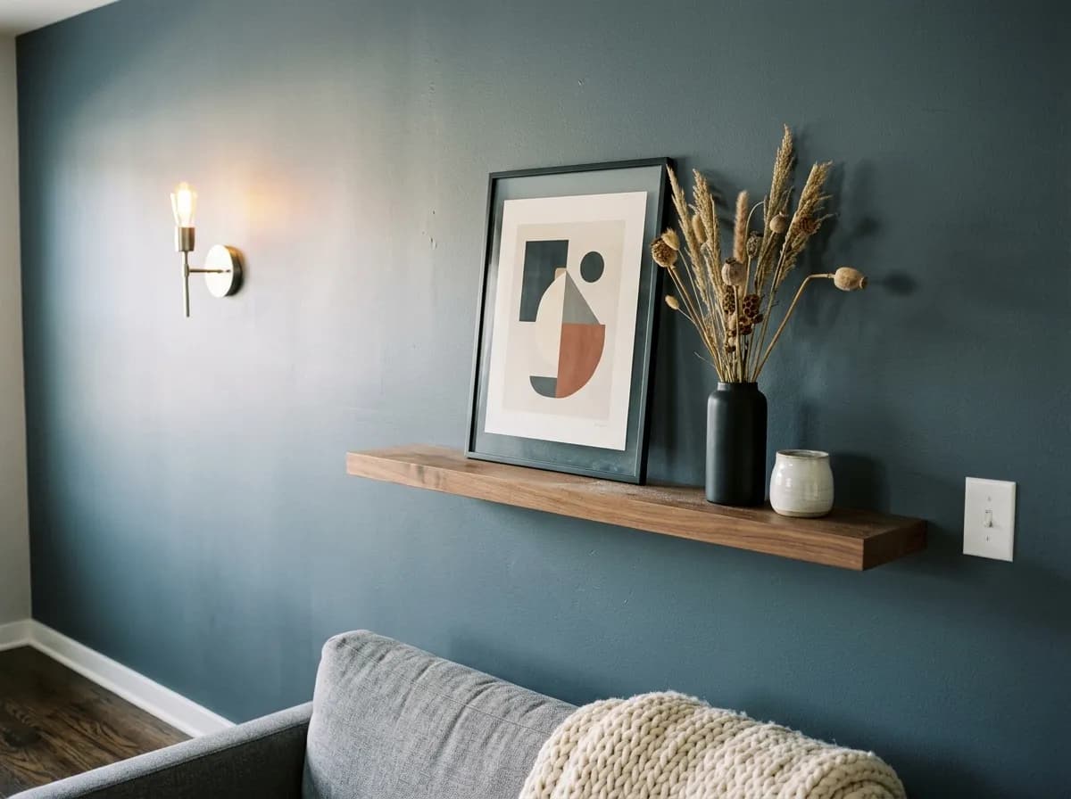
Slate Tile reads as a deep, muted blue-gray on the wall, dark enough that plenty of reviewers reach for the word charcoal when describing it. At LRV 14.8, it absorbs considerably more light than it reflects, so it carries real visual weight in any space. It is not a flat or lifeless dark, though. There is a dusty, almost mineral quality to it that keeps it feeling rich rather than heavy.
How it actually appears shifts noticeably with light. In bright daylight or cool LED light, the blue undertone steps forward and the color reads crisper and a touch lighter, closer to a classic slate blue-gray. In warm incandescent light or a dim room, it pulls back toward a softer neutral charcoal and can approach near-black in corners. That swing is wide enough that reviewers consistently warn against relying on a paint chip, which will not show you either extreme. Sample it on the actual wall and check it at morning, midday, and evening before committing.
The base read is cool gray with a clear blue lean, and that much nearly everyone agrees on. Beyond that, there is a genuine split in how people describe what else is underneath. A number of reviewers identify it firmly as blue-gray, with the blue component noticeable enough that it competes with the gray rather than hiding behind it. Under certain lighting conditions the color can look almost like a muted slate blue, which is not a stretch given the name.
Other reviewers flag a subtle green or blue-green quality that surfaces especially in natural light or when the color is surrounded by warm materials. This is not an obvious green, more of a blue that leans slightly toward the teal end of the spectrum rather than pure cool blue. It keeps the color from reading as a straightforward charcoal and gives it a more complex, layered quality. If your space has a lot of warm wood tones or warm-white trim nearby, that contrast can draw out the cooler, greener edge more than you might expect from the chip.
The practical takeaway is that you should not treat Slate Tile as a predictable flat gray. It is cool throughout, but whether the dominant secondary impression is blue or blue-green will depend on your specific light source, the orientation of your room, and what colors are sitting next to it. North-facing rooms tend to intensify the cooler, bluer reading. South and west light will soften it toward a more neutral charcoal. Either way, the warmth in it is essentially absent.
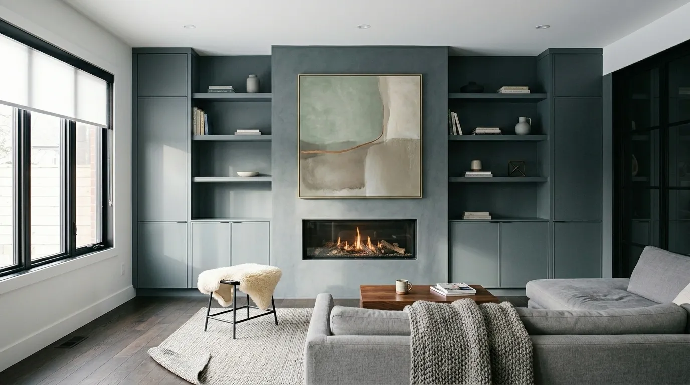
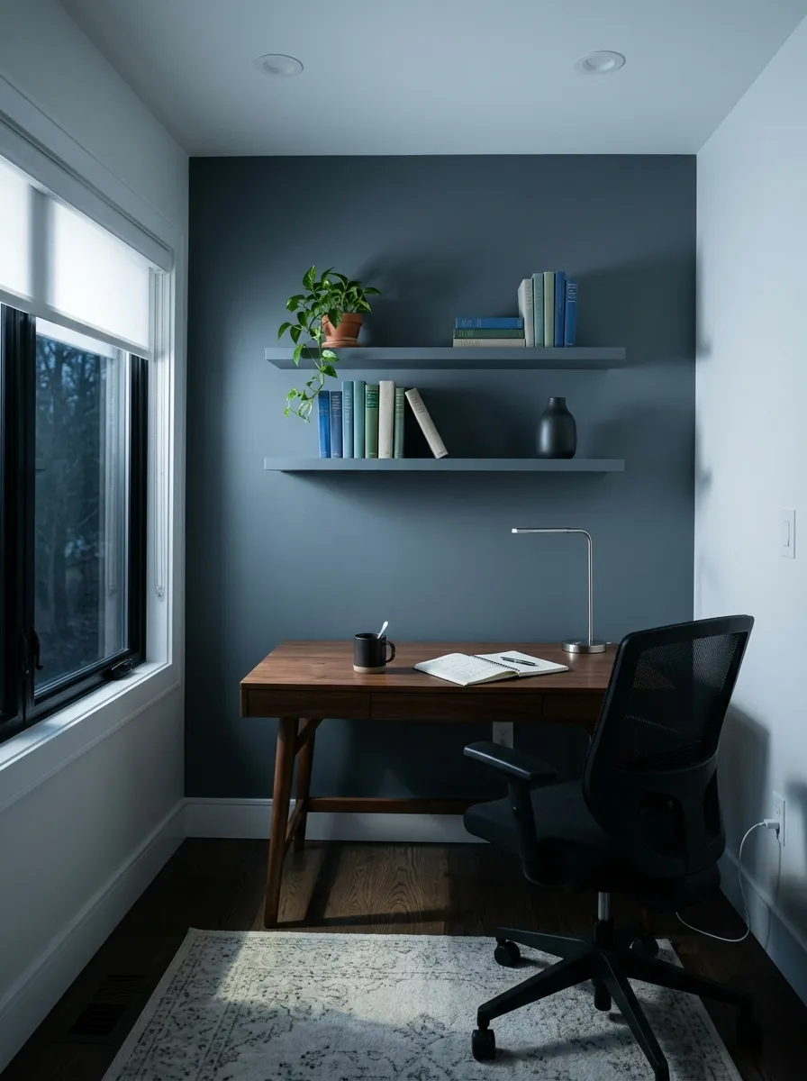
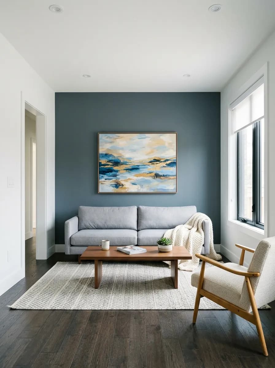
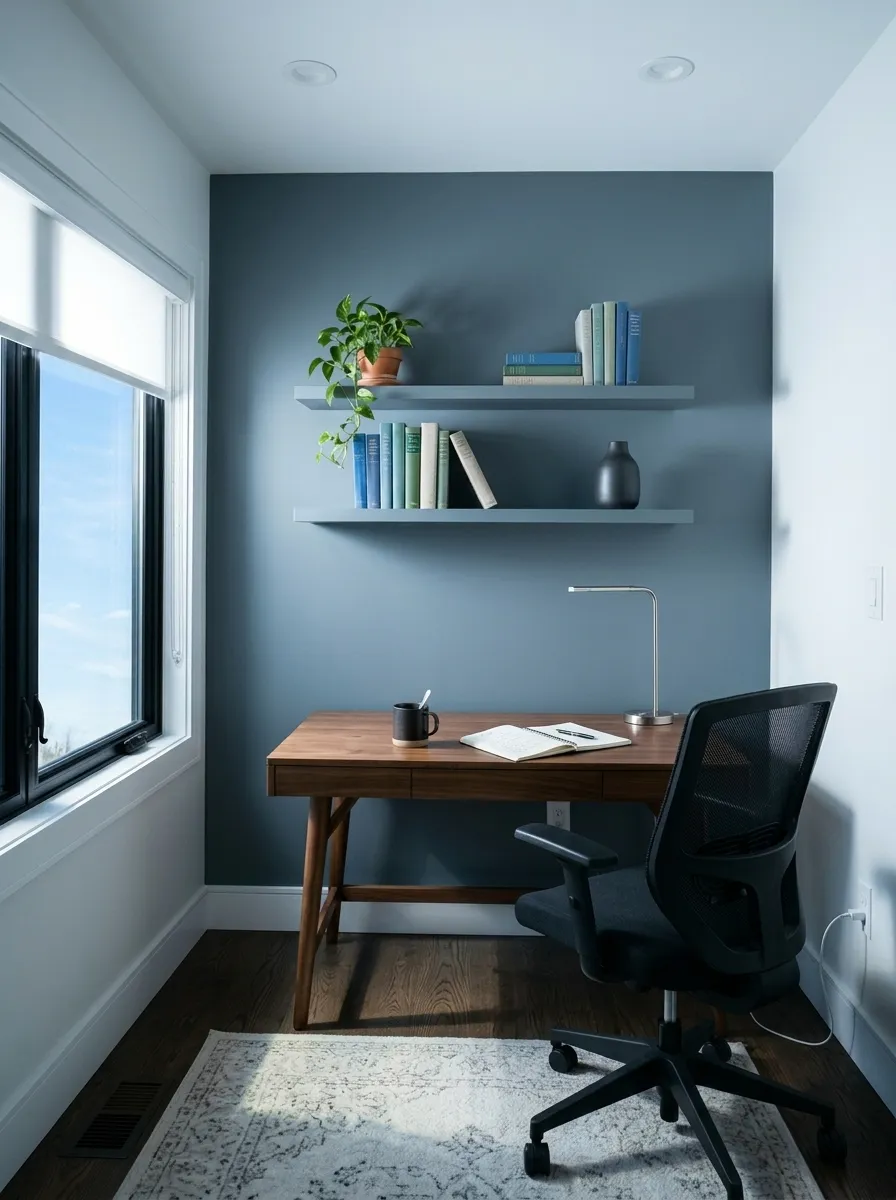
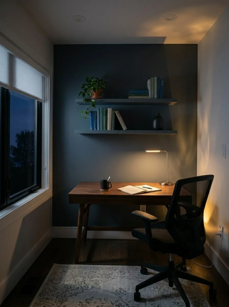
Because of its LRV of 14.8, Slate Tile dominates whatever surface it covers, so it works best when used deliberately as a focal point rather than as an all-over room color in small or dim spaces. Accent walls, fireplace surrounds, and feature walls are where it consistently earns the most praise. It creates a moody, grounded backdrop in living rooms and bedrooms without needing much else to make the space feel considered. Home offices and reading nooks are also strong candidates, where that cocooning darkness actually helps with focus and atmosphere.
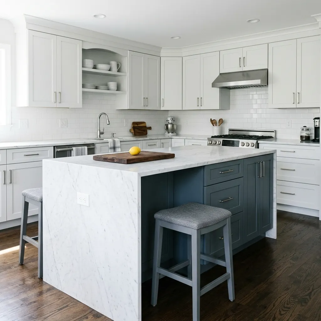
Kitchen cabinets and islands are a popular application. The cool, sophisticated tone pairs naturally with stone countertops and stainless or brushed nickel hardware, and because cabinets are a defined surface rather than a whole room, the darkness reads as intentional rather than oppressive. Bathroom vanities work on the same logic. Laundry rooms and pantries are places where designers often recommend leaning into a dark color because the rooms are small and utilitarian anyway, and the result feels polished.
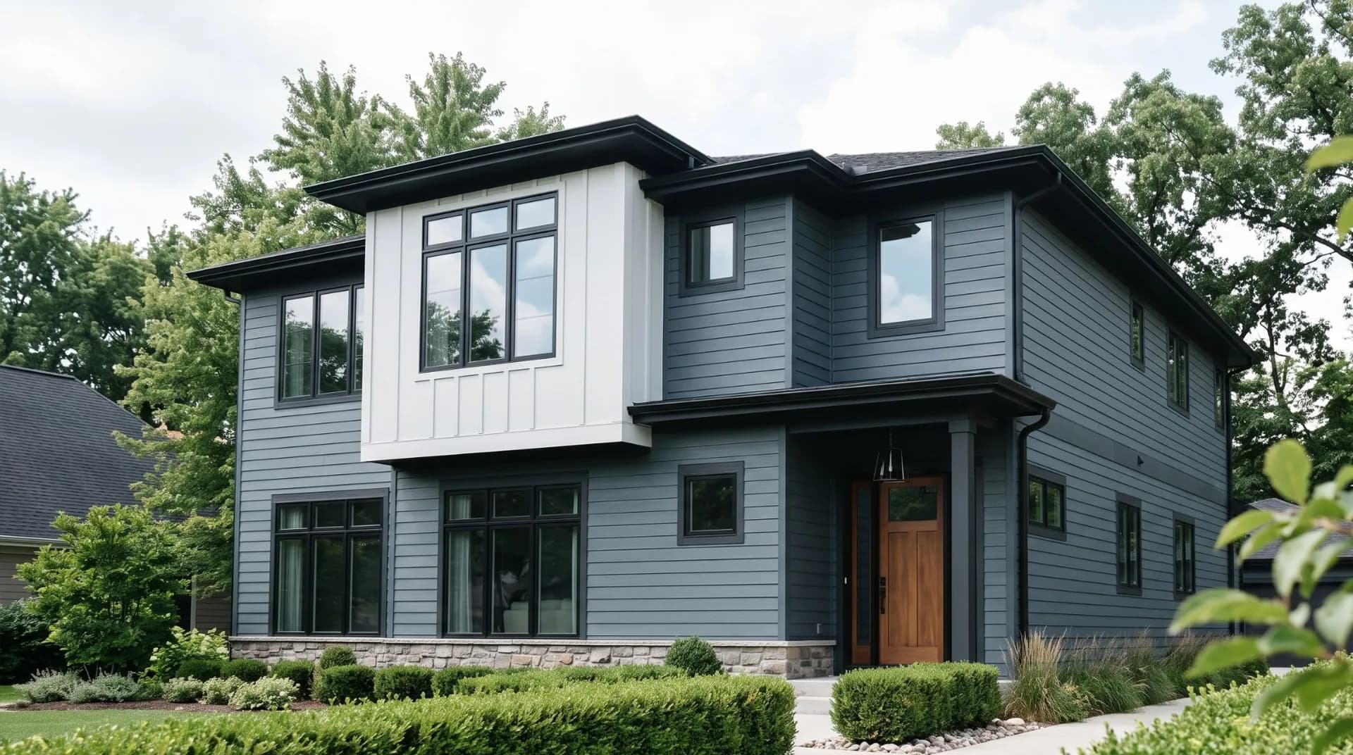
On the exterior, Slate Tile has real credibility. Its cool tone reads contemporary on modern or transitional architecture, and it holds up well on both siding and trim applications. Many reviewers single out front doors and shutters as especially effective uses, where the depth of the color gives an entrance strong curb presence without veering into stark black. A crisp near-black trim grounds it further on the exterior. For any use, the consistent advice from the research is to sample on the actual surface in your actual light, because the color shifts enough between lighting conditions that the chip will not tell the whole story.
Use Slate Tile on a single feature wall or fireplace surround to anchor the room without closing it in. Pair it with Shoji White (SW 7042) on the remaining walls and bring in warm wood tones to keep the space from reading cold. The LRV of 14.8 means the accent wall will hold its depth even in a well-lit room.
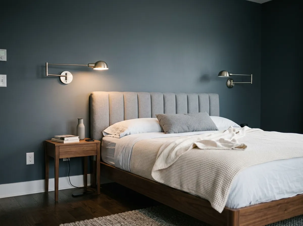
A bedroom in Slate Tile, used on all four walls, creates a genuinely restful, cocooning feel that works especially well in north or east-facing rooms. Keep bedding and textiles on the lighter or warmer side to balance the depth. At LRV 14.8 the room will feel intentionally moody, not merely dark, if the lighting is layered thoughtfully.
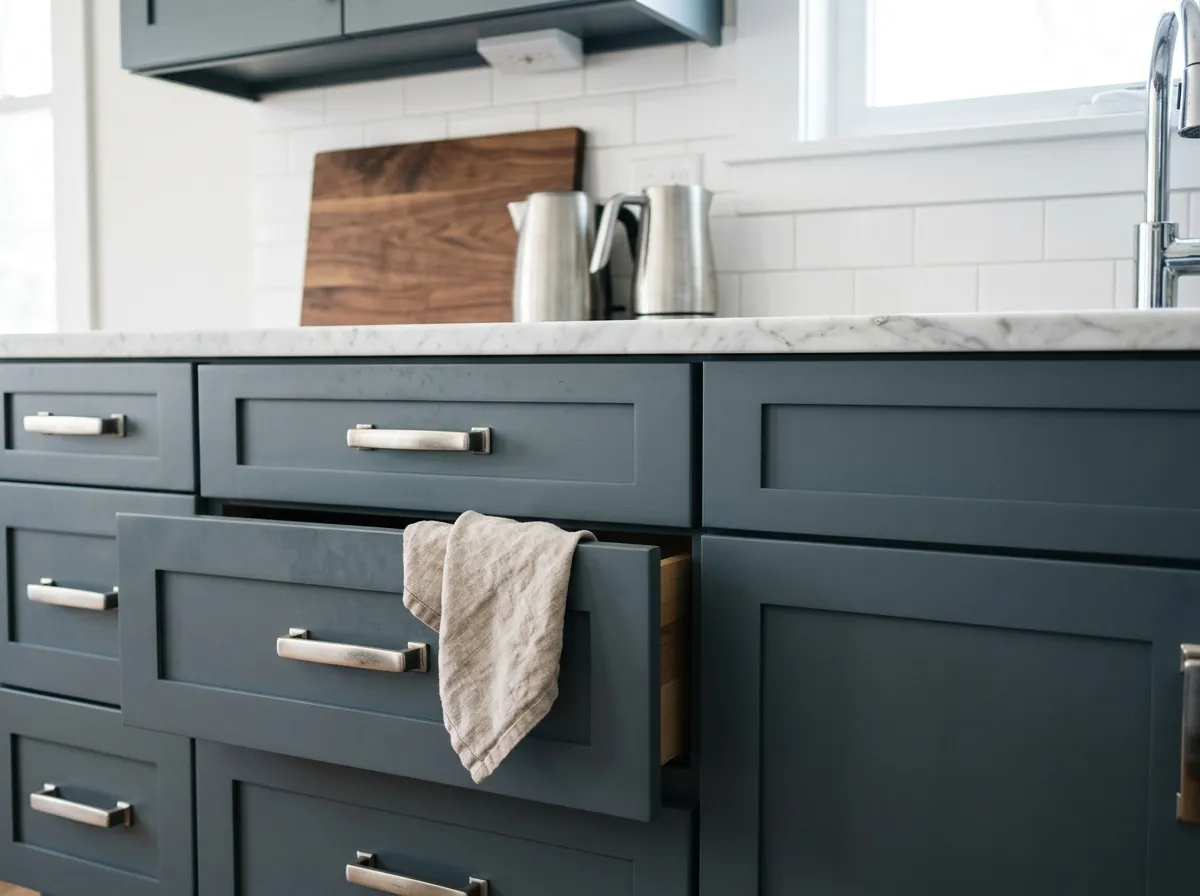
Slate Tile on lower cabinets or a central island pairs cleanly with stone countertops and stainless or brushed nickel hardware. The cool blue-gray reads sophisticated against both white upper cabinets and open shelving. It holds its character under both warm and cool kitchen lighting, though the green edge may show more under cool LEDs.
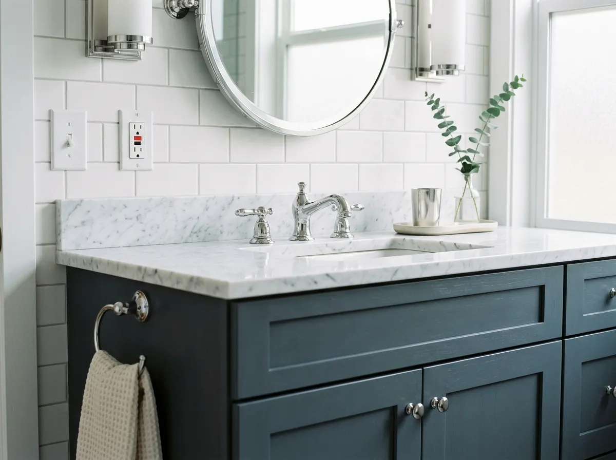
A vanity in Slate Tile with a marble or light stone top is one of the more straightforward applications because the scale is contained and the contrast works immediately. Chrome and brushed nickel fixtures reinforce the cool tone. Avoid warm brass if you want a consistently cool, clean palette.
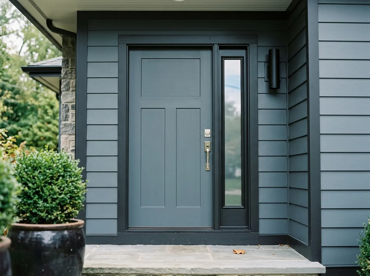
On siding or as a front door and shutter color, Slate Tile reads contemporary and grounded. It suits modern, transitional, and craftsman exteriors well. Pairing it with a very dark near-black trim sharpens the look and prevents the color from appearing muddy against typical landscaping greens.
Slate Tile coordinates naturally with both cool whites and warm off-whites, and the three official coordinates from Sherwin-Williams reflect that range. Ice Cube (SW 6252) is a clean, light cool white that plays directly into the blue-gray character of Slate Tile and keeps the palette feeling crisp and contemporary. Shoji White (SW 7042) brings a soft warm undertone that creates a more layered contrast, warming up what is otherwise a very cool color story. Intellectual Gray (SW 7045) is the bridge option, a mid-range cool-leaning gray that ties a multi-room scheme together without fighting Slate Tile's undertone.
Beyond trim and wall pairings, Slate Tile responds well to natural materials. Medium-to-dark warm woods like walnut and cherry provide contrast without clashing, and marble or stone surfaces play into its mineral quality. For an earthy, nature-forward scheme, muted greens make strong accent partners because they echo the subtle green edge that appears in some light conditions. Warm golden accents such as mustard or terracotta, cream-colored trim, and orange-toned or honey-oak wood are the combinations to avoid. They pull against the cool undertones in a way that makes the color look unsettled rather than intentional.
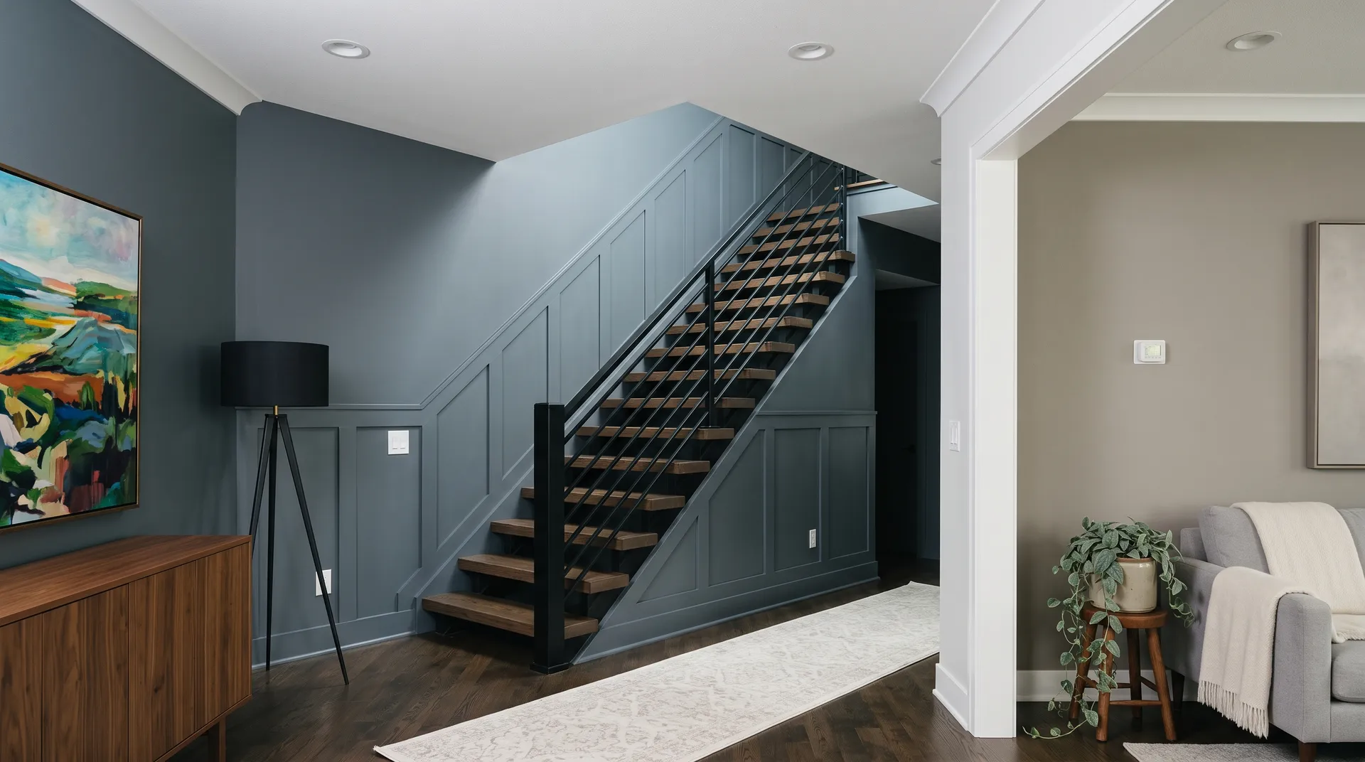
This foyer holds together because Slate Tile's cool blue-gray weight is balanced against crisp white and a warm material mix, and the whole thing feels intentional rather than accidental. Only three of the seven colors are actually paint: Slate Tile drenches the feature wall and stair wainscot paneling, Ice Cube covers the upper walls, ceiling, and trim, and Intellectual Gray carries the adjacent living-zone wall. The remaining four colors are the room's furnishings and materials, each shown here as its closest Sherwin-Williams paint match, so hover any pin or swatch to identify them.
All comparisons are matched against Slate Tile at LRV 14.8.
Mustard, terracotta, and burnt orange pull hard against Slate Tile's cool undertones and make the color look unsettled rather than grounded.
Cream trim introduces a yellow warmth that sits awkwardly against a color with essentially no warm undertone, making both surfaces look slightly off.
Heavily orange or reddish wood tones clash with Slate Tile's cool blue-gray character, and the contrast reads as unintentional rather than dynamic.
Slate Tile is a deep, muted blue-gray with an LRV of 14.8. It sits on the darker end of the paint scale, reading somewhere between a cool charcoal and a dusty slate blue depending on the light in your space.
The dominant undertone is cool blue-gray, but reviewers disagree on the secondary layer. Some read a clear blue lean that makes it feel distinctly blue-gray. Others pick up a subtle green or blue-green quality that surfaces in natural light. Either way, there is no warmth in this color. Expect the cool, slightly complex undertone to shift depending on your light source and what surrounds it.
Slate Tile is decidedly cool. It carries no yellow, beige, or red warmth. The base is cool gray with a blue lean, and in some lighting conditions a faint green-blue edge appears. If your space runs warm or you have warm-toned materials throughout, that contrast will be noticeable.
The LRV is 14.8, which places it firmly in the dark range. Paint with an LRV this low absorbs far more light than it reflects, so the color will make a space feel smaller and moodier. That is a feature in accent and focal-point applications, but it is something to plan around if you are considering it for a whole room with limited natural light.
The Sherwin-Williams color code is SW 7624. The hex value is #606E74 and the RGB is 96 / 110 / 116.
Ice Cube (SW 6252), Shoji White (SW 7042), and Intellectual Gray (SW 7045) are the official coordinates. For trim, crisp cool whites or soft warm whites work better than cream. Medium-to-dark warm woods like walnut and cherry, stone and marble surfaces, and muted greens all complement it well. Avoid warm golden tones, orange-toned wood, and cream trim.
Yes on all three. On exteriors, its cool contemporary tone works well on siding and looks especially sharp on shutters and front doors. Pairing it with a very dark near-black trim sharpens the look. On kitchen cabinets and bathroom vanities, the contained surface lets you enjoy the depth without overwhelming a whole room. Just make sure to sample it on the actual surface in your actual light before committing, because the LRV of 14.8 means it reads very differently under warm versus cool light.