Labradorite
What Labradorite Actually Looks Like
Labradorite is a deep, saturated blue-gray that earns its name. The mineral it references shifts color depending on the angle of light, and this paint does something similar on your walls. In bright daylight, you read it as a slate blue with a clear green pull. As the light fades, it drops into something closer to charcoal, almost stormy.
This is a chameleon color, and you need to know that going in. Morning light from an east-facing window will lift the blue and make the room feel cooler. By late afternoon, the same wall can go gray and heavy. Under warm incandescent bulbs, the green undertone steps forward and softens the whole thing.
What makes it distinctive is that it never reads as flat navy or plain gray. There is depth in it. You will catch the color changing throughout the day, which keeps a room from feeling static.
Labradorite Undertones
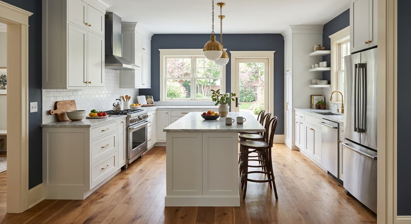
The dominant undertone here is green, sitting under the blue-gray base. That matters more than people expect. A green undertone means Labradorite plays well with natural wood, brass, and warm neutrals, but it can clash with anything that leans purple or pink.
When you choose trim, flooring, and furnishings, hold them against the wall in the actual room before committing. The green can grab onto nearby colors and pull them in unexpected directions. A "neutral" gray sofa might suddenly look muddy next to it. Test first.
Where Labradorite Works Best
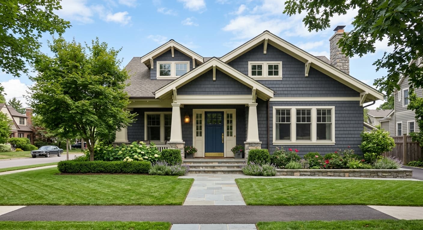
This color belongs in spaces where you want depth and intimacy. Think dining rooms, studies, powder rooms, and bedrooms. It wraps a room and makes it feel enclosed in a good way.
North-facing rooms get the most interesting result, because the cooler natural light leans into the blue and green tones without washing them out. South-facing rooms with strong sun will read brighter and slightly more vivid, which works if you want energy. In small rooms, Labradorite creates a cocooning effect rather than shrinking the space, so do not be afraid to use it in a tight powder room or a windowless hallway. In large rooms, it grounds the space and pairs beautifully with plenty of natural light.
What to Pair With Labradorite
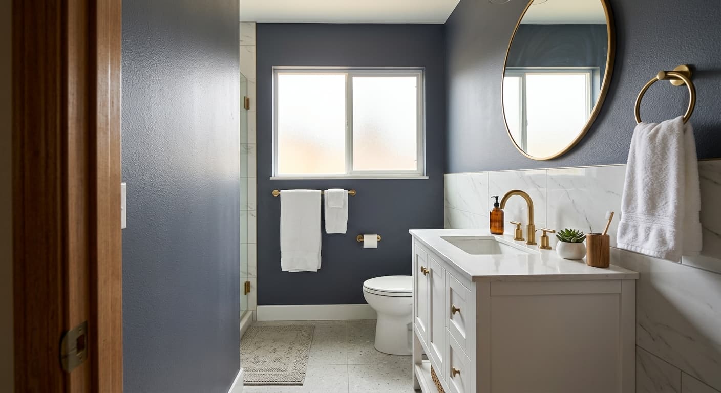
For trim, a crisp white like Sherwin-Williams Pure White (SW 7005) gives you contrast without going stark. If you want something softer, Alabaster (SW 7008) warms the edges and lets the green undertone breathe. Avoid bright cool whites, which can make the trim look blue and the wall look dingy.
Wood tones are your friend here. White oak, walnut, and warm mid-toned floors all complement the green base. Brass and aged bronze hardware look sharp against the depth of the color. For adjacent walls or open-concept flow, consider Accessible Beige (SW 7036) or Agreeable Gray (SW 7029) to balance the saturation. Leather, linen, and natural fibers all read well next to it. If you want a tonal scheme, a lighter blue-gray like Tradewind (SW 6218) keeps things in the same family.
Colors That Clash With Labradorite
Do not pair Labradorite with cool, blue-based grays. They fight the green undertone and the whole palette goes murky. Skip stark high-contrast whites in rooms with limited light, because the gap reads harsh. The most common mistake is using it in a dim room and expecting the daylight swatch to hold up. It will not. In low light, this color goes dark fast, so make sure you have adequate lighting or you embrace the moody result on purpose.