
MorningBlue-green freshness forward
A blue-green-gray that sits at medium depth, calm enough for bedrooms, complex enough to shift noticeably across the day. See how it reads in your light.
Silvermist lands somewhere between a soft aqua and a weathered sage, but it is neither. The blue and the green share roughly equal billing, and the gray pulls both back toward something quieter and more complex than either could be alone. At LRV 46.9 it sits squarely in the medium range, light enough to keep a room from feeling closed in but with enough pigment depth to register as a real color choice rather than a near-neutral.
What you actually see on the wall depends heavily on where you are standing and what time of day it is. In strong natural light, the blue-green freshness moves forward and the color can read almost airy, with a faint coastal quality. As light drops, the gray base takes over and the whole thing shifts toward something muted and composed. One reviewer noted a darker, almost coral-green cast in genuinely dim light, which is unusual but worth knowing. This is not a color that behaves the same at 8 a.m. and 8 p.m., and that variability is either the appeal or the reason to keep looking, depending on what you need from a wall color.
Across a full room the color has real presence without feeling heavy in most light conditions. On an accent wall it can feel a touch more dramatic and contained. On exterior siding or stucco, full sun tends to lighten it and blend the undertones, so it reads softer outdoors than the chip suggests.
The undertone debate around Silvermist is genuine and unresolved, and you should know that going in. Some reviewers read it as primarily blue with green doing visible supporting work and gray acting as a softener. Others say all three contribute so evenly that no single one wins. Still others, especially when placing it next to comparison colors, call it the greener option in the pair. The honest answer is that it is all three and that which one you notice most depends on your light, your finishes, and what is sitting next to it.
Cool trim is where most reviewers land safely. Bright whites and clean off-whites let the blue-green blend read as intended. Cream or yellow-based trim is the one combination that consistently draws warnings: those warm undertones can pull a yellow cast out of Silvermist that is not visible in isolation, and the pairing ends up fighting itself. Chrome and polished nickel hardware consistently complement it, while brass can either read as a deliberate warm contrast or tip into conflict depending on the specific brass finish.
North-facing rooms tend to amplify the cool, blue-leaning side of the color, sometimes pushing it toward chilly. South-facing and west-facing rooms with warm afternoon light balance the coolness more successfully. This is one of those colors where a large sample card on multiple walls, viewed across different times of day, is not optional caution but genuinely necessary. What looks like a muted blue-gray in the morning can read more green-gray by late afternoon, and reviewers are consistent on that point.
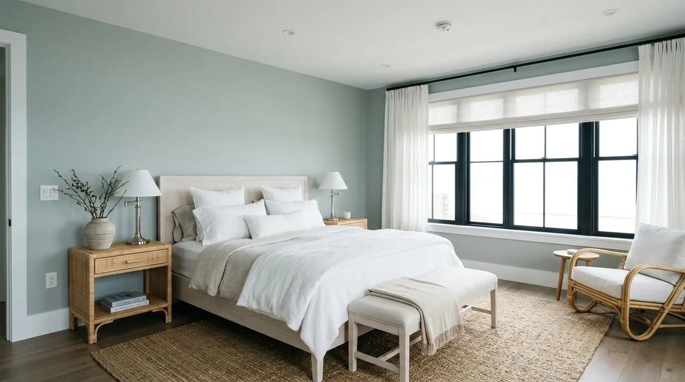
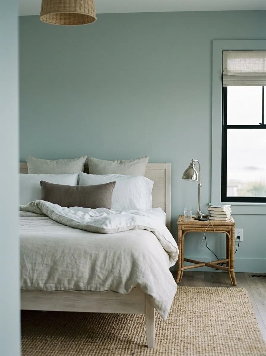
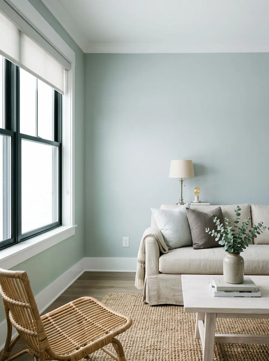
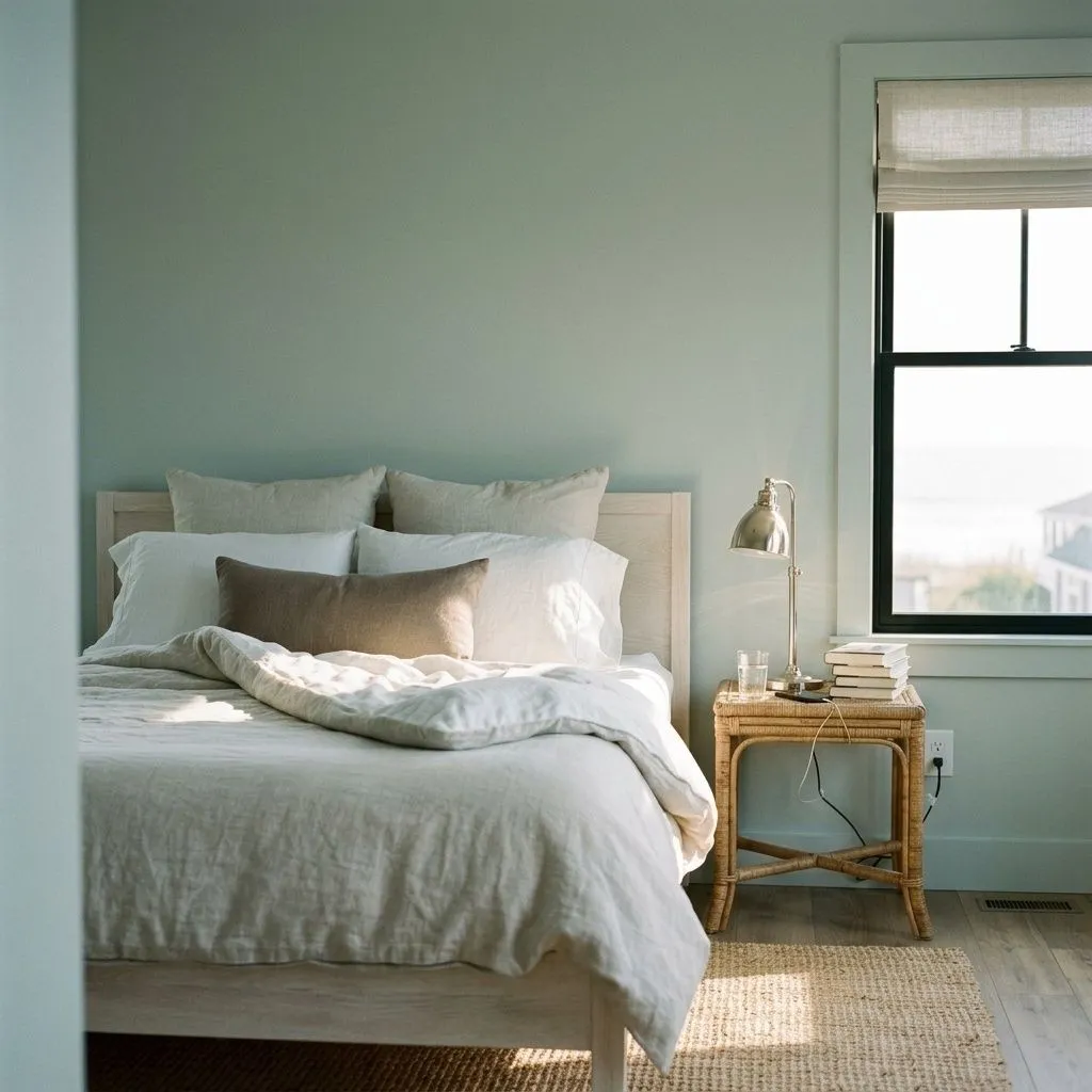
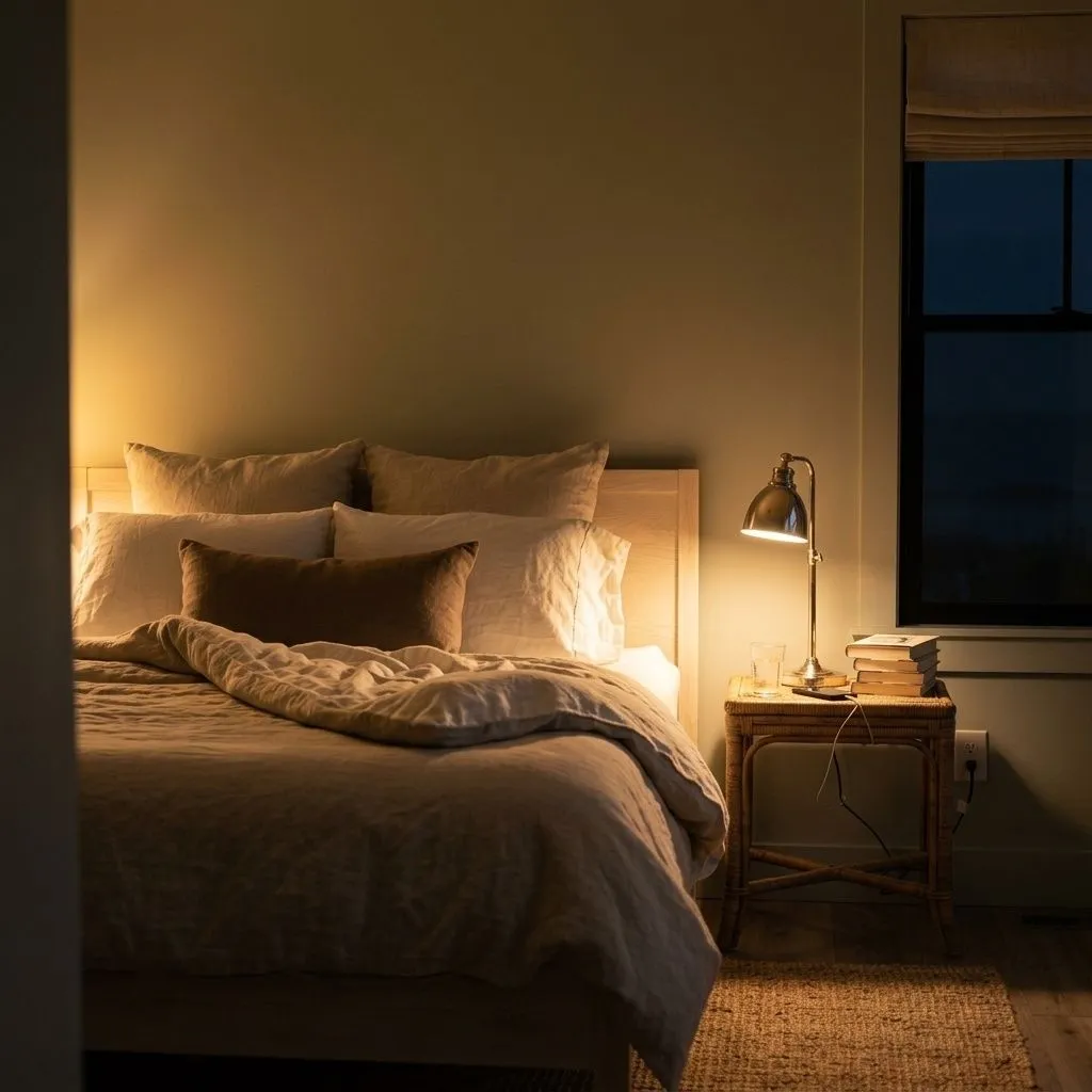
Bedrooms are the most cited use, and the case is straightforward. The color has a calming, slightly receding quality that works well with the LRV sitting at 46.9, present enough to feel intentional but not so saturated that it feels activating. It suits coastal and Caribbean-influenced spaces in particular, where the blue-green blend reads as deliberate rather than indecisive. Reviewers also consistently recommend it for living rooms with good natural light, though they are more cautious about large, lower-light living spaces where the gray base can feel subdued rather than serene.
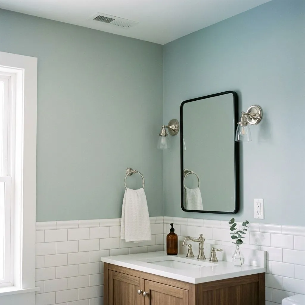
Bathrooms are a strong secondary use. Against white subway tile and chrome or polished nickel fixtures, Silvermist reads as a clean, light aqua-gray that does not fight the utilitarian elements of the room. It makes a bathroom feel spa-adjacent without the color being too aggressive about it. Kitchen cabinetry is also cited, where the color reads fresh and slightly unexpected without being jarring. A few reviewers note that it can feel like a lot across a large all-cabinet kitchen, so smaller kitchens or two-tone configurations where it appears on lower cabinets only tend to work better.
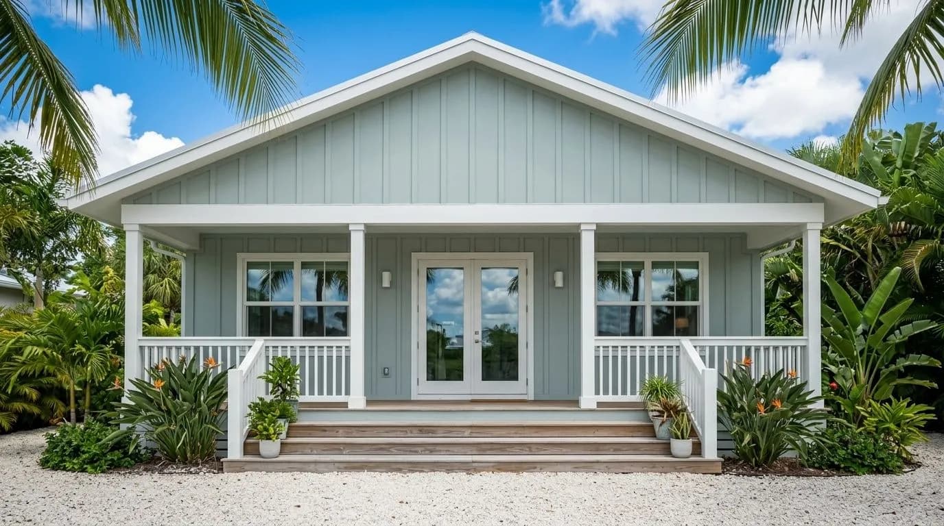
On exteriors it performs reliably. Full sun lightens and blends it, so it tends to read lighter on siding than it does indoors, and the coastal quality of the color translates well to exterior contexts. Front doors are a reasonable application where the color makes a quiet but specific statement. For interiors, the consistent caution is that it demands good light to look its best, so if you are working with a north-facing room that gets very little sun, plan to sample it extensively before committing to all four walls.
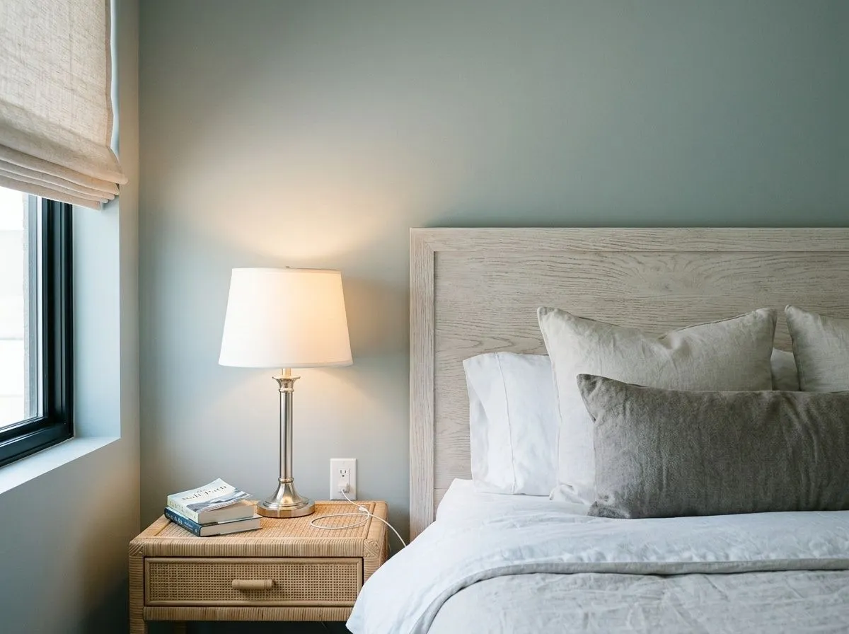
Silvermist is widely recommended for bedrooms precisely because the LRV of 46.9 gives the color enough presence to feel intentional while the cool blue-green blend reads as calm rather than stimulating. It suits coastal and relaxed-traditional styles especially well. Pair it with white or linen bedding and wood furniture in a medium stain and it settles into a room that feels put-together without much effort.
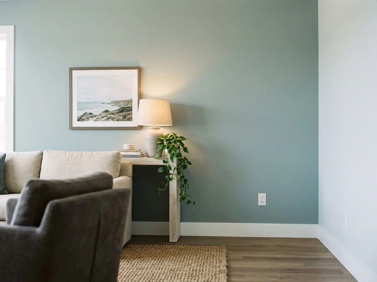
In a living room with south or west-facing windows, Silvermist rewards good light with a fresh, airy quality that makes the space feel larger than it measures. In lower-light living rooms or north-facing spaces, the gray base dominates and the result can feel more subdued than intended, so a feature wall rather than all four walls is the safer approach there.
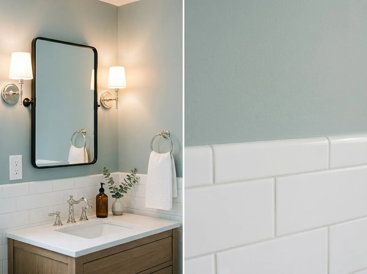
Against white subway tile and chrome or polished nickel hardware, Silvermist reads as a clean aqua-gray that gives the bathroom a considered, calm quality. The medium LRV keeps it from feeling dark even in bathrooms with limited windows. It is one of the more consistently praised applications in the research, with reviewers noting it works with both modern and transitional fixtures.
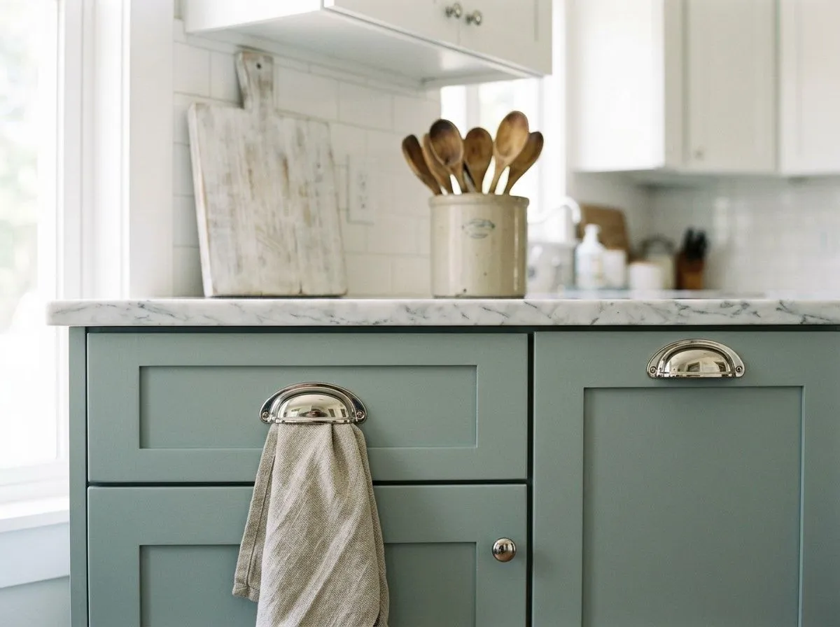
On cabinets, the color reads fresh and specific without being a statement color in the aggressive sense. It works best in kitchens with white or bright off-white uppers or walls so the cool blend has something clean to sit against. Reviewers suggest caution in large, all-cabinet kitchens where the depth at LRV 46.9 can start to feel heavy; a two-tone application on lower cabinets only tends to be the more successful approach.
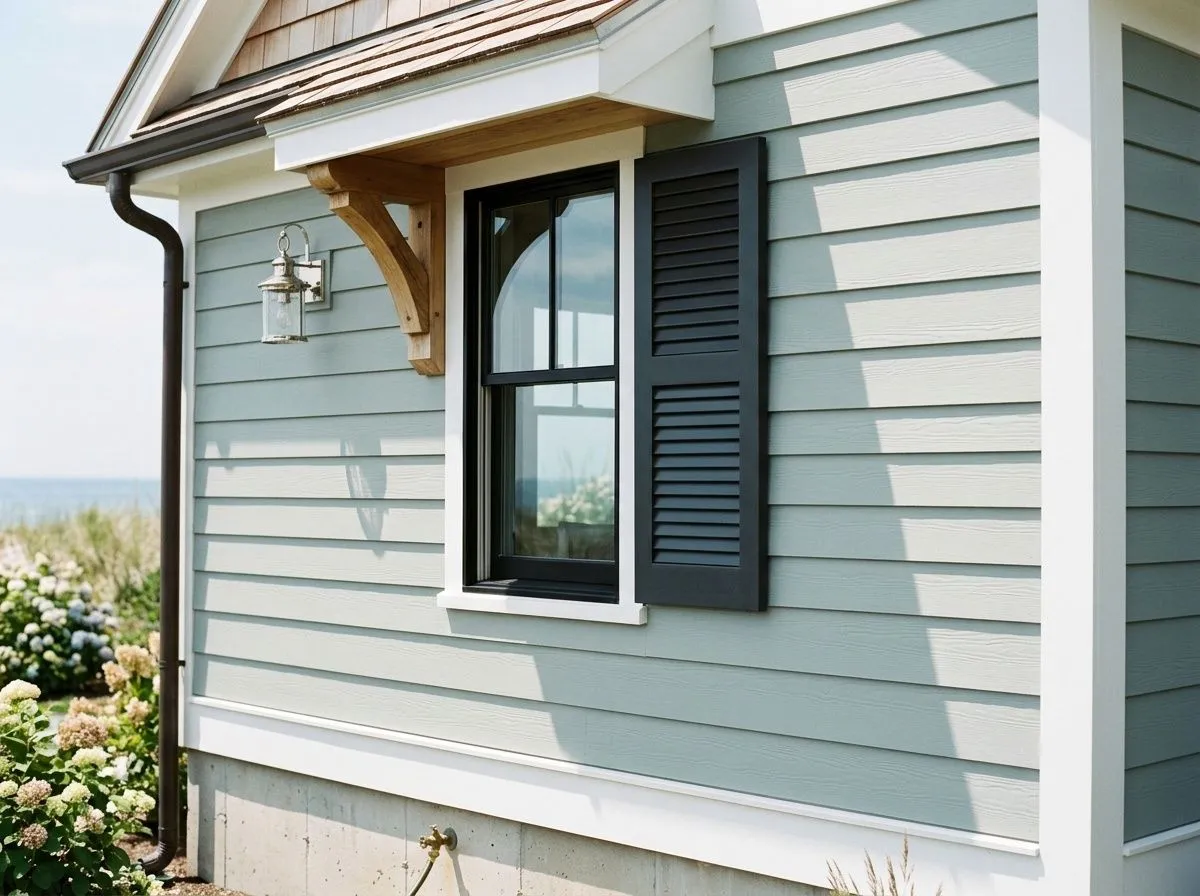
Full sun lightens and blends Silvermist outdoors, so it reads softer and less saturated on exterior siding or stucco than it does inside. The coastal undertone quality translates naturally to exterior contexts, and it pairs cleanly with white trim and darker accent colors on shutters or doors. It holds up as a front door color as well, where it makes a quiet, specific impression.
White trim is the standard and well-supported move with Silvermist. Extra White (SW 7006) gives the crispest contrast, letting the blue-green depth of the walls read clearly against a clean, bright boundary. Reserved White (SW 7056) is the softer option, warming the pairing slightly and producing a less high-contrast result that some prefer in bedrooms. Either one keeps the cool blend intact in a way that cream or warm whites do not. Reviewers are consistent that the yellow-toned trim family is where this color runs into trouble, so staying in the bright-to-soft-white range is the reliable approach.
For deeper accents and coordination, Attitude Gray works as a grounding companion, adding weight without introducing a competing color note. Beyond the coordinating palette, the color sits naturally alongside wood tones across a wide range of stain colors, which is unusual enough to be worth noting. Deeper blues and sage greens extend the blue-green-gray theme rather than fighting it, and reviewers mention dark accent colors in the charcoal family as contrast picks that hold up well against Silvermist's medium depth.
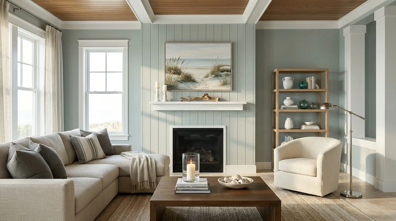
The wood, textiles, stone, and metal carry most of what you see here, and the paint is doing less heavy lifting than you might think. Silvermist lands on the walls and the v-groove fireplace paneling, and that is the only actual paint in this seven-color room. The remaining six colors are the furnishings and materials, each matched to its closest Sherwin-Williams equivalent, so hover a pin or swatch to see exactly what is in play.
All comparisons are matched against Silvermist at LRV 46.9.
Yellow-toned or cream whites pull a warm cast out of Silvermist that is not visible when the color sits alone, creating a fight between the cool wall color and the warm trim that makes both look off.
In rooms that get little natural light, the blue side of Silvermist amplifies and the result can read cold and flat rather than calm. At LRV 46.9 it does not have the reflectivity to compensate for genuinely dark conditions.
Silvermist is a color that needs room to breathe and enough surface area to show its blue-green-gray complexity. On a tiny backsplash or a very small accent area, it tends to read simply as a flat gray-green without the depth that makes it interesting.
Silvermist is a soft, muted blue-green-gray. It is not a bright teal, not a flat gray, and not a true sage. The blue and green sit together in the base and the gray holds them back, producing a medium-depth color at LRV 46.9 that reads calm and slightly coastal in most light conditions.
Silvermist carries blue, green, and gray undertones, and which one dominates is genuinely contested among reviewers. Some read it as primarily blue with green doing visible supporting work. Others call it an even three-way blend. Still others, when placing it next to comparison colors, read it as the greener option. All reviewers agree it shifts with light: cooler and bluer in north-facing or low light, more green-gray in warm afternoon light.
Silvermist is a cool color. The blue and green base and the absence of any yellow or red warmth put it firmly in the cool category. It can feel chilly in north-facing rooms with limited light and more balanced in south or west-facing rooms where warm sunlight offsets the cool blend.
Silvermist has an LRV of 46.9. That puts it in the medium range, light enough to avoid reading as a dark or heavy color but with enough depth to behave differently in low light versus bright natural light. It is not a safe-anywhere light neutral and benefits from good natural light to read at its best.
Silvermist's Sherwin-Williams color code is SW 7621. The hex value is #B0B8B2 and the RGB is 176, 184, 178.
Bright or soft whites are the most reliable trim companions. Extra White (SW 7006) gives the crispest contrast and Reserved White (SW 7056) offers a softer pairing. Attitude Gray works as a deeper coordinating accent. Wood tones across a wide range of stains work well with it, which is less common for cool colors. Avoid cream or yellow-based whites, which create a visual conflict by pulling a warm cast out of the cool wall color.
Yes on all three, with some caveats. On exteriors, full sun lightens and blends the color so it reads softer than indoors, and the coastal quality of the blue-green blend works naturally on siding and stucco. On a front door it makes a quiet but specific impression paired with white trim. On cabinets it reads fresh and deliberate, though reviewers suggest caution in large all-cabinet kitchens where the depth at LRV 46.9 can feel heavy across the whole space.