
MorningGreen-blue · fresh, spa quality

A medium green-gray with genuine depth, Oyster Bay shifts from spa-fresh sage to cool slate depending on your light and room orientation. Paint a large sample and study it across the day before you commit.
Oyster Bay SW 6206 lands squarely in the medium range with an LRV of 44.1, which means it absorbs more light than it reflects and reads noticeably deeper on the wall than lighter coastal greens. Think of a cloudy shoreline at midday: soft, muted, and slightly hazy. The color draws its character from an even mix of green, gray, and a quiet hint of blue, and none of those three fully dominates. It never gets vivid or saturated. It just sits there with a calm, collected authority.
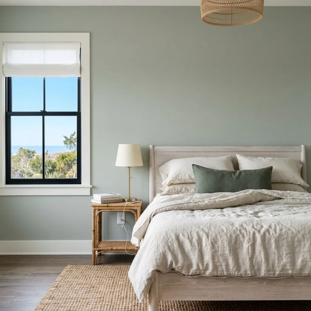
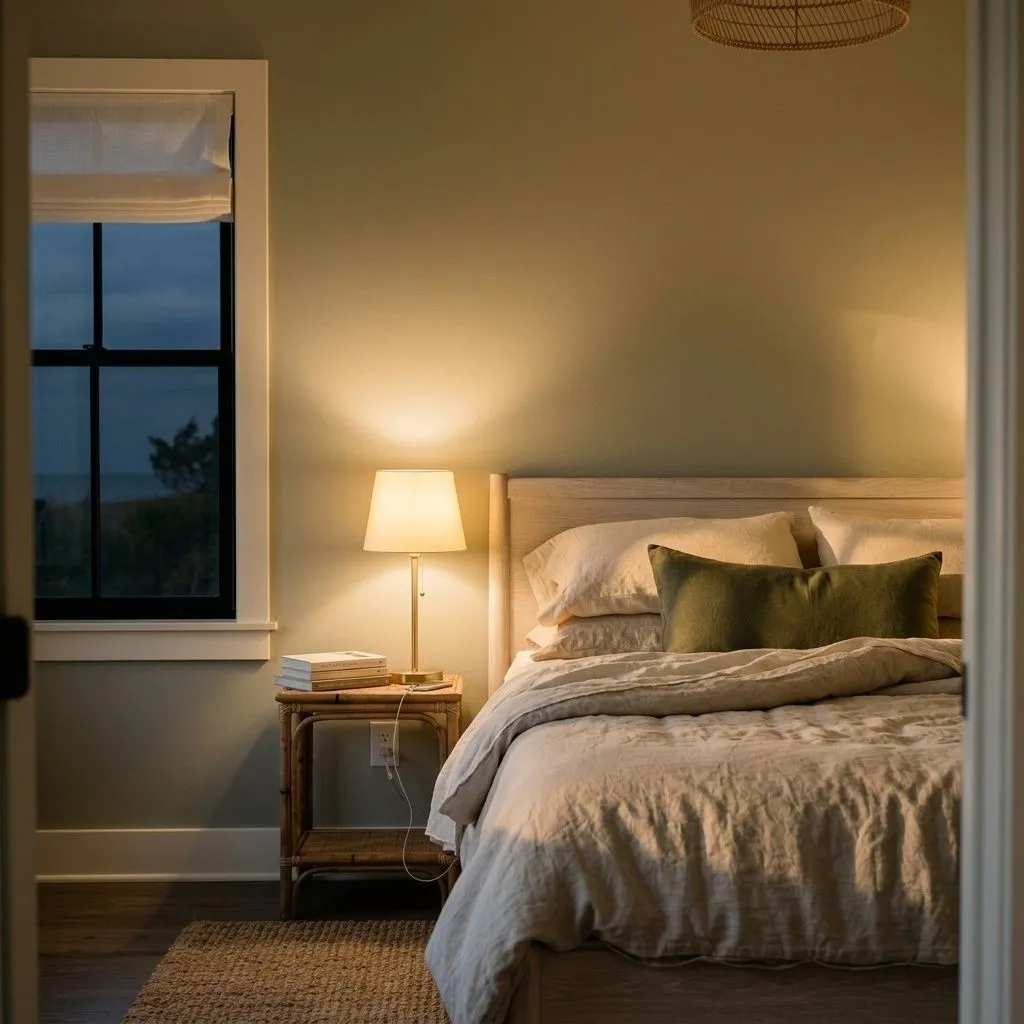
In strong natural daylight the green and blue-green rise to the surface and the color can feel genuinely fresh and spa-like. In lower or cooler light it pulls gray and can look almost slate. A faint brownish cast has also been reported in certain warm artificial settings, which surprises first-time users who expected a clean green-gray. This is a chameleon, and that quality is both its appeal and its main risk. Paint it on a large sample first and study it in the morning, midday, and evening before you commit to a full room.
The official classification puts Oyster Bay in the greens and sage family, and on most walls you will see why: there is genuine green in the base. But the independent consensus from reviewers is that it reads cooler and more gray-forward than a typical sage, driven by a slate-blue undertone that surfaces reliably in north-facing rooms or under cool LED lighting. So officially it is green; in practice it often feels like a cool, slightly blue-tinged gray with green depth behind it.
Where reviewers genuinely disagree is on the warm-versus-cool question. Many call it definitively cool because the gray and slate-blue dominate. Others say it behaves warmly in south-facing rooms or under warm incandescent and warm-white bulbs, where it can pick up a creamy, yellowish-green quality and feel much less severe. A smaller number report that brownish cast in artificial light, which reads warm but not flattering if you were expecting clean green-gray. The honest answer is that Oyster Bay is predominantly cool with a green-gray character, and it flexes warm only under specific lighting conditions. You need to test it in your actual room rather than relying on a small chip under a store light.
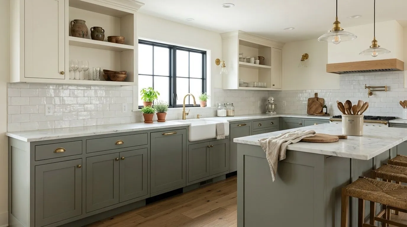
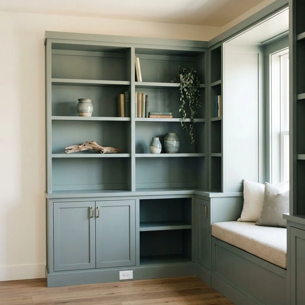
Oyster Bay earns its strongest reviews on cabinets and built-ins. The depth of LRV 44.1 gives painted cabinetry a collected, sophisticated quality without going dark, and the green-gray reads especially well against white walls or cream countertops. Bathrooms are another natural home: the slate-blue-green undertone plays directly into a spa-like atmosphere, and it works beautifully on full walls in bathrooms that get good natural light or on half-walls paired with white subway tile. Interior doors painted in Oyster Bay are a lower-commitment way to introduce the color throughout a home.
For full-wall use in living rooms and bedrooms, light orientation matters a great deal. South- and east-facing rooms with warm afternoon sun let the green and blue-green read clearly and keep the color from feeling heavy. North-facing or poorly lit rooms are the caution zone: the mid-low LRV pulls the color grayer and can make a space feel gloomy. In those situations, bright white trim, light wood floors, and warm-toned textiles do real work to lift it. Rattan, wicker, and natural linen textures complement the earthy, nature-inspired quality of the color, and brushed or antique brass hardware flatters the green side.
On exteriors, Oyster Bay is a strong performer for coastal and traditional homes. It suits siding, shutters, and front doors, and it pairs naturally with white trim and natural wood accents. The muted quality keeps it from reading too trendy and gives exteriors a timeless, slightly weathered coastal character. Farmhouse-style homes are another good fit, particularly with cream or warm white trim rather than a stark bright white.
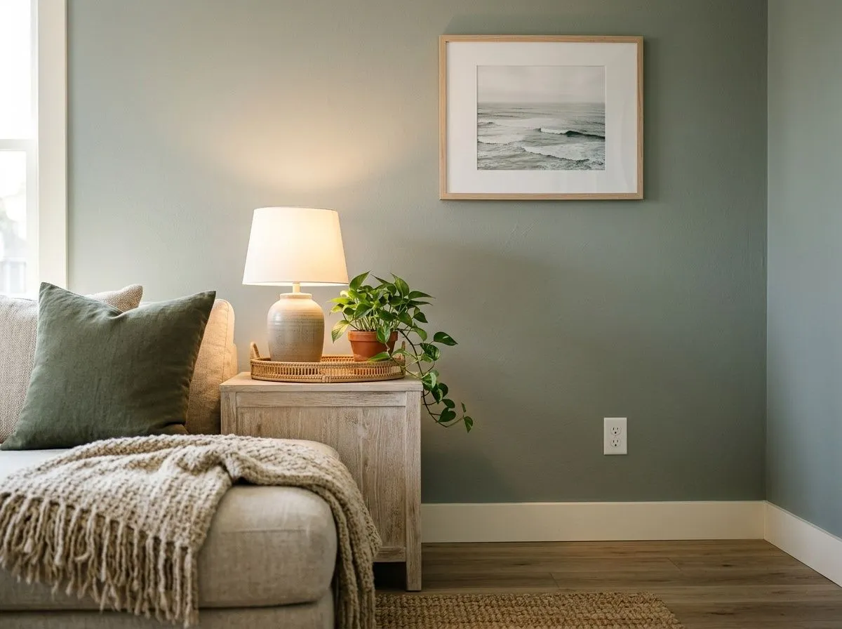
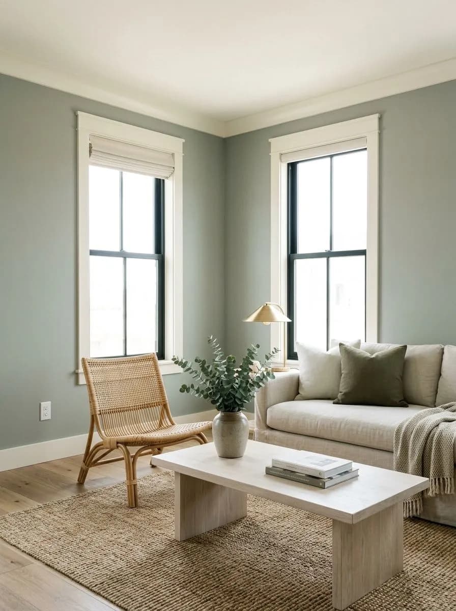
In a living room with decent natural light, Oyster Bay gives walls a calm, settled quality that reads neither too casual nor too formal. Keep trim in a warm creamy white to prevent the LRV 44.1 depth from feeling heavy, and lean into warm wood floors and natural fiber textiles. A north-facing living room is the one situation to approach with caution and a large sample first.
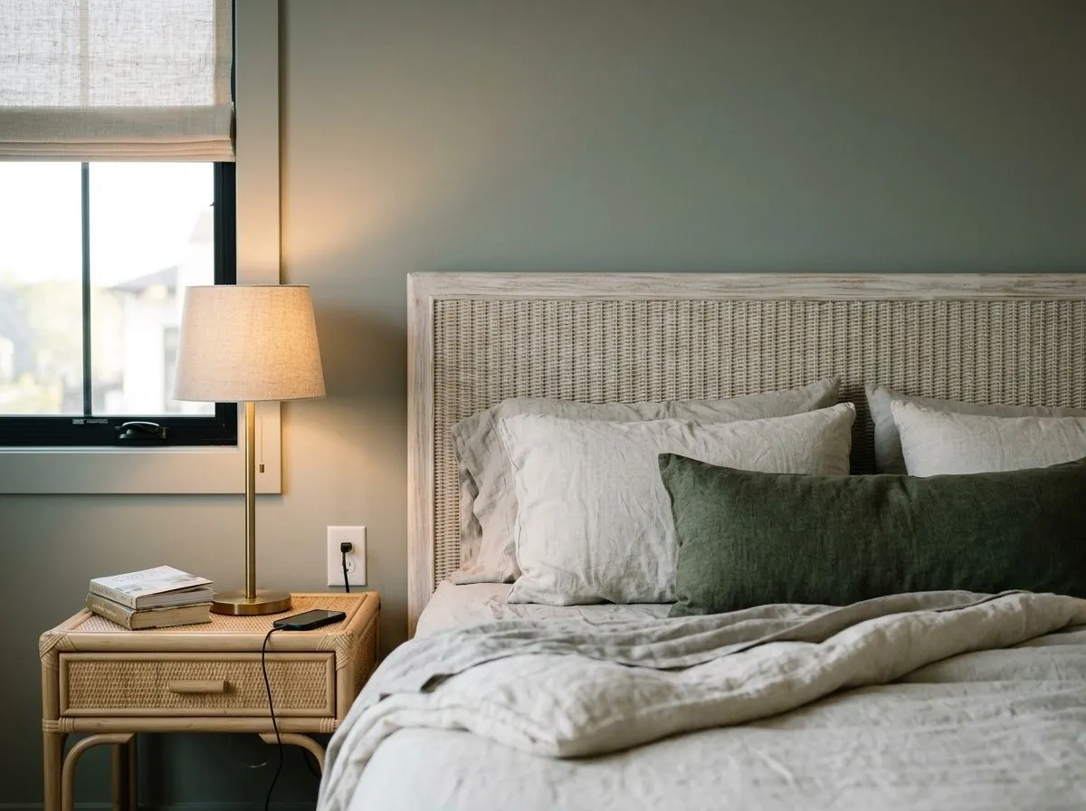
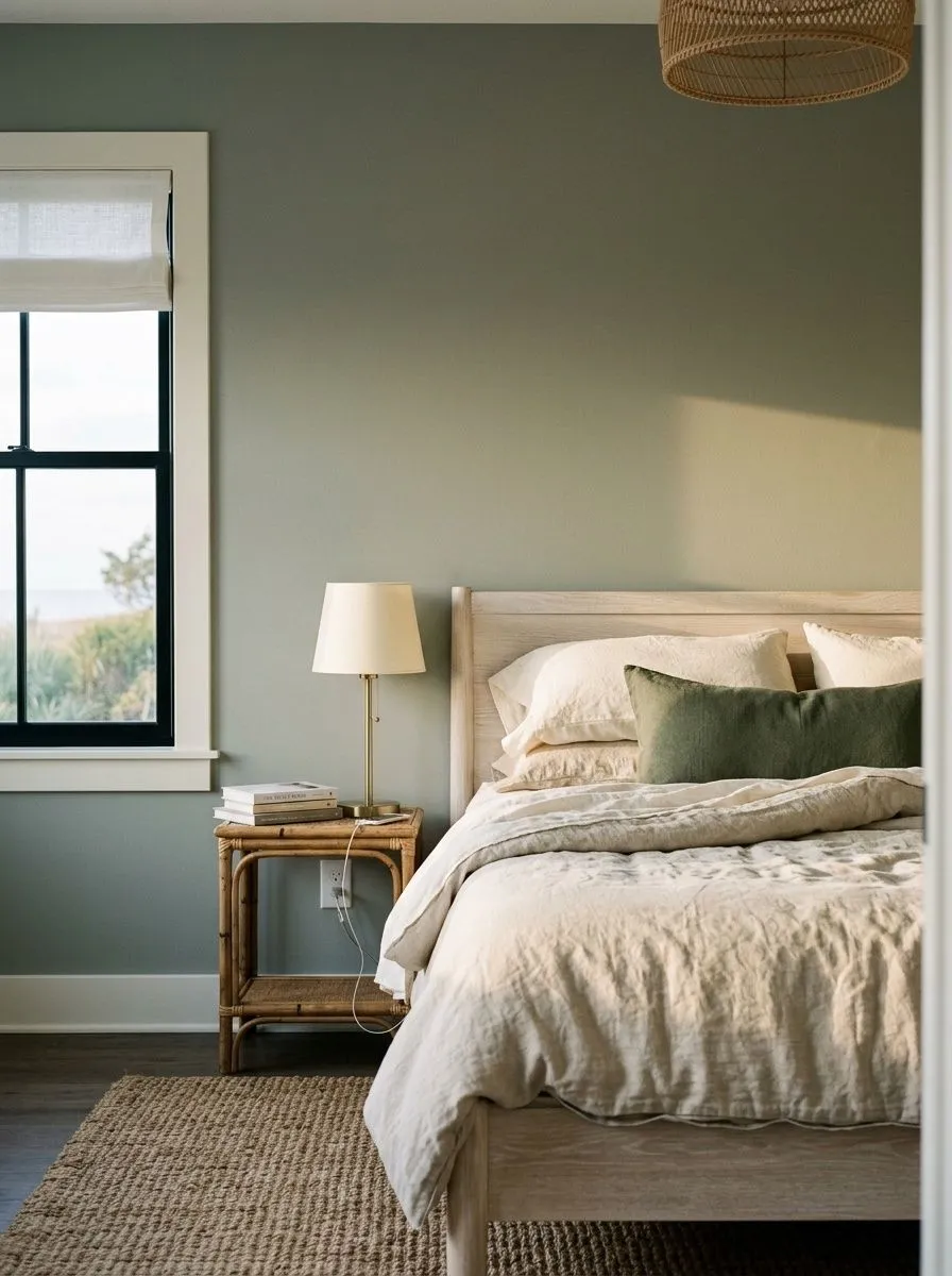
The muted, gray-green quality of Oyster Bay is genuinely restful in a bedroom, where that spa-like read works in your favor. Warm artificial lighting in the evening will shift it toward a creamier, slightly warmer green-gray, which most people find flattering. Pair it with linen bedding, warm wood furniture, and brushed brass hardware for the full nature-inspired effect.
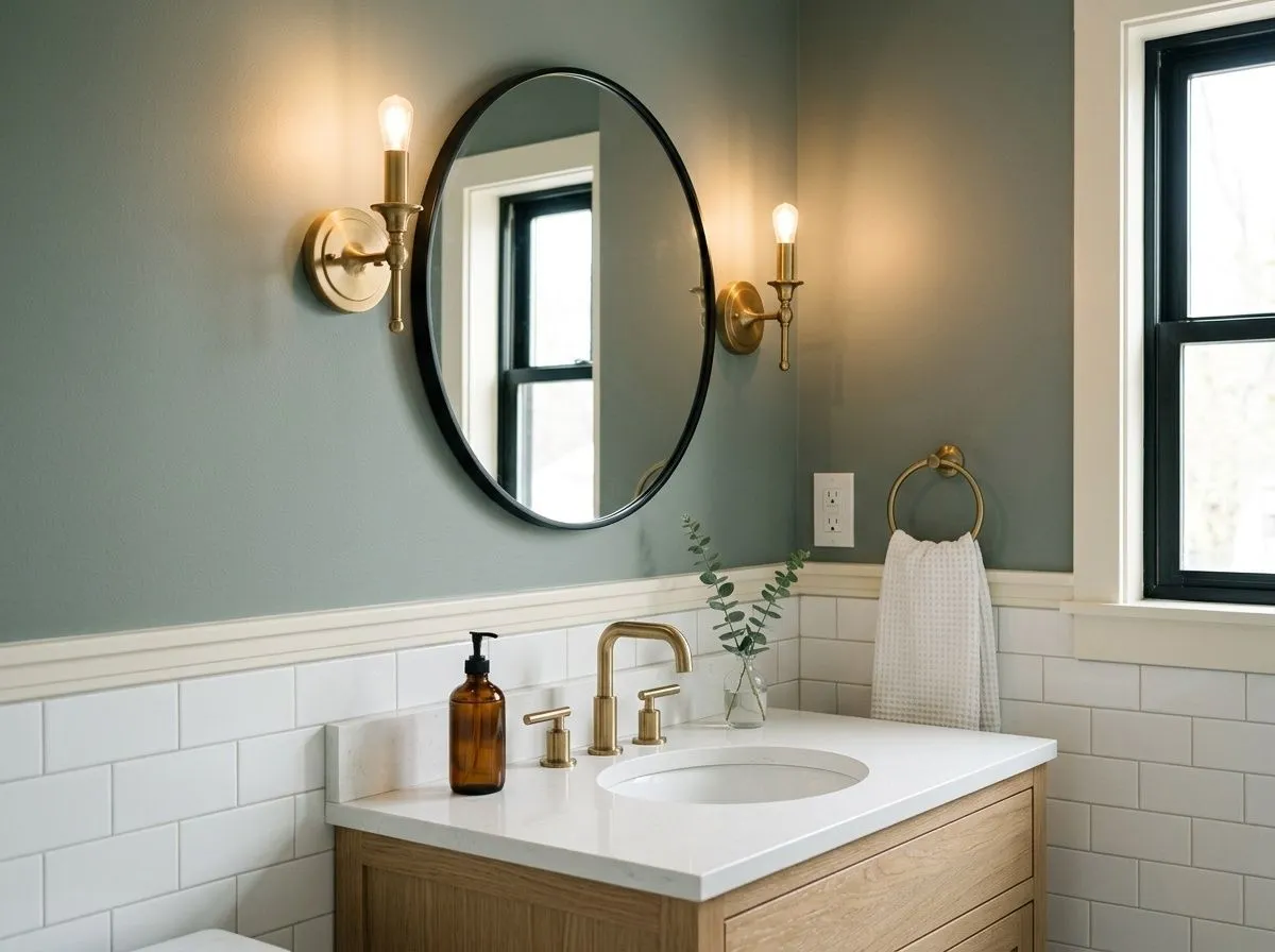
This is one of Oyster Bay's best applications. The slate-blue-green undertone reads clearly in a well-lit bathroom and creates the serene, clean atmosphere the color is known for. It pairs naturally with white subway tile and matte black or brushed brass fixtures, and the LRV 44.1 depth gives the room presence without feeling dark in a typically smaller space.
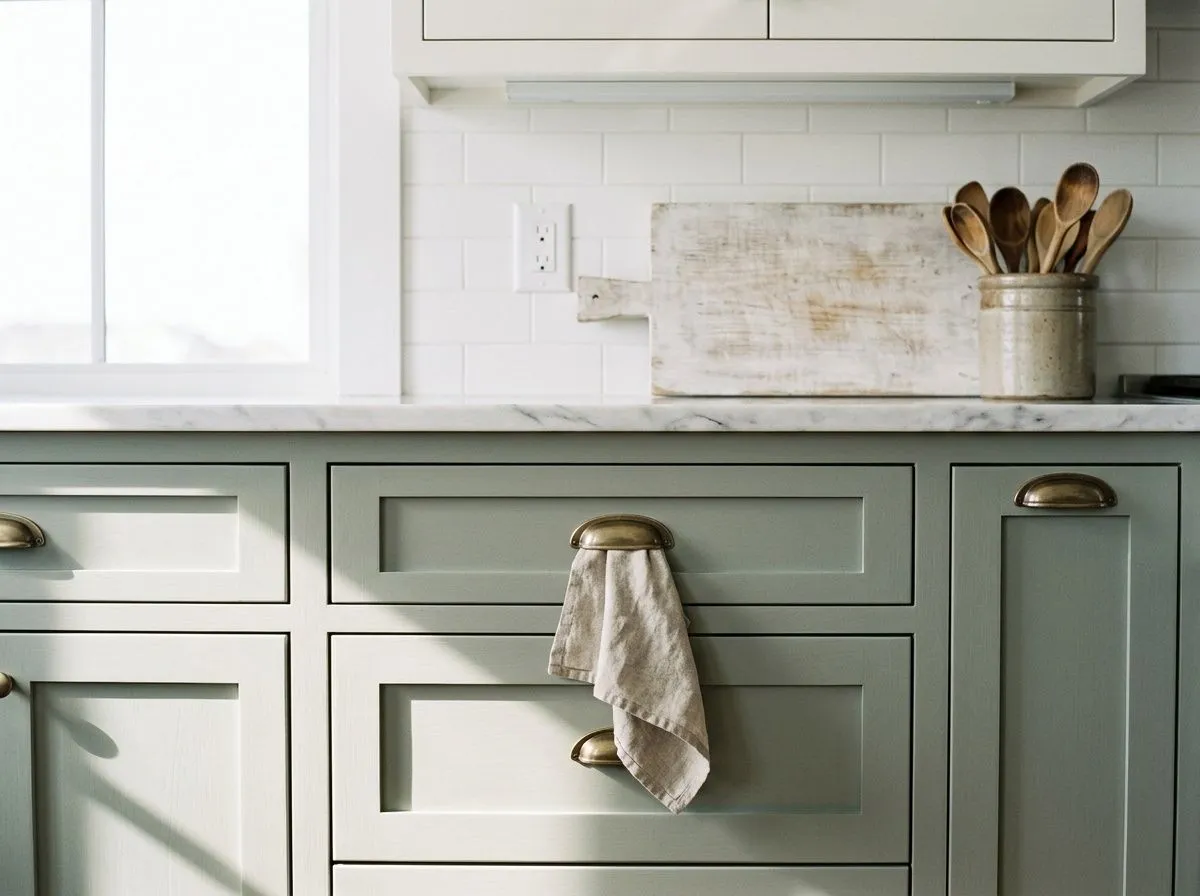
Oyster Bay on lower cabinets with white uppers and a white or light stone countertop is a combination that reviewers consistently call sophisticated. The depth of the color reads intentional on cabinetry in a way it can sometimes miss on flat walls. Brushed gold or antique brass hardware brings out the green side and ties the look together.
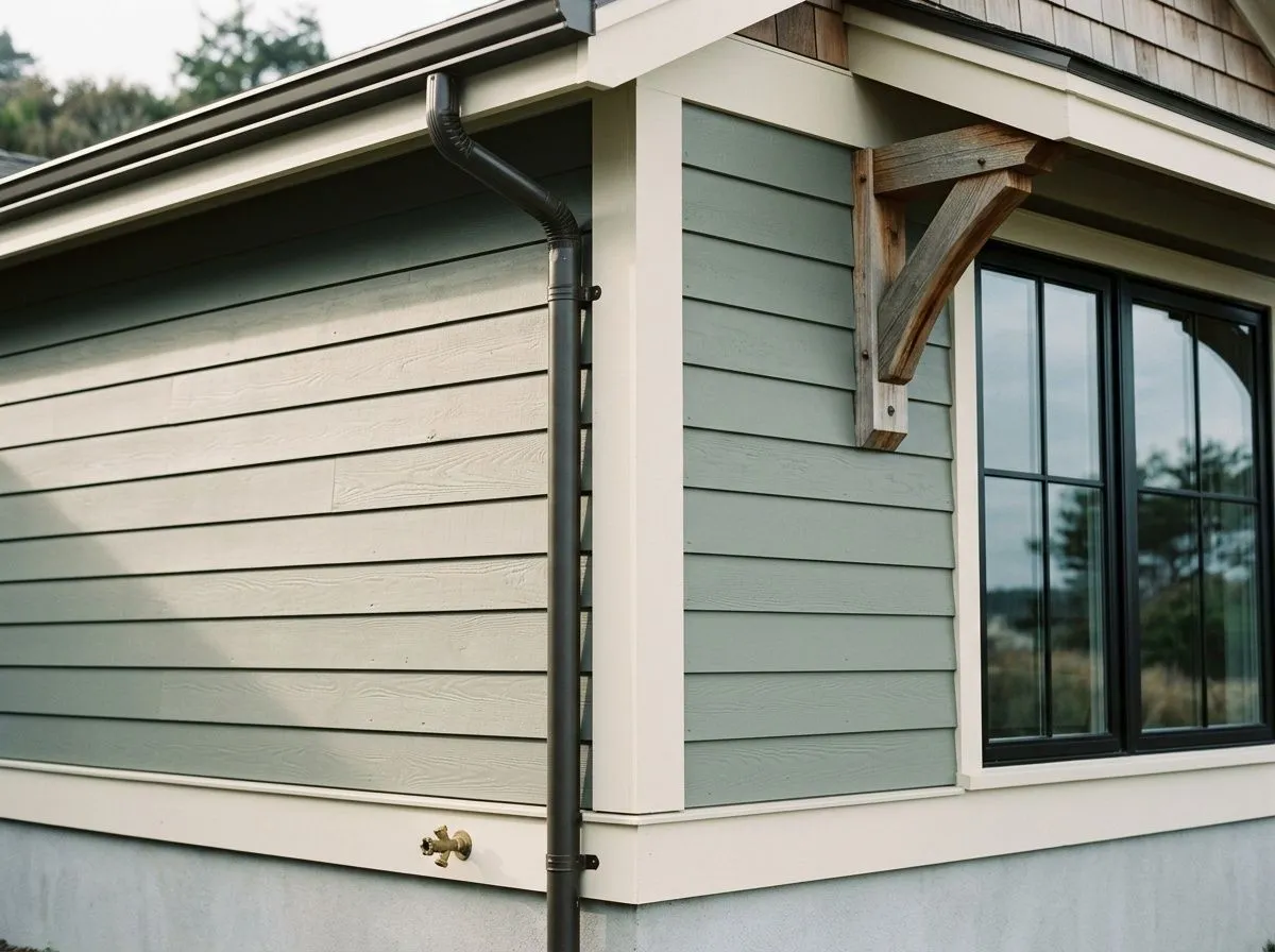
On a coastal or traditional exterior, Oyster Bay handles siding, shutters, and front doors equally well. Its muted character keeps it from dating quickly, and it pairs convincingly with warm white or cream trim and natural wood details. The green-gray shifts with the outdoor light across the day, which reads as a feature rather than a flaw on an exterior surface.
Sherwin-Williams coordinates Oyster Bay with Spare White (SW 6203), Greek Villa (SW 7551), and Prairie Grass (SW 7546). Spare White makes a crisp, clean trim pairing that keeps the green-gray reading fresh rather than heavy. Greek Villa is a warm, creamy off-white that plays into the earthy, organic side of Oyster Bay and works particularly well as a ceiling or trim color in rooms where you want a softer overall contrast. Prairie Grass brings in a deeper, earthier green neighbor that grounds the palette if you are working across multiple rooms or want a coordinating accent.
Beyond the official coordinates, a warm creamy white on trim does more to flatter Oyster Bay than a stark blue-white, which can push the slate-blue undertone cold. Muted and deeper blues make natural companions, as do warm beiges and taupes in adjacent spaces. Brushed gold and matte black both work as metal accents, with brushed gold specifically flattering the green side of the color. Natural textures in warm tones, rattan, cane, warm-toned wood floors, and linen, round out a palette that earns the earthy organic label this color carries.
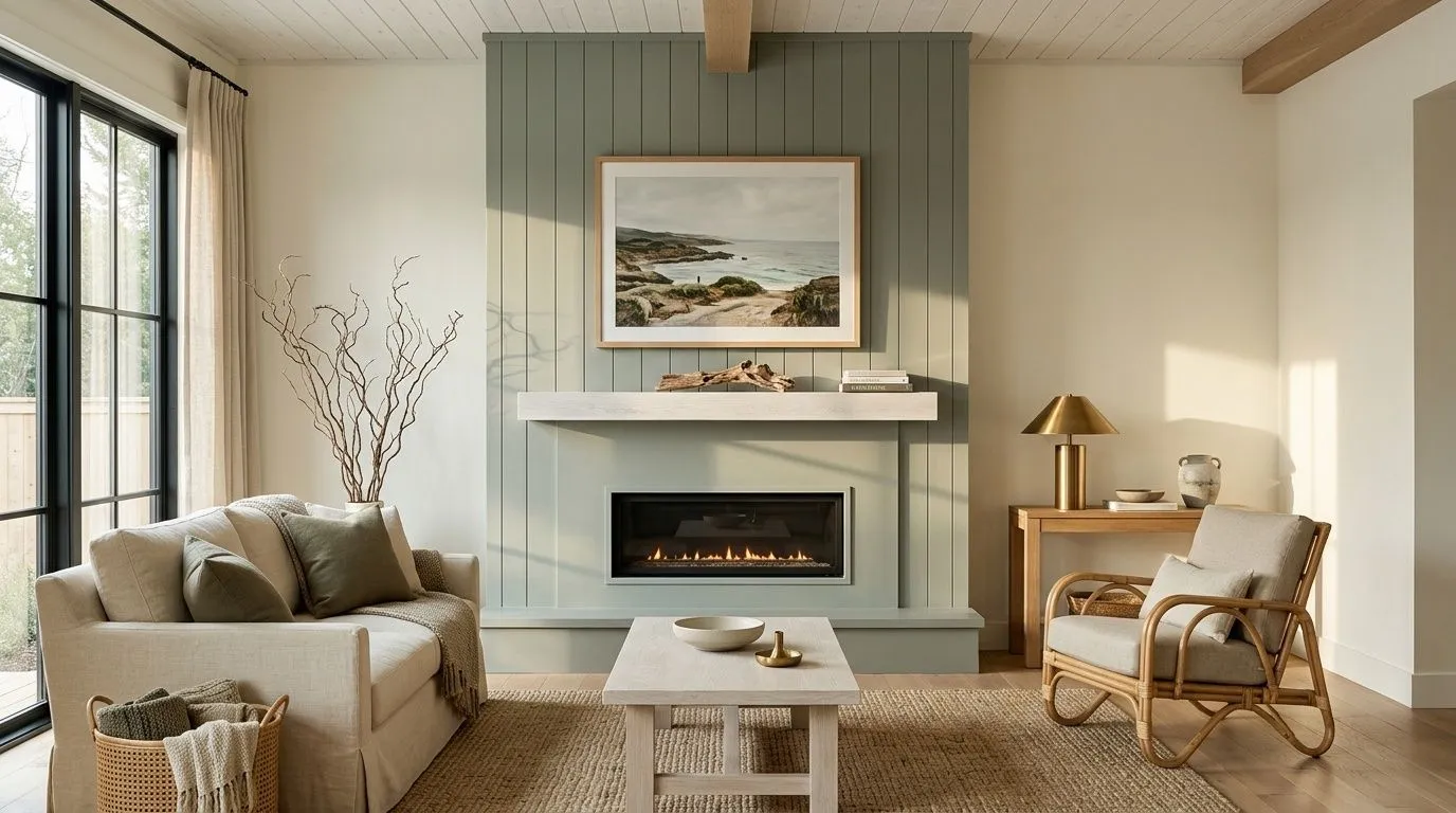
From the feature wall to the throw pillow, every color in this room has a Sherwin-Williams name, making the whole scheme something you can actually shop. Two of those colors are real paint: Oyster Bay on the drenched feature wall and v-groove fireplace, and Spare White on the surrounding walls and trim. The remaining five represent the room's furnishings and materials, each matched as closely as possible to a Sherwin-Williams swatch. Hover any pin to see which one.
All comparisons are matched against Oyster Bay at LRV 44.1.
Pairing Oyster Bay with a stark, blue-toned white on trim or ceilings amplifies the slate-blue undertone and can push the whole room cold and flat, erasing the green warmth that makes the color interesting.
In a north-facing room or a space with little natural light, cool-temperature LEDs drive Oyster Bay strongly toward gray and can make the walls read heavy and uninviting given the LRV of 44.1.
Heavily orange or red-toned wood floors and furniture create a jarring contrast with Oyster Bay's cool green-gray, since warm orange tones pull directly against the blue and slate undertones in the color.
Oyster Bay is a medium, muted green-gray with a hint of slate-blue. It sits in the soft, earthy range of the sage family and reads calm and slightly moody rather than bright or vivid. Its LRV of 44.1 puts it in the mid-tone range, deeper than most light coastal greens but not a dark color.
The primary undertones are green, gray, and a quiet slate-blue. The balance between them shifts with light. In strong natural daylight the green and blue-green read most clearly. In lower or cooler light the gray and slate-blue take over. Some reviewers also report a faint brownish cast under certain warm artificial lights. The color is a chameleon, and that is the most honest summary of its undertone behavior.
It is predominantly cool. The gray and slate-blue undertones drive a cool read in most lighting conditions. However, in south-facing rooms or under warm-white bulbs it can shift toward a creamier, warmer green-gray. Calling it strictly warm or strictly cool would flatten the reality: it leans cool but flexes more than most greens in its family.
The LRV of Oyster Bay SW 6206 is 44.1. That puts it solidly in the medium range, absorbing more light than it reflects. It reads noticeably deeper on the wall than lighter coastal greens and will feel heavier in rooms without good natural light.
Warm creamy whites work best for trim and ceilings. Sherwin-Williams coordinates it with Spare White (SW 6203) and Greek Villa (SW 7551), both of which keep the green-gray balanced without going cold. Muted and deeper blues, warm beiges, and taupes work well in adjacent spaces. For accents, brushed or antique brass and matte black both complement it, with brushed gold particularly flattering the green side. Natural textures like rattan, cane, and linen complete the earthy, nature-inspired palette.
The Sherwin-Williams color code is SW 6206. The hex value is #AEB3A9 and the RGB values are 174, 179, 169. The LRV is 44.1.
Yes to all three. Cabinets and built-ins are actually one of its strongest applications: the LRV 44.1 depth looks intentional and sophisticated on cabinetry, especially against white walls or light countertops. On exteriors it suits coastal and traditional homes well, working on siding, shutters, and front doors paired with warm white or cream trim. Its muted quality gives exteriors a timeless character rather than a trendy one.
It sits in the sage family and Sherwin-Williams classifies it in the greens and sage collection, so yes in a technical sense. In practice it reads more gray-forward than a classic sage. The slate-blue undertone gives it a cooler, more complex quality than a straightforward sage, so if you are expecting a warm, herby green, Oyster Bay will likely read cooler and more muted than you picture.