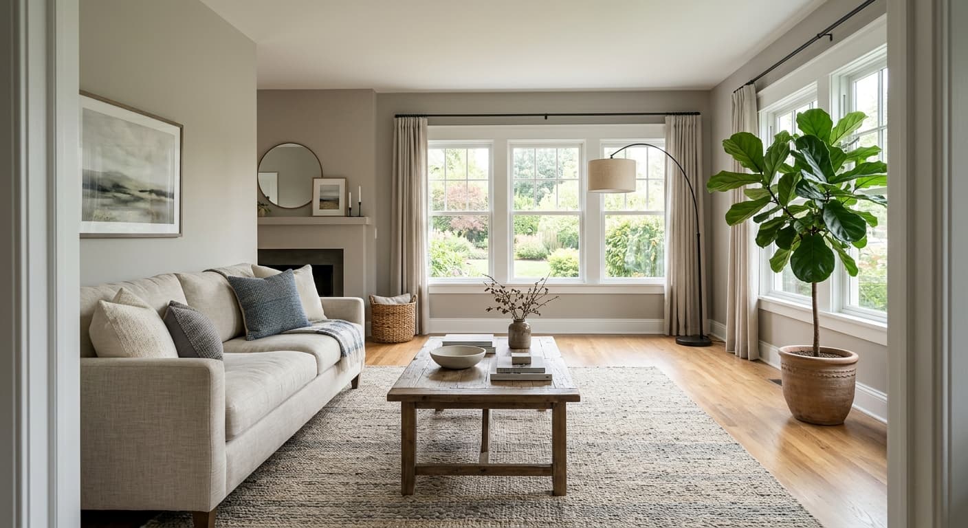
Sedate Gray reads as a soft, light warm gray with an LRV of 60.8, which means it reflects a solid amount of light and keeps a room feeling airy rather than heavy. It never goes stark or cold. What you get instead is a quiet, calm neutral that sits somewhere between a true gray and a warm greige, and many people who live with it describe it as leaning more toward a light taupe or even a gentle beige than what you might expect from anything called gray.
The overall impression on the wall is understated and inviting. It has enough color to feel intentional but not so much that it competes with furnishings or artwork. Under ample natural daylight it presents as a clean, slightly warm gray. Shift to warmer incandescent or LED light in the evening and its warmth deepens slightly, pulling the room toward a cozier, more enveloping feel. It is a light shade, but it is not a white-adjacent nothing color. It holds its own.
This is where Sedate Gray gets interesting and where you should sample before you commit. The database flags three undertones: warm, gray, and green. Reviewers largely confirm the warmth first, describing taupe and beige pulls that make the color feel more grounded and organic than a standard cool gray. Sherwin-Williams actually files it in the yellow paint family in their internal organization, which lines up with that slightly golden-taupe cast people keep reporting on painted walls.
The green whisper is real but conditional. In rooms with northern exposure or in spaces that borrow reflected light from trees or green landscaping outside, that soft green can surface and shift the color noticeably. Some reviewers call it pleasant and earthy. Others find it unexpected and unwelcome, especially if they wanted a straightforward warm gray. So the honest answer is that the undertone you experience depends heavily on your specific light conditions.
There is genuine disagreement in independent reviews about how to categorize this color. Some people call it a warm gray. Some call it a light greige. Some say it reads as a muted beige. Nobody calls it a cool gray or blue-leaning neutral. That consensus on warmth is reliable. The exact flavor of that warmth, whether it tips taupe, green, or golden, is what shifts with your room. Sample it on a large board and move it around before you decide.
Sedate Gray is a natural fit for bedrooms, living rooms, and bathrooms, and it works across a wide range of design directions. Reviewers use it in modern and minimalist spaces where its restraint reads as intentional sophistication, and just as comfortably in farmhouse, rustic, and traditional rooms where its warmth ties into natural materials. It is a flexible color that does not demand a particular style commitment from you.
Orientation matters. South- and west-facing rooms with warm, generous light let Sedate Gray settle into its most comfortable register: warm, calm, and quietly inviting. North-facing rooms are where the green undertone is most likely to surface, so if your room faces north, sample carefully and check it at multiple times of day. East-facing rooms will give you a cool reading in the afternoon that shifts warmer in the morning light.
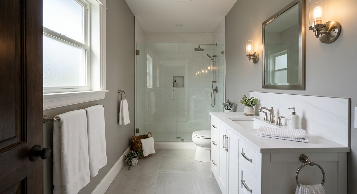
Beyond main living spaces, it works well in home offices where a neutral that is not stark white helps reduce visual fatigue. It plays well with wood tones, stone surfaces, metal hardware, and natural textiles like linen and cotton. At LRV 60.8 it has enough reflectance to keep bathrooms and smaller rooms feeling open, while its warmth prevents it from going clinical or cold in those spaces.
In a living room, Sedate Gray creates a calm backdrop that recedes behind furniture and lets the room feel collected rather than bare. Its LRV of 60.8 keeps the space bright without requiring all-white everything. Layer in warm wood furniture and linen upholstery and the color does exactly what a good neutral should: it makes everything else look better.
Sedate Gray is one of the more reviewed bedroom choices in this color family, and that makes sense. Its warmth and restraint contribute to a room that feels settled and easy to rest in. Pair it with cream bedding and wood nightstands and the LRV 60.8 reflectance keeps the space from feeling enclosed even in a smaller room.
In a bathroom, the color's warmth prevents the clinical coolness that pure grays can introduce, especially in rooms with cool tile or chrome fixtures. The 60.8 LRV keeps things feeling light. If your bathroom is north-facing, check for the green undertone under your actual fixture lighting before committing.
Sedate Gray works well in a home office because it is neutral enough to avoid distraction and warm enough to avoid the visual fatigue that comes from stark white walls under screen light. It reads as a thoughtful, composed background. Pair with natural wood desk surfaces and warm-toned lighting for the best result.
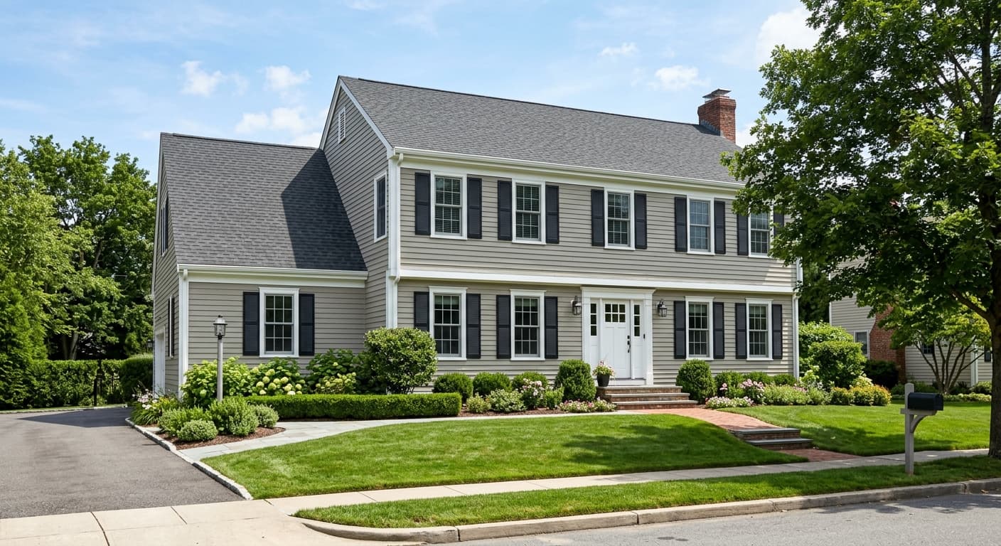
Sedate Gray is available for exterior use and its warm greige quality translates well to siding, especially on craftsman, farmhouse, and traditional-style homes. Under outdoor light it will read lighter and potentially more clearly warm-gray than it does inside. Pair with a crisp warm white or cream trim to reinforce that warmth.
Sedate Gray coordinates cleanly with Moderne White (SW 6168) for trim, and that pairing is one of the most recommended approaches. The creamy quality of Moderne White keeps the combination warm throughout and avoids the jarring contrast you get when you put a warm wall color next to a bright, blue-white trim. For a deeper, more grounded accent, Cornwall Slate (SW 9131) brings a slate-blue dimension that anchors Sedate Gray without pulling it cold. Waterloo (SW 9141) goes further into deep blue-green territory and gives a more dramatic contrast while still respecting the warm foundation of the wall color.
Beyond those coordinating colors, Sedate Gray accepts wood tones at every value level, from light oak to dark walnut. Warm metals like unlacquered brass, aged bronze, and matte gold read particularly well against it. Stone countertops and tile with warm veining or texture reinforce the taupe-gray quality of the wall. Natural fibers in cream, oat, and linen keep the palette cohesive without making it feel matchy.
All comparisons are matched against Sedate Gray at LRV 60.8.
Bright white trim with a blue or violet base pulls strongly cool against Sedate Gray's warm wall tone. The contrast makes the wall read muddier and the trim look harsh rather than clean.
Deep, warm-saturated accents like terracotta, rust, or bright mustard can overwhelm Sedate Gray's quiet register. The wall is designed to recede, and loud warm accents compete with rather than complement that quality.
True cool gray floors with blue or purple undertones pull against Sedate Gray's warmth in a way that reads as unresolved rather than interesting contrast. The two neutrals compete instead of layering.
It reads as a soft, light warm gray with clear taupe and beige qualities. Many people describe it as closer to a light greige than a traditional gray. It is not stark or cold, and its LRV of 60.8 keeps it feeling airy and open in most rooms.
The primary undertones are warm, gray, and green. Most reviewers notice the warmth first, describing taupe, beige, or slightly golden qualities. The green undertone is real but conditional: it surfaces most in north-facing rooms or spaces that borrow reflected light from outdoor greenery. Sampling in your specific light is strongly recommended.
It is a warm gray. Sherwin-Williams files it in the yellow paint family internally, and independent reviewers consistently describe it as warm, taupe-leaning, or greige. Nobody characterizes it as a cool or blue-based gray.
The precise LRV is 60.8. That puts it in the light range, meaning it reflects a solid majority of light and will keep rooms feeling bright. It is lighter than Repose Gray (LRV 58.2) and very close to Agreeable Gray (LRV 60.4).
The Sherwin-Williams code is SW 6169. The hex value is #D1CDBF and the RGB is 209, 205, 191.
Cream and warm white trim work best, with Moderne White (SW 6168) being the coordinating choice. For deeper accents, Cornwall Slate (SW 9131) brings a grounded slate-blue and Waterloo (SW 9141) adds a bold blue-green contrast. Warm wood tones, natural stone, warm metals like brass or bronze, and natural textiles in linen or oat all pair cleanly with it.
Yes, it is available for both interior and exterior use. On exteriors it reads as a warm greige and suits craftsman, farmhouse, and traditional-style homes well when paired with cream or warm white trim. For cabinets, its light LRV of 60.8 keeps things feeling open, though at this lightness level it reads more as a wall color than a classic cabinet shade. It can work on cabinets in a space where you want a soft, warm neutral rather than a high-contrast statement.
