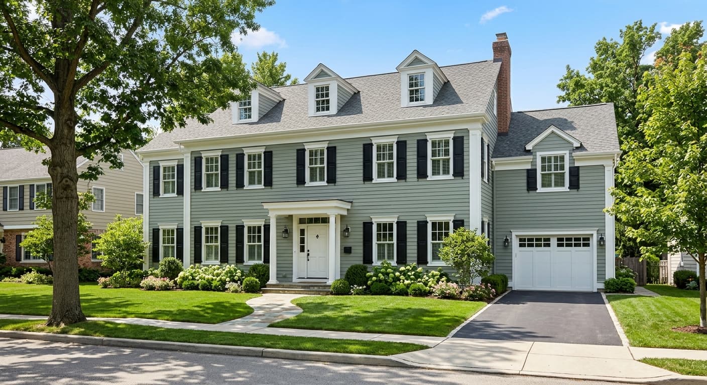
Accolade
What Accolade Actually Looks Like
Accolade is a warm greige that reads more gray in some rooms and more beige in others. That shifting quality is the whole point of this color. In flat morning light it can look almost taupe, soft and a little muted. By afternoon, when warmer light pours in, the beige side wakes up and the walls feel cozier.
You will notice it never goes stark or cold. There is enough warmth baked in to keep it grounded, but not so much that it tips into yellow or pink. Think of it as a quiet backdrop rather than a statement. The color does the work of making everything else in the room look intentional.
Under artificial light, results depend on your bulbs. Warm white LEDs (around 2700K) push Accolade toward its beige character. Cooler bulbs (4000K and up) pull out the gray and can flatten it slightly. Test both before you commit, because the difference is real.
Accolade Undertones
The dominant undertone here is a soft warm gray with a whisper of green that keeps the beige in check. That green is subtle, but it matters. It is the reason Accolade plays well with so many adjacent colors without clashing. When you hold it next to a true taupe, you will see the cooler edge come forward.
Undertones decide your trim, your flooring, and your fabric choices. Because Accolade leans warm-neutral, you can go either direction. Warm it up with creamy whites and oak, or cool it down with crisp whites and gray-toned floors. Knowing which way you want to lean before you shop saves you from buying furniture that fights the walls.
Where Accolade Works Best
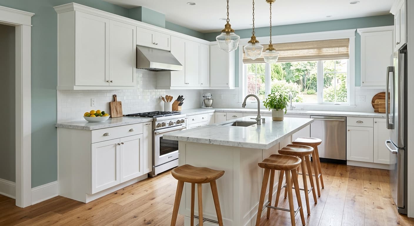
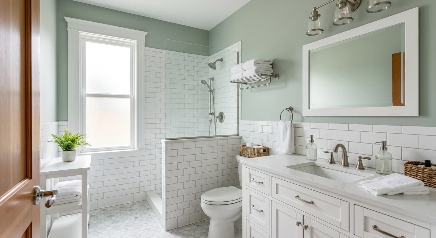
This is a strong choice for open-concept main floors, hallways, and any space where you want continuity from room to room. It carries well across large square footage without feeling heavy. In south-facing rooms, the natural warmth gives Accolade a comfortable glow. In north-facing rooms, where light skews cool and blue, the color holds its own and avoids looking dingy, which is more than a lot of greiges can claim.
It works in small spaces and large ones alike. In a smaller room, the mid-range lightness keeps things from closing in. In a big living area, it gives you a neutral envelope that lets your furniture and art take the lead.
What to Pair With Accolade
For trim, reach for a clean warm white. Sherwin-Williams Alabaster (SW 7008) is a reliable match that keeps the warmth consistent. If you want a touch more contrast, Pure White (SW 7005) gives you a slightly crisper line without going cold. For a deeper companion color, Urbane Bronze (SW 7048) makes a handsome accent on doors, built-ins, or an island.
Flooring-wise, white oak and natural hardwoods are a natural fit. Greige-toned luxury vinyl works too. For furniture, lean into camel leather, oatmeal linen, and black metal accents. These tones pick up the warmth and give the room some grounding contrast. If you want a coordinating wall color one room over, Agreeable Gray (SW 7029) sits in the same family and transitions smoothly.
Colors That Clash With Accolade
Do not pair Accolade with cool, blue-based grays in the same sightline. The green-warm undertone will make those grays look slightly off, almost dirty by comparison. Avoid bright white trim with a blue base for the same reason. And skip heavy yellow lighting if you do not want the beige to take over completely. The most common mistake is choosing this color from a tiny swatch and skipping a real sample. Greiges are notorious for shifting, and Accolade is no exception.