Sherwin Williams Eventide reads as a light-medium blue-gray on the wall, the kind of color that sits comfortably between a soft muted blue and a cool gray without fully committing to either. At LRV 41.4 it reflects roughly half the available light, so it gives a room a settled, calm quality without feeling dim or heavy. It is not the saturated slate you might picture from the name. It is softer and more restrained than that, closer to a dusty spa blue with a hint of something silvery behind it.
How it actually looks depends a great deal on the light source and time of day. In good natural light it leans into its blue-gray character and you can pick up a quiet lavender warmth. Under warm incandescent or warm LED bulbs, the blue pulls back and the gray comes forward, making it read almost like a straight cool gray. North-facing rooms tend to amplify the lavender and can make it feel slightly more violet. South- and west-facing rooms keep it bluer and more balanced. That variability is genuinely part of its character, not a flaw, but it means you will see a notably different color at 8 a.m. than at 8 p.m.
The undertone story on Eventide is where reviewers diverge most, and it is worth taking that disagreement seriously rather than pretending one reading is definitive. The most consistent observation across independent sources is a soft lavender-gray note, a subtle violet quality that separates it from a plain blue-gray and keeps it from feeling flat. That is the undertone most people land on first when sampling it.
A meaningful number of reviewers also detect a faint blue-green or sage-adjacent quality, particularly against warm whites or in rooms with warm wood tones. In those contexts it can shift toward a cooler, slightly aquatic gray-green rather than a violet blue-gray. The difference between those two reads can be significant if you are coordinating with other materials in the room. The blue-green shift is more likely in rooms with a lot of warm-toned wood, tile, or fabric nearby, because the contrast pulls the cooler green out of the paint.
Whether Eventide is warm or cool is a reasonable question without a clean answer. Our editorial read calls out dark, blue, and purple undertones, and the research confirms that the lavender and blue are real. But at LRV 41.4 and with that gray base, it never reads as a warm color. It is a cool color with an occasionally violet quality, not a warm one with a blue cast. Sample it on multiple walls and look at it next to your specific trim, flooring, and furnishings before committing.
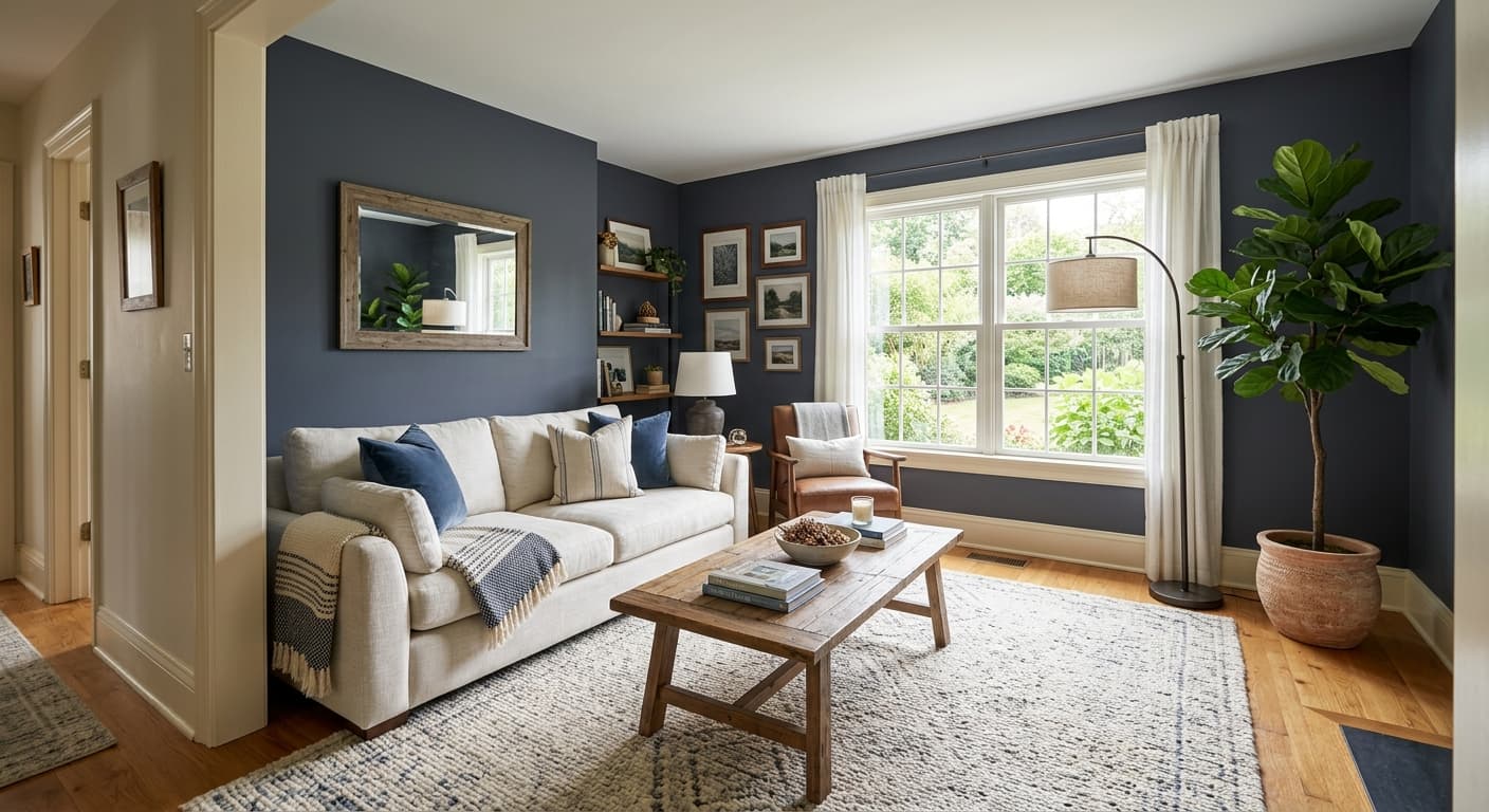
Eventide is genuinely well suited to bedrooms. Its cool, calm quality works with the mood most people want in a sleeping space, and that subtle lavender keeps it from feeling cold or clinical the way a pure blue-gray sometimes can. It does not need to be an accent wall application, though it works beautifully there too. A full-room bedroom in Eventide at LRV 41.4 will feel enveloping but not dark, restful without being stark.
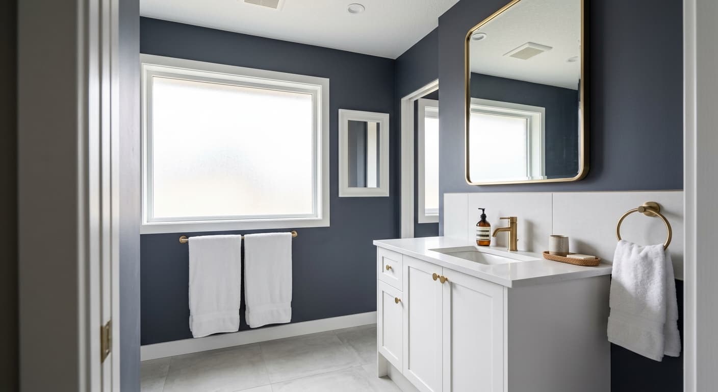
Studies and reading nooks are another strong use case. The color supports focused, quiet activity without the eye-fatiguing qualities of bright or high-contrast walls. In a room lined with books or darker wood furniture, Eventide provides a cool foil that holds its own without competing. Bathrooms with natural light also benefit from it, especially if the fixtures lean white or soft gray, because the color reads clean and spa-like without the coldness of a straight gray.
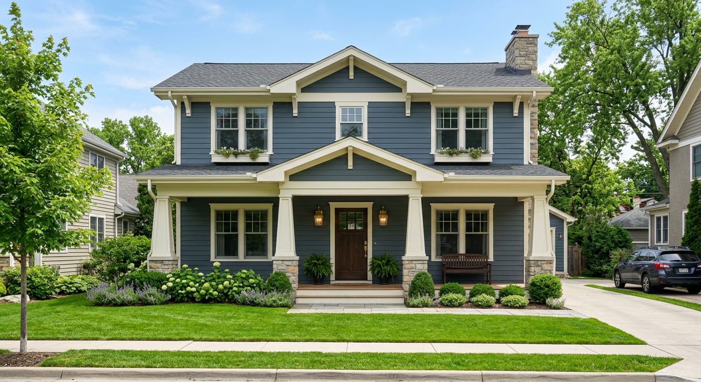
For orientation, south- and west-facing rooms generally give you the most balanced and blue-forward version of the color. North-facing rooms can push the lavender further than some people intend, so sample carefully in those exposures. Eventide also functions on exteriors according to its availability listing, and it reads as a composed, understated blue-gray from the street. On a front door or shutters it has enough character to stand apart from generic grays while remaining quiet enough to work on most architectural styles.
Eventide is a natural fit for a bedroom, where its calm, cool quality supports rest without making the space feel cold. The lavender undertone adds a softness that a straight gray lacks, and at LRV 41.4 the room will feel settled rather than dark. Pair it with warm linen bedding and a soft creamy white trim to keep it from reading too cool at night under warm bulbs.
On a single accent wall, Eventide has enough presence to anchor a room without overwhelming it. It works especially well behind a bed or a sofa where the color grounds the main piece of furniture. Keep the remaining walls a soft warm white or a light warm greige to let the blue-gray character of Eventide read clearly.
A study painted in Eventide feels focused and composed, two qualities that serve concentrated work. Darker wood shelving or furniture contrasts well against the cool blue-gray, and the color does not cause the visual fatigue that brighter or more saturated walls sometimes do. Good task lighting matters here since warm bulbs will shift the color toward a grayer read.
In a bathroom with natural light, Eventide reads as a clean, spa-adjacent blue-gray that pairs well with white fixtures and soft gray or warm wood vanities. The LRV of 41.4 is workable in a bathroom as long as you have a window or strong overhead light. Under warm artificial light only, the color flattens toward a plain cool gray, so plan your lighting accordingly.
Eventide reads as a composed, understated blue-gray on exteriors and holds its cool character in full sunlight. On a front door it provides enough distinctiveness to stand out from generic grays while remaining quiet enough for most home styles. White or off-white trim and natural stone or brick details complement it well.
Eventide coordinates most naturally with colors that balance its cool blue-gray cast rather than compete with it. Grey Mist (SW 9625) works as a trim or ceiling color, its soft warmth taking the edge off Eventide's coolness without clashing. Accolade (SW 9516) brings a warm creamy quality that creates a classic cool-wall, warm-trim contrast many designers recommend for blue-gray rooms. Portsmouth (SW 9644) sits close to Eventide in the same collection and can work as a deeper accent, a slightly more saturated companion for layered, tonal schemes.
Beyond the coordinating palette, Eventide pairs well with natural materials that have warm undertones: linen, oak, aged brass, and matte terracotta. Those warmer elements pull the blue-gray forward and let the lavender quality of the paint become more readable. Crisp bright whites tend to emphasize the coolness and can make the color feel slightly stark, so softer, slightly creamy whites generally serve it better.
All comparisons are matched against Eventide at LRV 41.4.
Eventide's cool blue-gray-lavender character sits in sharp opposition to warm yellow or golden paint in adjacent rooms or on adjacent walls. The contrast is not complementary in a flattering way; it makes both colors look off and pushes the lavender in Eventide toward an unflattering purple.
Pairing Eventide with a stark, cool bright white trim emphasizes the coldness of the blue-gray and can make the wall color feel harsher and more clinical than it should. The contrast also tends to push the undertone toward a flat gray rather than the more nuanced blue-lavender it is capable of.
Orange-toned wood, common in older pine floors or honey oak cabinetry, sits on the opposite side of the color wheel from blue-gray and can make Eventide look muddier and the wood look more orange than it actually is. The blue-green undertone that some reviewers detect in Eventide becomes more pronounced and less flattering against orange wood.
Eventide (SW 9643) is a light-medium blue-gray with a subtle lavender undertone. It sits in the medium shade range at LRV 41.4 and reads as a muted, calm blue-gray that shifts noticeably depending on light conditions. It is softer and less saturated than a traditional slate or denim blue.
The primary undertones are blue, gray, and a quiet lavender-purple quality. A portion of independent reviewers also detect a faint blue-green or sage note, particularly in warm-toned rooms. The color does not have a single fixed undertone read; it shifts based on light source, time of day, and what surrounds it on the wall, which is why sampling on multiple walls before committing is genuinely important.
Eventide is a cool color. Its blue and lavender-gray undertones keep it solidly on the cool side of the spectrum. It never reads as a warm color, though the lavender quality gives it slightly more softness and complexity than a purely cool blue-gray would have.
Eventide has an LRV of 41.4, which puts it in the medium range. It reflects roughly 41 percent of light, meaning it will give a room a calm, settled feel without making it feel dark or closed in, as long as there is reasonable natural or artificial light in the space.
The Sherwin-Williams color code is SW 9643. The hex value is #a3afac and the RGB values are 163 red, 175 green, and 172 blue.
Eventide coordinates well with soft warm whites and creams, particularly Grey Mist (SW 9625) and Accolade (SW 9516), both of which balance its cool cast. Portsmouth (SW 9644) works as a deeper tonal companion in layered schemes. In terms of materials, warm linen, oak, aged brass, and matte terracotta all pair well because their warmth pulls the blue-gray quality of the color forward. Avoid cool bright whites as trim, since they push the color toward feeling flat and cold.
Yes. Eventide is available in both interior and exterior formulas. On exteriors it reads as a composed, understated blue-gray that holds its character in full sunlight. On a front door it provides enough distinction from generic grays to be interesting while staying quiet enough for most architectural styles. For cabinets, the mid-tone LRV of 41.4 means it works best in kitchens or bathrooms that have reasonable light; in dark cabinetry-heavy spaces it may read slightly heavier than intended.
Benjamin Moore Quiet Moments (BM 1563) is the most commonly cited cross-brand alternative. It shares a similar muted blue-gray character with a soft lavender-adjacent quality and comparable mid-tone depth. As with any cross-brand comparison, the two colors are not identical, so sample both if you have reason to consider switching brands.
