
MorningWarmest · most inviting
A light, soft warm greige — a warm gray that holds just enough color to never read as plain off-white or flat gray. Sample it large in your actual light before you commit.
Drift of Mist reads as a light, soft warm gray that sits right at the edge between an off-white and a pale gray. At LRV 69.1 it is one of the brighter colors in the warm neutral family, bright enough that in a sun-drenched room it can drift toward plain white and lose its character entirely. In moderate light it holds its identity as a quiet greige, neither too creamy nor too cool.
The warmth in this color is passive and muted, not the kind of warmth you notice immediately. It does not look beige in the way a tan or a honey-toned neutral does. Instead it sits back and reads as a soft, weathered neutral with an earthy quality. That earthiness comes partly from a subtle green undertone that surfaces once the paint is on the wall, giving it a character that is a little more complex than a straightforward off-white or a simple warm gray.
In person, the hex #DCD8D0 and RGB 220/216/208 tell the story well: the red, green, and blue channels are all close together and high, which is why it sits so near white. The slight drop in blue relative to red and green is where that warmth and subtle earthy quality come from. It photographs lighter than it reads in person in many rooms, so a large sample on the actual wall is the only reliable way to see what you are working with.
The undertone story is where Drift of Mist gets interesting and where reviewers disagree most. The dominant finding from independent sources is a subtle green undertone that reveals itself once the color is on the wall. This is not an obvious sage or olive cast, but a muted, earthy hint that keeps the color from reading as a true gray and gives it that weathered, organic quality. If you are expecting a clean warm gray or a simple greige, this green note can catch you off guard.
Beyond the green read, reviewers also report secondary flashes of muted blue depending on the light source and what surrounds the wall. In cooler north-facing light the color can pull grayer and slightly cooler, which is when the blue note tends to surface. In warmer afternoon light from a south or west exposure the warmth reasserts itself and the greige quality is more apparent. So the undertone you see is partly a function of the room, not just the paint chip.
One important note: no independent reviewers reported a purple or violet flash in Drift of Mist. This sets it apart from cooler off-whites that share a similar LRV range but have a different base. The green note is the main thing to test for. If you have found that green undertones in other neutrals have bothered you, you should treat this color with the same caution you would apply to any green-leaning gray, and sample it large before committing. The base is technically yellow-warm, but the green read on the wall is real enough that it shapes how the color lives in a room.
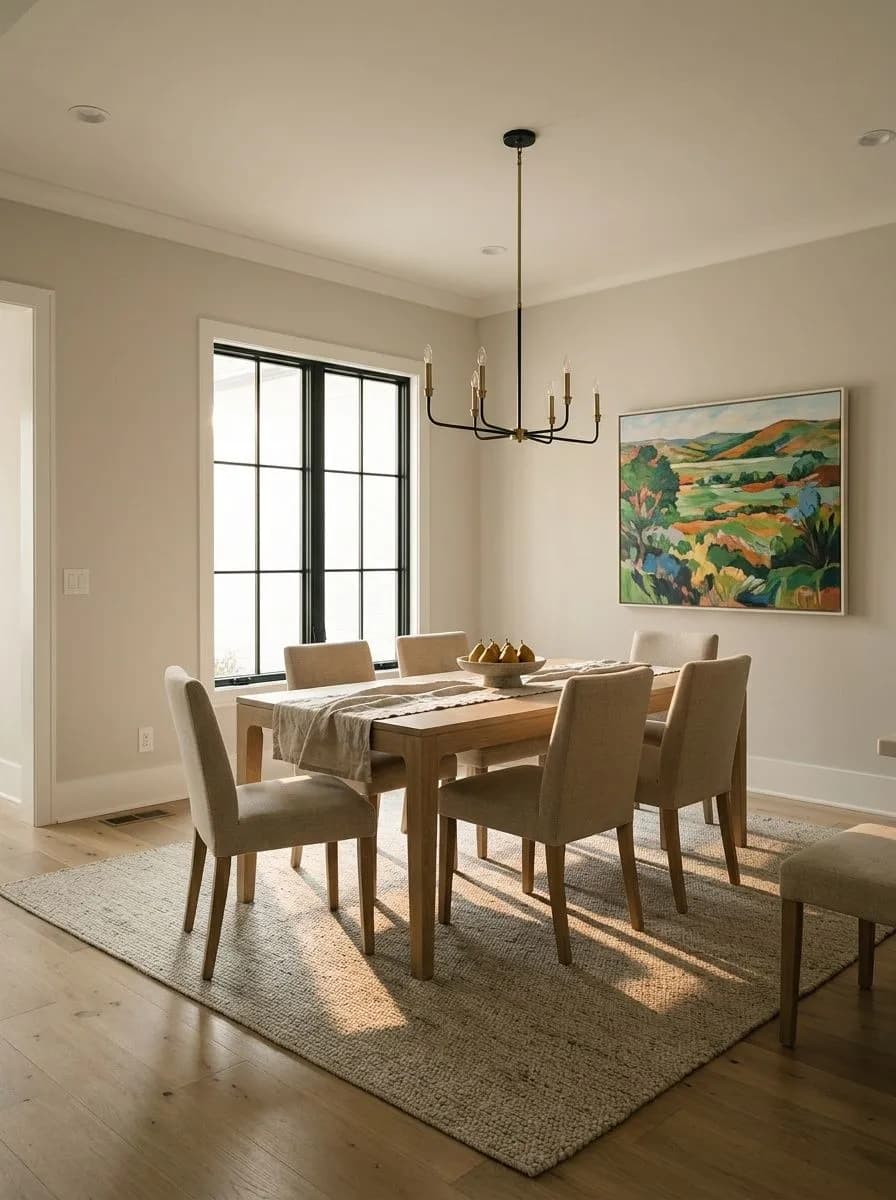
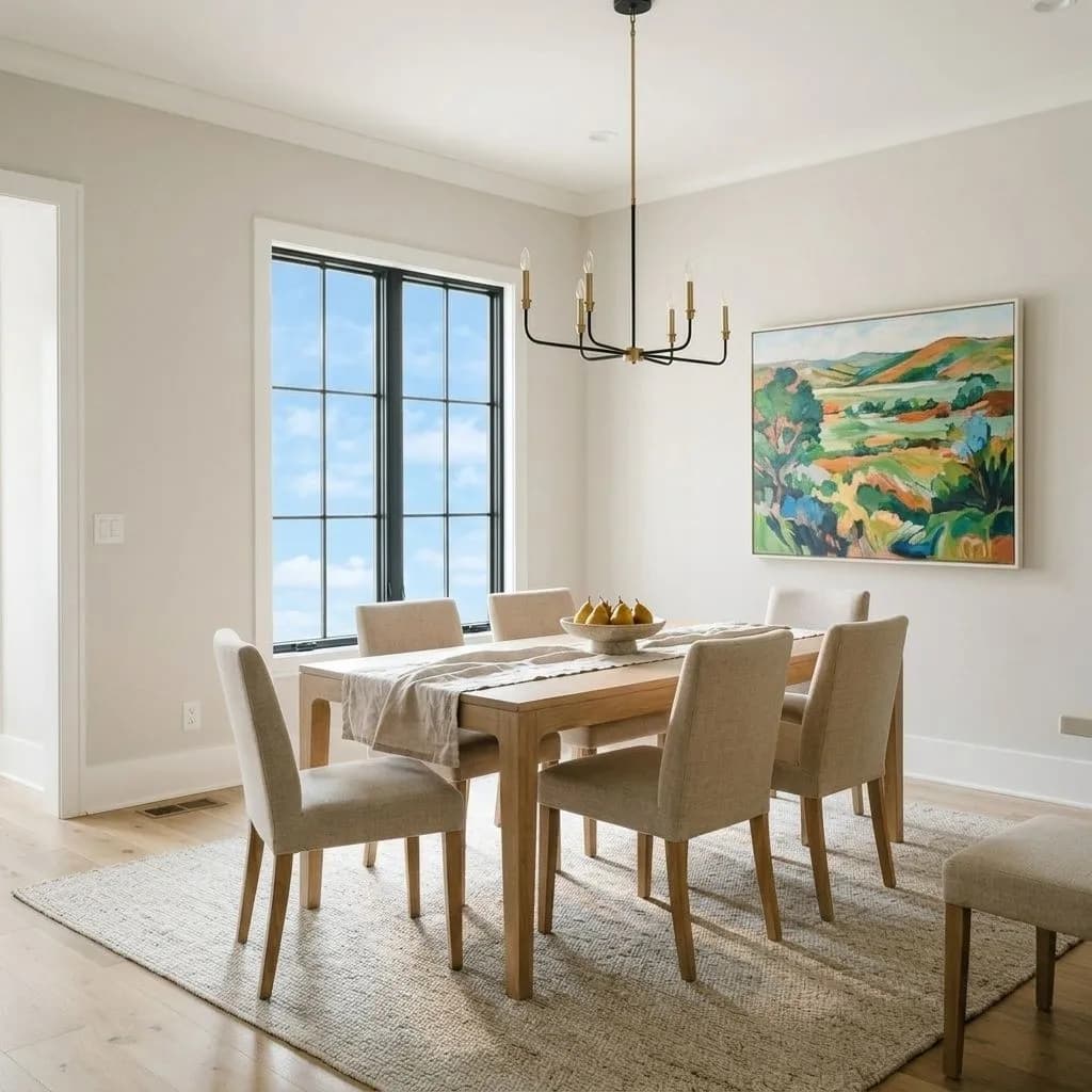
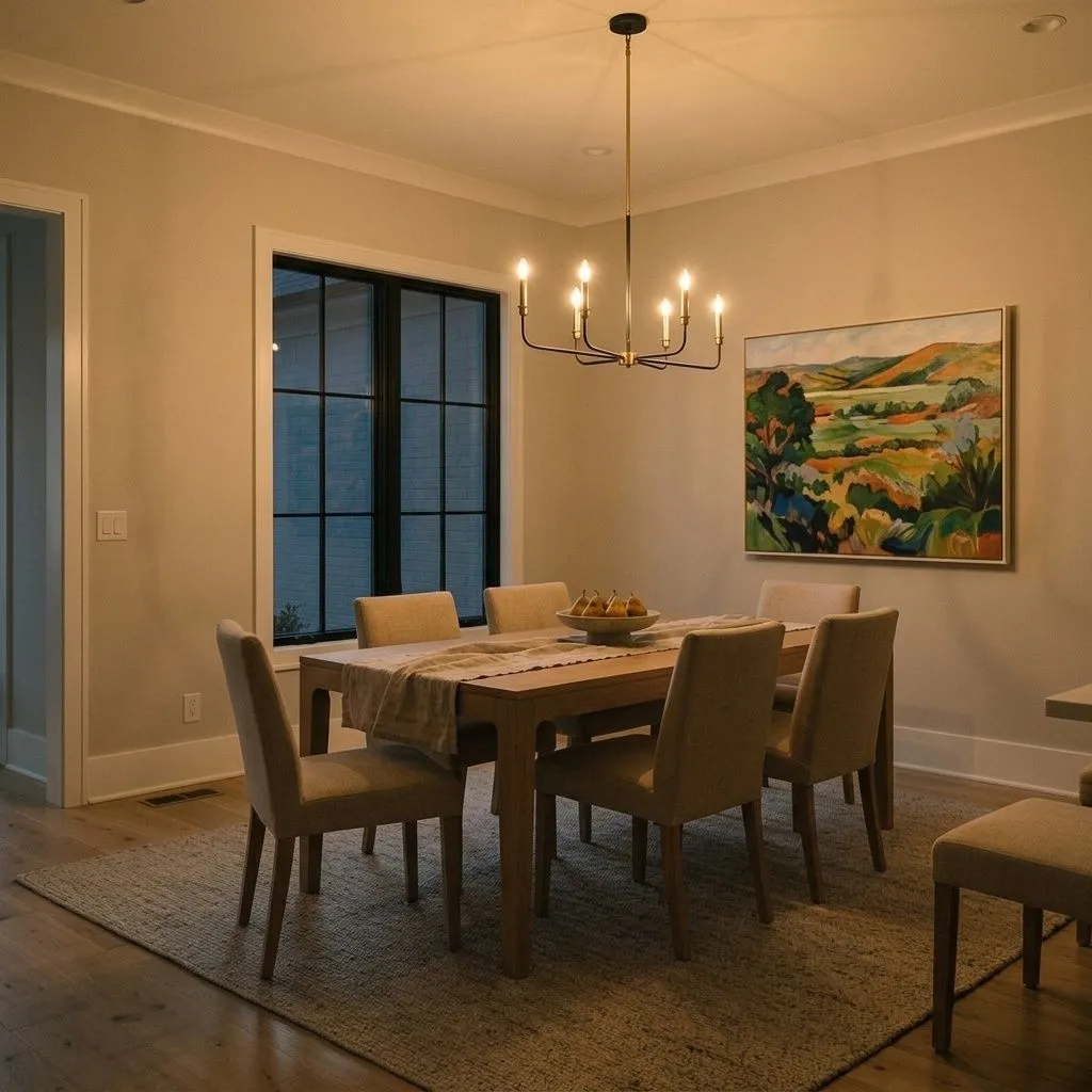
Inside the house, Drift of Mist earns its strongest recommendations in living rooms, bedrooms, and bathrooms where light is moderate and reasonably stable. Open-concept and transitional spaces suit it well because its neutral warmth does not compete with adjacent rooms, and it acts as a connective tissue color that flows without demanding attention. It pairs naturally with weathered and reclaimed wood, which plays into its earthy, organic quality.
The tricky part is its behavior across mixed exposures. In a north-facing room it can go flat, gray, and a little dingy. In a very bright south or west-facing room it can wash out toward white and lose the subtle character that makes it worth choosing. Whole-house use in homes where rooms face different directions is genuinely risky because the color can shift noticeably from room to room, which reads as inconsistency rather than intentional variation. It performs most reliably in rooms with moderate, stable light, ideally east-facing morning light or a room with consistent indirect light.
For cabinets in kitchens and bathrooms, the answer is a qualified yes, but reviewers flag it as fussy. The finish you choose and the surrounding materials matter a lot because the wrong combination can make it look dingy rather than soft. On exteriors, most sources advise against it. Without interior light bouncing around, the color lacks depth and tends to wash out. One dissenting view holds that it can work outside if paired with dark trim for contrast, but that is a minority position. As a trim color it is not the right call since you want something cleaner and brighter to define edges.
The living room is where Drift of Mist gets the most consistent praise. Its soft, non-committal warmth works well in open layouts where the color needs to read coherently from multiple angles and under different light sources throughout the day. Pair it with warm wood furniture and a brighter white trim to keep the room feeling airy rather than flat.
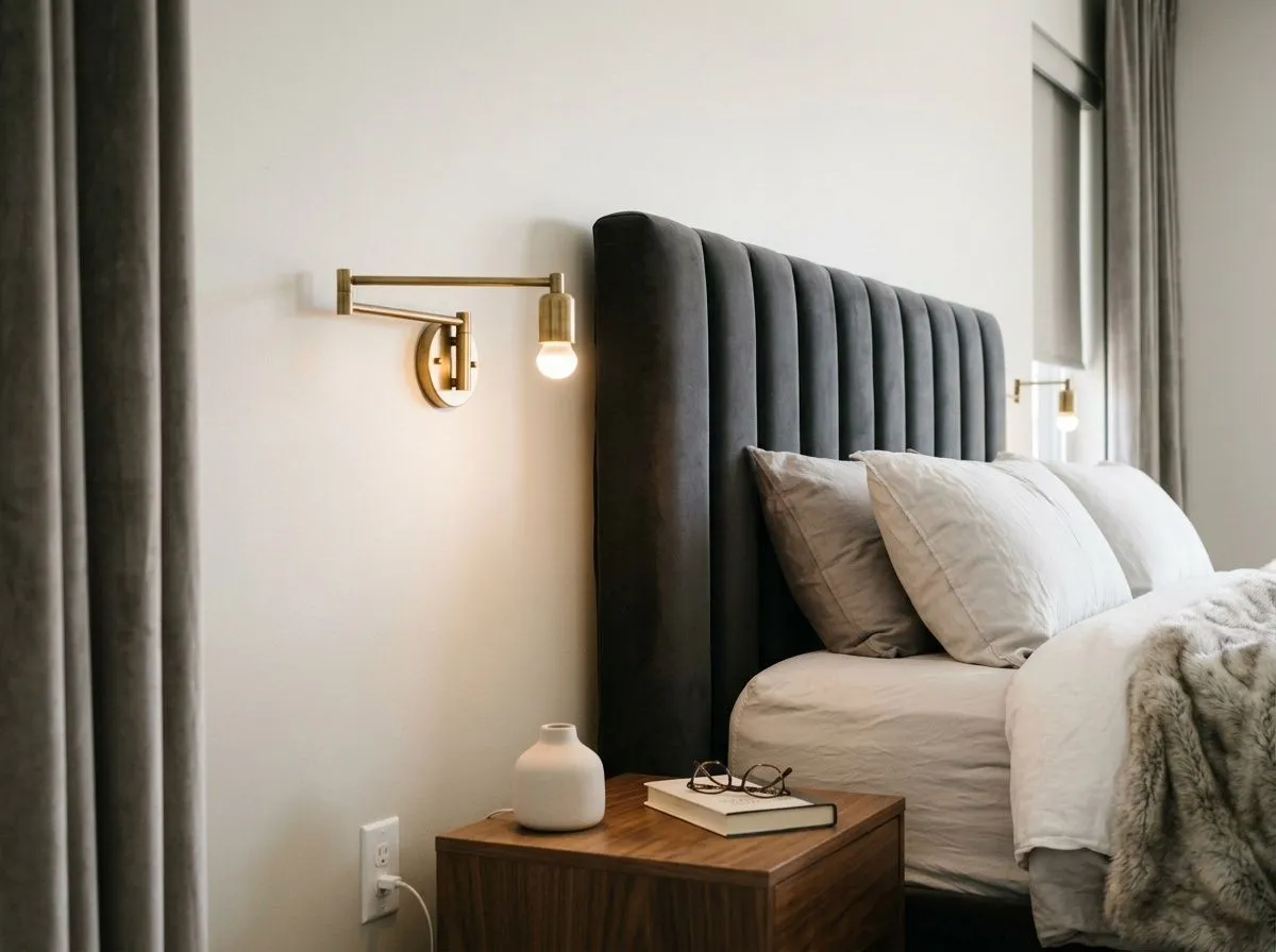
In a bedroom Drift of Mist delivers a calm, restful quality without going stark. It reads soft enough to feel gentle in the morning and settled in the evening under artificial light. East-facing bedrooms are particularly well suited since morning light brings out its warmth and afternoon shadows do not push it toward the flat gray it can become under cooler north light.
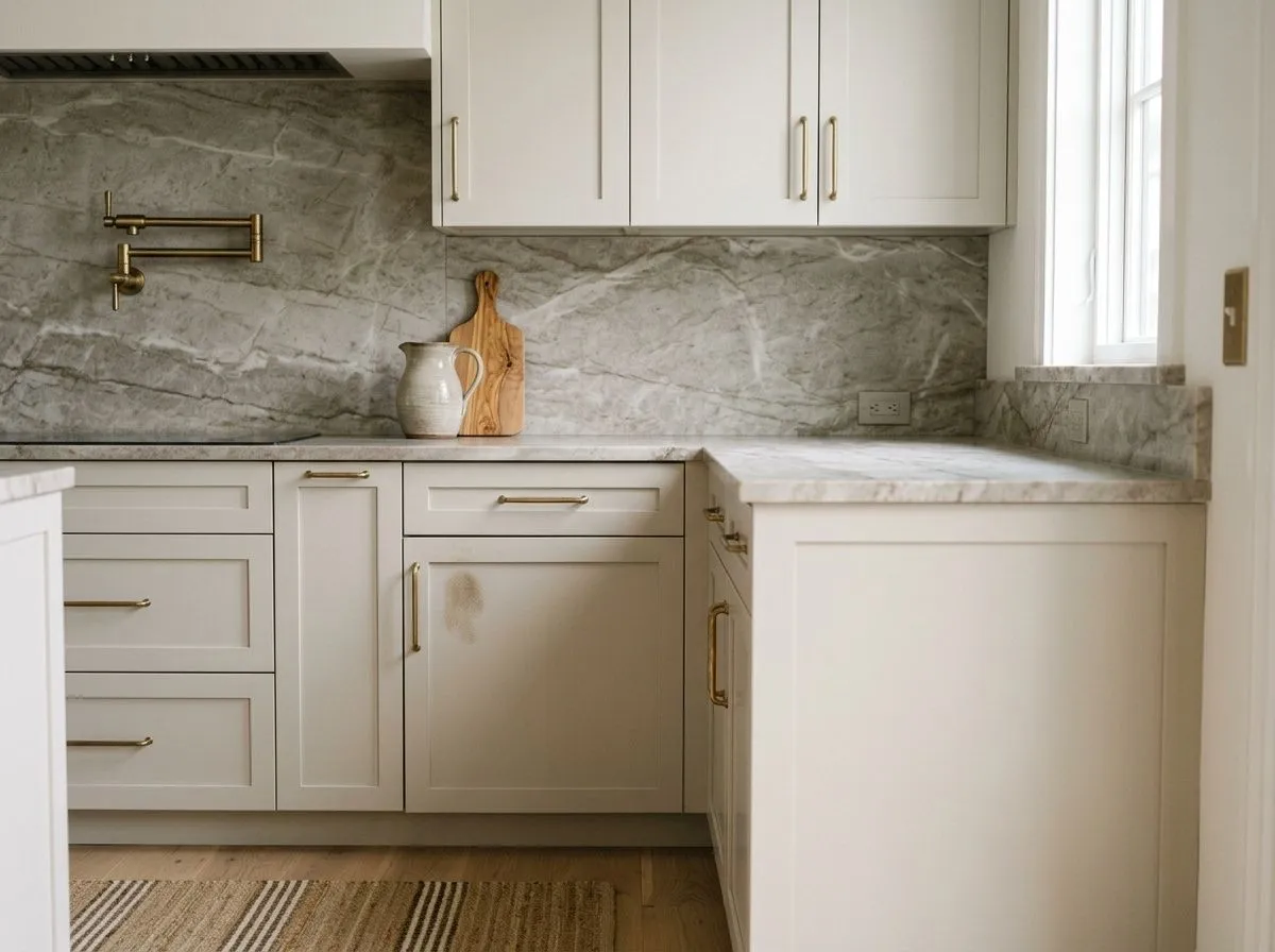
On kitchen walls or cabinets, Drift of Mist can work but demands careful coordination. The earthy green undertone can conflict with cool gray countertops or overly bright stainless finishes, so the finish level and surrounding materials need to be considered carefully. It reads best paired with warm stone countertops, wood hardware, or brass fixtures that echo its earthy base.
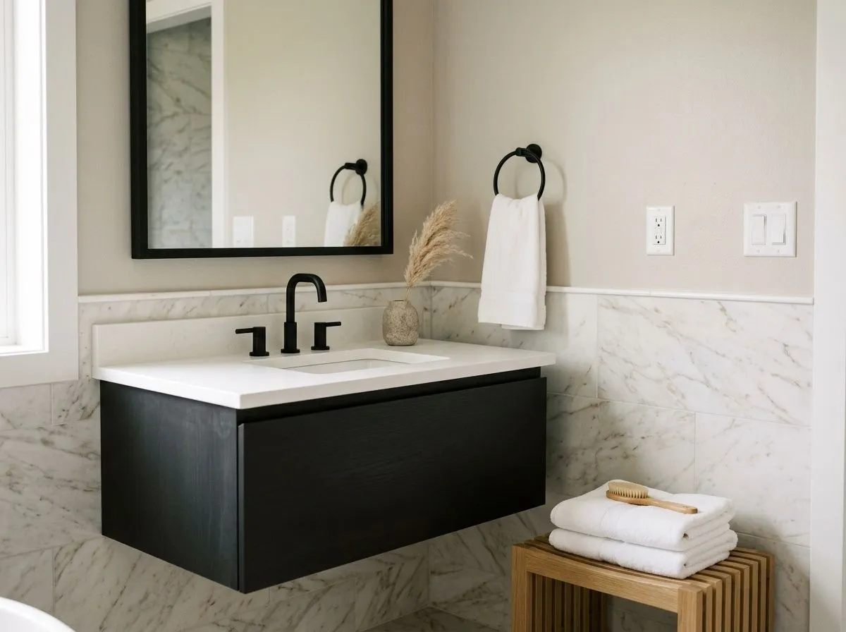
Bathrooms with controlled artificial lighting and moderate natural light suit Drift of Mist well. It adds warmth without looking yellow and gives a spa-adjacent softness that works with warm whites and natural stone. Avoid using it in a windowless bathroom or under fluorescent lights, where it can tip toward dull gray.
Sherwin-Williams coordinates Drift of Mist with Eider White, a warm off-white that reads creamier and slightly softer, which works well as a trim companion when you want low contrast and a cohesive, wrapped feel. For accent depth, Polished Concrete and Perle Noir sit in the same color family and give you steps toward gray and near-black respectively, which can anchor a room that would otherwise float.
Beyond the official coordinates, the research points consistently toward bright, clean whites for trim when you want definition. A warm creamy white keeps things soft and unified, while a crisper white gives more edge and clarity. On the accent side, weathered wood tones, soft blues, and muted sage greens all work with the earthy undertone in Drift of Mist rather than fighting it. The color is forgiving with accents precisely because its own personality is so restrained.
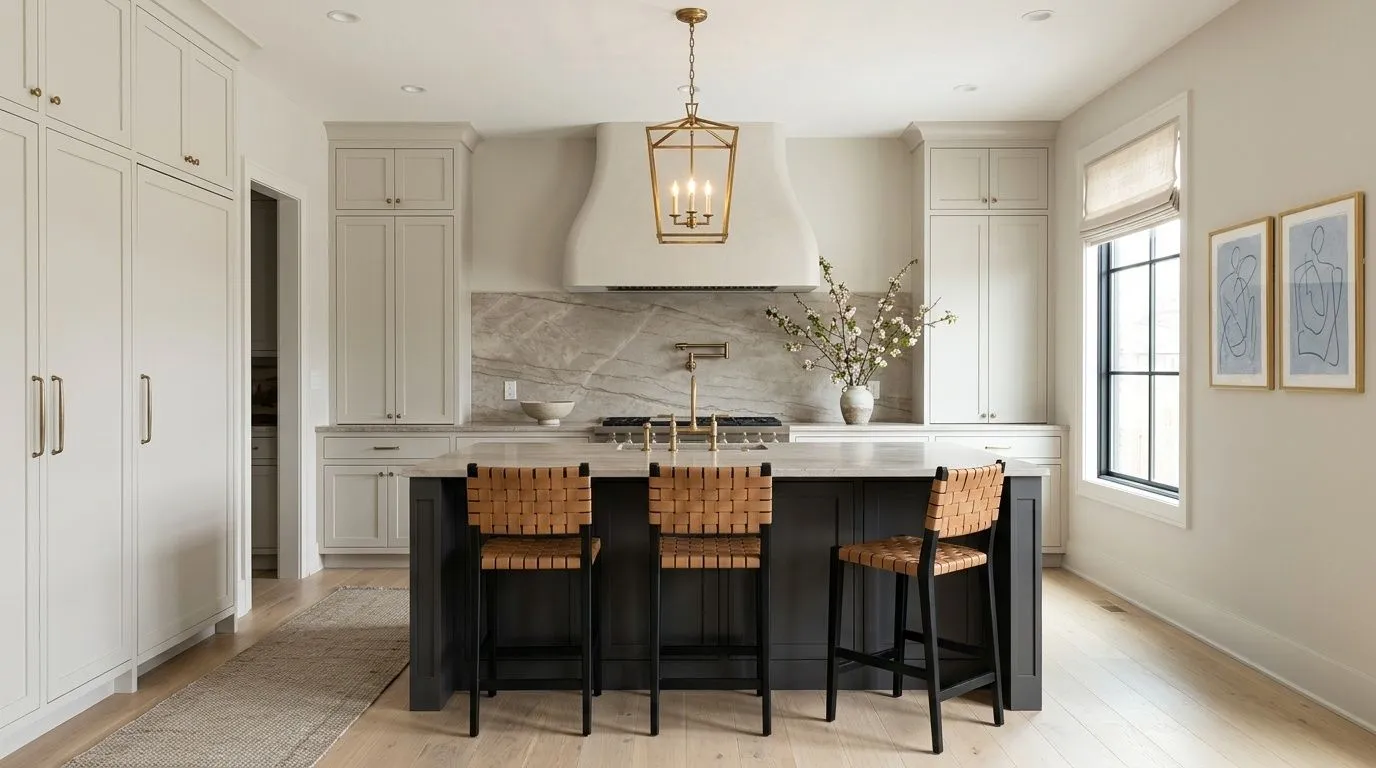
Drift of Mist makes this kitchen fully shoppable because every color you see, from the painted surfaces to the wood, stone, and textiles, traces back to a Sherwin-Williams match. Three of the seven are actual paint: Drift of Mist wraps the perimeter cabinetry, walls, and plaster hood; Eider White takes the ceiling and trim; Perle Noir lands on the island and steel window frames. The remaining four are the room's materials, each shown as its closest Sherwin-Williams equivalent, so hover any pin or swatch to start pulling the palette together.
All comparisons are matched against Drift of Mist at LRV 69.1.
When Drift of Mist sits next to a cool blue-gray floor, the green undertone in the walls pulls against the blue in the floor and both colors can look off. Neither reads as intentional and the combination feels muddy rather than layered.
In a north-facing or dim room, pairing Drift of Mist walls with a stark bright white trim amplifies how flat and gray the wall color can look in the absence of warm light. The contrast highlights the cool shift rather than the warmth.
Polished chrome or cool silver hardware reads sharply against Drift of Mist's earthy green undertone, pushing the wall color toward looking dingy and making the fixtures look harsh. The two finishes pull in opposite directions on the warm-cool axis.
Drift of Mist SW 9166 is a light, soft warm gray that reads right at the boundary between an off-white and a pale greige. It is bright enough at LRV 69.1 to feel airy and open, but it holds enough warmth and subtle earthy character to avoid reading as a stark white. In direct warm light it leans greige; in cooler or north-facing light it can shift grayer.
The dominant undertone independent reviewers identify is a subtle green note that surfaces once the paint is on the wall. This gives the color an earthy, weathered quality and keeps it from reading as a straightforward warm gray. Depending on the light, secondary blue flashes can also appear, particularly in cooler north-facing rooms. No reviewers reported a purple undertone, which distinguishes it from cooler off-whites in a similar LRV range.
It is technically warm, with a yellow-leaning base. However, the warmth is passive and muted rather than obvious. Because of the green undertone and its sensitivity to light, it can read cooler in north-facing or low-light rooms. Most people would describe it as sitting in the warm gray or greige territory rather than feeling definitively warm the way a cream or tan would.
The LRV is 69.1, which places it near the top of the mid-range and close to off-white territory. It reflects a lot of light and will feel quite bright in well-lit rooms, potentially washing out in very sun-saturated spaces. In darker or north-facing rooms, the high LRV still keeps it from feeling heavy, but the color can lose definition and look flat.
The Sherwin-Williams color code is SW 9166. The hex value is #DCD8D0 and the RGB is 220 / 216 / 208.
Sherwin-Williams pairs it with Eider White as a soft warm trim companion, and with Polished Concrete and Perle Noir for deeper accent steps in the same family. For trim, a bright warm white works well for low contrast while a cleaner, crisper white adds definition. On the accent side, weathered wood tones, warm brass or bronze hardware, muted blues, and soft sage greens all work with the earthy green note in the paint rather than against it.
For exteriors, most reviewers advise against it because the color lacks the depth to hold up outdoors and tends to wash out without interior light. One dissenting view holds that it can work outside with dark trim for contrast, but that is a minority position. For cabinets in kitchens or bathrooms, it gets a qualified yes, but reviewers flag it as fussy about surrounding finishes and easy to make look dingy if the countertops, hardware, and fixtures are not carefully coordinated. As a front door color it would likely disappear at that scale.