
MorningWarm · toasty beige read
A warm greige off-white with shifting undertones of taupe, soft pink, and occasional violet, light enough to open a room without going stark. See how it moves in your light.
City Loft lands right on the border between off-white and light greige. At LRV 70.5 it is genuinely light, bright enough to open up a room without reading stark or cold, yet it carries enough depth that it never feels flat or builder-basic. On the wall it presents as a soft, warm off-white with a gentle toasty quality that keeps spaces feeling inviting rather than clinical.
What makes it interesting, and occasionally tricky, is how much it moves. In one room it looks like a clean warm beige. Shift the light or the neighboring colors and it can read taupe, greige, or a pale pinkish putty. In certain conditions reviewers have watched it pull distinctly purple or lavender. This is not a color that gives you one fixed reading, and that chameleon quality is both its main appeal as a whole-house neutral and its main source of sample-day regret.
The overall impression is soft and settled without being heavy. It has enough warmth to feel cozy but enough gray to stay sophisticated. Rooms painted in City Loft tend to photograph well and feel cohesive when connecting to adjacent spaces, which is a big part of why it shows up repeatedly on open floor plans.
Almost every reviewer agrees on the foundation: warm gray-beige or taupe. That much is settled. What creates the debate is which secondary note surfaces, and how strongly, because City Loft carries more than one.
Several reviewers read a soft pink or peach flash, particularly in warmer afternoon light or under incandescent and 3000K bulbs. Others land on violet or purple as the secondary note, especially in north-facing rooms or under cool daylight-spectrum lighting. A few describe a red-brown warmth that reads almost terracotta at sunset. One thoughtful framing calls it a warm gray-taupe hybrid with feather-light violet and pink that most people will barely register, but that some will find conspicuous once they see it. Other reviewers emphasize the gray, beige, and taupe trio while noting pink and purple can appear as shifts rather than constants.
The practical takeaway is that this color does not behave the same way in every home. Bulb temperature is the single biggest variable: warmer bulbs in the 3000 to 3500K range bring out the beige and taupe warmth and suppress the purple tendency. Cool daylight bulbs push it grayer and can activate the violet or lavender read. Because the undertone you actually live with depends heavily on your orientation, your window size, and your light fixtures, sampling on a large board and living with it through different times of day is not optional advice here. It is the advice.
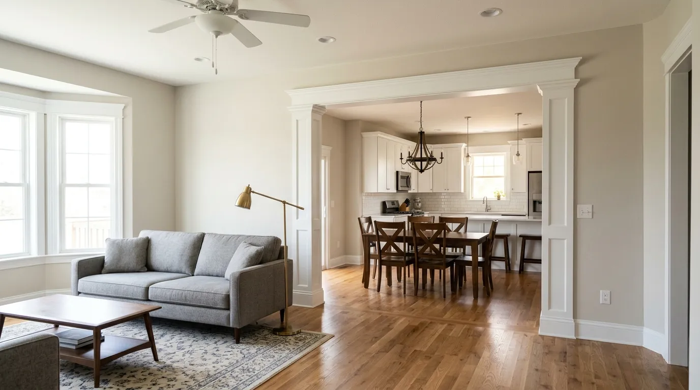
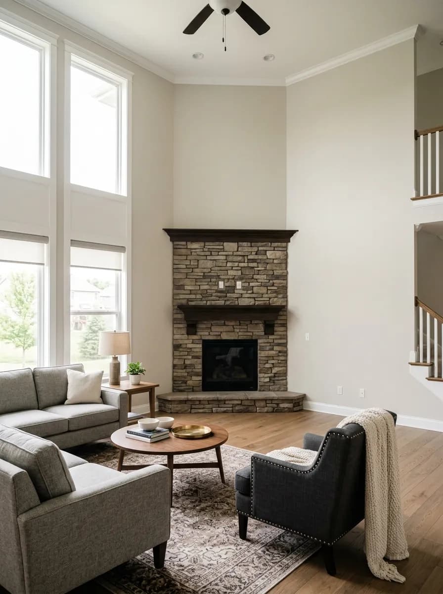
City Loft is most often recommended as a whole-house neutral, and it earns that reputation. On open floor plans where the living room flows into a dining room and kitchen, its balanced greige undertones transition cleanly between spaces without creating jarring tonal shifts at each doorway. At LRV 70.5 it reflects enough light to keep connected rooms feeling open even where natural light is uneven.
Orientation shapes how it performs. North-facing rooms run cooler and grayer by nature, and City Loft responds by adding welcome warmth and preventing that cold, flat look common in north rooms. South and west exposures bring out more of the beige and taupe warmth, especially in the late afternoon when the color can glow softly. East-facing rooms get a warm read in the morning that cools through the day. Very bright, sun-drenched rooms risk washing it out slightly, and very dark rooms can make it read flat. In either case pairing it with a slightly deeper trim or accent color helps anchor the look.
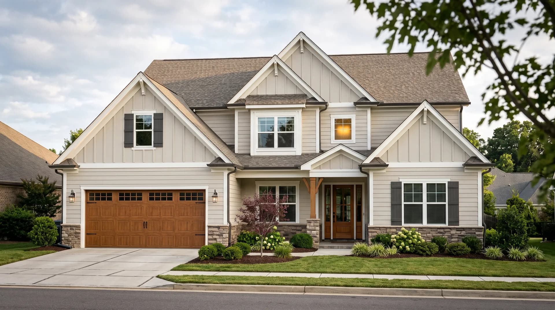
Beyond walls, City Loft gets strong marks on kitchen cabinets specifically. It reads bright and clean in that context while the warm undertone gives cabinetry a custom, slightly aged quality that pure white cannot replicate. Reviewers also use it on home exteriors as a main body color paired with a clean white trim and coordinating shutters, where it works against stone, brick, and asphalt roofing without looking muddy or overly beige. Style-wise it fits traditional, transitional, farmhouse, modern, coastal, and French country interiors without friction.
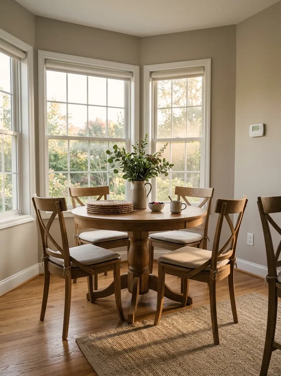
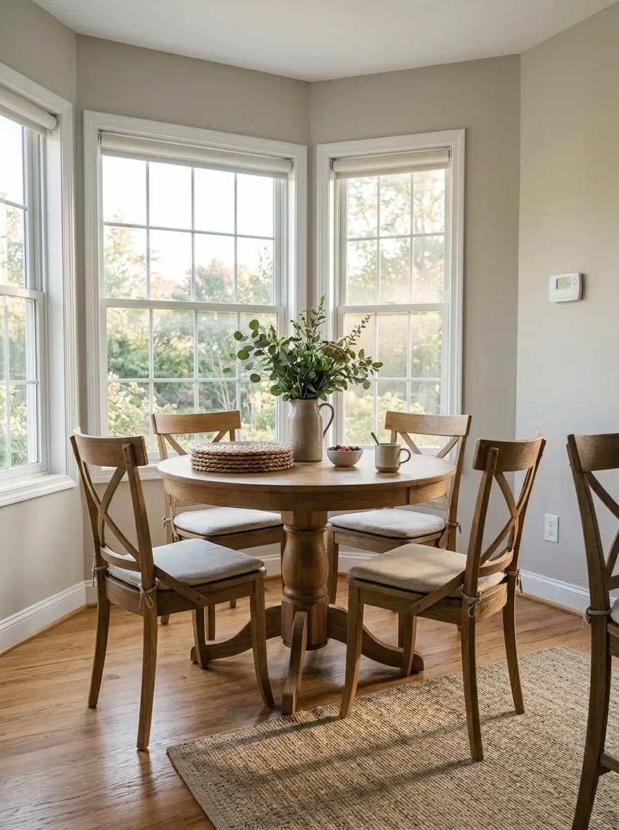
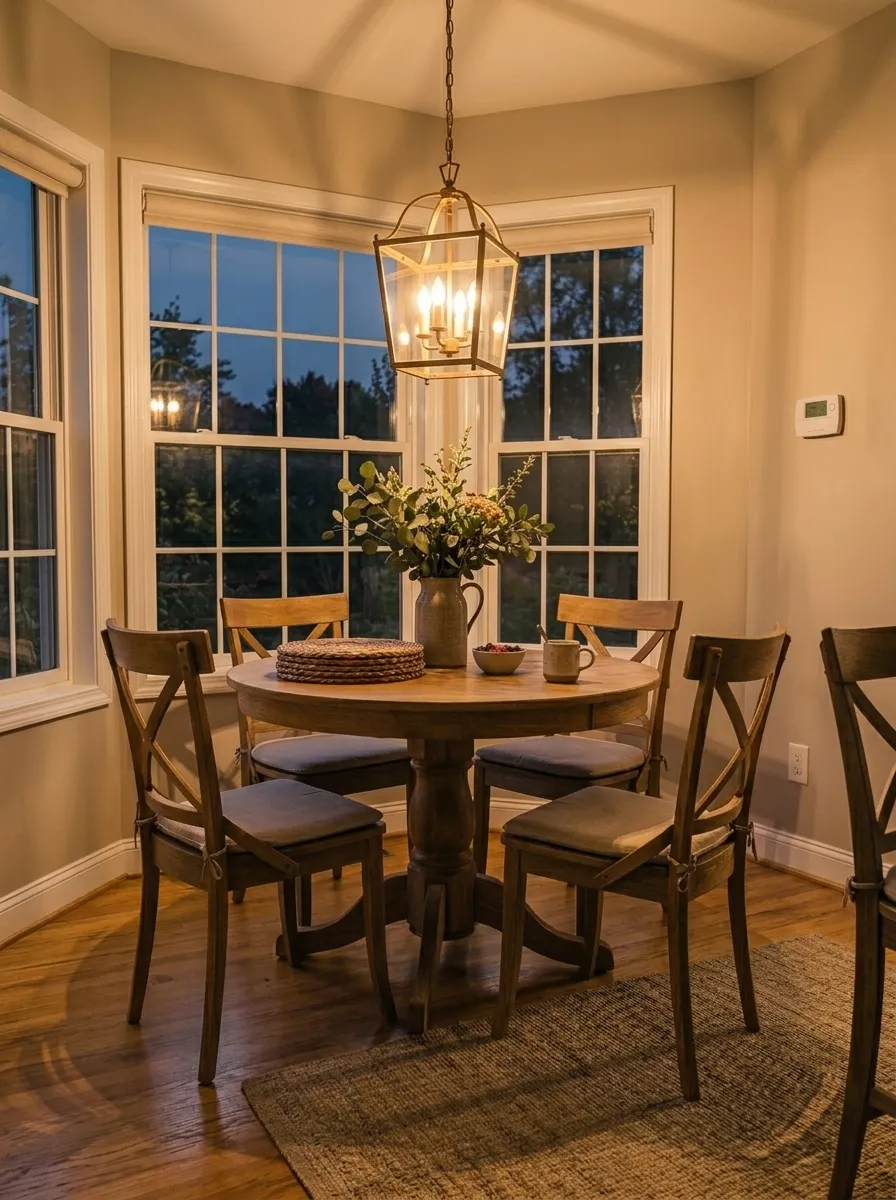
City Loft reads warm and settled in a living room, especially on an open floor plan where it needs to bridge into a kitchen or dining space. The LRV 70.5 keeps it bright without feeling washed out. Layer in natural wood furniture and a muted blue-gray accent to let the warm undertone read clearly.
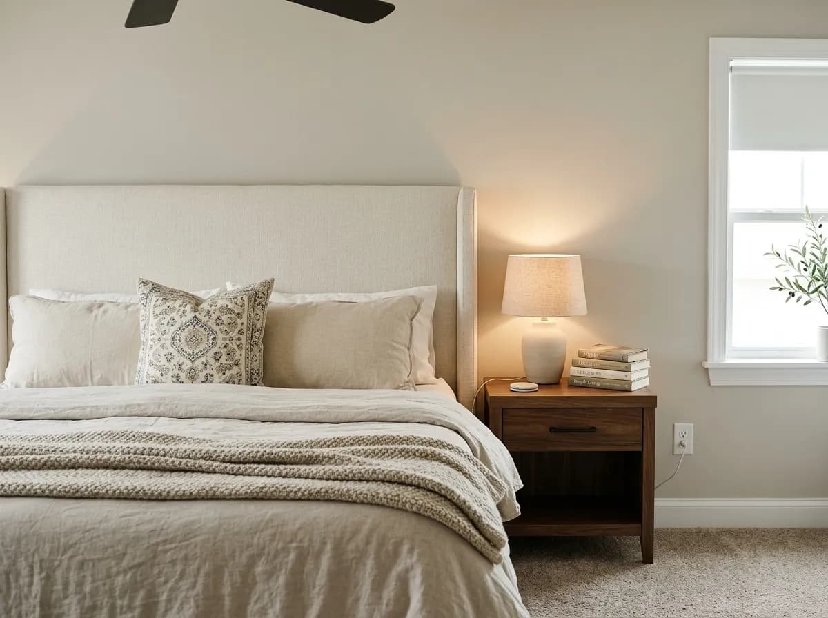
In a bedroom City Loft creates a calm, cozy backdrop that does not fight against soft linens or warm wood furniture. North or east-facing bedrooms benefit most, where the color adds warmth that the orientation might otherwise lack. Keep the trim a slightly brighter white to stop the walls from looking too flat.
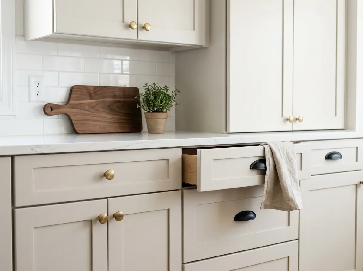
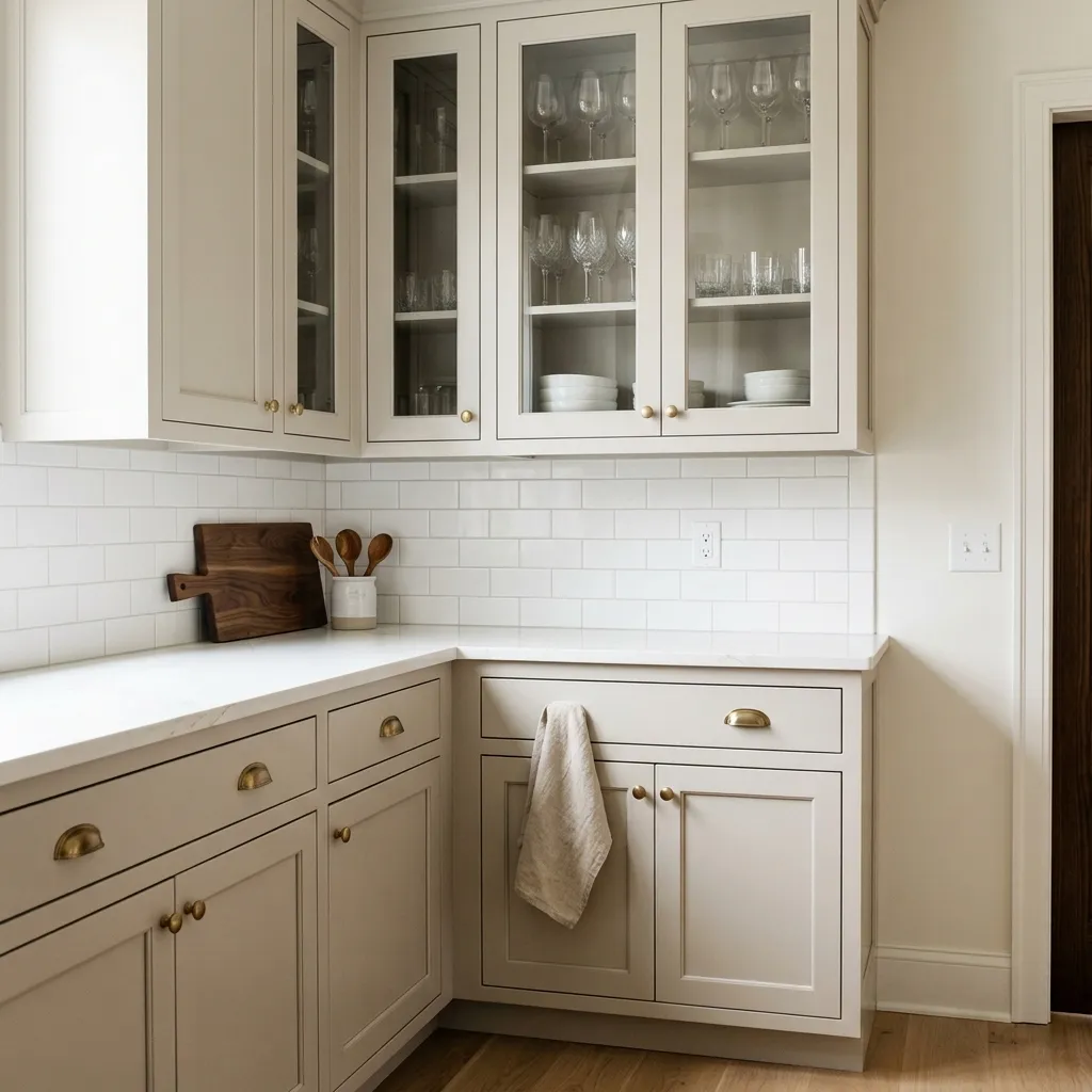
On kitchen cabinets City Loft performs particularly well, sitting brighter than a true greige but carrying enough warmth to look custom rather than builder-white. It pairs well with warm wood open shelving, stone countertops, and matte black or unlacquered brass hardware. Mind the bulb temperature: cool LEDs can push cabinet color toward purple-gray.
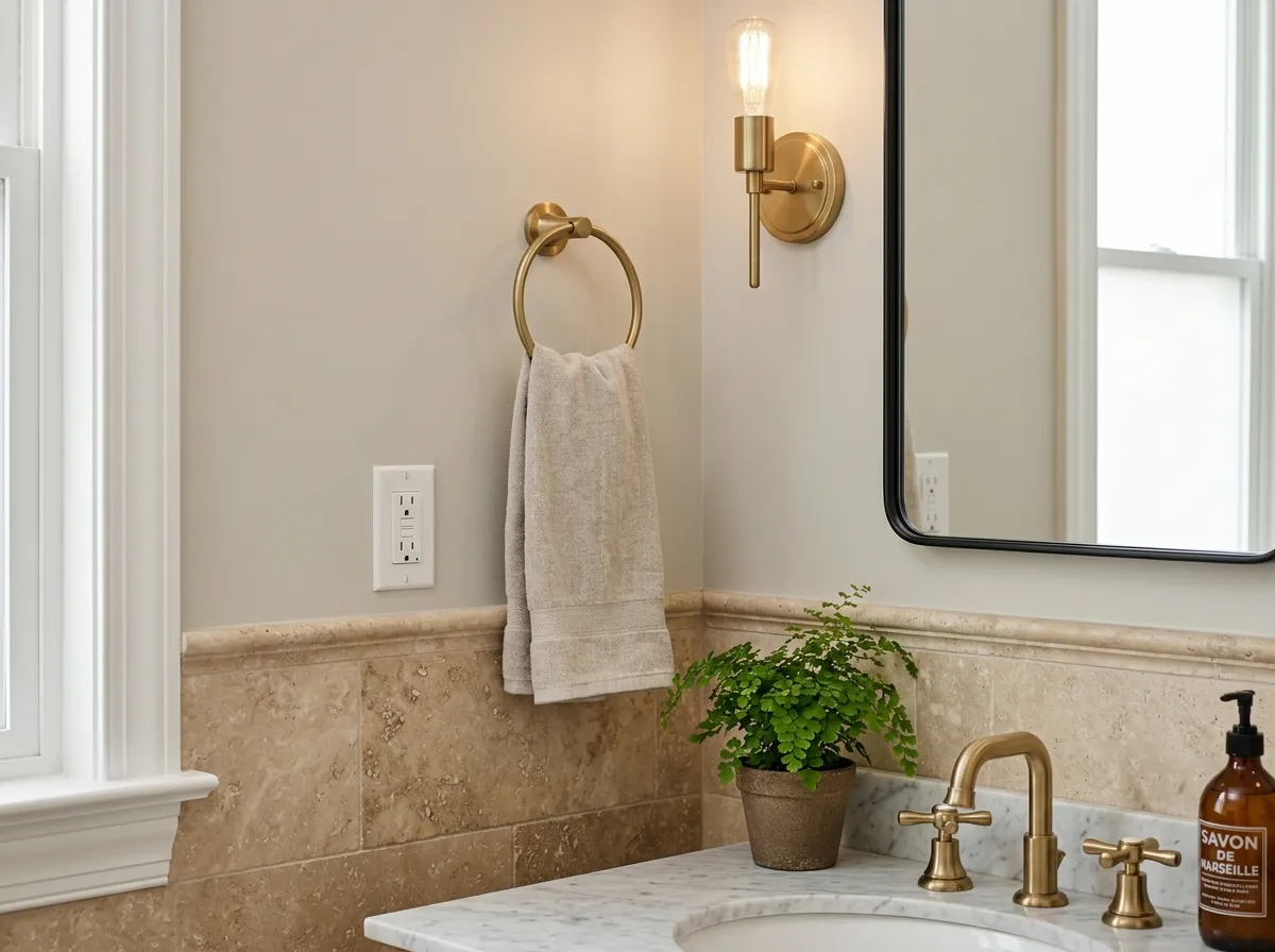
In a bathroom City Loft brings warmth without going yellow or creamy, which makes it compatible with cool marble, warm travertine, and most grout tones. Recessed lighting with bulbs at 3000 to 3500K keeps the beige-taupe quality front and center. In a windowless bath it can read slightly gray or flat, so warm-toned fixtures or a natural wood vanity help it stay alive.
City Loft anchors a palette well because it is neither too warm nor too cool, which means it plays nicely with a wide range of supporting colors. Sherwin-Williams coordinates it with Snowbound (SW 7004), a soft brighter white that works well as a trim companion without creating harsh contrast, and with Taupe Tone (SW 7633), a deeper warm taupe that grounds City Loft walls beautifully in living rooms and primary bedrooms. The third coordinating color in the family is Connor's Lakefront (SW 9060), which adds a muted blue-green accent layer for anyone who wants a nature-inspired, coastal, or transitional palette.
Beyond the official coordinates, the pairings that show up most consistently in independent reviews are warm grays and taupes for a layered tonal look, muted blue-greens and blue-grays for contrast without clash, soft charcoals and navy for drama in accents, and natural wood tones and browns that reinforce the warm undertone rather than fighting it. For trim and ceilings, reviewers consistently reach for a crisper white to give City Loft walls a clean frame and to keep the overall look from going too soft.
The stair hall is mostly built from textiles, wood, and metal, and those materials do the heavy lifting here. Only two colors are actual paint: City Loft wraps all the walls in a drenched, two-story envelope, while Snowbound covers the trim, casings, crown, and stair skirt. The remaining five colors are the room's furnishings and finishes, each shown as its closest Sherwin-Williams match. Hover any pin or swatch to see exactly what you're looking at.
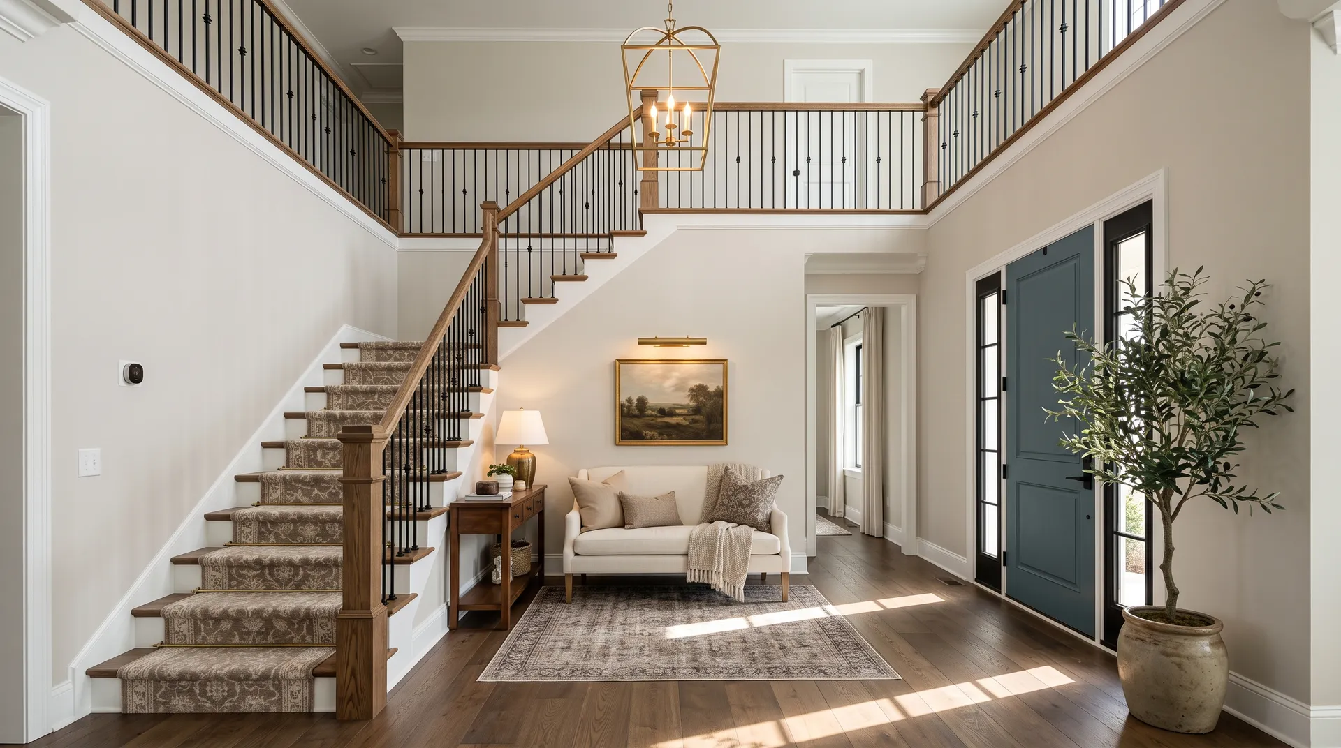
All comparisons are matched against City Loft at LRV 70.5.
Pairing City Loft walls with a trim color that has cool gray or blue undertones creates a visible tension because the warm beige base of City Loft pulls in the opposite direction. The result reads muddy or disconnected rather than crisp.
Bulbs in the 5000 to 6500K daylight range are the single most-cited cause of City Loft looking wrong after painting. They suppress the warm beige undertone and push the color toward gray-purple, which often surprises people who saw warm greige on the sample chip.
City Loft sits at LRV 70.5, which is light and relatively soft. A high-saturation or very dark accent wall in the same room can overpower it, making City Loft look washed out or dingy by comparison rather than warm and refined.
City Loft is a warm off-white that sits right on the line between off-white and light greige. At LRV 70.5 it is genuinely light and airy but carries a soft warm depth that keeps it from reading stark or cold. Its hex value is #DFDAD1 and its RGB is 223, 218, 209.
The base undertone is a warm gray-beige or taupe, and that much reviewers agree on. Beyond that, the secondary notes create real debate. Some see soft pink or peach, particularly in warm afternoon light. Others read violet or purple, especially in north-facing rooms or under cool lighting. A few describe a red-brown warmth. The color is a chameleon, and what you see will depend heavily on your room's orientation, window size, and light bulb temperature.
City Loft is fundamentally warm. It has enough gray to stay away from overtly yellow or creamy territory, but it is not a cool or crisp white. Reviewers consistently describe it as warm-neutral, and the beige-taupe base confirms that. Under cool daylight bulbs it can shift grayer or slightly purple, but that is a lighting artifact, not the color's true character.
City Loft has an LRV of 70.5, which puts it firmly in the light range. It is brighter than a mid-tone greige and reflects enough light to keep rooms feeling open and airy, while still carrying enough depth to read as more than a plain white.
City Loft's Sherwin-Williams code is SW 7631. The hex is #DFDAD1 and the RGB is 223, 218, 209.
City Loft coordinates well with Snowbound (SW 7004) as a trim white, Taupe Tone (SW 7633) as a deeper tonal companion, and Connor's Lakefront (SW 9060) for a muted blue-green accent. More broadly, it works with warm grays, soft charcoals, navy, muted blue-greens and blue-grays, natural wood tones, and creams. For trim, a slightly brighter warm white gives it a clean, defined edge.
Yes on all three. Kitchen cabinets are a particularly popular use: City Loft stays bright while the warm undertone reads custom and rich rather than sterile white. On exteriors it works as a main body color paired with clean white trim and suits stone, brick, and asphalt roofing. On a front door it reads as a warm, sophisticated neutral that is distinct without being bold. In all cases, check the undertone behavior under your specific lighting conditions before committing.