Dreamy White is not a crisp, clean white. On the wall it reads as a soft, warm off-white with a creamy body that sits comfortably between white and the palest of beiges. At LRV 70.9 it is genuinely light and reflective, so it opens up a room and makes a small space feel bigger and airier without ever looking stark or clinical. It has real presence as an off-white rather than a neutral nothing.
The finish shifts noticeably depending on light. Under warm incandescent or Edison-style bulbs, the golden and pink tones push forward and the color feels softer and a little more envelope-you cozy. In strong natural daylight from a south or west window it reads clean and breezy. In dim rooms or toward evening, the beige deepens and the color becomes noticeably warmer and more settled. Reviewers describe a subtle beige-pink cast as its most consistent trait, though Sherwin-Williams files it in the purple family, and several observers note a faint lilac or pink-lavender can surface under certain lighting conditions. That range means the color is not a simple read, and you will likely see it do different things at different times of day in the same room.
The undertone story on Dreamy White is genuinely layered, and sources do not fully agree, so it is worth taking the disagreement seriously. The most consistent description across independent reviewers is a creamy, slightly golden base with a pale pink cast. That combination keeps it from reading as a flat beige and gives it a softness that neutral off-whites lack.
Where things get more complicated is Sherwin-Williams' own classification: the brand files this color in the purple family, and several reviewers back that up by noting a light lilac or pink-lavender undertone that can emerge alongside the yellow and pink. In practice, the purple read is subtle and most apparent in certain artificial light or when the color is surrounded by cooler neighboring tones. In warmer, well-lit rooms it typically stays in creamy-pink territory and the purple is a secondary note rather than a dominant one.
The takeaway is that Dreamy White is warm overall, but the specific warm undertone you see, golden, pink, or faint lilac, depends heavily on your light source, room orientation, and what colors surround it. That variability is why sampling in your actual room is not optional here. Buy a large sample, paint a poster board, and move it around through morning and evening light before you commit.

Dreamy White earns its name in rooms where you want rest and warmth rather than brightness and energy. Bedrooms are the natural fit. The creamy warmth makes the room feel settled at night, and the reasonably high LRV of 70.9 keeps it from turning heavy or cave-like during the day. It works in both a traditional romantic bedroom with layered textiles and a simpler farmhouse or coastal room with white linens and natural wood.
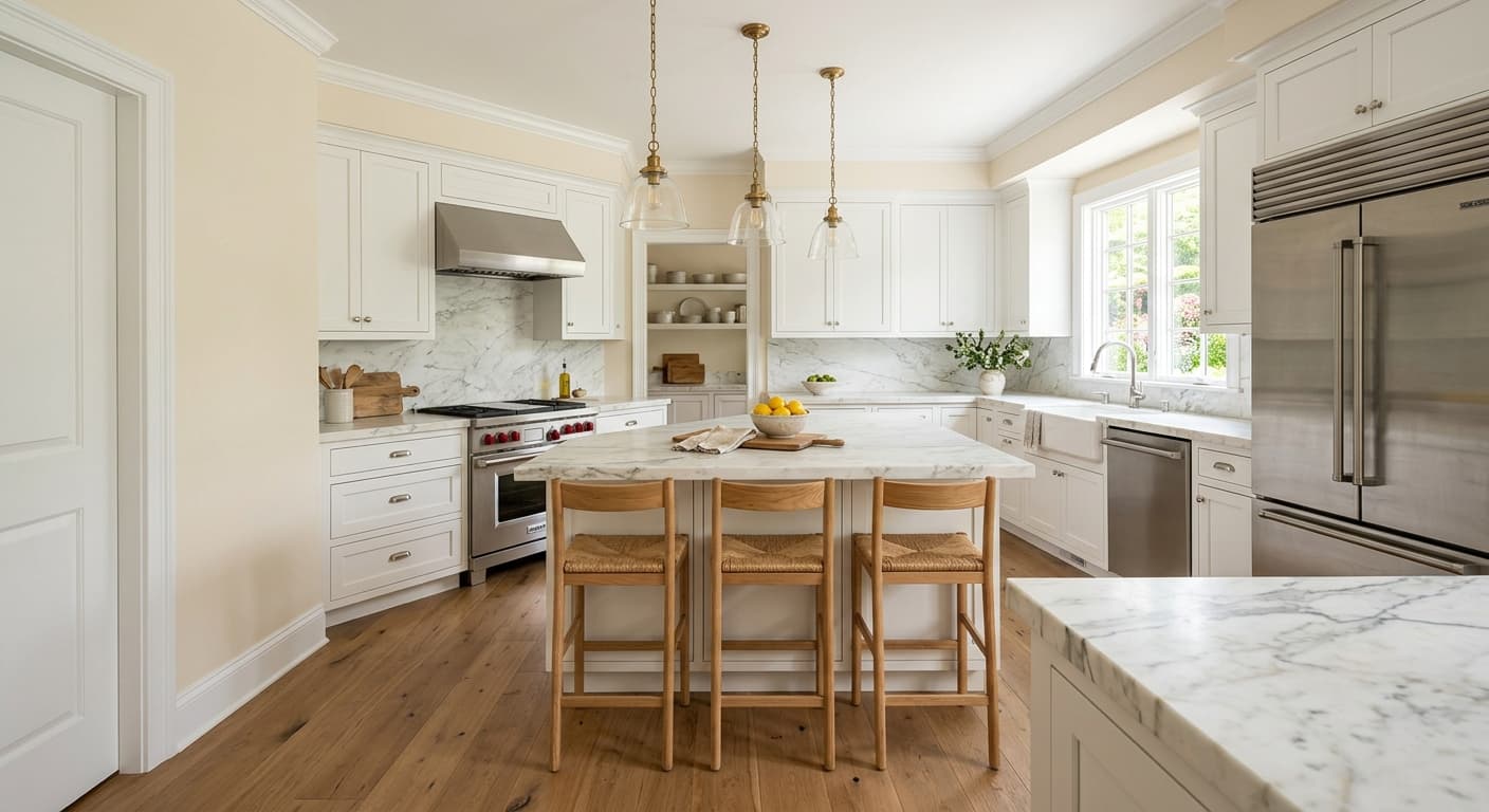
Living rooms and common areas benefit from the same quality. The color does not demand attention, but it has enough warmth to feel intentional rather than default. In a south or west-facing living room with plenty of daylight it stays clean and fresh. In a north-facing room you will see more of the beige and pink, which can read cozily inviting or slightly flushed depending on your other choices, so pair it carefully in that orientation. Reviewers also flag it as a reliable kitchen color when you want warmth without yellow-heaviness, since the pink and lilac notes keep it from reading as pure butter-yellow.
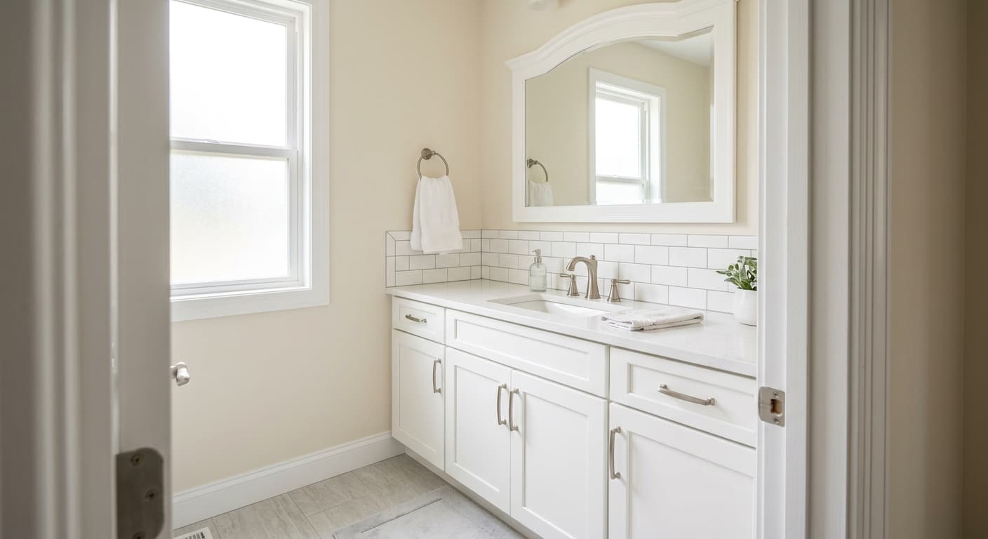
For exteriors, Dreamy White can work as a body color on a home that suits a soft, warm, traditional palette, though the faint pink-lavender undertone is more variable in open sky light and strong sun can shift it in unexpected directions. Front doors and cabinets are applications where the color holds up well in controlled interior light, and on kitchen or bathroom cabinetry it gives a gentler, more lived-in feel than a true bright white.
This is the room Dreamy White is built for. The creamy warmth is restful at night and the LRV of 70.9 keeps it from feeling heavy in morning light. Layer in warm-white bedding, natural wood furniture, and aged brass hardware to lean into the softness.
In a south or west-facing living room Dreamy White reads clean and light all day. In a north-facing space the pink-beige tones deepen toward evening, which can feel cozy or slightly flushed depending on your upholstery and rug choices. Keep accent colors muted to let the wall color settle.
Dreamy White avoids the heavy yellow cast that some warm whites develop under kitchen task lighting because its pink and lilac notes balance the gold. It works especially well on walls alongside natural wood cabinetry or on cabinets themselves when you want warmth without brightness.
On kitchen or bathroom cabinetry Dreamy White gives a softer, more vintage feel than a stark white. The pink undertone pairs well with brushed gold or unlacquered brass hardware, and the LRV of 70.9 keeps the cabinets feeling light even in a kitchen without abundant natural light.
The gentle warmth and soft beige-pink cast make Dreamy White a natural in a nursery or young child's room. It provides a warm, calm backdrop without the stark brightness that can make a room feel clinical, and it coordinates easily with pastel accents in almost any color direction.
Dreamy White pairs cleanly with the coordinating colors Sherwin-Williams suggests alongside it. Snowbound (SW 7004) is a useful companion when you want a slightly cooler, crisper white for trim or adjacent walls, since the contrast is gentle enough to feel curated rather than jarring. Cocoa Berry (SW 9078) brings in deeper, warmer berry tones that play directly into the pink and lilac undertones already present in Dreamy White, making that pairing feel intentional and pulled-together in a bedroom or sitting room.
Beyond the coordinating palette, Dreamy White is at home with soft pastels, warm wood tones, aged brass or gold hardware, and natural linen or cotton textiles. Because the color already carries warmth, pairing it with strongly warm or heavily saturated tones can tip the balance. Cooler, muted accents, dusty blues, soft sage, pale blush, give it room to breathe and let its own undertone complexity do the work.
All comparisons are matched against Dreamy White at LRV 70.9.
The beige-pink warmth in Dreamy White and the blue-gray coolness of a silver or slate trim pull against each other visually. The contrast does not read as crisp and intentional; it reads as two palettes that missed each other.
Dreamy White is a background color that works through subtlety. Placing it next to a strongly saturated or vivid accent color, a bold cobalt, a bright coral, a deep forest green, overwhelms the delicate warmth and the off-white can start to look dingy or washed out by comparison.
Under bright cool-white LED or fluorescent light, the yellow and pink warmth in Dreamy White gets suppressed and the faint lilac or purple undertone the brand classifies it under can surface more prominently. The result can look flat or unexpectedly lavender-tinged rather than warm and creamy.
Dreamy White SW 6021 is a soft, warm off-white with a creamy, slightly golden base and a subtle beige-pink cast. It is not a crisp or bright white. With an LRV of 70.9 it is genuinely light on the wall but always reads as an off-white rather than a neutral true white.
The undertones are layered and somewhat debated. The primary read is creamy golden with a soft pink cast. Sherwin-Williams files the color in the purple family, and independent reviewers back that up by noting a faint lilac or pink-lavender undertone that can surface in certain lighting, particularly under cool artificial light. The specific undertone you see will shift depending on your room's orientation, light source, and surrounding colors, which is why sampling before you commit matters with this one.
Dreamy White is a warm white. Its creamy, golden base and beige-pink cast put it firmly in warm territory. The faint lilac undertone noted by some reviewers is a secondary quality and does not make the color cool overall. It will feel warmer and softer under warm incandescent light and slightly fresher in direct natural daylight.
The LRV is 70.9, which puts it in genuinely light territory. It reflects enough light to brighten a room and make a small space feel more open, but it is not so high that the warmth gets washed out.
The Sherwin-Williams code is SW 6021. The hex value is #E3D9D5, and the RGB values are 227 red, 217 green, 213 blue.
Dreamy White coordinates well with Snowbound (SW 7004) for trim or adjacent surfaces when you want a slightly crisper white companion, and with Cocoa Berry (SW 9078) for deeper, warmer berry accents that play into its pink and lilac undertones. More broadly it pairs well with soft pastels, warm wood tones, aged brass hardware, and muted dusty accents in blue, sage, or blush. Avoid strongly saturated or cool-toned accents, which can make the off-white look dingy.
It can work on exteriors as a body color on a traditionally oriented home, though the pink-lavender undertone is less predictable in open sky light and strong sun, so sample it on the actual facade before deciding. On front doors and cabinetry it performs well under controlled interior light, giving a softer, more vintage feel than a bright white. On kitchen cabinets the LRV of 70.9 keeps things light while the pink and golden warmth add character.
