Cultured Pearl lands in that sweet spot between a true white and a soft beige. On the wall it reads as a low-chroma warm off-white, grounded by a faint taupe warmth and just enough gray to keep it from feeling too creamy or yellow. The overall impression is quiet and refined rather than bold. It brightens a room without washing it out, and that balance is what makes it feel so livable.
Light plays a real role in how this color shifts. In strong natural daylight the gray component comes forward and the color feels a little cooler and more neutral, almost a soft dove. Under warm artificial light or in a lower-lit room the beige and warmth deepen noticeably, giving walls a cozier, slightly more enveloping feel. North-facing rooms may lean cooler and grayer; south or west-facing rooms tend to bring out the warmth. This is not a color that stays still across the day, so what you see on a paint chip at noon is only part of the story.
At LRV 72.8 it is genuinely light and reflective without being stark. It does not compete with bright whites for attention but still makes a space feel open. That measured lightness is a large part of why it works so well as a whole-house color: it holds together across rooms with different orientations without feeling like it is fighting itself.
The undertone picture here is more layered than a single word covers. The most obvious read is beige-ivory with a faint taupe warmth, which is what most reviewers see in moderate daylight. But there is a secondary note that people describe as peach or pinky-beige, especially in lower light or against very cool whites. Some find that pinky quality subtle and pleasant; others are caught off guard by it if they expected a clean greige.
Sherwin-Williams classifies Cultured Pearl in the purples and pinks family, and that classification is not just administrative. A quiet light-purple or mauve undertone can surface in certain lighting conditions, particularly in rooms with limited natural light or next to warmer wood tones. It does not announce itself the way a deliberate blush pink would, but it is there if you look for it. This is the undertone that generates the most disagreement among reviewers: some never see it, others find it becomes the dominant read in their specific room.
Because the color shifts depending on light source, wall orientation, and what it sits next to, the undertone question genuinely cannot be settled by looking at a chip. Sample it on a large patch of your actual wall, check it in morning light, afternoon light, and at night under your lamps. That process will tell you whether your room brings forward the warm beige side or coaxes out the pinky-pearl side, and it is the only reliable way to know before you commit.
Cultured Pearl earns its whole-house reputation because it adapts rather than dominates. In living rooms it creates a warm, collected backdrop that works behind both traditional and transitional furnishings. The slight gray keeps it from feeling old-fashioned while the beige warmth prevents the cold, antiseptic feeling that pure grays can produce. It handles open floor plans well because it reads consistently enough across connected spaces without becoming monotonous.
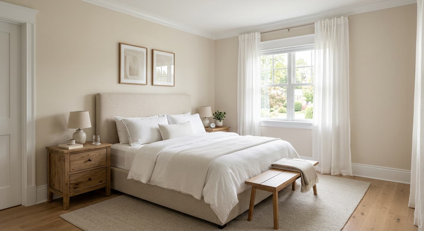
Bedrooms are arguably where it shines most. The warm pearl quality at LRV 72.8 is light enough to feel airy but not so white that the room feels clinical. That softness translates into a restful, settled atmosphere. Kitchens are a good fit too, especially in rooms where cabinetry or countertops carry warm undertones like cream, wood, or warm stone. The color ties those elements together without competing. It is worth being cautious in kitchens with very cool gray or stark white cabinetry, where the pinky undertone could become more visible and less welcome.
Orientation matters more than many paint guides acknowledge. South and west-facing rooms allow the warmth to surface naturally, and the color feels intentional and inviting. North-facing rooms cool it down and push the gray forward, which can work well for a calm bedroom but might feel flat in a living space without warm light sources or furnishings to compensate. Rooms with significant incandescent or warm LED lighting will reliably bring out the cozier, more beige-toned version of this color regardless of orientation.
In a living room Cultured Pearl functions as a genuinely neutral warm off-white that lets furniture and art carry the visual weight. It works in both traditional and transitional spaces because the faint gray keeps it from reading as dated cream. Pair it with Armadillo on a fireplace surround or built-in for a grounded, layered look.
At LRV 72.8 with a soft warm pearl quality, this color creates a restful atmosphere without making the room feel dim or stark. The beige warmth is noticeable enough to feel intentional in morning light, and under warm evening lamps the walls feel genuinely cozy. It pairs cleanly with linen, natural wood, and soft warm whites on trim.
Cultured Pearl works well in kitchens where cabinetry or countertops carry warm undertones like cream, wood, or warm stone. It ties those elements together without competing. Be cautious with very cool gray cabinetry or stark white surfaces, as that contrast may pull out the pinky undertone more than you intend.
This is one of the stronger whole-house candidates in the warm off-white category because it holds together across rooms with different light exposures. South and west-facing spaces bring forward the warm beige side while north-facing rooms show more of the gray, and both readings are livable. The consistency across open-plan spaces is a practical advantage.
Cultured Pearl pairs most naturally with colors that either anchor it with depth or keep its softness company. Snowbound is a clean near-white that makes an easy companion for trim, ceilings, and millwork: it is bright enough to pop against Cultured Pearl without creating the kind of stark contrast that would make the walls look dingy. Armadillo brings in the earthy, medium-depth warmth this color needs when the palette wants more weight, working well for accent walls, case goods, or exterior trim. Ibis White sits closer to Cultured Pearl in tone and reads as a softer, warmer alternative for ceilings in rooms where you want less contrast overhead.
Beyond the coordinating family, Cultured Pearl connects naturally to deeper taupes and warm greiges that share its beige-gray foundation. Wood tones in the honey-to-walnut range read well against it. Crisp white trim is the most common pairing and it works, though the contrast will emphasize the color's warmth. If you want to reduce the pinky-pearl effect, lean into cooler-toned metals and stone rather than very warm brass or red-based woods.
All comparisons are matched against Cultured Pearl at LRV 72.8.
Placing Cultured Pearl next to a cool gray or blue-leaning wall in an open floor plan can pull the pink-pearl undertone forward noticeably, making the color look more blush than intended.
Pairing Cultured Pearl with a very bright, cool white on trim and doors creates a contrast that can make the walls read as distinctly pink or peachy rather than a soft neutral, especially in well-lit rooms.
Heavy red-orange wood floors or cabinetry can amplify the peach and pink notes in Cultured Pearl, pushing the overall palette into territory that feels unintentionally warm or dated.
Cultured Pearl SW 6028 is a soft, light warm off-white with a beige-ivory base and a quiet pearl quality. It is light enough to brighten rooms at LRV 72.8 but has enough warmth to feel settled and inviting rather than stark or clinical.
The primary undertone is a warm beige-taupe, but Cultured Pearl also carries a secondary peach or pinky-pearl note that becomes more visible under low or warm artificial light. Sherwin-Williams places it in the purples and pinks family, and a faint mauve or light-purple undertone can appear in certain light conditions. The undertone you see most depends heavily on your room's light source and orientation.
It is primarily a warm color. The beige-ivory base and pearl warmth are the dominant reads in most lighting. That said, in strong natural daylight or in north-facing rooms the gray component comes forward and it can feel cooler and more neutral. It is not a cool white by any measure, but it is not a flat, yellow-heavy cream either.
Cultured Pearl has an LRV of 72.8, which puts it solidly in the light range. It reflects a good amount of light without approaching the brightness of a true white, making it a practical choice for rooms where you want warmth and openness at the same time.
Sherwin-Williams coordinates it with Snowbound for trim and ceilings, Armadillo as a grounding deeper accent, and Ibis White as a softer ceiling option. It also pairs naturally with warm taupes, honey-toned woods, and warm stone countertops. Keep trim and adjacent colors on the warm side to avoid pulling out the pinky undertone.
The Sherwin-Williams code is SW 6028. The hex is #E5DCD6 and the RGB values are 229, 220, 214.
It works well as a whole-house color because it reads consistently across different room orientations, shifting slightly warmer or cooler with the light rather than looking mismatched. For cabinets it is a viable choice in kitchens with warm countertops or wood elements, but sample it next to your specific cabinet material first since the pink-pearl undertone can become more pronounced against cool or very bright white surfaces.
