
MorningWarm · taupe reads forward
A warm greige that sits squarely between beige and gray at LRV 38.7, inviting without going soft. Sample it on multiple walls to catch how it shifts through your day.
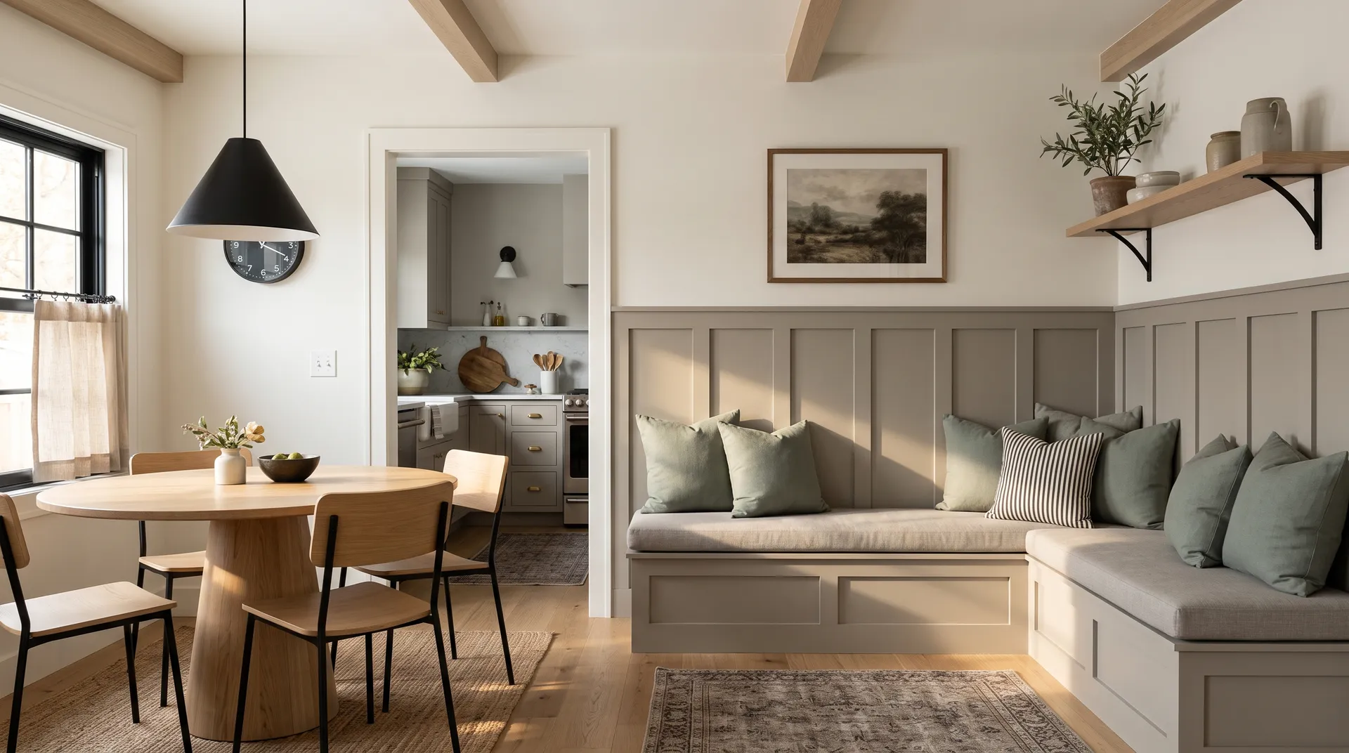
Dorian Gray SW 7017 lands squarely in greige territory, a blend of gray and beige that reads warm enough to feel inviting but gray enough to function as a true neutral. At LRV 38.7 it sits in the mid-tones, darker than the pale grays that dominate builder palettes but nowhere near a deep charcoal. On the wall it makes a statement without overwhelming a room, and that middle-ground depth is a big part of its appeal.
In bright, warm light it pulls beige and taupe, almost reading like a warmed-up gray rather than a gray with beige in it. In lower light and north-facing rooms it holds a grayer, stormier quality, still warmer than most true grays but decidedly less beige. Most reviewers describe the overall effect as sophisticated and grounded. One outlier calls it remarkably stable across light conditions, but the majority are clear: this color shifts noticeably as the day moves and light changes, and what you see on a paint chip under fluorescent store lighting tells you very little about how it will land on your walls.
The undertone picture is where sources split, and you should go in knowing that before you buy a sample. The consistent thread is warmth with brown or greige underneath. On that much, reviewers agree. What divides them is the secondary shift you catch in certain lights.
Several independent reviewers describe a faint purple or violet cast indoors, particularly in rooms where natural light is limited or where cool-toned materials are nearby. Others report a subtle green shift, and those reviewers tend to locate it specifically on exteriors, especially under rooflines with cool or purple tones, or in rooms with a lot of natural light coming through foliage. No source flags a strong blue undertone, which is meaningful because it means Dorian Gray does not go icy the way many mid-tone grays do when they hit north light.
The practical takeaway is that neither the purple nor the green read is dominant. Multiple reviewers use language like "vague" or "subtle" to describe these shifts, and most say the base warm greige character is what you see most of the time. Still, if your trim is cream or your flooring is a pink-toned wood like red oak, these underlying notes can surface in ways you did not expect. Sample on multiple walls at different times of day before you commit.
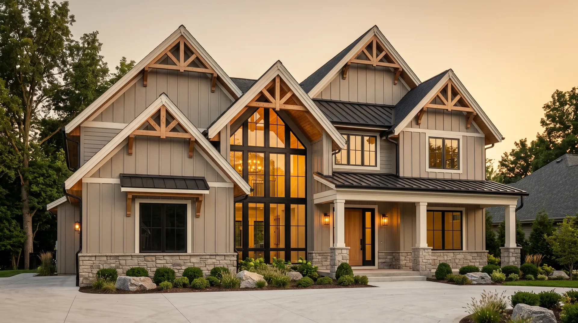
Exterior use is one of the strongest cases for Dorian Gray. Reviewers consistently praise it for siding, front doors, and shutters, and it appears on Sherwin-Williams' own Top Exterior Colors list. The mid-tone depth gives exteriors presence without going dark and heavy, and the warm greige character reads well against natural stone, red brick, and both painted and unpainted wood trim.
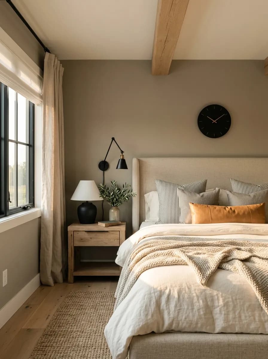
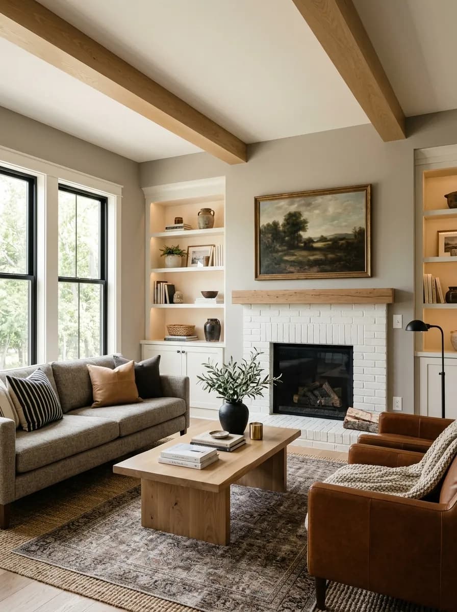
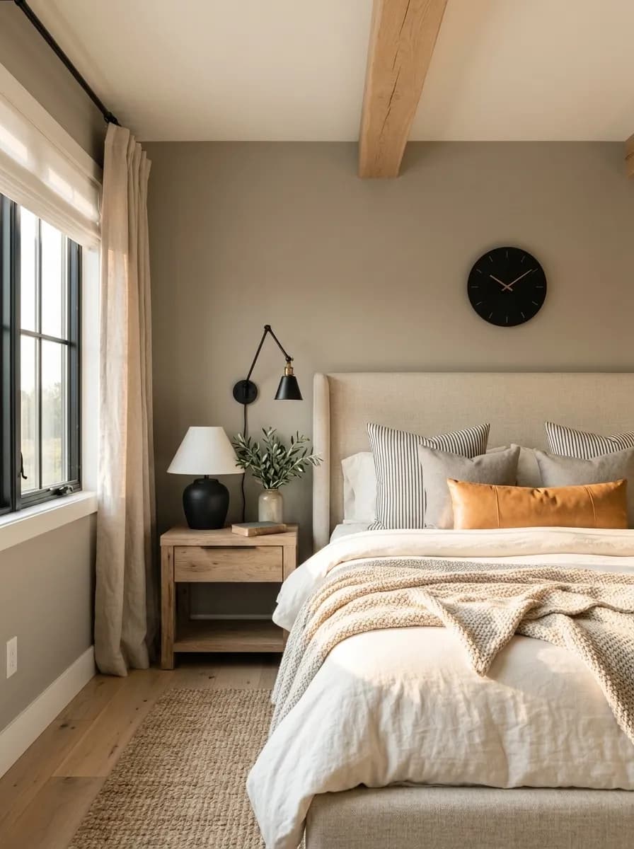
Inside, cabinetry and accent applications get the most consistent praise. Kitchen islands, bathroom vanities, and built-ins in Dorian Gray come up repeatedly as a less predictable alternative to white or navy. As a trim or board-and-batten color paired with a lighter wall it adds depth without requiring a dramatic commitment. For whole-room wall applications, reviewers favor it in rooms with adequate natural light: bathrooms, dining rooms, home offices, living rooms, and bedrooms in south-facing or well-windowed situations. North-facing rooms stay livable but shift grayer and cooler, and the color holds enough warmth to avoid feeling cold or bleak.
The consistent caution is about dark or dim rooms. Small rooms and spaces without good light risk reading flat, drab, or dingy when this color wraps all four walls. If your room is east or west facing with limited window area, consider using Dorian Gray on a single accent wall or for cabinetry rather than as a full room treatment. Its character also pairs naturally with warm materials: dark and medium woods, stone surfaces, and dark flooring all let it settle into the warm side of its personality rather than pushing toward the purple or green edge.
In a living room with decent natural light, Dorian Gray reads warm and grounded, a backdrop that lets wood furniture and upholstered pieces take center stage. South-facing rooms will push it lighter and more taupe through the afternoon. In dim living rooms, keep it to one feature wall rather than wrapping the space.
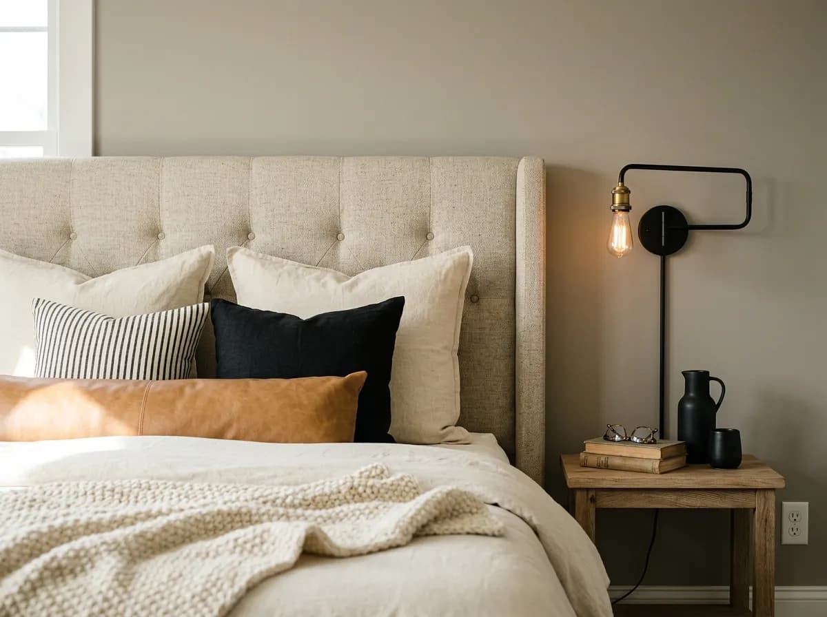
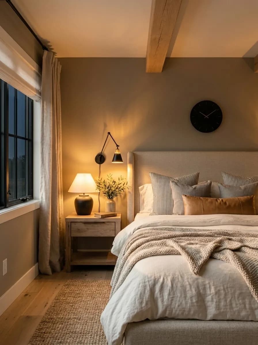
Bedrooms with east or south exposure give Dorian Gray the light it needs to stay warm and restful rather than flat. Pair it with warm wood nightstands or dark furniture to keep it from tipping gray. In a north-facing bedroom it takes on a stormier, more dramatic quality that some find moody and others find draining.
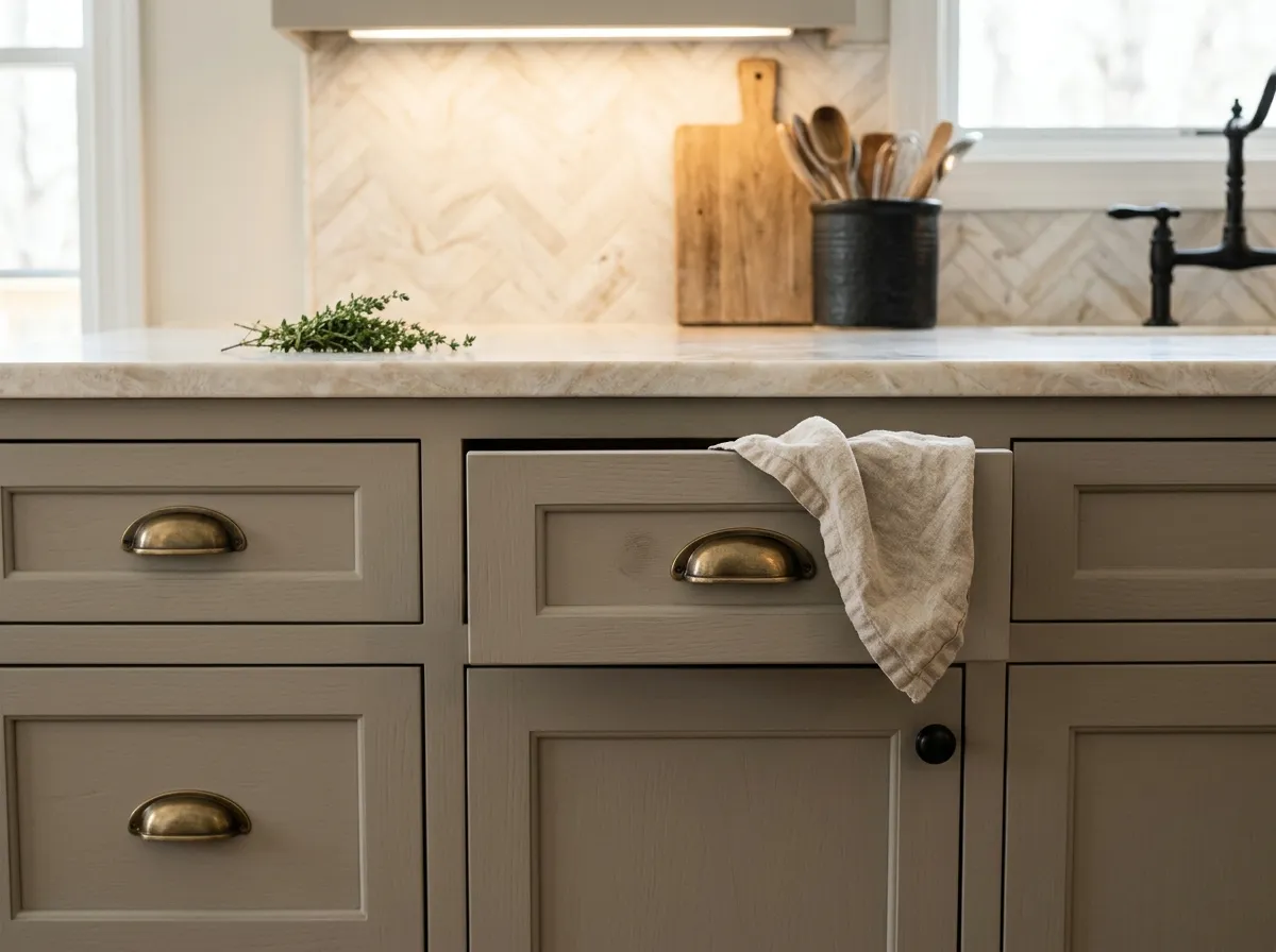
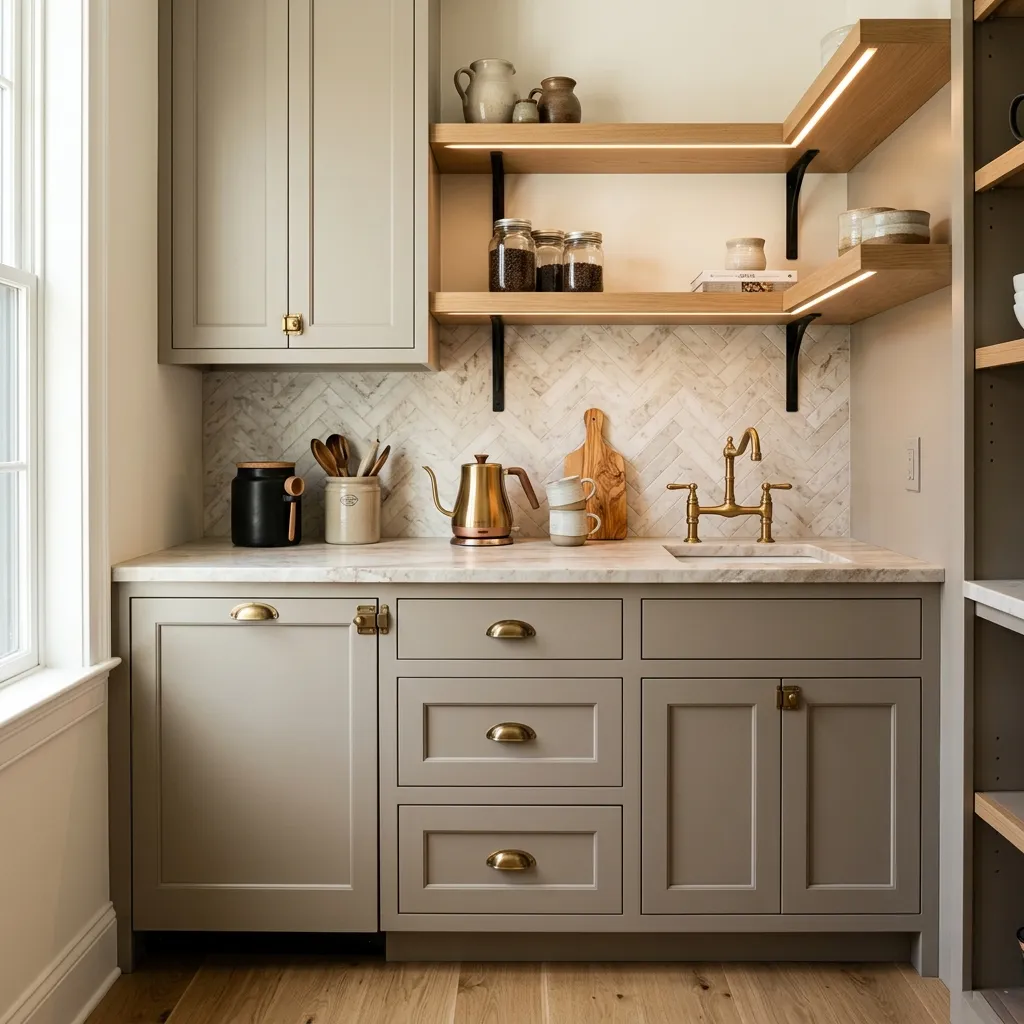
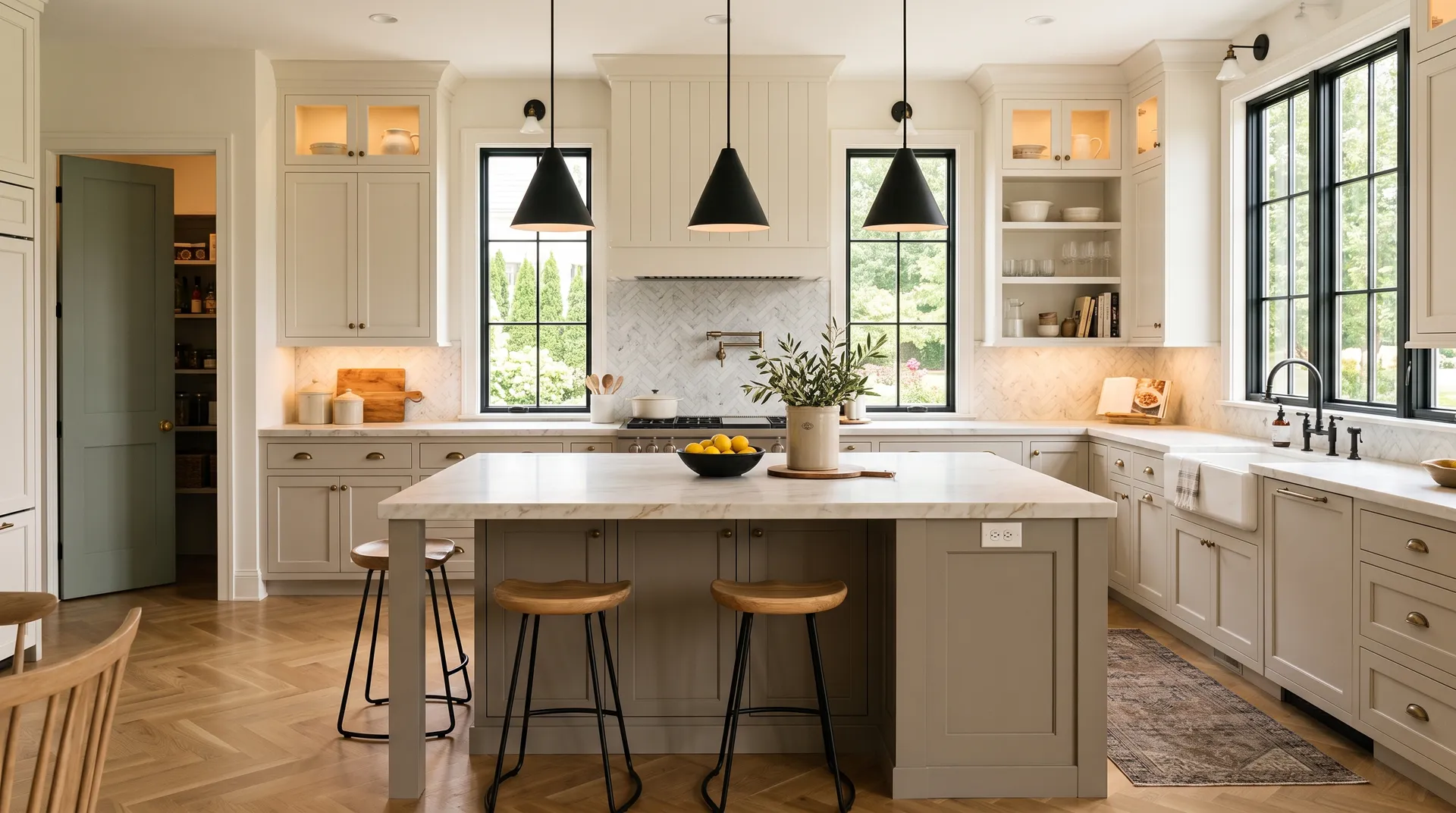
This is one of the strongest interior uses for Dorian Gray. On a kitchen island or perimeter cabinets it reads as a refined, warm alternative to both white and navy. It works well against dark stone counters and espresso or dark-stained hardware and pulls, but it can look muddy next to very light or pink-toned wood.
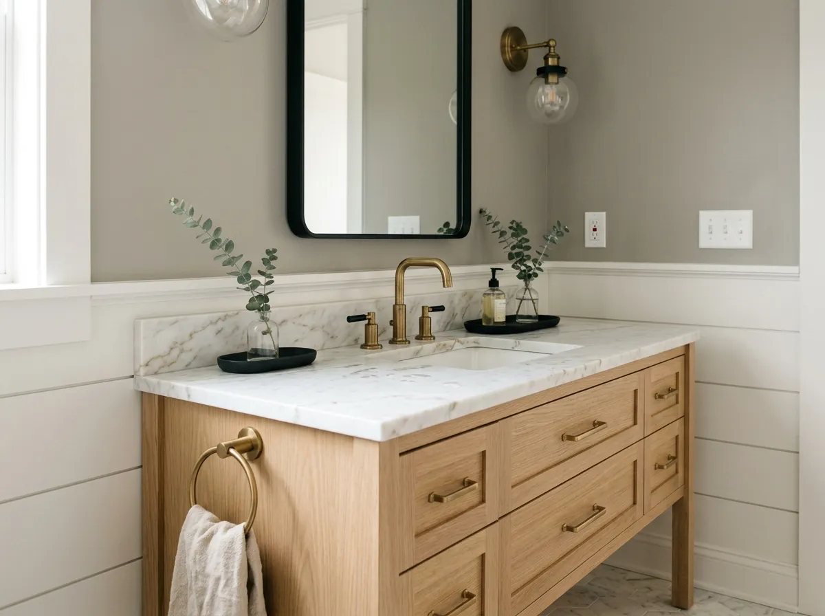
Bathrooms, especially those with good overhead or natural light, are a reliable fit. Dorian Gray on a vanity or on all four walls in a well-lit bath gives the room a spa-like, grounded feel. In windowless bathrooms, use it on the vanity alone and go lighter on the walls.
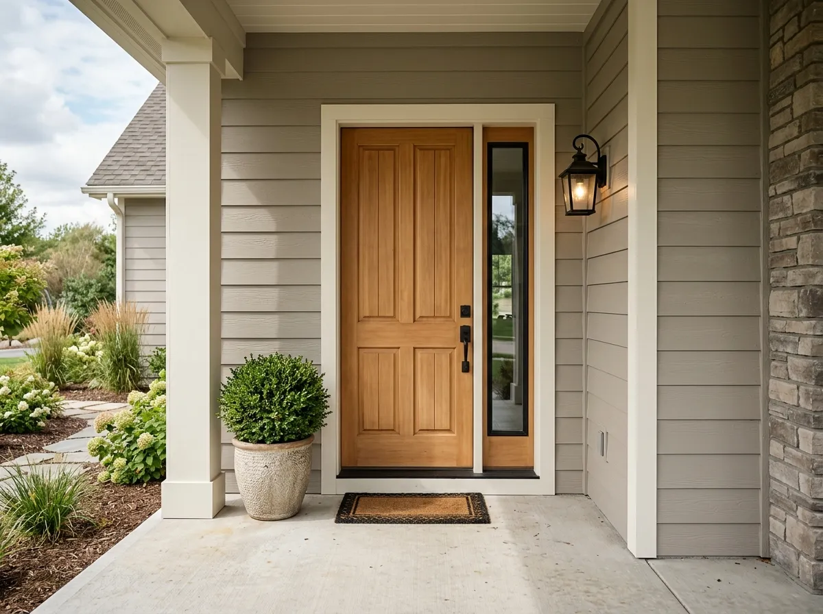
Dorian Gray earned a spot on Sherwin-Williams' Top Exterior Colors list for good reason. On siding it has enough depth to read intentional from the street without going dark. On a front door it is a sharp, modern choice against brick or stone, just be aware that rooflines with cool tones can pull the subtle green shift more visibly outdoors.
Dorian Gray is easy to pair because its warm greige base does not fight with a wide range of whites, off-whites, and deeper tones. Sherwin-Williams coordinates it directly with Eider White (SW 7014), a soft warm white that keeps the pairing from feeling stark, Skyline Steel (SW 1015), which leans into the blue-gray side for a cooler contrast, and Jasper Stone (SW 9133), an earthy warm tone that reinforces the brown and greige character in Dorian Gray itself.
Beyond those formal coordinates, reviewers reach frequently for warm whites on trim. A creamy white works well; a stark cool white can make Dorian Gray look slightly purple or green by comparison, so lean toward whites with yellow or pink undertones rather than blue. For high contrast, a true near-black on doors or windows anchors the palette. Soft blues and muted greens also coordinate well, playing off the occasional cool note in Dorian Gray without fighting its warm base. Avoid pairing it with cream trim if you want the color to stay neutral, and steer clear of pink-toned stained woods, which can pull the undertones in an unflattering direction.
Paint accounts for two of the seven colors here: Dorian Gray on the banquette and board-and-batten wainscot, and Eider White across the upper walls, trim, and ceiling. The other five represent the room's furnishings and materials, each matched to its closest Sherwin-Williams equivalent so you can track down a similar look. Hover any pin or swatch to identify a color.
All comparisons are matched against Dorian Gray at LRV 38.7.
Cream trim or cabinets can make Dorian Gray look cool and slightly off when the two are side by side, pulling the purple or gray notes forward and making the color look less warm than you expected.
Red oak and other pink-toned stained woods in the same room can cause the subtle secondary undertones in Dorian Gray to surface in ways that read muddy or slightly clashing rather than warm and layered.
In dim or north-facing rooms without warm materials, Dorian Gray can look flat, drab, and grayer than the warm greige you sampled in bright light, essentially losing the character that makes it appealing.
Dorian Gray is a medium-depth warm greige, a blend of gray and beige that reads warmer than most mid-tone grays but gray enough to work as a versatile neutral. At LRV 38.7 it sits in the true mid-tones, darker than pale builder grays but far from a deep charcoal.
The base is warm with brown and greige underneath, and that is where most reviewers agree. Beyond that, opinions split: some see a faint purple or violet note indoors in limited natural light, while others report a subtle green shift, especially on exteriors or in rooms with a lot of natural light coming through foliage. Neither shift is dominant, and most reviewers describe them as vague rather than obvious, but they can surface depending on your light exposure, roofline color, and surrounding finishes.
It is warm. Dorian Gray does not go icy or blue the way many mid-tone grays do in north light. In bright south-facing rooms it pulls distinctly beige and taupe. In north-facing rooms it reads grayer and stormier but retains enough warmth to stay livable rather than cold.
The precise LRV is 38.7. That puts it firmly in the mid-tone range, dark enough to make a statement and register as a real color on the wall, but not so dark that it dominates a room. In well-lit rooms it will look lighter than LRV 38.7 might suggest; in dim or north-facing rooms it will appear closer to its true depth.
The Sherwin-Williams color code is SW 7017. The hex value is #ACA79E and the RGB is 172, 167, 158.
Sherwin-Williams coordinates it with Eider White (SW 7014), Skyline Steel (SW 1015), and Jasper Stone (SW 9133). For trim, choose warm whites rather than cool or cream whites to avoid pulling the purple or gray notes forward. Dark near-blacks work well for high-contrast doors and windows. Soft blues and muted greens coordinate without fighting the warm base. Avoid cream trim and pink-toned stained wood floors, which can make the undertones surface awkwardly.
Yes on all three. It appears on Sherwin-Williams' Top Exterior Colors list and reviewers consistently praise it for siding, shutters, and front doors. The mid-tone depth reads intentional from the street without going heavy. On cabinetry, kitchen islands and bathroom vanities are particularly popular applications, where it works as a warm, grounded alternative to white or navy. Just note that on exteriors, cool rooflines can amplify the subtle green undertone, so sample it in your actual setting.