Chatroom lands in the light-medium range with an LRV of 40.8, meaning it reflects roughly half the light that hits it. On the wall it reads as a warm greige, not a clean gray and not a true beige, but something in between with a quiet organic depth. In full daylight it can look like a softened stone or weathered linen, grounded and calm without feeling heavy.
What separates Chatroom from a generic greige is a subtle green-gray undertone that gives the color a hint of the outdoors. It is restrained, not a sage or an olive, but that influence prevents it from reading as flat or one-dimensional. In warmer incandescent or amber-toned light, the warmth in the base comes forward and the color settles closer to a toasty neutral. In cooler or dimmer light it can shift toward a more muted, slightly mossy gray.
Overall the color reads calm and cozy rather than stark. It is a backdrop color, the kind that makes a room feel settled and put together without demanding attention. Because it sits at a medium depth, it works whether you want the walls to recede or to add a little weight to a bright, airy space.
The undertone picture for Chatroom is genuinely debated, and it is worth understanding the full range before you commit. The most common read among reviewers is a warm greige base with a soft green-gray cast layered on top. That combination is what gives the color its organic, grounded quality. The green is not assertive, but it is present, and in rooms with cooler north or east light it can become the dominant note.
Some sources describe the undertone differently, calling it a muted yellow-based greige that only shifts toward green-gray in particular lighting or when placed next to certain colors. A smaller number of reviewers have noticed a faint warmth that reads almost pink or violet in very specific conditions, though this is a minority read and likely depends heavily on surrounding finishes and light sources. The disagreement is real and worth taking seriously rather than dismissing.
The practical takeaway is that Chatroom is not a neutral that sits still under every condition. It is a balanced warm neutral most of the time, but its quiet green-gray influence means it can flex depending on your room's orientation, your light bulbs, and the whites or woods you put next to it. Sampling on your actual wall is genuinely useful here, especially if a green reading would bother you or if you are working with existing cool-toned elements that could amplify it.
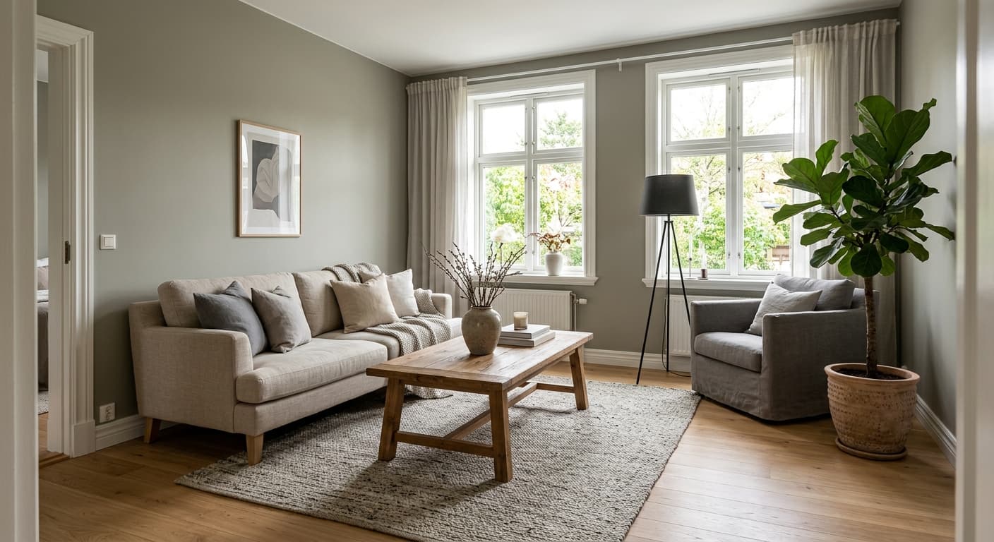
Chatroom's LRV of 40.8 puts it in a sweet spot for rooms where you want warmth and substance without closing a space down. Living rooms are a natural fit. The color adds enough depth to feel intentional and cozy while remaining light enough to work in reasonably sized rooms with standard natural light. It suits transitional and relaxed-traditional interiors especially well, where the goal is a grounded, welcoming backdrop rather than a bold statement.
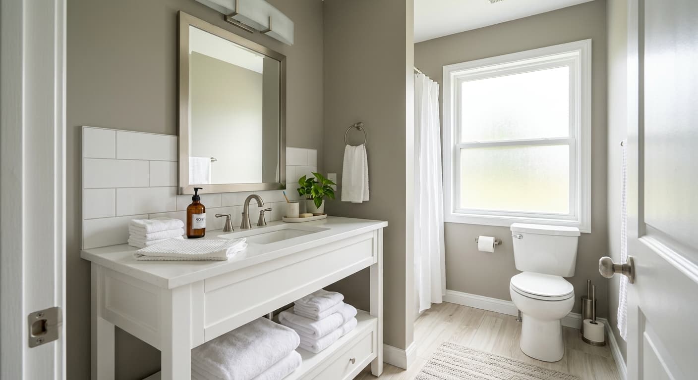
Bedrooms respond well to Chatroom because the warm greige base is easy to wake up to and easy to wind down in. It pairs naturally with soft textiles, wood tones, and the kind of layered lighting that shifts through the day. Bathrooms are also a solid use case, particularly larger bathrooms with good light. In a small or windowless bathroom the color can feel dim, so keep that in mind if your space is tight.
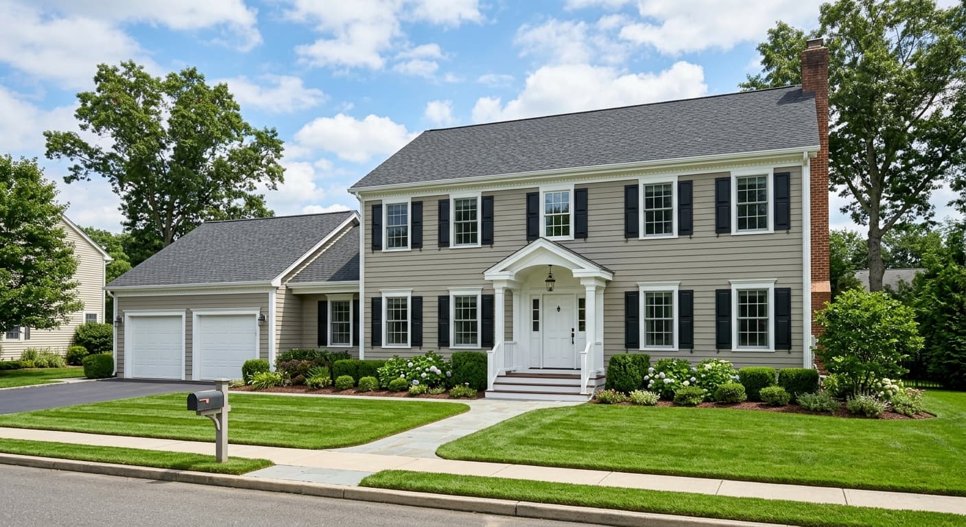
Orientation matters with this one. South and west-facing rooms bring out the warmth in Chatroom and minimize the green-gray cast, making it feel more like a soft warm neutral. North and east-facing rooms can pull the green-gray influence forward, sometimes quite noticeably. If your room faces north, sample generously and observe the color at different times of day before deciding. The color is also a reasonable candidate for a front door or exterior trim in sheltered situations, where its warm earthiness reads well against natural materials like brick, stone, or wood siding.
Chatroom at LRV 40.8 gives a living room real presence without feeling cave-like. It works especially well in rooms with warm artificial lighting, where the greige base comes forward and the space settles into something cozy and inviting. Pair it with creamy trim and natural wood furniture to keep the palette cohesive.
The warm, calm quality of Chatroom makes it a reliable bedroom color. It is restful without being cold, and it layers well with soft bedding and varied lighting. In a south-facing bedroom it will lean warm and wrapped; in a north-facing room, sample first to confirm you are comfortable with a slightly cooler, greener read.
In a bathroom with decent natural light, Chatroom adds warmth and a spa-like groundedness that cool grays cannot match. Stick to warm whites on trim and cabinetry and use warm-toned bulbs to keep the undertone from shifting green. Small, dark bathrooms are a tougher fit at this LRV.
A hallway painted in Chatroom reads as welcoming and well-considered, and the medium depth gives it enough substance to feel finished in a space that often gets overlooked. Keep the ceiling lighter, a warm creamy white works well, to avoid any sense of compression.
Chatroom holds up outdoors as a warm earthy neutral that reads well against natural stone, brick, and wood. On a front door it is distinctive without being loud. Make sure your surrounding trim and landscaping lean warm rather than cool so the green-gray undertone does not become the dominant impression from the curb.
Chatroom was designed with Moderne White and Ivoire as its primary coordinates, and both pairings make good sense. Moderne White keeps things crisp without going stark, giving the warm greige a clean contrast partner that does not fight the green-gray undertone. Ivoire leans creamier and warmer, which softens the whole palette and emphasizes the cozy, organic side of Chatroom rather than its gray qualities. Either direction works depending on whether you want the room to feel light and fresh or warm and enveloping.
For accents, Cajun Red offers a bold counterpoint that plays off the earthiness in Chatroom without clashing. It is a committed choice, best suited for a single accent wall, cabinetry, or accessories rather than a full room pairing. Beyond the official coordinates, Chatroom responds well to warm wood tones, aged brass and bronze hardware, and natural textiles in cream, oatmeal, or soft terracotta. Keep your whites on the warm side throughout the room to avoid making the green-gray undertone more prominent than you want it.
All comparisons are matched against Chatroom at LRV 40.8.
Pairing Chatroom with a stark or blue-leaning white on trim pulls the green-gray undertone forward and makes the wall color read murkier and less intentional than it should.
Brushed nickel and cool chrome can amplify the gray side of Chatroom while stripping out its warmth, leaving the overall palette feeling a little flat and unresolved.
Teal, icy blue, or cool aqua accents can make Chatroom's green-gray undertone appear more prominent and slightly off, since the cool tones in the accent pull the green out of the wall color in an unflattering way.
Chatroom SW 6171 is a warm mid-tone greige, a blend of gray and beige with a quiet green-gray undertone. It reads as a calm, grounded neutral that is neither a clean gray nor a straight beige, sitting comfortably in the medium value range at LRV 40.8.
The most common read is a warm greige base with a subtle green-gray cast. Some reviewers describe it as more of a muted yellow-based beige that only shifts green in certain light, and a few have noted faint pink or violet warmth in specific conditions. The honest answer is that the undertone can flex depending on your room's light and surrounding finishes, so sampling on your wall is the best way to confirm how it will behave in your specific space.
Chatroom is primarily a warm neutral. Its greige base gives it genuine warmth, but the green-gray undertone keeps it from reading as a pure warm beige. In south and west-facing rooms with warm light it leans clearly warm. In north or east-facing rooms with cooler light it can shift toward a more neutral or slightly cool-green read.
The LRV of Chatroom is 40.8, which places it in the light-medium range. It reflects roughly half the light hitting it, making it versatile enough for most standard rooms without feeling too dark or too pale.
Chatroom pairs well with warm or creamy whites on trim, such as Moderne White or Ivoire from its coordinating palette. Natural wood tones, aged brass and bronze hardware, and warm textiles in cream or oatmeal all complement it well. For a bold accent, Cajun Red from the coordinating palette works. Avoid stark, blue-leaning whites and cool-toned metals, as both can amplify the green-gray undertone in an unflattering way.
Chatroom's Sherwin-Williams code is SW 6171. The hex value is #B0AB9C and the RGB breakdown is 176, 171, 156. The LRV is 40.8. It is available in both interior and exterior formulas.
Yes, with some caveats. On exteriors and front doors, Chatroom reads as a warm earthy neutral that pairs well with stone, brick, and natural wood. Surround it with warm-toned trim to keep the green-gray cast from becoming the dominant outdoor impression. For cabinets, it works best in kitchens or bathrooms with warm lighting and warm hardware finishes. The medium depth at LRV 40.8 gives cabinets enough presence to feel grounded without going too dark.
