Urban Putty lands squarely in that middle zone between beige and taupe, with just enough gray to keep it from feeling sandy and just enough warmth to keep it from feeling cold. At LRV 53.9, it carries medium brightness. It is not a pale, receding neutral and not a deep moody tone either. On the wall it reads as a soft, earthy putty, the kind of color that registers immediately as calm and grounded without demanding much attention.
In person the color has a matte, almost velvety presence when applied in flat or eggshell finishes. It is lighter than many popular medium greiges, which means it does not close a room down, but it still gives walls enough body to feel considered rather than cautious. Bright midday light opens it up and pushes it toward a lighter sandy warmth, while late-afternoon and evening light pull it back toward a deeper, smokier taupe. Either direction still reads as intentional and livable.
The undertone story on Urban Putty is genuinely complicated, and reviewers do not all land in the same place. The broad consensus is a warm beige-taupe base, which puts it clearly on the warmer side of the greige spectrum. But beyond that shared starting point, observers split. Some pick up a distinct gray-green cast, particularly on north-facing walls or in rooms with a lot of cool, indirect daylight. Others read it as leaning subtly yellow, especially in spaces flooded with warm afternoon sun. A smaller contingent notes a faint red warmth that adds depth rather than pinkness.
Our editorial database codes it as gray, warm, and taupe, which tracks with most real-world observations: the gray is there, but it is subordinate to the warmth. The practical consequence of all this complexity is that Urban Putty behaves differently depending on your room's orientation and light sources. South and west rooms tend to amplify the yellow or red warmth. North and east rooms are where the green-gray signal is most likely to surface. It is rarely a problem, but it is worth knowing before you commit, because the color you see on a small chip in the paint store may not be the one that shows up on an entire wall in your specific light.
Urban Putty is a natural for living rooms and bedrooms where the goal is a backdrop that feels warm without being obviously tan or obviously gray. It has enough color to give a room personality but reads neutral enough that furniture and art lead the conversation. In dining rooms it creates a cozy, grounded atmosphere without the heaviness of a deep brown or a saturated earthy tone.
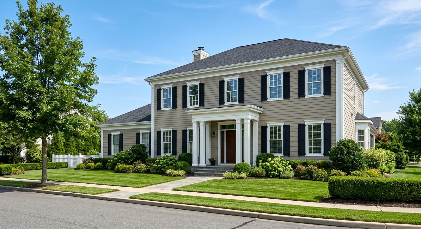
Beyond those three core spaces, the color has built a real following as a kitchen cabinet color. Its putty warmth reads well against both light countertops and richer stone surfaces, and it holds up alongside brass and warm metal hardware particularly well. Home offices benefit from its calm, focused quality. For exteriors it is available in exterior formulas and reads as a warm, contemporary siding or trim color, though the green-gray undertone is more noticeable in full sun, so sampling outdoors first is especially important.
Orientation matters more with Urban Putty than with a straightforward warm beige. South and west-facing rooms with strong afternoon light will bring out the warmth and may even pull the yellow notes forward. North and east rooms are where the gray-green undertone is most likely to become prominent. If your room runs north, sample on a large board and check it both in daylight and under your artificial light before deciding.
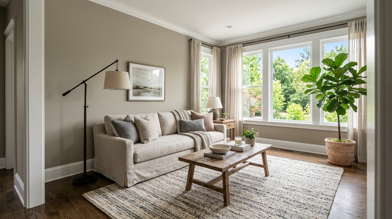
Urban Putty gives a living room an earthy, settled quality that works whether your furniture is mid-century, traditional, or transitional. The LRV of 53.9 keeps the space feeling open in average-sized rooms with standard windows. Pair with Peppercorn (SW 7674) for trim or built-ins and the contrast is sharp enough to feel intentional.
In a bedroom the warmth reads as restful rather than stimulating, making it an easy choice for walls in spaces meant for winding down. It works particularly well with warm wood tones in furniture and brass bedside hardware. Marshmallow (SW 7001) on the ceiling keeps the room airy without clashing.
Dining rooms with warm artificial light at dinner time benefit from Urban Putty's tendency to deepen and warm under incandescent or amber LED sources. The cozy quality that emerges suits a dining setting well. Panda White (SW 6147) on the trim keeps the room crisp during the day.
Urban Putty has a genuine following as a cabinet color, and the research supports it. It sits between white and gray-green cabinet trends without fully committing to either, which gives it real staying power. Brass pulls and warm-toned hardware are the obvious choice here.
The calm, grounded quality that makes Urban Putty work in bedrooms translates directly to a home office. It is not distracting and not sterile. In rooms with strong artificial lighting, check for any green-gray shift before committing, since task lighting can activate that undertone.
Urban Putty is cooperative with a wide range of neutrals and accents, but it shows best when you pair it with colors that either anchor the warmth or provide clear contrast against it. Panda White (SW 6147) and Marshmallow (SW 7001) both work as trim and ceiling options, offering light, clean relief without going stark white. For a deeper, more grounded contrast, Peppercorn (SW 7674) is a natural companion. Its cool charcoal-gray pulls against Urban Putty's warmth in a way that feels contemporary and deliberate rather than expected.
Brass, unlacquered or satin, is the hardware story most reviewers gravitate toward, and the research backs that up. The warm undertone in Urban Putty reads in harmony with gold-toned metals in a way that cooler greiges often cannot pull off. For soft furnishings, warm creamy whites, camel leather, olive linen, and muted terracotta all play well. Cooler blues and blue-grays can work as accent colors in pillows or artwork, but a heavily cool-dominant palette risks surfacing the green-gray undertone more than you might want.
All comparisons are matched against Urban Putty at LRV 53.9.
Pairing Urban Putty walls with a distinctly cool gray-blue on trim or cabinets creates a tonal fight. The gray-green undertone in Urban Putty that emerges in certain lights will compete with the cool trim rather than recede, and the whole room can feel murky and unresolved.
A stark, blue-white ceiling above Urban Putty walls throws the color's warmth into sharp and unflattering contrast. The ceiling reads cold and the walls read dirty by comparison, robbing the room of the cohesive, calm quality that makes Urban Putty appealing in the first place.
Urban Putty's warm, earthy undertone does not make peace with cool chrome or brushed nickel hardware. The contrast is not interesting in a modern way; it simply makes the hardware look out of place and can activate the color's less flattering cooler notes on surrounding surfaces.
Urban Putty SW 7532 is a warm putty greige, sitting between beige and taupe with just enough gray to keep it from reading as a flat sandy neutral. It has a soft, earthy quality that feels both contemporary and timeless, and it falls in the light shade category with an LRV of 53.9.
The undertones are genuinely layered and not uniform across all light conditions. The base reads as warm beige-taupe, which is the broad consensus. Depending on your room's orientation and light source, you may also notice a subtle gray-green cast, a gentle yellow warmth, or a faint red depth. North-facing rooms are most likely to surface the gray-green. South and west rooms tend to amplify the yellow or red warmth.
Urban Putty is warm overall. It sits on the warmer side of the greige spectrum and reads noticeably warmer than cooler gray-taupes. The gray component is subordinate to the warmth rather than dominant. That said, the green-gray undertone can surface in specific lighting situations, particularly in rooms with cool, indirect daylight, which is why sampling in your actual space matters.
The precise LRV of Urban Putty SW 7532 is 53.9. That puts it solidly in the medium brightness range. It reflects enough light to keep a room from feeling closed in, but it has enough depth to give walls real presence. It is lighter than many popular medium greiges but is not a near-white.
Sherwin-Williams code is SW 7532. The hex value is #CFC0AB and the RGB values are 207, 192, and 171.
Panda White (SW 6147) and Marshmallow (SW 7001) work well as warm white trim and ceiling options. Peppercorn (SW 7674) provides a deep, cool-charcoal contrast that reads modern and intentional next to Urban Putty's warmth. For hardware, brass and satin brass are the standout pairing, consistently called out in real-world reviews. Warm wood tones, camel leather, olive linen, and muted terracotta all complement the color in soft furnishings.
Yes on both counts, with some caveats. For kitchen cabinets it has a genuine following and the warm putty tone holds up well alongside brass hardware and both light and richer countertop materials. For exteriors, Urban Putty is available in exterior formulas and reads as a warm, contemporary siding or trim color. In full outdoor sun, the green-gray undertone can be more noticeable, so sampling on the actual exterior surface in your yard's light conditions is especially important before committing.
