Sand Beach lands on the wall as a soft, warm beige that genuinely earns its name. Think of dry shoreline sand in afternoon light, settled and calm, with enough warmth to feel inviting but enough restraint to stay out of the way of your furniture and art. At LRV 56.8 it sits comfortably in light-to-mid territory, meaning it reads as a proper color rather than a near-white, but never feels heavy or cave-like on typical residential walls.
Lighting changes its personality in meaningful ways. Under bright natural light, especially in south- or west-facing rooms, it lifts and reads airier, almost like a warm cream with a sandy blush. In low light or under warm incandescent bulbs, the subtle gray undertone the color carries comes forward just enough to add depth and seriousness without tipping into taupe. North-facing rooms are worth testing first; the gray can become more assertive there, and some people love that cooler, sophisticated read while others find it at odds with what they expected from a sand-colored beige.
The undertone picture here is genuinely interesting and worth sitting with, because reviewers and designers do not all agree on what they see. Sherwin-Williams files Sand Beach in the Yellows and Golds family, and in warmer light that classification makes sense: there is a honey-adjacent warmth at its base. But most independent reviewers note a second layer, a faint gray undertone that keeps it from ever reading overtly golden or yellow the way a traditional warm beige might.
That gray component is the source of most of the disagreement you will find in real-world reviews. Some people put up a large sample expecting a beachy tan and feel it pulls cooler and more neutral than anticipated, especially in rooms with northern exposure or cool-balanced LED lighting. Others in warm-light rooms report it reads almost exclusively as a soft sandy beige with no gray detectable at all. Both camps are correct for their conditions. The practical takeaway is that Sand Beach occupies a genuinely middle ground: warm enough to feel cozy and grounded, but tempered enough by that gray whisper to stay adaptable across a range of room orientations and light sources. It is not a safe, washed-out nothing-color, but neither is it a statement yellow-beige. That balance is precisely why it shows up in so many whole-house palettes.
Sand Beach works across a wide range of spaces, and its appearance in whole-house palettes is not accidental. Because it does not lean hard in any one direction, it carries consistently from room to room without clashing with itself as light conditions shift. Living rooms and main-level common areas are where it earns the most praise: it reads warm and welcoming without the fussiness of a more saturated color, and it gives furniture and textiles room to do their job.
Bedrooms are another natural fit. The sandy warmth reads restful rather than stimulating, and in spaces with softer, warmer lighting the color settles into something genuinely cozy. It suits coastal chic interiors especially well, but it handles modern farmhouse and rustic aesthetics just as comfortably. Entryways benefit from it too, since it gives a home a grounded, warm first impression without committing to anything too bold.
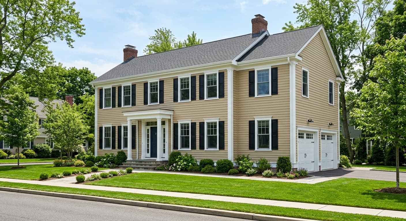
Exterior use is supported both by Sherwin-Williams availability in exterior formulas and by independent reviewers who find it performs well on siding and trim contexts. On facades with natural wood accents, stone, or brick, the sandy warmth ties materials together without competing. Cabinets are a less common application and worth a careful sample test first; at LRV 56.8 it has enough mid-tone depth to work on cabinetry in warmer kitchens, but in cool-lit or north-facing kitchens the gray undertone can read muddier than expected on large flat cabinet faces.
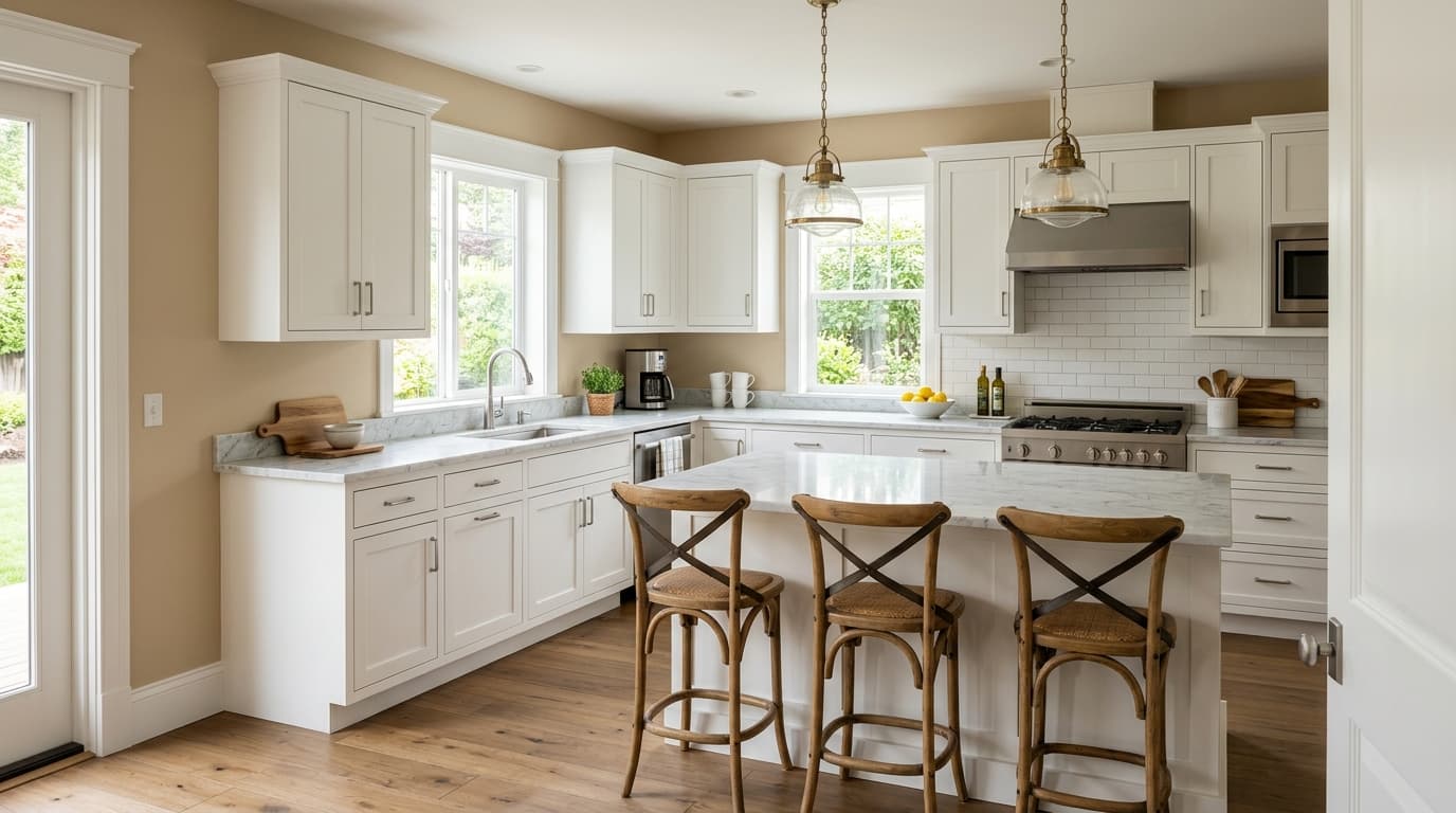
This is the room Sand Beach shows up in most consistently across independent reviews, and for good reason. It gives a warm, welcoming read without locking you into a specific style, so furniture in leather, linen, or cotton all coexist comfortably. Pair with warm wood floors and Panda White trim and the room feels grounded but not heavy.
The sandy warmth reads restful in sleeping spaces, and warm-toned bedside lighting will reinforce the cozier side of the color. It suits both master bedrooms and guest rooms, since it feels personal without being polarizing. Layer in natural textiles like linen duvet covers and woven throws to bring out the coastal, relaxed quality of the hue.
Sand Beach makes a strong first impression in entries because it reads warm and calm rather than stark or aggressive. It transitions naturally into adjacent rooms if you are running it through a whole-house palette. Add a natural wood console or rattan mirror and the sandy quality of the color comes through immediately.
On siding, Sand Beach works well with warm stone, brick, and wood trim details. It reads as a soft, sandy tan rather than a flat beige from the street, which gives a home genuine curb presence without being loud. Pair with crisp white trim or deeper green shutters for contrast that feels intentional.
In a home office with warm lighting, Sand Beach is calm enough to avoid distraction while still feeling like a considered, finished room. The slight gray undertone in cooler or north-facing office spaces can add a more focused, serious quality that some people actively prefer. Test a large sample under your actual work lighting before committing.
Sand Beach pairs most naturally with colors that either anchor it or lift it, and the coordinating palette Sherwin-Williams suggests does exactly that. Panda White (SW 6147) is the obvious trim and ceiling choice: a warm white that echoes the sandy base of Sand Beach without competing with it, keeping the overall look cohesive rather than patchy. Use it on baseboards, window casings, and doors for a soft, pulled-together finish.
For contrast and life, Urban Jungle (SW 9117) and Jade Dragon (SW 9129) both bring deeper olive-tan and sage-green energy that feels right at home against a sandy beige wall. These work as accent wall colors, cabinetry choices, or exterior door colors. Beyond the official palette, the color responds well to natural materials: warm wood tones, rattan, linen, and jute all reinforce the coastal, grounded feeling the color sets up. Keep metals in brushed brass or matte black territory; polished chrome can bring out the gray undertone more than you might want.
All comparisons are matched against Sand Beach at LRV 56.8.
Sand Beach carries a warm sandy base that will read muddy or tired next to cool blue-gray or blue-based gray upholstery and case goods. The two undertone families work against each other rather than creating contrast.
A cool, blue-white trim will pull the gray undertone in Sand Beach to the surface and make the wall read muddier and less warm than it is. This is one of the most common complaints from people who find the color disappointing after painting.
Gray-blue laminate, cool-toned tile, or purple-gray stone flooring creates undertone conflict with Sand Beach that makes both surfaces look off rather than intentional.
Sand Beach is a warm, soft beige named for the sandy tone of a sun-warmed shoreline. It sits at LRV 56.8, which puts it solidly in light-to-mid territory: not a near-white, not a deep neutral, but a calm, grounded beige with genuine color presence on the wall.
The base undertone is warm and sandy-beige, consistent with its placement in Sherwin-Williams' Yellows and Golds family. But there is also a faint gray undertone that keeps it from reading overtly golden or yellow. That gray component is subtle but real, and it becomes more apparent in north-facing rooms or under cool-balanced LED lighting. In warm natural or incandescent light, the sandy warmth dominates and the gray recedes.
Sand Beach is a warm color. Its sandy beige base is grounded in warm, yellow-adjacent territory. The faint gray undertone keeps it from being a pure warm beige and gives it versatility, but it is not a cool or gray-dominant neutral. Most people and most lighting conditions will read it as warm.
Sand Beach has a precise LRV of 56.8. That puts it in the light-to-mid range, bright enough to feel open and airy in most rooms but with enough depth to read as a real, intentional color rather than a washed-out background tone.
Warm whites work best for trim and ceilings, and Panda White (SW 6147) is the coordinating choice designed to complement it directly. For contrast and depth, Urban Jungle (SW 9117) and Jade Dragon (SW 9129) bring olive and sage green energy that pairs naturally with a sandy beige base. Natural materials such as warm wood, rattan, linen, and jute reinforce the relaxed coastal quality of the color. Keep metals in warm or matte finishes rather than cool chrome to avoid pulling the gray undertone forward.
Sand Beach is Sherwin-Williams code SW 7529. The hex value is #D4C5AD and the RGB breakdown is 212 red, 197 green, 173 blue.
For exteriors, yes. Sand Beach is available in exterior formulas and reads as a warm, grounded sandy tan on facades, pairing well with natural wood, stone, and brick details. For front doors, it is a softer choice that works in coastal and farmhouse contexts, though deeper coordinating colors like Urban Jungle (SW 9117) will make a bolder statement. For cabinets, proceed with caution and sample first. At LRV 56.8 it has enough mid-tone body to work on cabinetry in warm-lit kitchens, but in cool or north-facing spaces the gray undertone can read flat or muddy on large cabinet faces.
