Touch of Sand reads as a soft, warm sandy beige on the wall. It sits at LRV 58.5, which puts it squarely in medium-light territory. It reflects enough light to keep a room feeling open without washing out to near-white, and it holds enough depth to register as a real color rather than a filler neutral.
In good natural light it looks like clean, sun-warmed sand, calm and refined. It has a gentle mix of beige and taupe that keeps it from feeling flat. Sherwin-Williams files it in the orange family, and that classification is meaningful, because even though the color reads soft and understated, there is a warmth baked in that can shift under different lighting conditions. Some reviewers see a subtle pink or peach tint emerge under warm artificial light or against certain flooring tones. Others read it as a straightforward sandy tan. That range of perception is real, and it is exactly why sampling on your actual wall matters.
On large wall surfaces the color stays cohesive and easy to live with. It does not dominate or compete with furnishings. In a room with limited natural light it can deepen slightly and lean cozier. In a bright, south- or west-facing room it can feel almost creamy and airy. Either way it maintains its sandy, relaxed quality.
The undertone story on Touch of Sand is more layered than a simple label like "beige" suggests. Sherwin-Williams assigns it to the red and orange color family, which is a meaningful signal. Beneath the sandy surface there are subtle warm undertones that can read pink, peach, or orange depending on the light and the materials around it.
Many reviewers describe it as a warm sandy neutral and stop there, finding the undertones pleasant and unobtrusive. Others flag a soft pink or rosy lean, particularly under warm incandescent or LED bulbs, or when placed next to warm-toned wood floors or yellow-adjacent finishes. That pink quality is never saturated or obvious, but it can be enough to shift the feel of a room if you were expecting a straightforward tan. It is worth being aware of, not alarmed by.
In cooler or more neutral light, such as north-facing rooms or spaces with cool-white daylight bulbs, the pinkish quality tends to recede and the color settles into a more neutral sandy beige. If you are comparing it side by side with similar colors like Sand Dollar or Accessible Beige, look specifically at how each one behaves in your own light. Sources do not all agree on whether the pink lean is noticeable in everyday use, and that disagreement is honest: the effect is real but context-dependent. Warm flooring, warm trim, and warm artificial light all amplify it. Cooler or more neutral surroundings keep it reading as a clean sandy beige.
Touch of Sand works as a whole-house neutral because its LRV of 58.5 and soft warmth stay livable across different room types and orientations. It suits living rooms, bedrooms, and transitional hallways especially well. It has a relaxed, grounded quality that reads inviting without being heavy.
It performs particularly well in beach house and coastal interiors, where its sandy warmth supports a natural, unhurried palette. In a living room it creates a backdrop that is warm but not demanding, so furniture and textiles do most of the visual work. In a bedroom it reads calm and restful. Designers frequently use warm sandy beiges in this LRV range for open-plan spaces where the color needs to carry across living, dining, and kitchen areas without clashing.
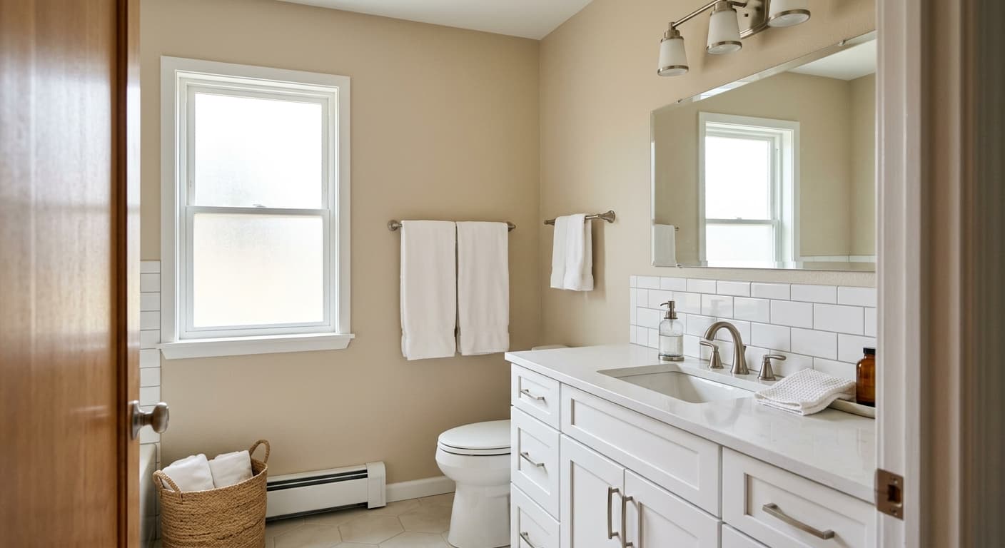
For orientation, south- and west-facing rooms will bring out its warmth most fully, leaning slightly golden or peachy in strong afternoon light. North-facing rooms are where it tends to be most neutral and behave most predictably as a sandy beige. East-facing spaces get cooler afternoon readings, which can temper its warmth nicely in climates with intense morning sun. On exteriors it holds up well and suits transitional, craftsman, or coastal home styles. For cabinets it can work as a soft, warm option, though the pink undertone, if present in your light source, will be more apparent on large flat cabinet faces than on walls.
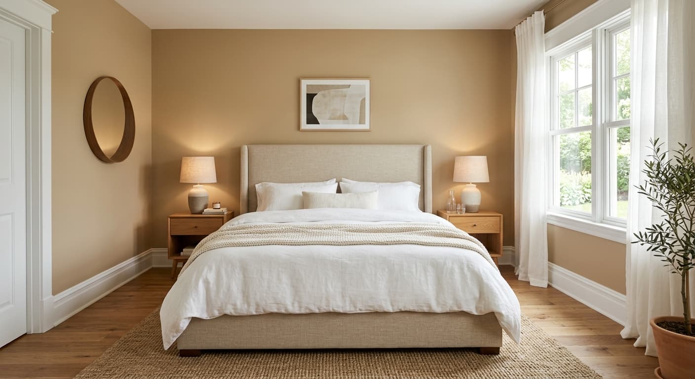
Touch of Sand gives a living room a warm, settled feel without reading heavy or dated. Its LRV of 58.5 keeps the space bright enough in rooms with reasonable natural light. Pair it with natural wood furniture and warm white trim for a cohesive, relaxed look.
In a bedroom Touch of Sand reads calm and cozy, especially in the evening under warm artificial light where its sandy warmth deepens slightly. It works well with linen bedding, warm wood tones, and soft terracotta accents. Keep trim in Modest White or Westhighland White to maintain the warm, restful palette.
Because it is a medium-light neutral at LRV 58.5, Touch of Sand is one of the more practical whole-house colors in this family. It stays consistent across living areas, hallways, and bedrooms without fighting with itself room to room. Sample it in your darkest room first to confirm it reads sandy rather than dingy in lower light.
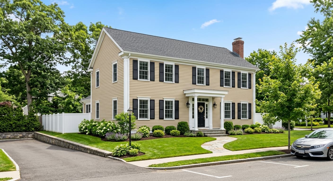
Touch of Sand is available in exterior formulas and suits coastal, transitional, and craftsman home styles well. In full sun its sandy warmth shows clearly and reads welcoming. Pair with a deeper trim in Tiki Hut territory or go crisp with Westhighland White for a clean contrast.
This is where Touch of Sand feels most at home. Its sandy, warm beige quality supports natural materials, sea-glass accents, and soft blues without requiring any forced styling. It reads like the inside of a well-kept beach cottage, comfortable and unfussy.
Touch of Sand pairs cleanly with whites that share its warmth without competing. Modest White and Westhighland White both work well as trim choices, keeping the overall palette in the same warm register and avoiding any cool or blue-white contrast that would make the sandy wall color look muddy. If you want a slightly crisper separation between wall and trim without going stark, Westhighland White is a reliable choice because it is warm enough to harmonize but light enough to define the edge.
For depth and contrast, Tiki Hut brings a richer, earthier brown that grounds the palette and suits coastal or nature-forward interiors. Soft blues and blue-greens are a natural partner for sandy beiges in this family, playing up the beach-house quality of the color. Warm wood tones, natural linen, woven textures, and muted terracotta accents all sit well next to Touch of Sand without pulling its undertone in an unexpected direction.
All comparisons are matched against Touch of Sand at LRV 58.5.
Pairing Touch of Sand with a cool or blue-toned gray trim creates an undertone conflict. The sandy warmth of the wall and the cool lean of the trim pull against each other, and the wall can start to look faintly pink or muddy by comparison.
A stark cool-white ceiling will create an awkward temperature gap with Touch of Sand walls. The contrast can make the wall color look dingy or overly warm rather than sandy and intentional.
Gray slate, cool limestone, or blue-veined marble flooring can pull the pink undertone out of Touch of Sand more noticeably, because the cool floor and warm wall are working against each other rather than harmonizing.
Touch of Sand is a soft, warm sandy beige. It sits at LRV 58.5, making it a medium-light color that reads open and airy while still registering as a real, warm neutral on the wall. It has a calm, sandy quality with subtle warmth that can lean slightly peach or pink in certain light conditions.
Sherwin-Williams files Touch of Sand in the red and orange color family, which tells you something real about its undertone. Reviewers describe subtle pink and peach undertones beneath the sandy surface. In warm artificial light or next to warm wood flooring, that pink lean can become more apparent. In cooler or more neutral light it settles into a straightforward sandy beige. The undertone is soft and not saturated, but it is worth sampling in your actual space before committing.
It is warm. Touch of Sand has a sandy, beige base with orange-family undertones that keep it firmly in warm neutral territory. It never reads cool or gray. The warmth can vary in intensity depending on your light source, leaning peachy under warm bulbs and more neutrally sandy in natural daylight.
The LRV of Touch of Sand is 58.5. That puts it in the medium-light range. It reflects enough light to feel open and uncrowded in most rooms, but it has enough depth to read as a deliberate color choice rather than an off-white.
The Sherwin-Williams color code is SW 9085. The hex value is #D5C7BA and the RGB values are 213, 199, 186.
Warm whites make the best trim choices. Modest White and Westhighland White both coordinate well without introducing a cool contrast. For depth and grounding, Tiki Hut works as a richer accent or exterior trim color. Soft blue-greens suit the coastal quality of this color for accents and accessories. Natural textures like linen, jute, and warm wood tones all sit comfortably in this palette.
For exteriors, yes. Touch of Sand is available in both interior and exterior formulas and suits coastal, transitional, and craftsman styles. On a front door it reads as a warm, welcoming sandy neutral that is more interesting than beige but not bold. For cabinets it can work, but keep in mind the pink or peach undertone will be more visible on large flat surfaces like cabinet faces than on walls, so sampling in your kitchen light is especially important before committing.
