Soft Suede reads as a light-to-medium warm greige on the wall. It is not an off-white and not a bold color, but it sits firmly in the middle of that popular beige-greige zone where a room feels grounded without feeling heavy. At LRV 57.2 it reflects enough light to keep a space open and airy, yet it carries enough color presence that you notice it, which is exactly what makes it useful as an everyday neutral.
The chroma is deliberately low. That restraint is the point. Soft Suede does not shout or demand attention, but reviewers consistently note that the quiet undertone complexity saves it from ever feeling flat or dull. There is a suede-like softness to it, a muted earthiness that gives walls gentle depth without any of the harshness you get from bright whites or saturated beiges. In warm natural light it leans a little more beige. Under cooler or overcast light it pulls slightly toward a taupe-gray. Either way it stays solidly neutral and never tips into an unexpected territory that surprises you after the paint dries.
The official editorial read is warm, tan, and suede, and most reviewers land in roughly the same place. Soft Suede carries a warm undertone that registers as a blended mix of beige and soft taupe-gray. It is not a pure yellow-beige and not a cool gray. The warmth is gentle and balanced, which is a large part of why it works so reliably in varied lighting conditions and across different rooms.
Where reviewers start to diverge is in how much they emphasize the gray side versus the beige side. Some describe it as a warm beige with a subtle gray veil, reading closer to a true greige. Others call it more of a light muted tan with just a whisper of gray that only surfaces in northern or shaded light. Neither camp is wrong. The color genuinely shifts depending on your light source and what surrounds it. In a room with warm incandescent or warm LED lighting, the beige and tan quality dominates and the gray recedes almost completely. In a north-facing room or under cool daylight bulbs, the taupe-gray side becomes more visible and the color can read almost like a warm gray.
There is no significant green, purple, or pink undertone reported by independent reviewers, which sets Soft Suede apart from some neighboring greiges that cause those color-shift headaches. That relative undertone cleanliness is one reason it photographs well and works across a wide range of furnishing palettes. If you are placing it next to cooler whites or grays on trim, expect the warm quality to become more pronounced by contrast.
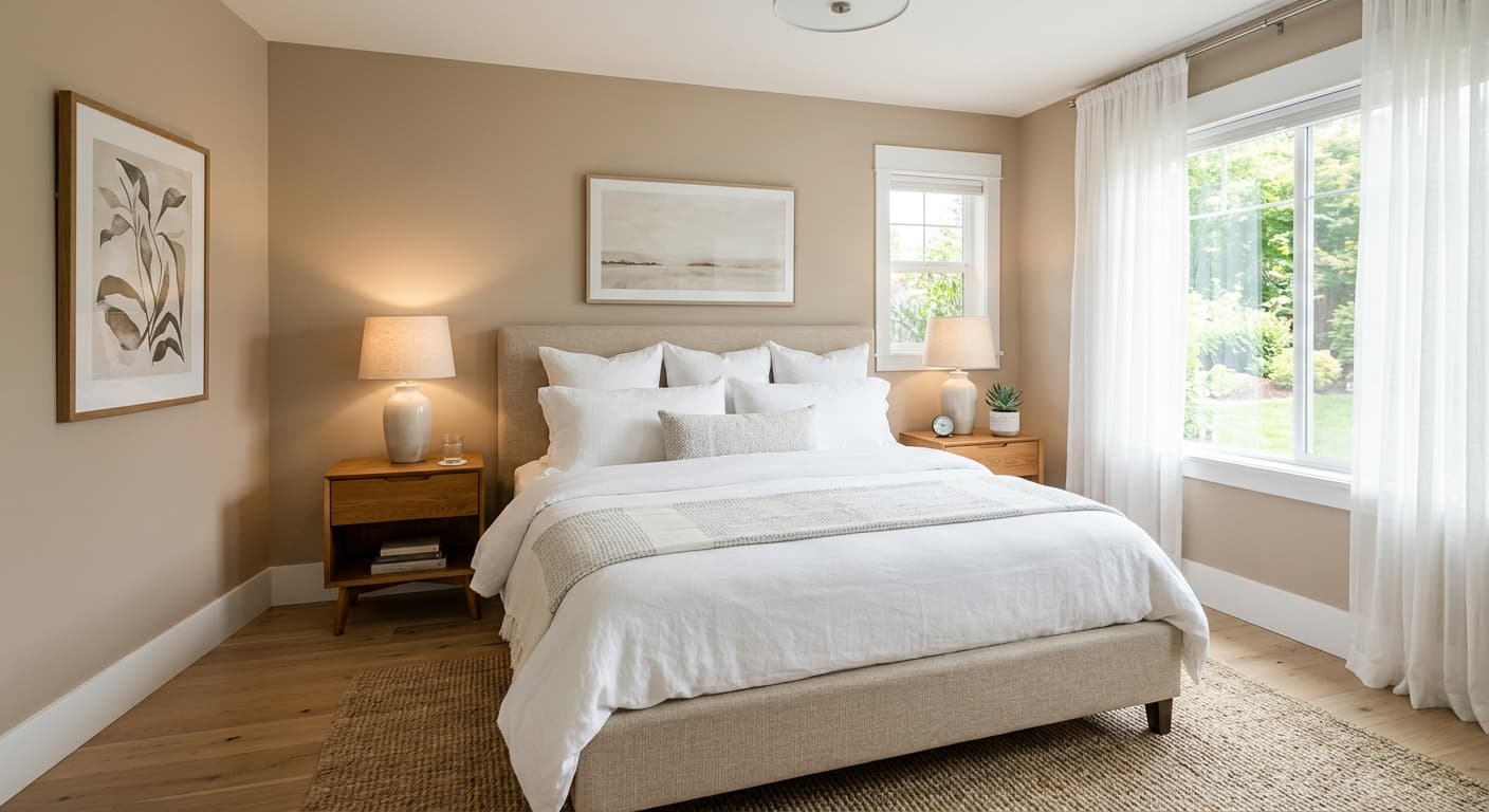
Soft Suede is a natural whole-house color. Its LRV of 57.2 is high enough to carry comfortably through hallways and rooms that do not get a lot of direct sun, and the warm neutrality means it does not fight with adjacent spaces when used throughout an open floor plan. Reviewers point to living rooms and bedrooms as the strongest applications, and the color's cozy, suede-like quality makes bedrooms feel settled and restful without being somber.
In south- and west-facing rooms with plenty of warm natural light, Soft Suede leans into its tan side and feels genuinely inviting. It suits traditional interiors, layered natural spaces, and transitional rooms that mix older furniture with newer pieces. It reads at home with linen upholstery, rattan and cane furniture, natural wood tones from light oak to medium walnut, and cream or antique-white textiles. In north- or east-facing rooms it still works, though the taupe-gray undertone becomes more present, which can actually read as sophisticated rather than cold.
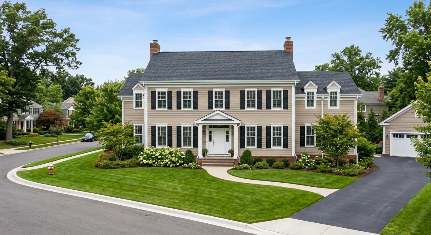
Beyond the primary living and sleeping spaces, it translates well to home offices and kitchens where you want a neutral that is warmer than a typical gray but more refined than a saturated beige. As a whole-house selection it gives each room a connected feel without every space looking identical, because the color shifts just enough with changing light to feel fresh from room to room. Its availability in both interior and exterior formulas also makes it a reasonable candidate for exterior trim, siding, or even a front door in the right architectural context.
Soft Suede is well suited for living rooms where you want a warm, approachable neutral that holds up through changing daylight. The LRV of 57.2 keeps the space from feeling boxed in even on cloudy days. Pair it with natural wood furniture and cream or linen textiles to bring out the suede warmth.
The muted, earthy quality of Soft Suede makes bedrooms feel restful rather than sterile. It does not carry the brightness that can feel activating in a sleep space, and at LRV 57.2 it keeps the room from going too dark. Layer warm-toned bedding and wood nightstands for a cozy, settled result.
For a home office, Soft Suede gives you a neutral that is calm enough to focus in but warmer and more interesting than a flat gray. It reads professional and collected without being cold. It works in east-facing offices where morning light brings out the beige side, and still holds its warmth through the afternoon.
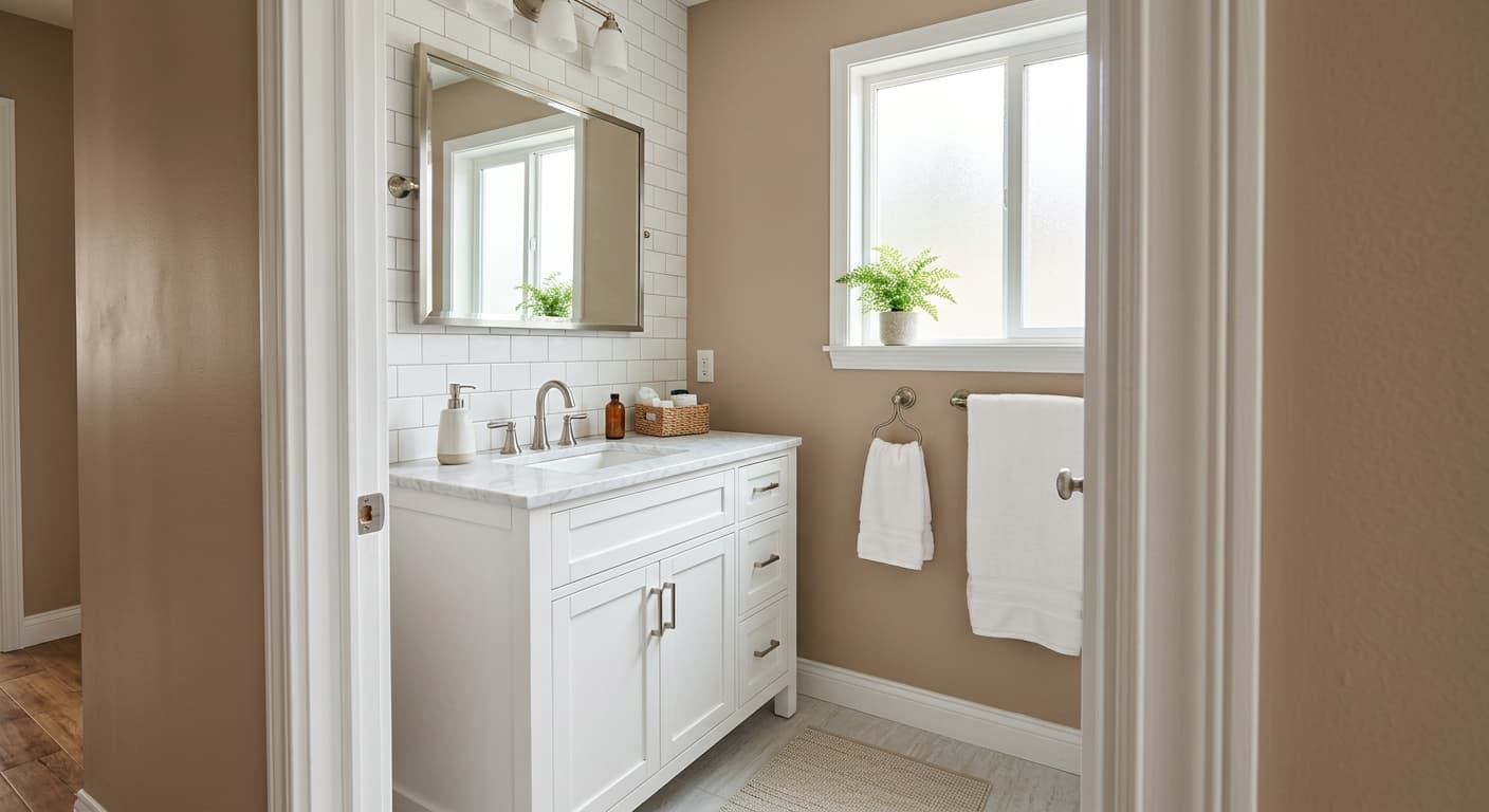
On kitchen walls, Soft Suede pairs well with natural wood cabinetry or white shaker cabinets, and it complements warm-toned countertops in butcher block or earthy quartz. Use Hibernate SW 9573 on an island for contrast that stays within the same warm family. The color does not compete with food-oriented palettes the way brighter or cooler neutrals sometimes do.
Hallways benefit from Soft Suede's mid-high LRV of 57.2 because the color holds its warmth even in spaces with limited natural light. It transitions smoothly between rooms when used as a whole-house color. Keep trim in Sunbleached SW 9585 to maintain brightness along the passage without breaking the cohesive flow.
Soft Suede layers easily because its muted warmth does not fight with neighbors. Sunbleached SW 9585 is the natural light companion here, a soft warm white that brightens trim and ceilings without introducing a stark cool contrast. It keeps the palette cohesive and lets Soft Suede read as the grounded mid-tone it is meant to be. For a creamier near-white option, Corallite SW 9698 adds a touch more warmth on millwork and reads harmonious rather than chalky against the suede body color.
For depth and contrast, Hibernate SW 9573 anchors the scheme. Use it on a kitchen island, built-in cabinetry, or an accent wall to give the palette a mid-deep warm gray-taupe grounding note that feels intentional without overwhelming the space. Outside the coordinating family, natural materials do the heavy lifting: light oak or walnut floors, linen and cream textiles, rattan or cane accents, and warm-toned metals like unlacquered brass or aged bronze all reinforce the suede quality of the wall color and keep the overall look settled and layered.
All comparisons are matched against Soft Suede at LRV 57.2.
Pairing Soft Suede with a bright, blue-white or cool-white trim color creates an uncomfortable undertone clash. The trim's coolness pulls out any latent gray in the wall color and makes the whole scheme look unresolved rather than warm and layered.
Cool gray tile or very silvery hardwood can fight against Soft Suede's warm beige-tan quality, making the wall color look dingy or yellowish by comparison rather than warmly neutral.
Navy or bright teal accents that lean blue-green can make Soft Suede look more yellow-orange than it actually is, because the eye exaggerates the opposite temperature when two contrasting tones sit next to each other.
Soft Suede is a light-to-medium warm greige. It sits in the popular beige-greige zone, reading as a muted, earthy warm neutral with enough presence to register as a real color on the wall rather than an off-white. Its LRV of 57.2 keeps rooms open while the low chroma gives it a quiet, suede-like depth.
Soft Suede carries warm, tan, and suede undertones. Most reviewers describe it as a blend of soft beige and gentle taupe-gray. In warm light it leans more tan and beige; in cooler or north-facing light the taupe-gray side becomes more visible. There are no significant green, pink, or purple undertones reported, which makes it more predictable than many greiges in the same range.
Soft Suede is a warm color. The warmth is soft and balanced rather than intense, so it does not veer into yellow-orange territory, but it stays firmly on the warm side of neutral across most lighting conditions.
Soft Suede has an LRV of 57.2. That places it in the mid-to-upper range, bright enough to keep rooms feeling open and to work in spaces with limited natural light, while still reading as a grounded, substantive color rather than a near-white.
The Sherwin-Williams color code is SW 9577. The hex value is #D0C6B8 and the RGB values are 208, 198, 184.
Soft Suede pairs best with warm whites and warm deeper tones. Sunbleached SW 9585 works well as a trim and ceiling color, and Corallite SW 9698 is a creamier near-white alternative for millwork. Hibernate SW 9573 adds depth as an anchor tone on cabinetry or an accent wall. In terms of materials, natural wood tones, linen and cream textiles, rattan, and warm metals like brass or aged bronze all complement its suede-like warmth.
Yes on all counts. Soft Suede is available in both interior and exterior formulas, so it is a valid option for siding, exterior trim, or a front door in a warm, traditional, or transitional architectural context. On cabinets it reads as a warm, sophisticated alternative to white or gray, and it pairs naturally with wood elements and warm hardware finishes.
