Symmetry reads on the wall as a soft, muted beige-greige with a gentle taupe warmth underneath. At LRV 60.6 it lands in that useful middle zone: light enough to keep a room feeling open and airy, grounded enough to avoid the flat emptiness that pure off-whites can carry. It is not a bright color, not a bold one. It is the kind of neutral that reads as calm and settled the moment you see it.
The tone shifts depending on your light source and time of day. In warm afternoon sun it leans more beige and feels cozy. In morning light or in rooms with cooler or more diffuse light it quiets down into a softer, more balanced greige. It pairs equally well with dark wood furniture and light upholstery, which tells you how versatile the underlying tone really is. As a backdrop, it tends to recede gracefully and let the things in a room come forward.
This is where reviewers split, and it is worth understanding the disagreement rather than picking a side. Most sources read Symmetry as a warm beige-greige with a taupe quality, meaning it carries a blend of brown, gray, and just enough warmth to feel inviting. Some describe it as clearly in the warm camp with a soft sandy or linen quality. Others say it sits closer to a balanced near-neutral that does not lean strongly in any direction, which can make it feel almost chameleon-like across different exposures.
In practice, the undertone behavior you see will depend heavily on what is around it. Pair it with crisp bright whites and the greige quality becomes more visible. Pair it with creamy or warm whites, like White Snow (SW 9541), and the warmth reads as cohesive and intentional. In a north-facing room with cooler indirect light, the color can settle into a quiet, somewhat muted greige that sits further from beige than you might expect from a swatch. In a south-facing room it tends to stay warm and linen-like throughout the day.
What you should not expect is any meaningful green, purple, or pink pull. The undertone story here is really about how much warmth versus how much gray is dominant at any given moment, and the answer is genuinely context-dependent. If your adjacent materials, trim, and furnishings run warm, Symmetry will look warm. If your space is cooler and grayer, it will lean that direction without looking wrong.
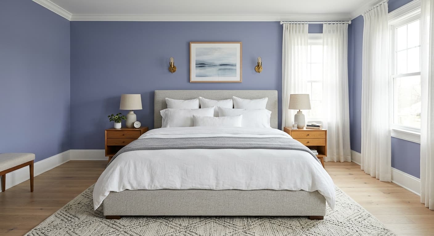
Symmetry earns a place on the walls of bedrooms, bathrooms, and living rooms, and the research backs all three. In bedrooms it creates the kind of quiet, restful atmosphere that lets you exhale when you walk in. It coordinates particularly well with soft blue-purples for a spa-inspired or calming scheme, which makes it a natural fit for primary bedrooms where people are actively trying to dial down stimulation. The muted warmth reads as sophisticated rather than sleepy.
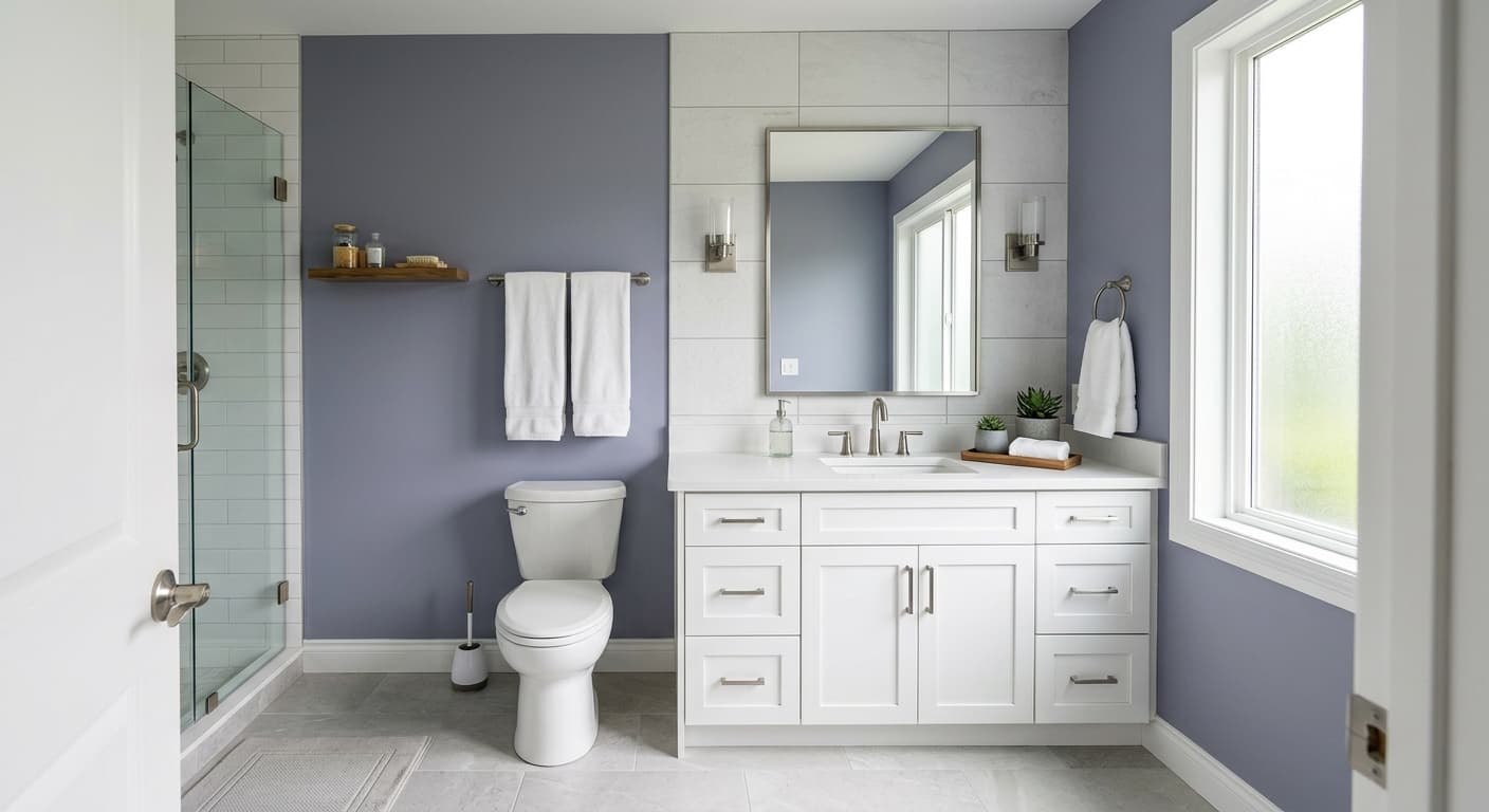
In bathrooms, especially those without abundant natural light, the LRV of 60.6 is genuinely useful. It keeps the room from feeling dim or cave-like without requiring you to go all the way to a near-white. Its association with spa-inspired spaces means it pairs easily with stone tile, warm wood vanities, matte fixtures, and white towels. The muted tone also helps disguise minor wall texture and surface imperfections, which matters in spaces where you are working close to the wall.
For living rooms, Symmetry functions best as a whole-room neutral rather than an accent. It is flexible with both dark and light furnishings, so if you are the type of person who rearranges or updates decor seasonally, it will not fight you. It works in open-plan spaces where it needs to read consistently across multiple exposures. Do keep in mind that south-facing open rooms will bring out the warmth more noticeably, which most people find appealing, while north-facing living rooms will show more of the greige quality.
Symmetry is at its best here. The muted warmth creates a restful backdrop that works with soft blue-purple bedding for a calming, spa-like feel. The LRV of 60.6 means the room stays light without reading stark, even with curtains drawn.
In bathrooms with limited natural light, LRV 60.6 keeps the space feeling open rather than dim. The taupe-greige tone pairs naturally with stone tile, warm wood vanities, and matte white fixtures. It also helps minimize the visibility of minor wall imperfections.
Symmetry reads as a sophisticated whole-room neutral in living spaces, flexible enough to work with both dark and light furnishings. In south-facing rooms the beige warmth comes forward; in north-facing rooms it settles into a quieter greige. Either reading works well.
Because it does not have a strong directional undertone pull, Symmetry can move consistently across connected spaces without looking like a different color in each zone. It reads as cohesive whether a room is flooded with afternoon sun or working with overhead light.
The calm, low-stimulus quality of Symmetry makes it useful in a workspace where you want a warm neutral that does not distract. It pairs easily with warm wood desks and bookshelves and keeps the room feeling grounded without being dark.
Sherwin-Williams pairs Symmetry with White Snow (SW 9541) as a trim and ceiling white, and it is a natural call. White Snow is a soft, slightly warm white that keeps the contrast in the room from feeling stark, preserving the overall cohesive warmth rather than introducing a cool bright-white edge. Smooth Stone and Stony Creek round out the coordinating palette as deeper grounded neutrals that can anchor an accent wall, fireplace surround, or cabinetry in the same room without creating tonal whiplash.
Beyond the coordinating palette, Symmetry takes well to soft blue-purple accents in textiles, bedding, or art. That pairing reinforces the calm, spa-like quality the color already suggests. For a more layered, earthy scheme, warm wood tones, matte black hardware, and natural linen textures all sit comfortably against it. What does not work as well is pairing it with very cool, stark grays or bright saturated colors, which can make the warm undertone look muddy or indecisive.
All comparisons are matched against Symmetry at LRV 60.6.
Pairing Symmetry with a crisp, blue-toned bright white on trim and ceilings can make the wall color look slightly dingy or yellowed by contrast, pulling out whatever warmth is in the undertone in an unflattering way.
Symmetry is a muted, low-saturation neutral. Placing it next to highly saturated jewel tones or bright primaries can make it look flat and unresolved rather than calm and sophisticated.
If your floors are a cool, blue-gray tone, Symmetry can look indecisive on the walls, with neither the floor nor the wall reading as clearly warm or cool, creating a muddy visual tension.
Symmetry SW 9601 is a light warm greige, a blend of beige, gray, and taupe that reads as a soft, muted neutral on the wall. It is neither a stark white nor a deep neutral, sitting at an LRV of 60.6 that keeps rooms feeling open and airy while still carrying warmth and depth.
Symmetry carries warm greige and taupe undertones, though reviewers do not fully agree on how strongly warm it reads. Some describe it as a clearly warm beige, while others see it as a near-neutral that sits between warm and cool. In practice, warm south-facing light pushes the beige forward, while cooler north-facing light reveals more of the greige quality. There are no notable green, pink, or purple pulls.
Symmetry leans warm overall, but it is not a strongly warm color. It sits in greige territory, meaning it has enough gray to feel balanced in many rooms. In warm light it reads as a soft sandy beige; in cooler or more diffuse light it settles into a quieter, more gray-leaning greige. Most people would call it warm, but it will not feel as decisively warm as a golden or honey beige.
Symmetry has an LRV of 60.6, which places it in the light range. That means it reflects a meaningful amount of light and will keep rooms feeling open, but it is not close to white. It will read as a real color on the wall rather than a near-white.
White Snow (SW 9541) works well as a trim and ceiling color, keeping the palette warm and cohesive. For a calming, spa-inspired bedroom scheme, pair Symmetry with soft blue-purple textiles or bedding. Smooth Stone and Stony Creek provide deeper grounded neutral options for accents or adjacent cabinetry. Warm wood tones, natural linen, and matte black hardware all sit comfortably with it.
Symmetry's Sherwin-Williams paint code is SW 9601. The hex value is #D5CBBE and the RGB values are 213 red, 203 green, 190 blue. The LRV is 60.6.
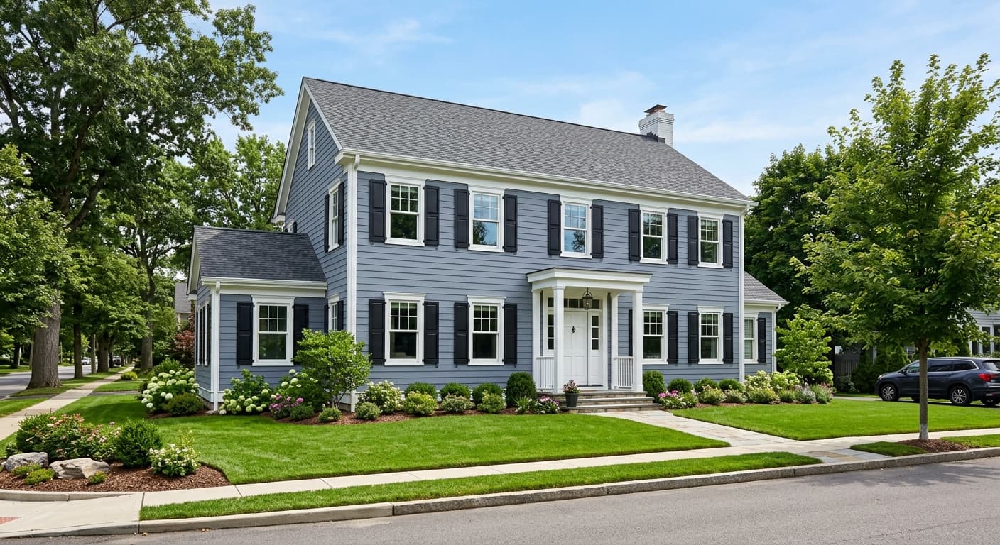
Symmetry is available in both interior and exterior formulas, so it can be used outside. As an exterior body color it would read as a soft warm greige, a solid choice for homes with warm stone, brick, or wood trim accents. For cabinets, the muted tone works best in low-contrast kitchen or bathroom schemes where you want warmth without a strong statement. It is not typically cited as a front door color given its quiet, receding quality, but it could work on a home where you want the door to blend rather than stand out.
