Opaline reads almost white at first glance. Stand back from a freshly painted wall and you will see a pale, clean surface that lets a room breathe. Step closer, or watch it through the day, and the color reveals itself: a gentle blue-green whisper lives underneath that high-reflectance base, keeping it from ever looking stark or flat. With an LRV of 73.1, it sits firmly in off-white territory, reflecting plenty of light while still registering as a color rather than a non-color.
The chroma is deliberately low. This is not a bold teal or a statement green, it is a barely-there pastel that leans atmospheric. That restraint is exactly what makes it versatile. It gives walls a soft, clean quality that designers associate with spa environments and coastal interiors without committing to anything that could feel trendy in five years.
The color is also filed under both whites and blues by different sources, which tells you something useful about how in-between it really is. Depending on your sheen level, the adjacent colors in the room, and the season, it can read as a very soft aqua off-white or as a muted gray-green. That range is a feature, not a bug, but it does mean you need to live with a large sample before committing.
The dominant undertone most reviewers agree on is a cool blue-green, consistent with the hex value of #DCDFD7 and the teal and blue tags in the color database. In bright, sun-filled rooms, the blue side tends to win. The color feels crisp and slightly aquatic without ever becoming aggressive. That cool quality is what makes it so popular for bathrooms, where a spa association is an asset.
Here is where the nuance gets interesting. In north-facing rooms, or any space that relies on artificial light or gets afternoon shade, the green undertone comes forward noticeably. Several reviewers describe it shifting from a soft blue-white in morning light to a muted sage-adjacent tone by evening. This is not a flaw but it is genuinely surprising if you only sample it on a bright south-facing wall. The research consistently flags this as the color's main gotcha: what you see at the paint store under fluorescent light is not the full story.
A smaller contingent of reviewers see a gray component too, particularly under warm incandescent or LED-warm bulbs. Under those conditions the blue recedes and the color can read as a cool gray-green. It is not the primary read, and most sources describe it as a blue-green rather than a gray-green, but if your lighting is predominantly warm, budget for that possibility. Sample it at night under your actual bulbs, not just in daylight.
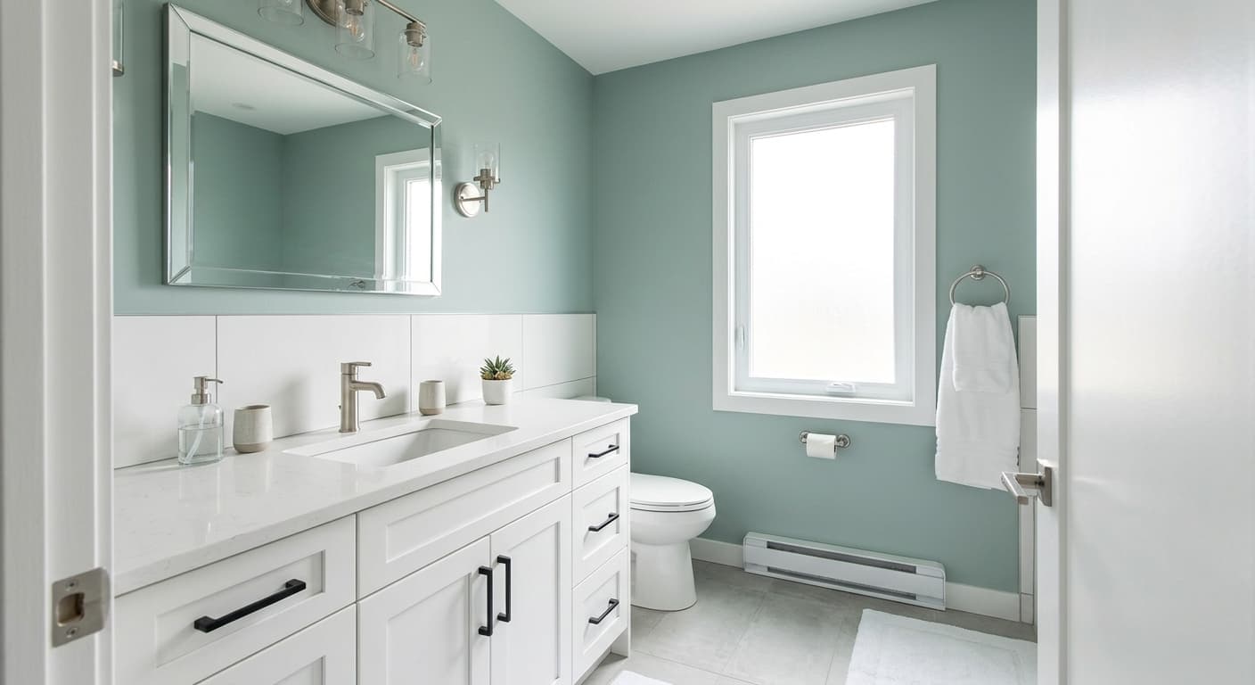
Bathrooms are the strongest match for Opaline. The cool blue-green undertone reinforces the clean, water-adjacent feeling that homeowners want in a spa-style bath, and the high LRV of 73.1 keeps the space from feeling cave-like even in a room with one small window. Multiple reviewers call it out specifically for master baths and powder rooms where a serene, slightly aquatic palette is the goal.
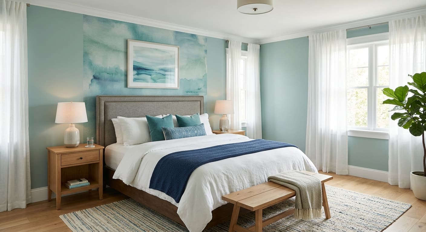
Bedrooms are the second natural home. The color is calming without being cold, airy without being clinical. It works in a primary bedroom where you want something more interesting than a plain white but nothing so saturated that it interferes with sleep or changes mood dramatically across the day. Because it lightens small spaces, it is also a smart pick for guest rooms or children's rooms where square footage is limited.
Kitchens, particularly those with a coastal or cottage direction, are the third recommended use. On kitchen walls or cabinetry it provides a clean, fresh backdrop that pairs naturally with white trim and natural wood tones. Exterior applications are also viable, and the color holds up well on cottage-style facades where the goal is a soft, understated presence rather than a bold statement. In any orientation, a south- or east-facing room will lean bluer and brighter, while a north- or west-facing room will coax out more of the green, so let your room's light exposure inform how confidently you commit.
This is Opaline's strongest application. The blue-green undertone reads as clean and water-forward, which reinforces the spa feeling most homeowners want. Pair it with white tile grout, chrome or brushed nickel fixtures, and Cotton White SW 7104 on the trim for a cohesive, tranquil result.
Opaline brings calm without coldness in a bedroom, which is a harder balance to strike than it sounds at this LRV. It works in both primary and guest rooms and keeps smaller spaces feeling open. Layer in warm textiles like linen or wool to soften the cool undertone and prevent the room from feeling too stark.
On kitchen walls or painted cabinetry, Opaline delivers a fresh, cottage-coastal feel without committing to anything too bold. It pairs naturally with white uppers or white subway tile and benefits from natural wood open shelving, which warms the palette. A south-facing kitchen will keep it looking bright and slightly aqua all day.
The color's low chroma and cool, airy quality make it conducive to focus without the visual noise of a more saturated hue. In a home office with good natural light, it reads clean and fresh rather than institutional. Watch for artificial light: under warm bulbs the green undertone can shift the mood more than expected.
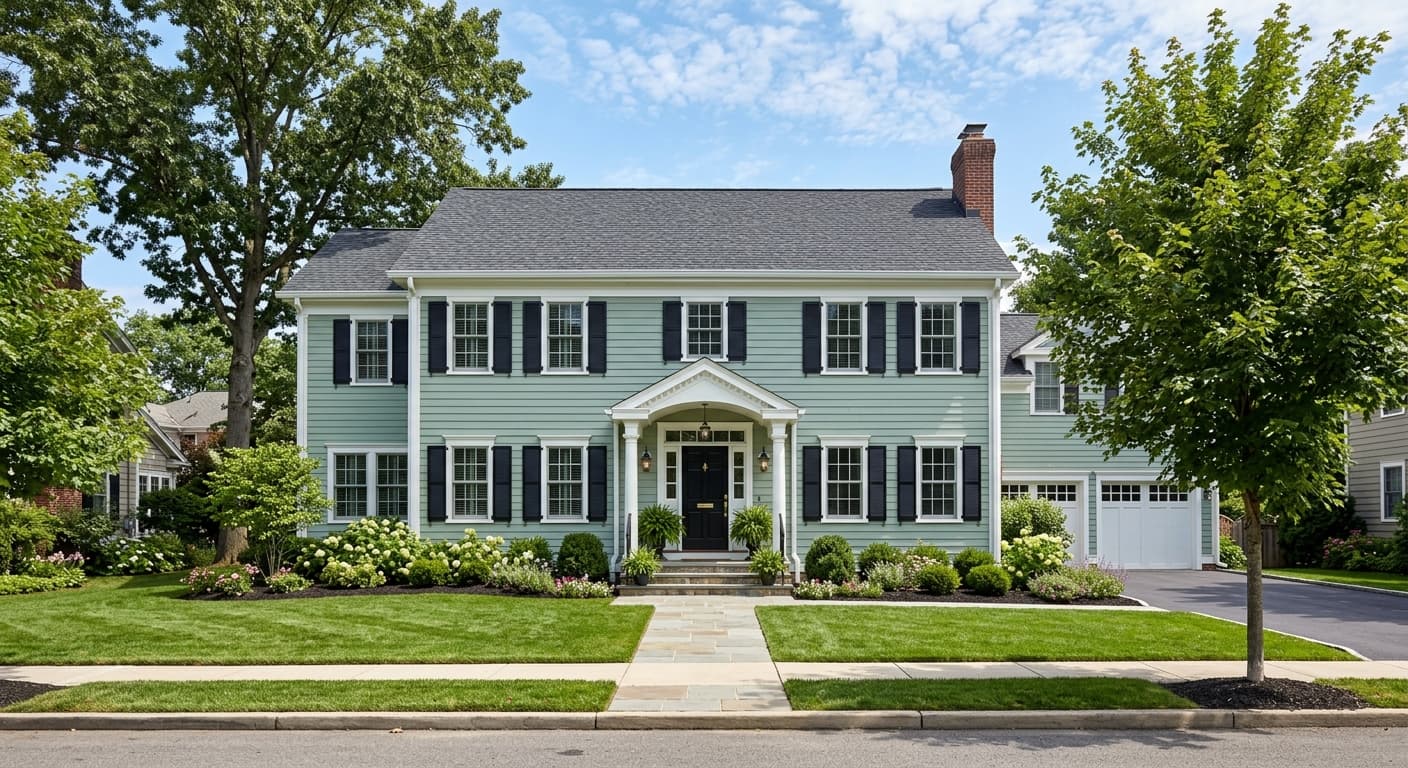
Opaline is available in exterior formulas and suits cottage or coastal facades well. At LRV 73.1 it reads as a soft, pale blue-green in full sun, which works especially well with white trim and natural wood accents. In overcast climates the green will dominate, so consider that regional light quality before committing.
Opaline pairs cleanly with crisp whites on trim and ceilings. Pure White SW 7005 is the most direct choice: it is bright enough to contrast without creating a jarring gap between the two, and its near-neutral character does not compete with Opaline's cool undertone. Cotton White SW 7104 reads slightly softer and warmer, which can be useful if you want to take the edge off the cool blue in a north-facing room without changing the wall color itself.
For accents and adjacent rooms, Pale Moss SW 9027 bridges the gap between Opaline's blue-green base and warmer natural materials like rattan, linen, or light oak. It keeps the palette cohesive without going monotone. On the hardware and material side, the color's cool undertones play well with brushed nickel, chrome, and matte black, and they hold up against natural wood tones that have a cool or gray-brown cast.
All comparisons are matched against Opaline at LRV 73.1.
Opaline's cool blue-green undertone can clash with warm golden woods like honey oak, warm pine, or yellow-toned bamboo flooring. The contrast between warm yellow and cool blue-green reads as muddy rather than complementary and makes both surfaces look off.
Under warm-spectrum bulbs, Opaline's blue recedes and the green undertone becomes the dominant read. Depending on the bulb temperature, it can slide toward a murky gray-green that looks unintentional rather than curated.
Deep terracottas, warm burnt oranges, and rich caramel tones sit on the opposite side of the temperature spectrum from Opaline and can make the wall color look washed-out or oddly greenish in comparison. The contrast is too stark for a harmonious room.
Opaline SW 6189 is a very light, soft blue-green off-white. It reads almost as a white at a glance, but a cool teal-green undertone keeps it from looking flat or stark. Its hex is #DCDFD7 and its RGB values are 220, 223, 215.
The primary undertones are cool blue-green and teal. In bright, sun-filled rooms the blue side tends to dominate. In shadier spaces or under warm artificial light, the green comes forward. A smaller number of reviewers also detect a gray component under warm bulbs, so your lighting environment will influence which undertone you notice most.
Opaline is a cool color. The blue and teal undertones place it firmly on the cool side of the spectrum. It does not carry the yellow, beige, or pink warmth you would find in a warm off-white. If you need to soften the cool quality, Cotton White SW 7104 on trim and warm textiles in the room will help without changing the wall color.
Opaline has an LRV of 73.1. That is high, meaning it reflects a substantial amount of light and helps rooms feel open and airy. It sits in off-white territory rather than mid-tone, so it will not darken a space noticeably even in rooms with limited natural light.
The Sherwin-Williams code is SW 6189. The hex is #DCDFD7 and the RGB values are 220 red, 223 green, and 215 blue.
Pure White SW 7005 and Cotton White SW 7104 both work well as trim colors, with Pure White offering a crisper contrast and Cotton White softening the cool edge slightly. Pale Moss SW 9027 is a natural accent option that bridges Opaline's blue-green base with warmer natural materials. On the material side, brushed nickel, chrome, matte black hardware, and cool-toned wood finishes all complement the color's cool undertone.
Bathrooms are the strongest fit. The blue-green undertone reads clean and spa-like, and the high LRV of 73.1 keeps even smaller baths feeling open. Kitchens with a coastal or cottage direction are also a natural match, either on the walls or on painted cabinetry. For cabinets specifically, the soft cool tone works well with white upper cabinets or white subway tile. It is also available in exterior formulas and suits cottage and coastal facades with white trim.
