Naturel lands in that sweet spot between a pale off-white and a true tan. At LRV 53.5 it has real body, enough that the warm beige tone registers clearly on the wall rather than washing out. It is a mid-tone, so expect it to hold its presence in a room rather than recede into the background. You will see color here, just a composed, muted version of it.
In bright, south- or west-facing rooms Naturel reads as a soft, clean warm beige. Keep the light moving and the tone stays airy without feeling stark. Drop the light, shift to north-facing exposure or artificial bulbs in the warm range, and the color deepens slightly toward a cozier tan. The shift is gradual rather than dramatic, but it is worth noting: what feels open and neutral at noon can feel noticeably warmer and more enveloping by evening lamp light. That behavior is part of the appeal for many people who choose it.
On sample boards it can look almost greige at first glance because the yellow is quiet rather than punchy. Get it up on a full wall next to your trim and flooring and the warmth asserts itself more clearly. It is not a timid color, but it is a well-mannered one.
The yellow undertone in Naturel is real and consistently noted across independent reviews, but it is restrained enough that the color does not read golden or honey-toned. Sherwin-Williams categorizes it under yellow, and that classification holds up on the wall. What you get is warm beige with a gentle yellow base, closer to a sun-warmed linen than to a butter or mustard tone. That subtlety is precisely what makes it versatile.
There is some disagreement worth knowing about. A portion of reviewers read Naturel as almost purely beige with minimal yellow, particularly in cooler or north-facing rooms where the warmth can pull back and the color reads a touch more neutral and even slightly greige. Others in warm, brightly lit spaces report that the yellow comes forward more than they expected, giving the color a tan quality that surprised them. Neither camp is wrong. The undertone is there, it just responds to your specific light conditions and the colors it sits next to.
Your trim color and flooring will push the undertone reading one way or the other. Pair Naturel with a cool or bright white trim and the yellow in the wall color becomes more obvious by contrast. Pair it with a warm cream trim like Alabaster and the whole palette softens into a cohesive warm-neutral story where the undertone blends rather than pops. Medium-toned wood floors with warm grain tend to reinforce the beige and quiet the yellow, while gray-based floors can make the warmth feel more pronounced. Sample first, in your actual room and lighting, and look at it across multiple times of day before committing.
Naturel earns its whole-house label because it bridges rooms without feeling like a compromise in any of them. Living rooms benefit from its warmth without the color feeling heavy, and it handles the shifting light over the course of a day gracefully. Bedrooms are a natural fit because the mid-tone warmth feels comfortable and settled rather than clinical or cold, which aligns with what most people want from a sleep space. Kitchens work too, especially those with warm wood cabinetry or natural stone counters that carry similar warm undertones.
Light orientation matters with any mid-tone neutral, and Naturel is no exception. South- and west-facing rooms give it room to breathe and show its cleaner, airier side. North-facing rooms will deepen the warmth and push it toward a cozier tan quality. That is not a dealbreaker, but if your north-facing room already feels small, test carefully to make sure the deeper read still feels open enough for you. East-facing spaces get good morning light that flatters warm beiges, then shift to shadier afternoon light, so the morning feel will likely be your baseline read.
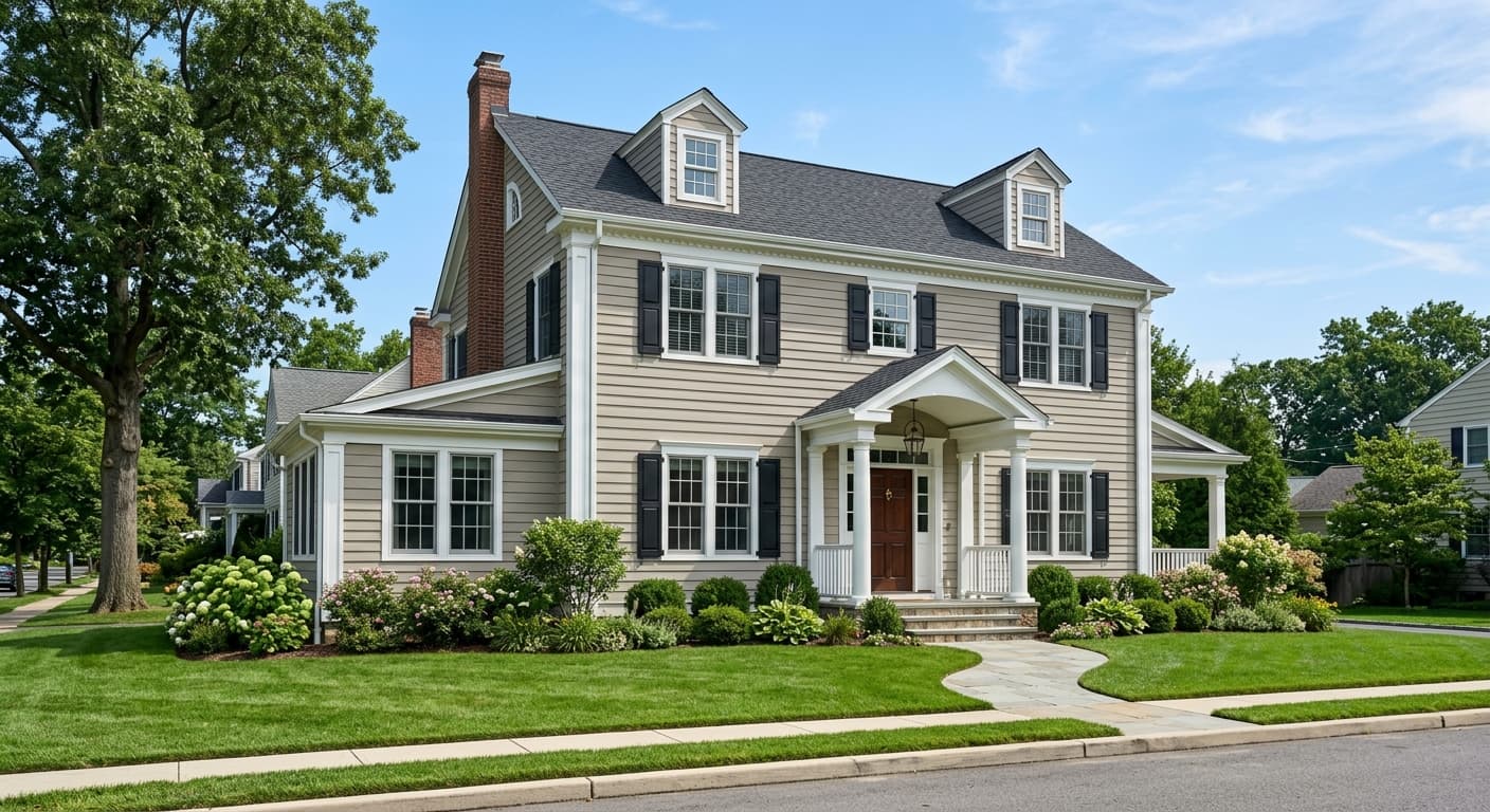
Naturel is available in both interior and exterior formulas. On exteriors it serves well as a body color on craftsman or transitional-style homes, where its warm beige reads grounded and approachable rather than pale or washed out. It handles the increased light exposure of an exterior without going chalky, which is a practical advantage for a mid-tone. Whole-house interior use is straightforward because it coordinates across rooms without creating jarring transitions, especially when you anchor the palette with consistent trim throughout.
Naturel gives a living room warmth without weight, which is hard to find in a single color. It handles the variety of light a living room sees across a day better than paler neutrals, which can read cold in the morning or evening. Pair it with warm wood furniture and cream upholstery for a relaxed, put-together look.
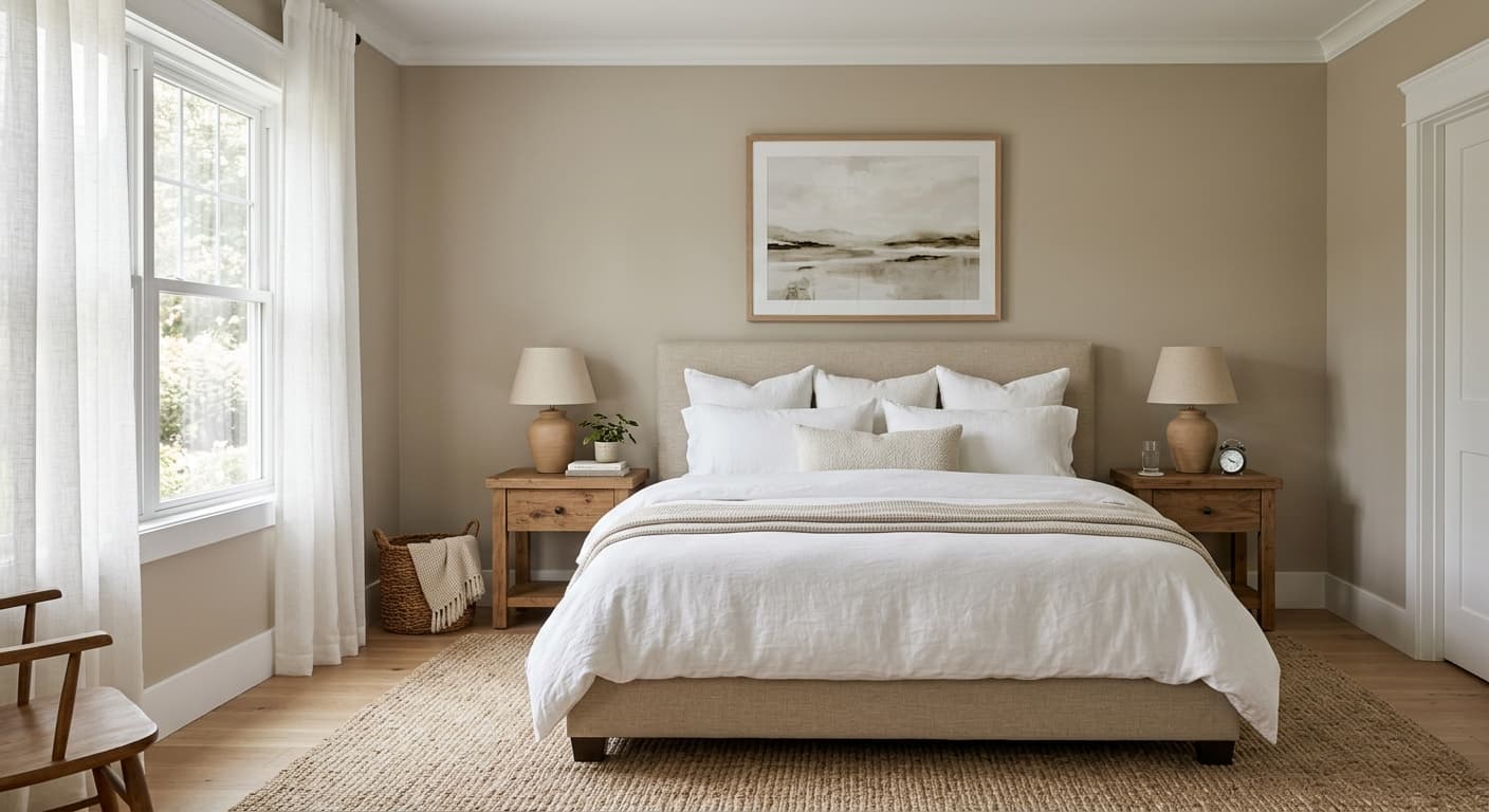
In a bedroom Naturel feels settled and comfortable, the kind of warm neutral that makes a room easy to spend time in without feeling busy. The mid-tone depth means it works with both light and darker bedding palettes. It reads particularly well in bedrooms with warm wood floors or furniture.
Kitchens with warm wood or painted cream cabinetry are a strong match for Naturel on the walls. The warm beige ties together natural materials without competing with them. In kitchens with stainless appliances, the warmth of Naturel keeps the space from reading cold.
Naturel is genuinely suited to whole-house use because it transitions between rooms without tonal clashes. Using consistent warm white trim throughout ties it together. It keeps a home feeling cohesive rather than painted room-by-room.
On an exterior Naturel holds up as a grounded warm beige body color rather than a pale off-white, which can look washed out in full sun. It suits craftsman and transitional-style homes particularly well. Pair it with a deeper warm neutral or earthy trim for contrast.
Naturel pairs most naturally with the warm whites and neutrals in its own tonal family. Alabaster (SW 7008) is the go-to trim companion, its creamy warmth sitting close enough in temperature that the two read as a unified soft palette rather than a sharp contrast. Grecian Ivory (SW 7541) is adjacent to Naturel in the Timeless Colors collection and works as a lighter field color or ceiling color if you want a gentle step up in brightness while staying in the same warm family. For a grounding accent or cabinetry color, Hardware (SW 6172) brings a deeper, more complex warm neutral that contrasts without breaking the palette.
Beyond those three, Naturel takes contrast well when you want more drama. A deep navy or a saturated deep green reads stronger against Naturel's warmth and makes the beige feel more golden by comparison. For a softer layered approach, lean on warm wood tones, natural linen textiles, and aged brass or bronze hardware, all of which sit comfortably in Naturel's temperature zone without competing.
All comparisons are matched against Naturel at LRV 53.5.
Pairing Naturel with a cool or blue-gray trim creates a temperature clash that makes the yellow undertone in Naturel look muddier or more orange than it actually is. The contrast between warm wall and cool trim pulls the undertone in an unflattering direction.
Cool gray flooring, whether tile, laminate, or painted concrete, throws Naturel's warmth into relief in a way that can make the wall color look unintentionally yellow or dingy rather than warmly neutral. The conflict is most visible in the transition zone near the floor.
Stark, bright whites next to Naturel pull its yellow undertone forward sharply, making it look more golden and less neutral than you likely intended. This is especially noticeable on trim, built-ins, or adjacent walls.
Naturel is a soft, muted warm beige with a restrained yellow undertone. It has real body at LRV 53.5, meaning it reads as a genuine mid-tone wall color rather than a pale off-white. It is warm and neutral without leaning golden or tan in most lighting conditions.
The primary undertone is yellow, though it is quiet rather than bold. In bright or warm light it reads as a gentle warm beige. In cooler or north-facing rooms it can pull back toward a more neutral beige with an almost greige quality. Reviewers split on how prominent the yellow reads, so sampling in your specific room and lighting is important. Trim color matters too: cool white trim brings the yellow forward, while warm cream trim blends it back.
Naturel is warm. Its undertone is yellow-based and it sits in the warm neutrals family. It does not read cool or gray in any typical lighting condition, though in a north-facing room with limited natural light it can feel more subdued and closer to neutral beige than in a bright south-facing space.
Naturel has an LRV of 53.5. That places it solidly in the mid-tone range. It is light enough to keep rooms feeling open but deep enough that the warm undertone is clearly visible in most conditions. It is not a light neutral that will read almost white in bright rooms.
Naturel pairs well with warm whites and creams for trim, especially Alabaster (SW 7008). Grecian Ivory (SW 7541) works as a lighter companion in an adjacent room or on the ceiling. Hardware (SW 6172) offers a deeper grounding accent for cabinetry or an accent wall. For contrast, deep navies or saturated deep greens work well and make Naturel's warmth feel more pronounced. Warm wood tones, natural linens, and bronze or aged brass hardware all sit comfortably in its temperature zone.
Naturel is Sherwin-Williams SW 7542. The hex is #CBC0AD and the RGB values are 203, 192, 173. The LRV is 53.5.
Naturel is available in an exterior formula and works well as a body color on craftsman or transitional-style homes where a grounded warm beige reads better than a pale off-white. On cabinets it can work if your counters and hardware carry warm undertones, though deeper neutral options tend to give cabinets more visual definition. As a front door color it is understated rather than bold, better as a complementary element than a high-contrast statement.
