
MorningCoolest · quiet and subdued
A soft, muted sage green — calm and grounded, easy to live with at LRV 61. It holds its read in gentle light and can flatten under harsh direct sun, so sample it in your room's own light before you commit.
Liveable Green lands in that interesting middle territory where a color resists easy categorization. At LRV 61.2 it is a light to mid-light shade, bright enough to feel airy but with enough pigment that it gives you something to look at. On the wall it reads as a soft, muted sage green, though in certain lights the green recedes so much that the overall effect is closer to an organic, earthy neutral than a clearly green room. If you are expecting the kind of obvious sage green you see on mood boards, sample this one first, because many people find it quieter and more restrained than they anticipated.
The gray content is the defining quality. It keeps Liveable Green from ever going vibrant or grassy, holding it in that calm, slightly weathered register that designers are reaching for when they want nature-inspired color without commitment. The tone is earthy and muted, genuinely easy to live with, which is precisely what the name promises. Reviewers consistently describe it as sophisticated rather than sweet, a distinction worth keeping in mind if you are working in a space that needs to feel collected and grown-up.
The undertone picture here is a little more complicated than the color name suggests, and independent reviewers are not fully in agreement. Most sources identify a yellow-green base underneath the gray, which gives Liveable Green a warm lean. Under incandescent or warm-toned artificial light that warmth becomes more visible, and the color can shift toward a soft, golden sage. In direct natural sunlight it can read lighter and more yellow-green than you expect, sometimes veering greige in a bright south-facing room.
At least one reviewer calls it balanced rather than definitively warm or cool, and that reading is worth taking seriously. The gray modifier is strong enough that on an overcast day, or in a north-facing room, the warmth can flatten out and the color reads as a gray-green with beige inflection rather than as a clearly warm sage. Neither reading is wrong. What both camps agree on is that Liveable Green does not pull blue or purple, so the cool-tone risks common to many grays are not a concern here. The trio of green, gray, and sage undertones works together to keep it earthy and grounded regardless of the light source, even if the exact balance shifts.
Because the color sits at that crossroads of warm and neutral, your room's orientation and bulb temperature will have a real say in what you get on the wall. A warm-white bulb in the 2700K range will nudge it toward its cozier, more golden side. Cooler daylight bulbs or a north-facing exposure will surface the gray and give the room a quieter, more composed feel. Sampling on your actual wall across different times of day is not optional advice here; it is genuinely necessary.
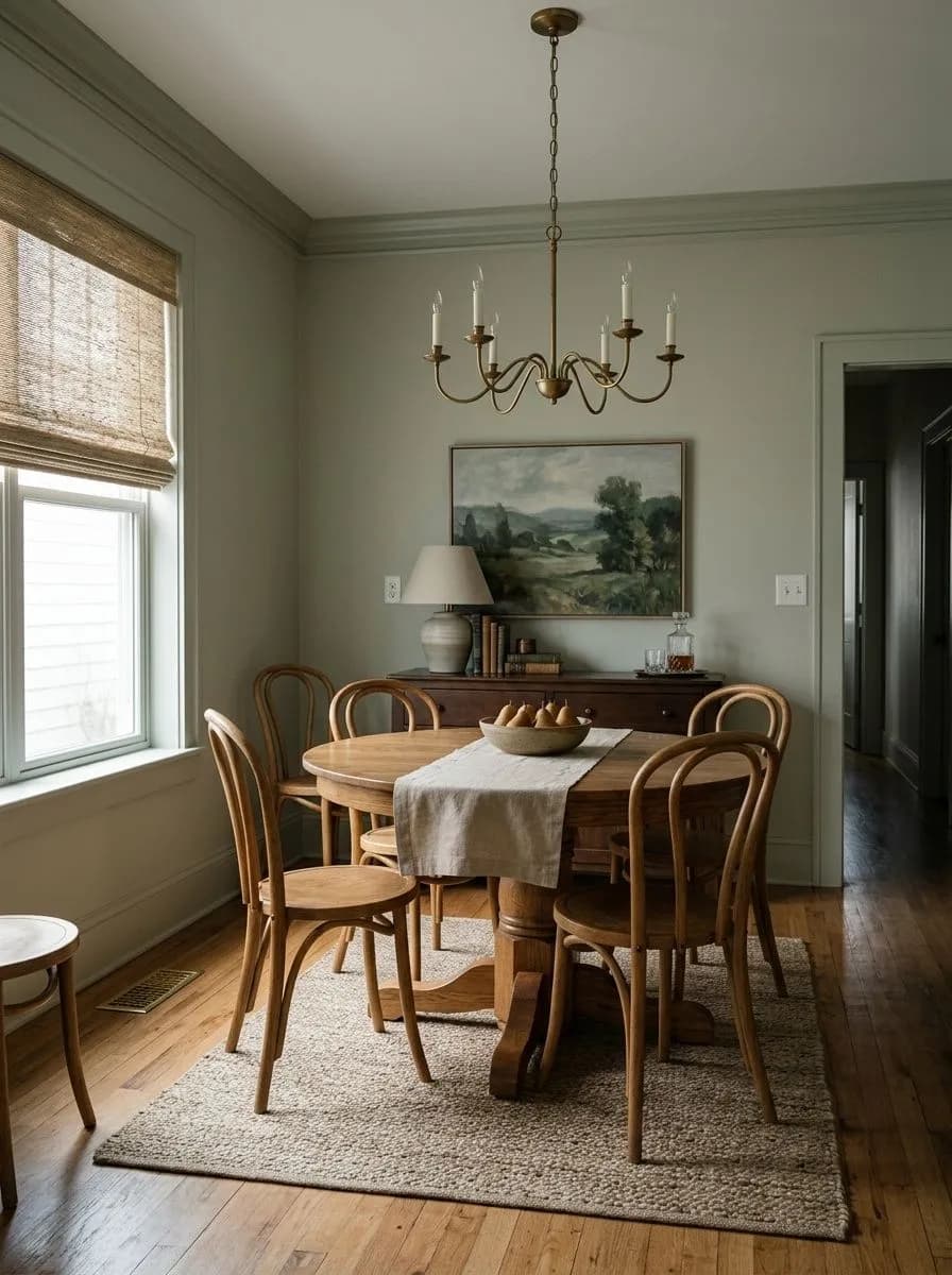
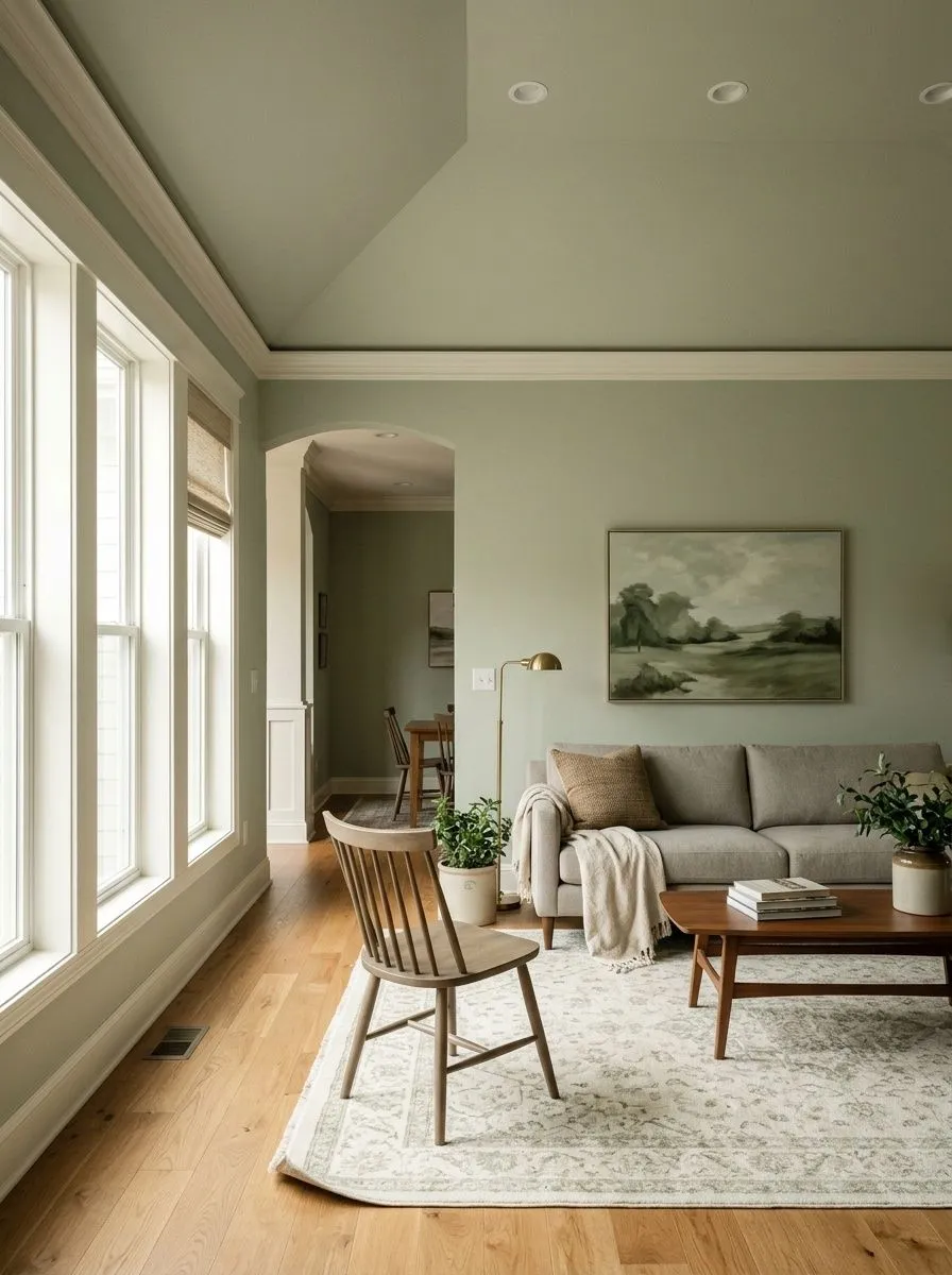
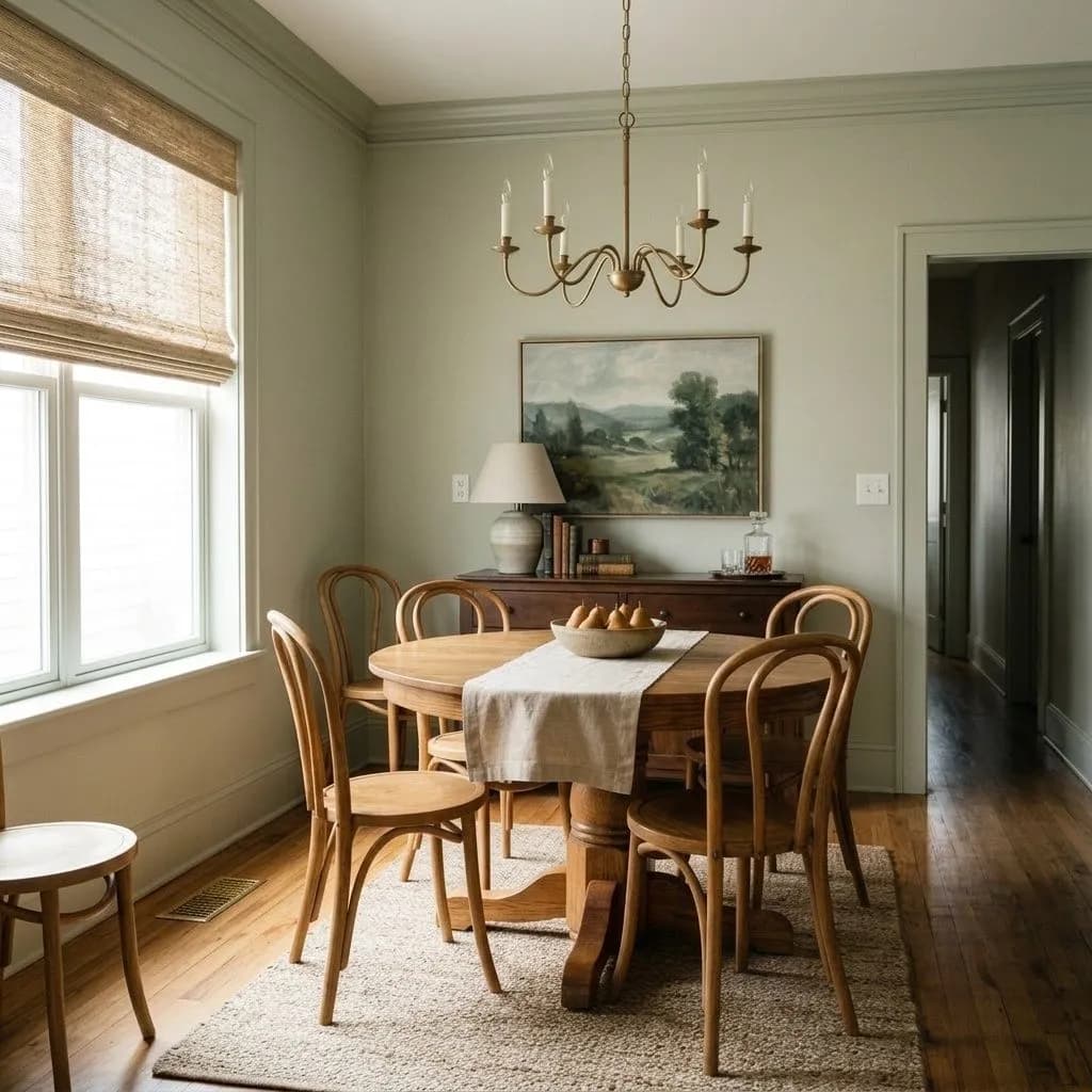
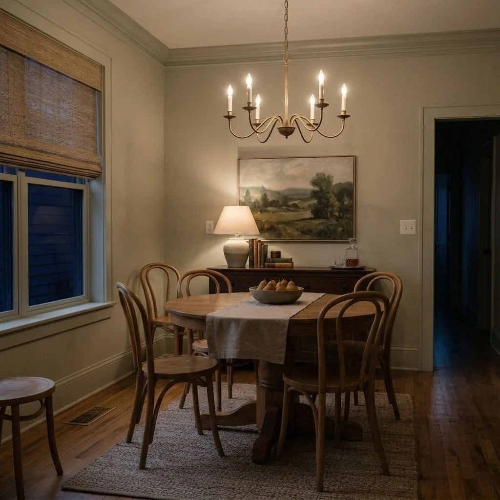
Liveable Green is a natural fit for living rooms and open-plan spaces where you want something that reads as a backdrop rather than a statement. Its LRV of 61.2 means it reflects a solid amount of light back into the room, so it does not eat up smaller spaces the way a deeper sage would. Reviewers single out living rooms and dining areas specifically because the color has that soothing, nature-inspired quality that makes a social space feel grounded without feeling heavy.
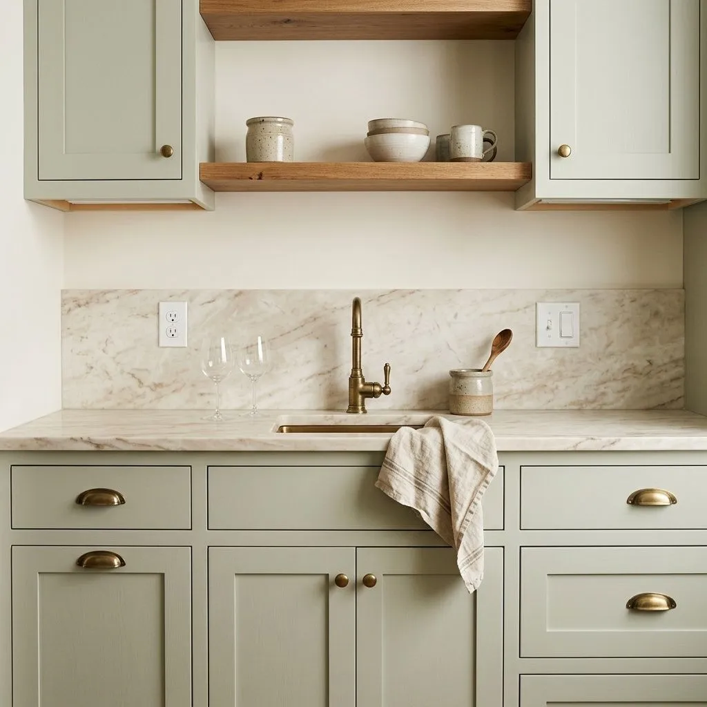
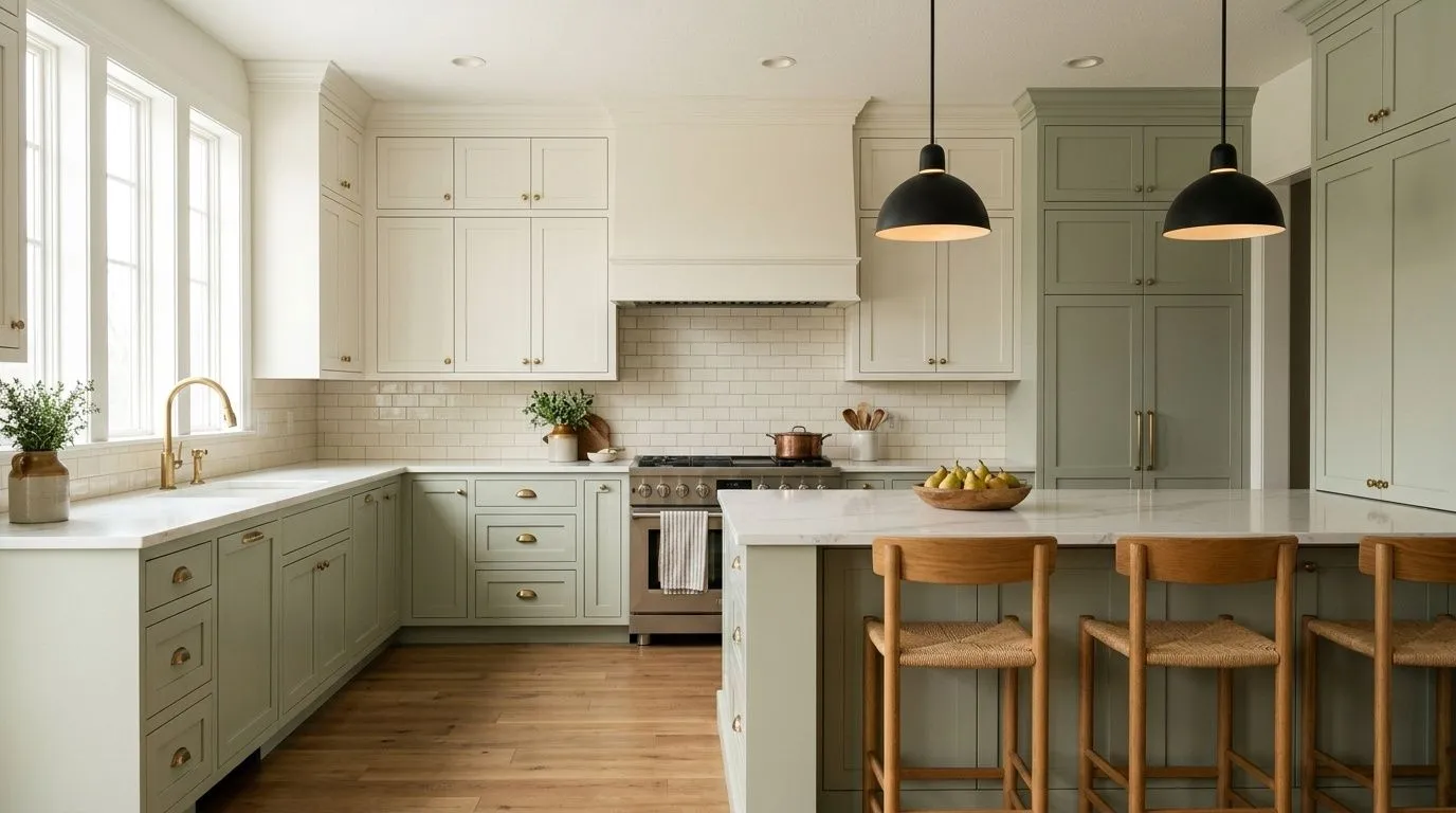
Kitchens and kitchen cabinets are a standout use case. On cabinetry it pairs well with white or cream tile, black or brass hardware, and light oak or natural wood floors. That combination gives you the organic modern aesthetic that is all over renovation coverage right now, without the color being so strong that it dominates the room. Bathrooms work well too, where the earthy sage tone creates a calm, spa-adjacent atmosphere. Bedrooms benefit from the same calming quality, and the warm undertone keeps it from feeling clinical at night under artificial light.
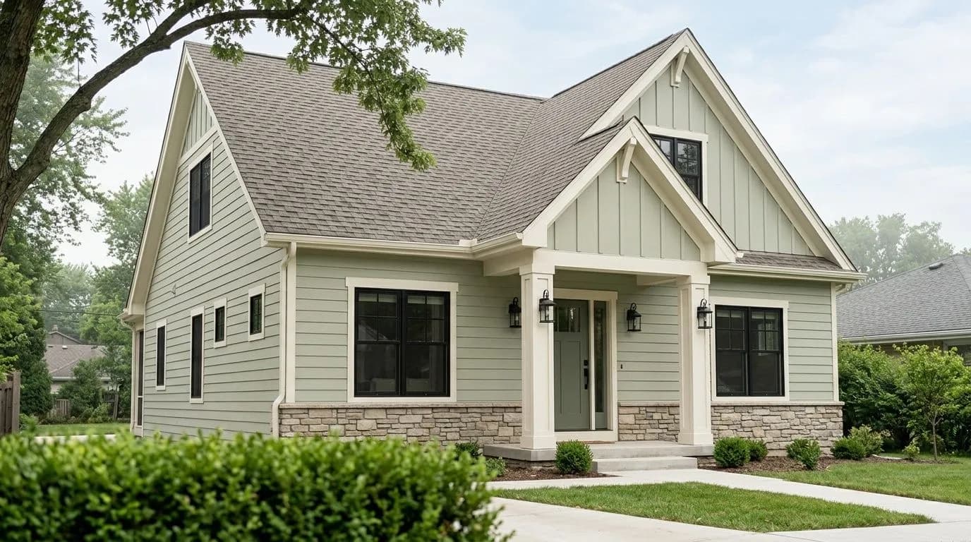
On exteriors, Liveable Green earns its place as a soft sage that reads naturally against landscaping and stone foundations. It is subtle enough to work in neighborhoods where bold color choices would stick out, but it has enough character to avoid reading as a generic greige from the street. South-facing rooms are where you need to be most careful, since the increased natural light can push the color lighter and more yellow-green than the swatch reads, which may or may not suit what you are going for.
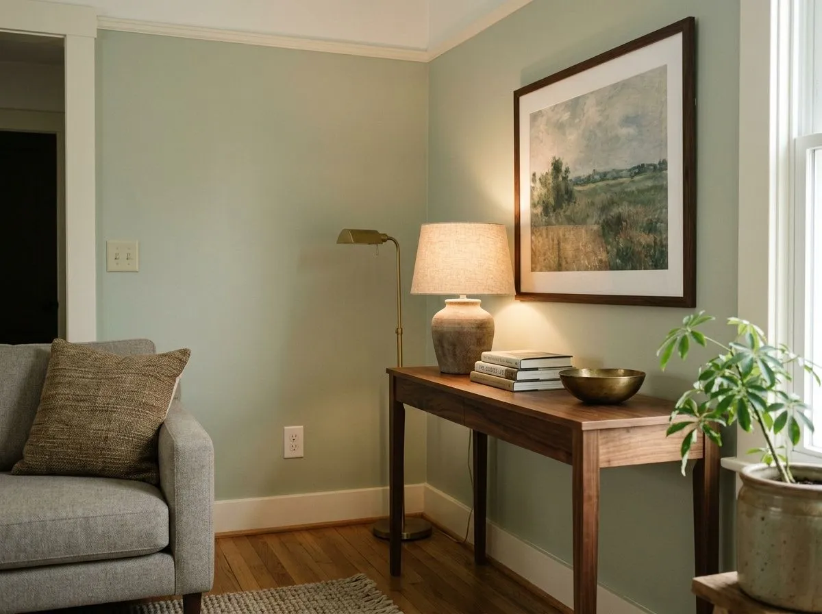
In a living room Liveable Green acts as a calm, grounded backdrop that lets furniture and art carry the room. Its LRV of 61.2 keeps the space feeling open even in moderate natural light. Pair it with warm wood furniture, linen upholstery, and Shell White on trim and the room settles into an easy organic register.
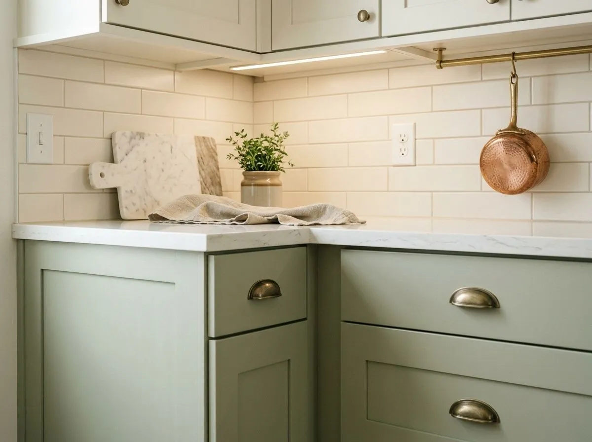
On kitchen walls or cabinets this color earns strong marks from reviewers who pair it with white quartz counters, brass or black hardware, and light oak floors. The muted sage reads modern but warm, and it does not compete with food or dishware the way a more saturated green would. Tile backsplashes in cream or off-white keep the whole scheme from going too cool.
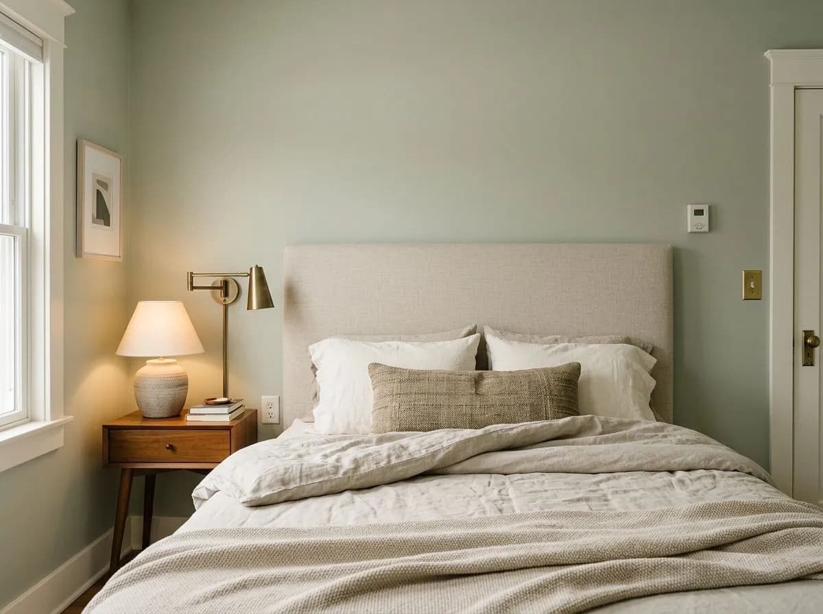
Liveable Green's calm, muted quality makes it an easy bedroom choice. Under warm incandescent or warm-white LED light the yellow-green undertone surfaces and the room feels cozy rather than clinical. Keep bedding and textiles in natural fibers and earthy tones so the color reads intentional rather than leftover.

In a bathroom the earthy sage tone creates a quiet, nature-adjacent atmosphere without trying too hard. It reads well with white fixtures and brass fittings, and the LRV of 61.2 is high enough to keep a smaller bathroom from feeling closed in. Avoid cool-toned lighting here; it will push the gray to the surface and flatten the warmth.
Liveable Green comes with three coordinating colors that each serve a different role. Sagey (SW 6175) sits just below it in the same family and works as a lighter companion on an adjoining wall or ceiling, keeping the palette cohesive without going monolithic. Shell White (SW 8917) is the trim and case work answer here, warm enough not to clash with the yellow-green undertone but crisp enough to give the green room to breathe. Evergreen Fog (SW 9130) acts as an anchor and accent, a deeper green that shares enough DNA with Liveable Green to feel intentional rather than thrown together.
Beyond the official coordinates, the color responds well to warm wood tones, natural linen and cotton textiles, and black or brass metal accents. Keep adjacent materials on the warmer side of neutral and the palette holds together easily. Steer away from stark cool whites on trim, since those can make the gray undertone look slightly muddy by contrast.
Paint accounts for just two of the seven colors here: Liveable Green on the walls, window mullions, and trim as the full sunroom envelope, and Shell White on the sills, door casing, and off-white accent trim. The remaining five cover the room's furnishings and materials, from warm wood and rattan to aged brass and botanicals, each matched to its closest Sherwin-Williams equivalent. Hover any pin or swatch to pull the exact color name.

All comparisons are matched against Liveable Green at LRV 61.2.
A stark, blue-leaning white next to Liveable Green will surface the gray undertone and make the color read slightly muddy or unresolved rather than fresh.
At 4000K or higher, the warmth drains out of Liveable Green and you are left with a flat gray-green that loses most of its sage character.
Deeply saturated oranges, terracottas, or bright yellows on a neighboring wall will make Liveable Green look drab by contrast, since the color depends on its own quietness for its appeal.
It is a soft, muted sage green with gray and yellow-green undertones. At LRV 61.2 it is a light to mid-light shade that reads as an earthy, organic neutral rather than a bold or vibrant green. Many people find it quieter on the wall than they expect from the swatch.
The dominant undertones are green, gray, and sage, with a yellow-green base underneath the gray. Most reviewers call it warm or warm-leaning. Under warm artificial light the yellow-green warmth surfaces more clearly. On overcast days or in north-facing rooms the gray takes over and it reads more as a gray-green with beige inflection.
It leans warm for most reviewers because of its yellow-green base, and it shifts warmer under incandescent or warm-white light. At least one source calls it balanced rather than clearly warm or cool, which is fair given how much the gray modifier softens the warmth. It does not pull blue or purple, so it is not a cool color in the way many grays are.
The precise LRV is 61.2, which puts it in the light to mid-light range. It reflects a solid amount of light back into a room without feeling washed out, and it has enough pigment to read as an actual color rather than a near-white.
The Sherwin-Williams code is SW 6176. The hex is #CECEBD and the RGB values are 206, 206, 189.
It is in the sage green family, yes, but with a strong gray modifier that keeps it from reading as a clearly green room. If you want an obvious sage, this may feel too neutral. If you want the organic, earthy quality of sage without the color being front and center, it works very well. Sampling on your actual wall in your specific light is the only way to know for sure.
Yes on all three counts. On exteriors it reads as a soft, earthy sage that blends naturally with landscaping. On cabinets reviewers pair it with white or cream tile, brass or black hardware, and light wood floors for a modern organic look. As a front door color it is subtle enough for most neighborhoods while still having visible character. Keep in mind that south-facing exteriors in strong sun can push it lighter and more yellow-green than the swatch suggests.