
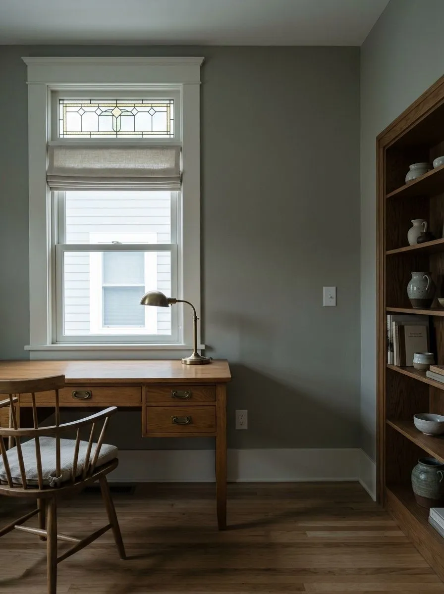
MorningGrayest · the green recedes
A muted gray-green sage that reads clearly green-grounded in good daylight and cools toward gray in low light. Give it layered warm light and sample it on your wall before you commit.
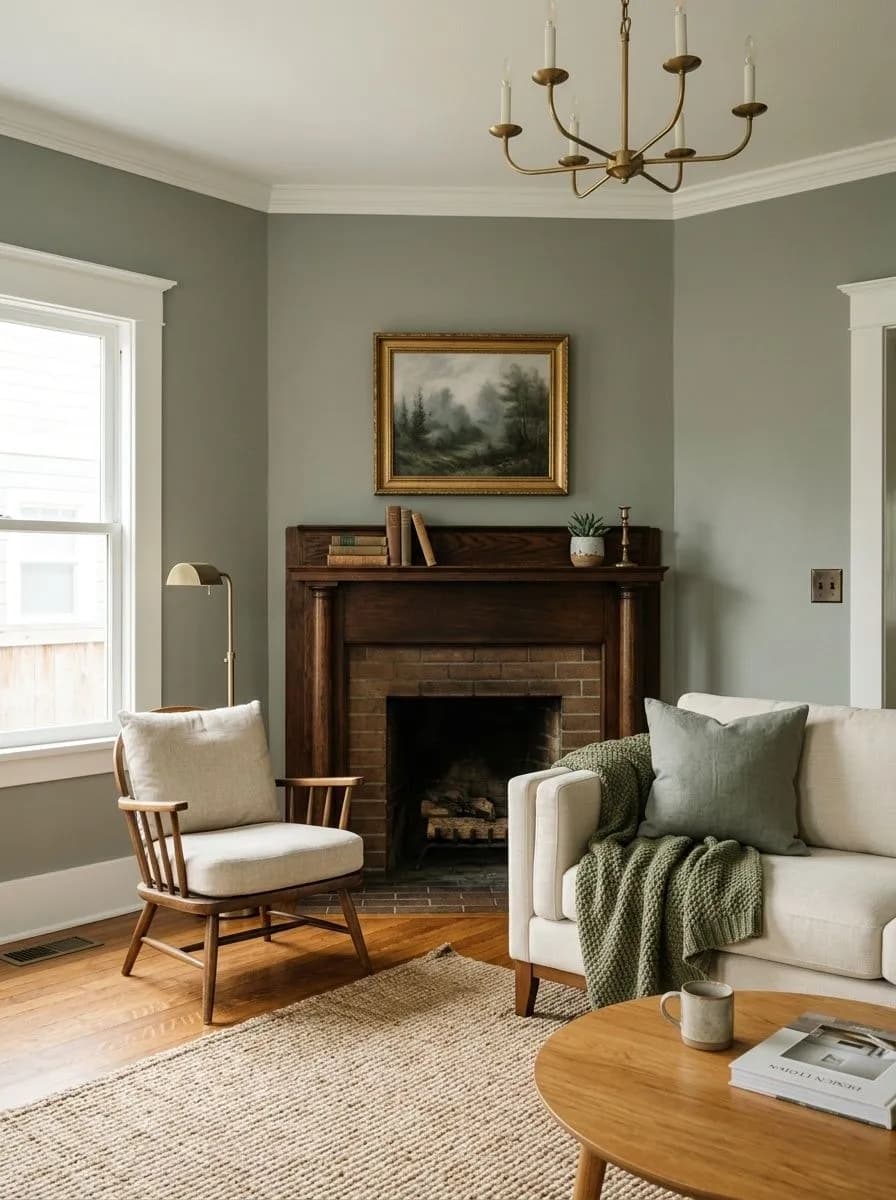
Sherwin Williams Evergreen Fog paint is a medium-depth, muted sage green that most reviewers describe as green-gray at its core. The gray keeps the green from ever feeling bold or sweet, which is exactly why it behaves more like a sophisticated neutral than a statement color. At LRV 30.4 it has real depth, enough to read confidently on walls and cabinets without being dark.
The chameleon behavior is the thing people talk about most. In bright south-facing light it pulls greener and warmer, occasionally nudging toward olive. In shade or north-facing rooms the gray takes over, and any blue in the formula becomes more noticeable, making the color feel moodier and cooler. Evening and artificial light tend to bring the green back forward. This means the same gallon can look like two different colors depending on where you stand and what time it is.
In low or no natural light reviewers consistently flag it as potentially too dark. That is not a flaw so much as a reality of a medium-shade color at this LRV. Test a large swatch in your actual space before you commit, because the shift between a bright window wall and a dim interior corner can be dramatic.
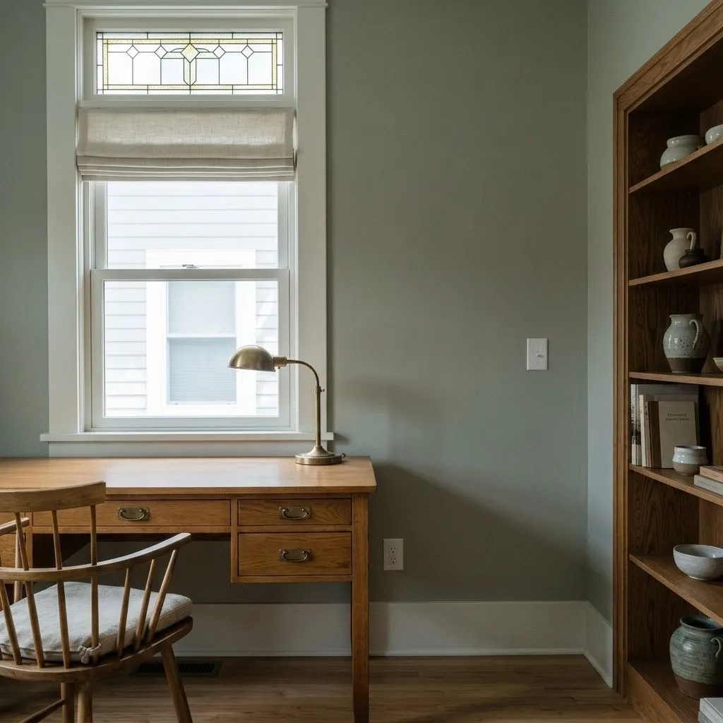
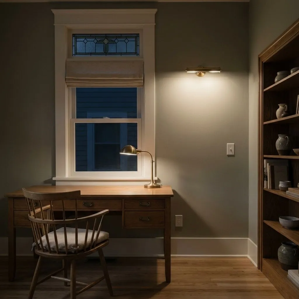
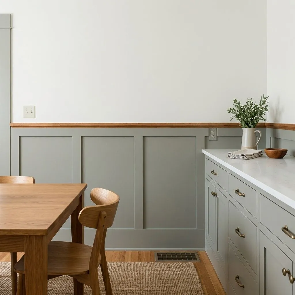
The undertone picture for Evergreen Fog is genuinely debated, and it is worth understanding why. One camp reads it as a warm green, arguing the yellow in the formula stays hidden under normal conditions but the overall cast leans slightly warm rather than cool. These reviewers insist there is no meaningful blue present.
A second camp calls it a cool-toned green with subtle blue undertones, where the gray component carries a cooler edge. Sherwin-Williams itself describes the color as green meeting gray with a touch of blue, which lines up with this view. A third perspective tries to reconcile both: primarily green and gray, a faint blue that surfaces situationally, and a trace of yellow that can emerge as olive in strong south light.
What that means practically: green and gray are always present, those are the constants. Blue is faint and shows up depending on your light and surrounding finishes. Whether the color reads warm or cool is genuinely situational, and that is not hedging, it is the honest answer. If you have a lot of north-facing gray light, plan for the cooler read. If you have warm south sun, plan for green and possibly olive.
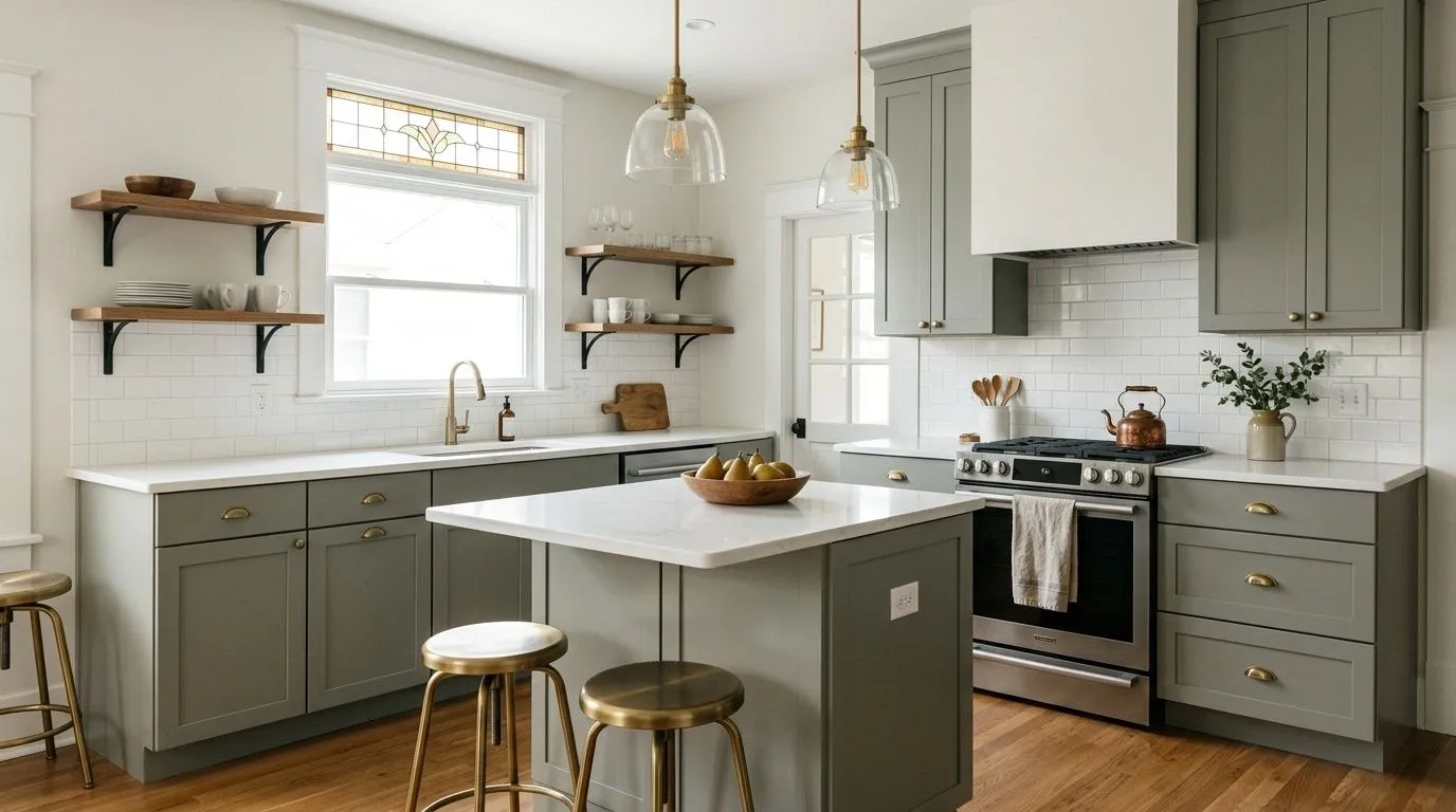
Kitchen cabinets and islands are where Evergreen Fog has built most of its reputation. Reviewers reach for it again and again on cabinetry because the muted green-gray reads rich and grounded without competing with countertops or backsplashes. Bathroom vanities and mudroom built-ins follow the same logic: a color with depth that still functions as a near-neutral in a hardworking space.
Beyond cabinetry, bedrooms and living rooms are common full-wall applications. Its neutral-leaning character makes it easy to layer with warm wood tones, natural textiles, and dark accents without the room feeling themed. Home offices and nurseries come up regularly too, partly because the muted sage reads calming without being boring. Accent walls and ceilings are also documented uses for people who want impact in a single plane rather than a full-room commitment.
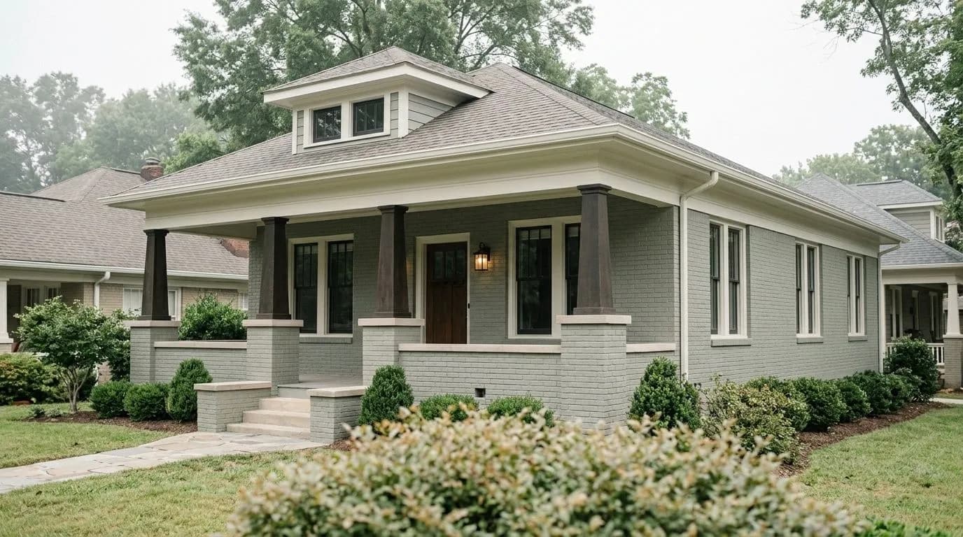
On the exterior Evergreen Fog works well on Craftsman and traditional home styles as a main body color, on shutters, and on front doors. A few reviewers note it can look slightly off next to cream or warm brick, where the color's undertones interact unpredictably. If your exterior masonry runs warm, test carefully. Next to white or light gray trim and stone it tends to perform well.
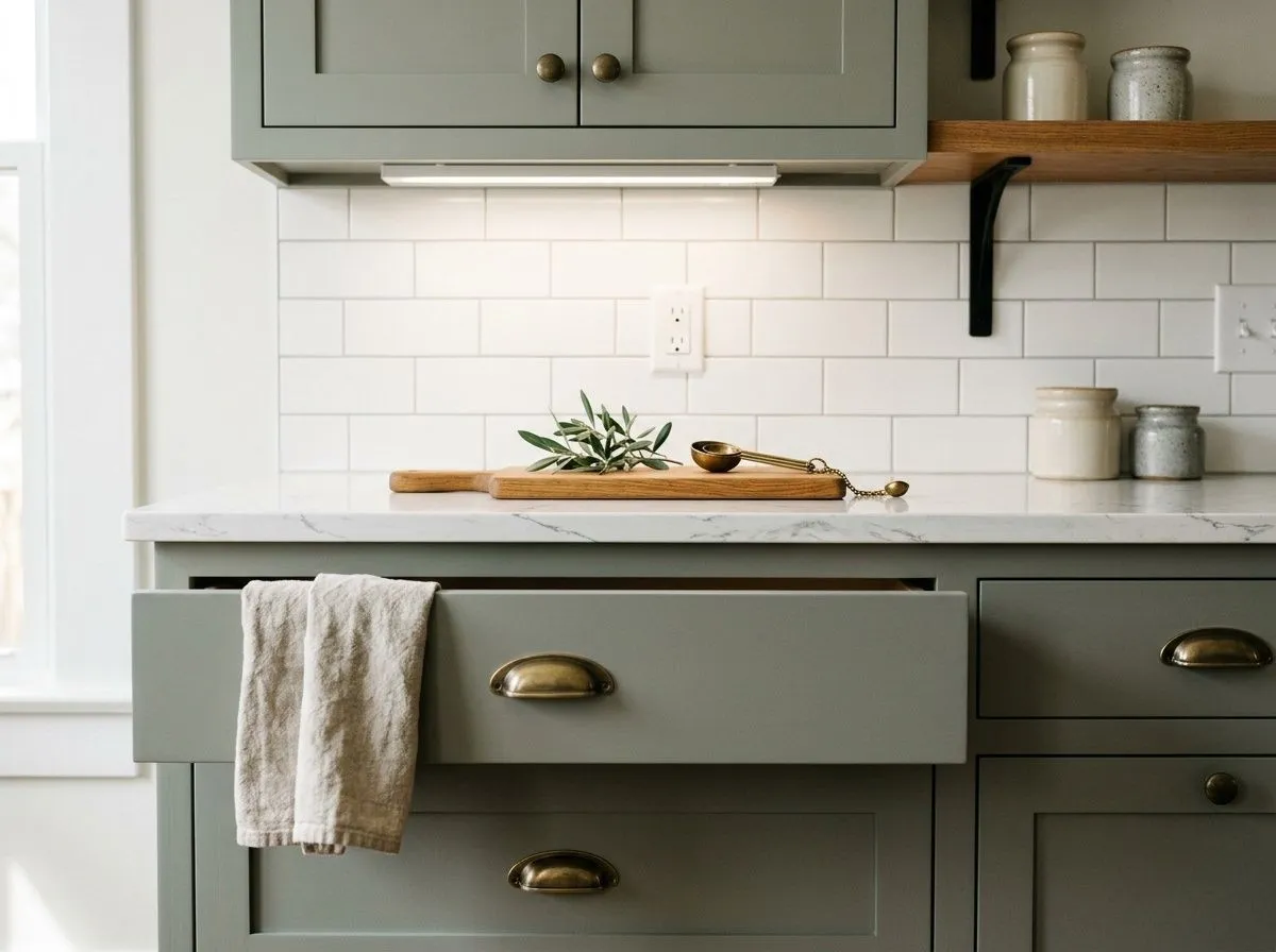
Evergreen Fog on kitchen cabinets or an island is its most documented use, and it earns that reputation. The muted green-gray gives cabinetry a grounded, considered look that pairs well with white or light stone countertops. Use a semi-gloss or higher sheen finish on cabinet surfaces for durability and to get a subtle glow that reads richer than flat paint. Keep your hardware in brass or matte black and your upper walls or ceilings in a clean white like Neutral Ground to avoid any yellow creep.
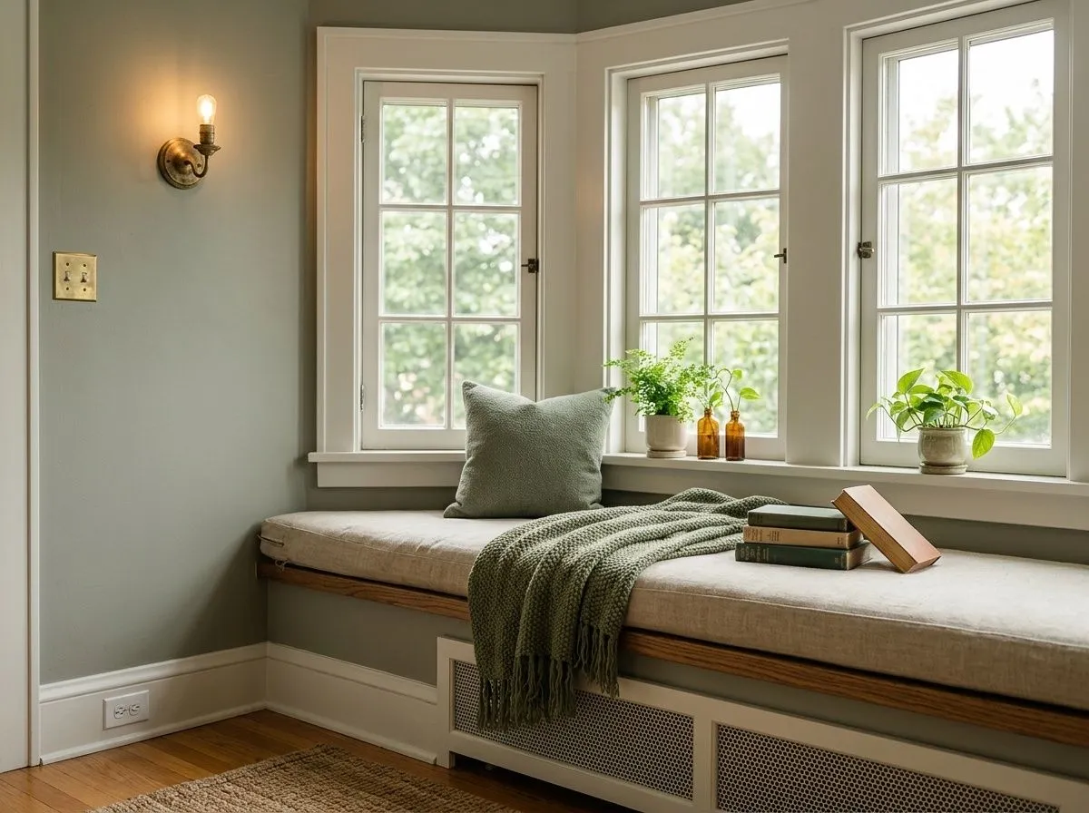
As a full wall color in a living room, Evergreen Fog creates a calm, nature-adjacent backdrop at LRV 30.4 that feels substantial without being heavy. Warm wood furniture, linen textiles, and leather pieces all work with it. South or west-facing living rooms will pull the green forward and keep the space feeling alive; north-facing rooms will lean moodier, which suits a library-style living room well. Layer your lighting so the room holds up at night, when the green tends to show more and the gray can deepen.
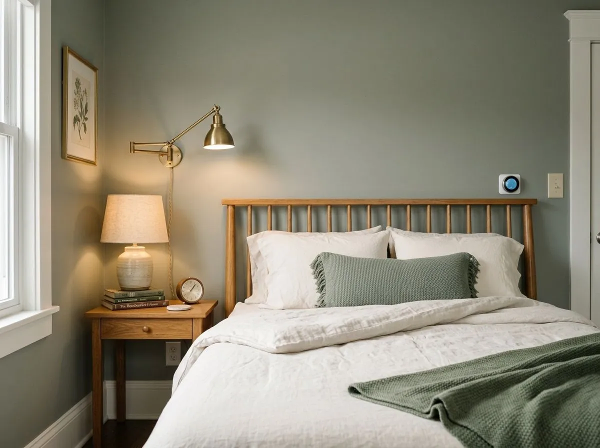
Bedrooms are a natural fit for this color. The gray component keeps it restful while the green adds enough life to make the room feel more interesting than a flat gray. It works on all four walls without feeling closed in, provided you have reasonable natural light. Pair it with warm wood nightstands and natural linen bedding. If the bedroom is north-facing or has limited windows, add warm-toned lamp lighting to balance the cooler gray pull and keep the space from feeling too dim.
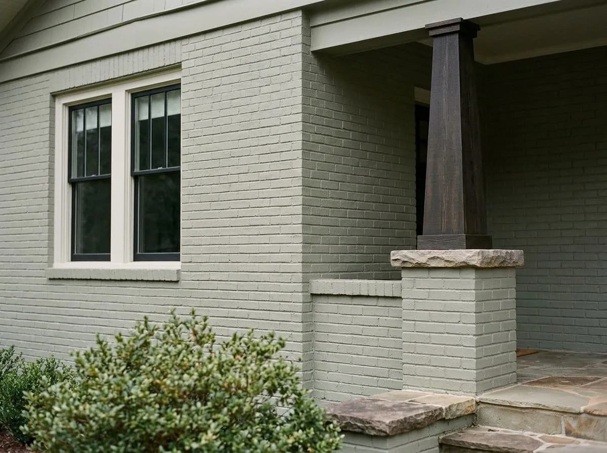
On a Craftsman or traditional exterior, Evergreen Fog reads as a composed, earthy green-gray that suits both main body and shutter applications. It holds up well next to white or soft gray trim and against natural stone or wood accents. The one situation to watch is warm cream or tan brick, where the undertones can interact in unexpected ways. Test a large painted panel against your actual siding or masonry before committing to the full exterior. Front door application in this color is popular and tends to read smart rather than trendy.
Evergreen Fog coordinates naturally with Ethereal White and Neutral Ground as trim and wall companions. Ethereal White keeps things crisp without adding yellow warmth that could push the sage toward olive. Neutral Ground brings a greige warmth that grounds the pairing without competing. Dried Edamame works as a tonal companion if you want to build a layered green-gray palette across connected spaces.
Beyond the coordinating palette, warm wood tones in walnut, cedar, and oak read beautifully against this color because they complement the green without fighting the gray. Brass and champagne gold hardware are the metal pairings reviewers favor most; black accents work too for a crisper contrast. Avoid warm cream trim or cabinet colors, which can amplify any yellow and create an off, muddy clash. Dark blues, muted beiges, greiges, and earthy browns all make strong companion wall or accent colors.
This bathroom holds together because everything in it is quiet without being empty, a Craftsman calm anchored by Evergreen Fog on the furniture-style vanity and flat-panel wainscot, with Ethereal White keeping the upper walls and ceiling clean. Only those two are actual paint. The other five colors are the room's materials, each matched to its closest Sherwin-Williams equivalent, so you can hover any pin or swatch to identify what you're seeing.

All comparisons are matched against Evergreen Fog at LRV 30.4.
Pairing Evergreen Fog with warm cream or yellow-undertone trim whites amplifies any yellow in the sage formula, making the combination look muddy or off rather than intentional.
At LRV 30.4 this color has real depth, and in rooms with limited natural light or north-facing exposures it can go noticeably dark, reading heavier than you expect from a sage green.
Pink or cherry-toned wood floors, furniture, or cabinets create a harsh contrast with Evergreen Fog's green-gray base, and the two undertone families actively fight each other.
Evergreen Fog SW 9130 is a medium-depth muted sage green with a strong gray component that keeps it from reading as a bold or bright green. Most people describe it as a green-gray that functions like a sophisticated neutral. Its hex is #95978A and its RGB values are 149, 151, 138.
Green and gray are the two constants that reviewers and the brand agree on. Beyond that, opinions split. One camp reads a faint warm-yellow lean, another picks up subtle blue, and Sherwin-Williams itself notes a touch of blue in the formula. The honest summary: gray and green are always there, blue shows up situationally depending on your light exposure and surrounding finishes, and warmth versus cool is genuinely situational rather than fixed.
It is neither definitively warm nor cool, and that is not a dodge. In south-facing or bright light it pulls warmer and greener, sometimes nudging olive. In north-facing or low light the gray and any blue dominate and it reads cooler. Your specific exposure will drive which camp it falls into for your space.
Evergreen Fog has an LRV of 30.4, which puts it in the medium shade range. It reads with real depth on walls and cabinets, and in low-light situations it can go noticeably dark. Layered lighting matters in rooms without strong natural light.
The Sherwin-Williams color code is SW 9130. The hex is #95978A and the RGB values are 149, 151, 138.
Yes, it sits squarely in the sage green family, but it leans more gray than most sages, which is why it behaves like a near-neutral. If you want a sage that reads clearly green, this one is quieter and more chameleon-like than brighter or warmer sage options.
All three are well-documented uses. Kitchen cabinets and bathroom vanities are where it has built much of its following, use a semi-gloss or satin finish for durability on cabinet surfaces. On exteriors it suits Craftsman and traditional styles well as a main body or shutter color. As a front door color it reads composed and grounded. The one exterior caution is warm cream or tan brick, where the undertones can interact unpredictably, so test before committing.