Let It Rain
What Let It Rain Actually Looks Like
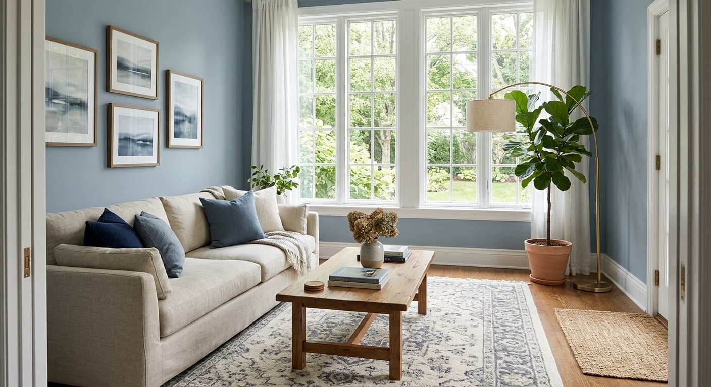
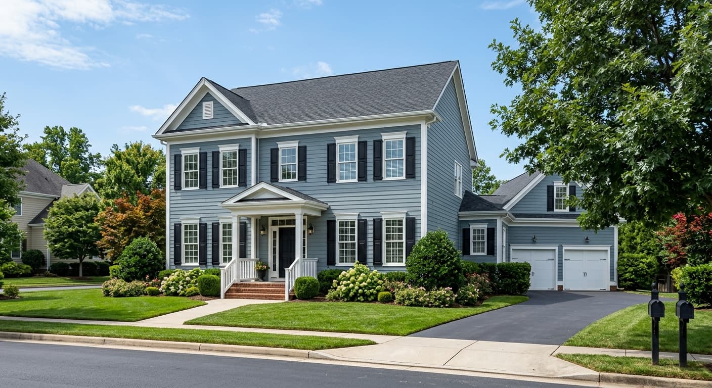
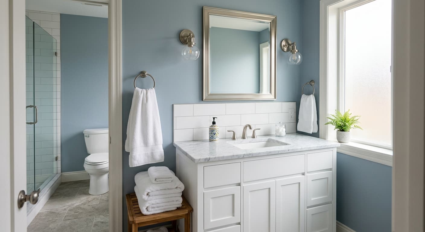
Let It Rain sits in that gray-blue-green territory where naming things gets tricky. On the chip it reads like a stormy slate blue. On your walls, it leans more complex than that, picking up green in some lights and softening into a dusty teal in others. This is a color that refuses to hold still.
In bright daylight, you will see the blue come forward and the whole thing feels crisp and a little cool. As the light fades toward evening, the green undertone rises and the color deepens into something almost moody. Under warm artificial light, it warms up too, reading softer and grayer than it does at noon.
What makes it distinctive is that mid-tone weight. It is dark enough to feel intentional and grounded, but not so dark that it swallows a room. You get color and depth without committing to a full charcoal or navy. That balance is harder to find than you would think.
Let It Rain Undertones
The dominant undertone here is green, with blue running close behind and a gray base keeping the whole thing muted. That green is the part to watch. Put Let It Rain next to a color with strong yellow undertones and the green can read murky. Pair it with cooler companions and the blue takes the lead instead.
This matters most for your trim and your adjacent walls. A clean white trim will sharpen the color and pull out its blue. A creamier white will warm it and emphasize the green. Test both before you decide, because the same paint can look like two different colors depending on what surrounds it.
Where Let It Rain Works Best
This shade earns its keep in rooms where you want atmosphere. Studies, dining rooms, bedrooms, and powder rooms all suit it well. It also works beautifully on cabinetry and built-ins, where the depth reads as sophisticated rather than heavy.
North-facing rooms will pull the cooler, grayer side of this color forward, so go in knowing it will feel moodier there. If you want that, lean in. If you do not, save it for a south or west-facing room where warmer light keeps it lively. In small spaces it creates a cocooning effect that feels deliberate. In large, bright rooms it holds up as a confident main color without overwhelming the space.
What to Pair With Let It Rain
For trim, Sherwin-Williams Pure White (SW 7005) keeps things crisp and lets the blue sing. If you want a softer, more traditional feel, Alabaster (SW 7008) warms the pairing and brings out the green. Both work. The choice depends on the mood you are after.
For flooring, mid to warm-toned woods like white oak or walnut balance the coolness nicely. Brass and aged bronze hardware look excellent against this depth of color. For coordinating shades, consider a soft greige like Agreeable Gray (SW 7029) on adjacent walls, or a deeper anchor like Iron Ore (SW 7069) if you want contrast with serious weight. Natural materials, linen, leather, and rattan all sit comfortably alongside it.
Colors That Clash With Let It Rain
Skip pairing this with cool, blue-based grays that fight its green undertone and leave the room feeling flat and indecisive. Stay away from stark, icy whites in north-facing rooms, where the combination can turn clinical and cold. And resist the urge to use it on every wall in a small, dark room with little natural light. Without something to bounce off, the color loses its complexity and just reads dark.