
MorningFresh · clean tan read
A mid-tone warm beige with a soft gold and tan core, reliably earthy in almost any light. See how it settles in your room.
Bungalow Beige SW 7511 is a mid-tone warm beige that reads light-medium on the wall. Its LRV of 53.3 means it reflects roughly half the available light, so a room feels open and settled rather than stark or cave-like. It holds its own without washing out, though in a poorly lit or small space it can tip toward flat and dull.
In strong natural light, especially south or west exposures, the color comes alive with a soft golden warmth that feels inviting and grounded. As the light flattens or shifts to artificial sources in the evening, it deepens toward a tawny tan or caramel and stays consistently warm throughout. Reviewers across multiple independent sources agree on one thing: this color does not drift pink, lavender, or gray under normal conditions, which is rarer in the beige family than you might expect. It is reliably, predictably warm.
The overall impression on a well-lit wall is of a clean, earthy beige that has enough depth to feel intentional but enough lightness to keep a room from feeling heavy. It is not a bright or barely-there neutral. It carries real presence.
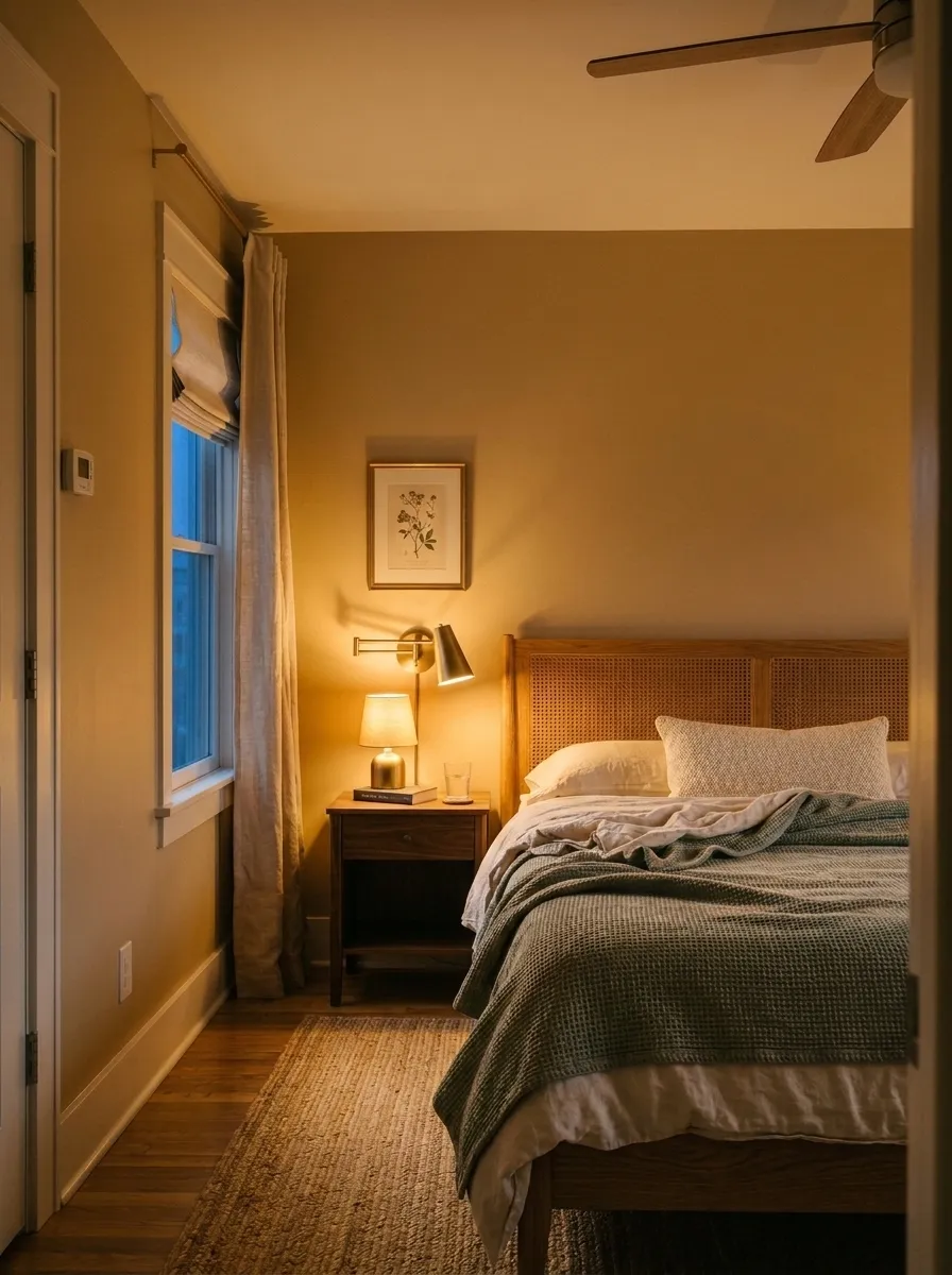
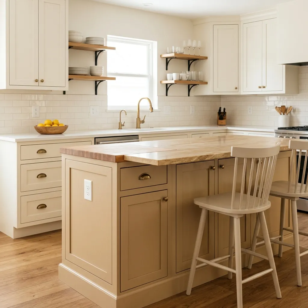
The primary undertone in Bungalow Beige is warm tan with a layer of soft gold sitting over a faint brown base. Most reviewers land on that description. In bright daylight, particularly in south or west-facing rooms, the yellow-gold note rises noticeably, giving the color a honeyed quality that pairs effortlessly with warm wood tones and cream elements.
There is a secondary undertone debate worth knowing about. Some reviewers also pick up a subtle warm red, orange, or caramel note underneath, especially in low or incandescent light. Others do not read this at all and describe the color simply as a clean, soft tan. Neither group is wrong. The orange-caramel note is faint and tends to surface only under specific lighting conditions, but if your room has warm amber bulbs or reddish wood tones, it can become more visible.
The one point of mild disagreement involves north-facing rooms. One source says north light nudges the color slightly toward a greige read, cooling it just enough to read less purely beige. Another says it simply looks more muted and earthy in north light but holds its warmth throughout. Both agree the color does not turn cool or greenish, which is a real concern with many competing beiges. The practical takeaway: the undertone story is warm gold and tan in most conditions, with a possible greige lean in the most challenging north light. Sample it large and look at it across the full day before committing.
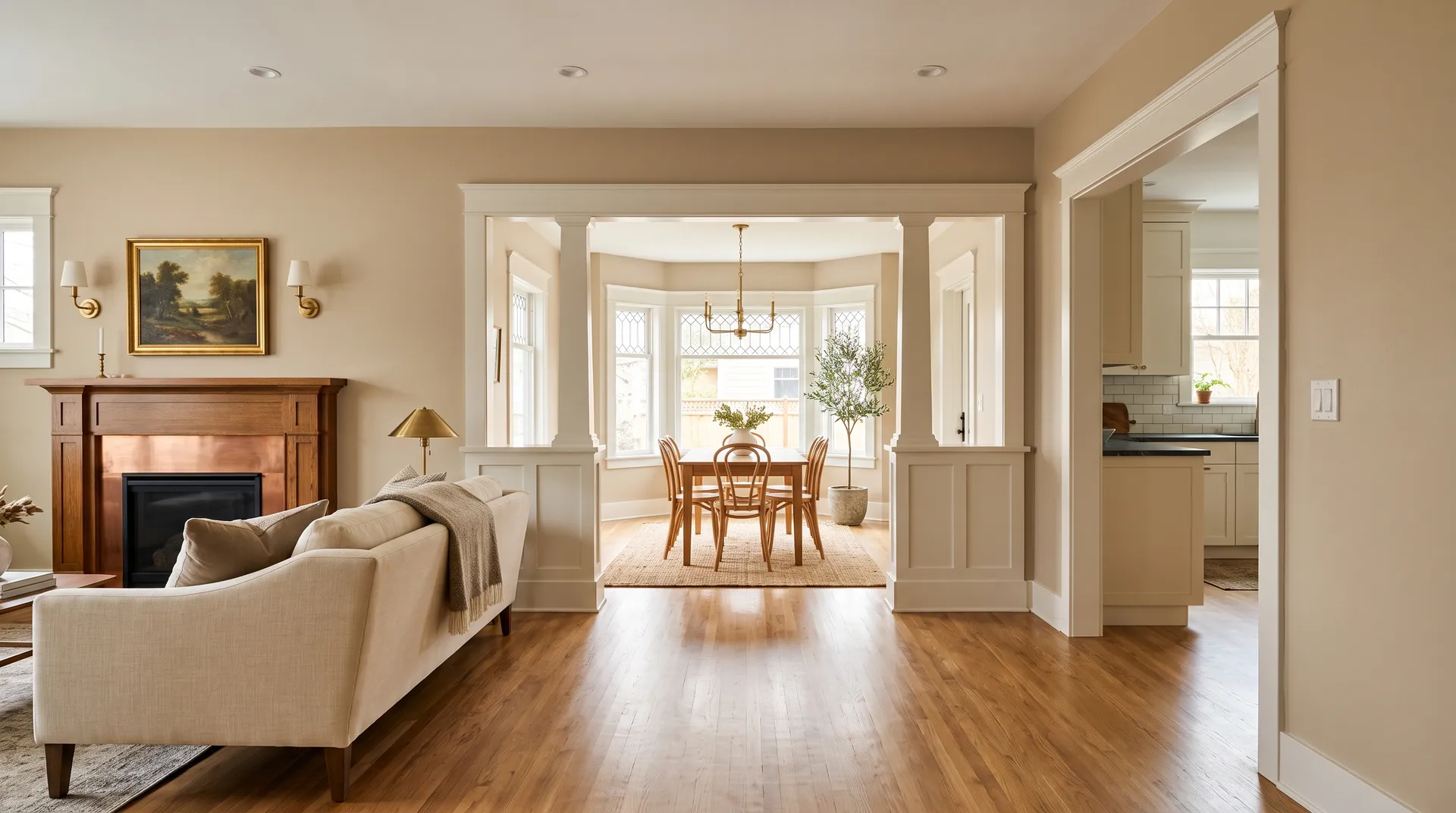
Bungalow Beige earns its reputation as a whole-house neutral because it reads coherently across a range of room types and functions. It works in living rooms, bedrooms, dining rooms, hallways, kitchens, and bathrooms. Because it does not shift unpredictably, it flows naturally from room to room without creating jarring color breaks, which is exactly what you want if you are painting an open floor plan or a connected series of spaces.
Exposure shapes how it performs significantly. South and west-facing rooms give it the best showing: south light keeps it bright and golden, and west light rewards you with the richest, mellowest warmth in the afternoon and evening. East-facing rooms are fresh and lively in the morning and deepen naturally as the day goes on. North-facing rooms are its toughest test. The color mutes there and loses some of its golden energy. It does not look bad, but it is worth sampling carefully if your main living spaces face north.
Beyond walls, reviewers report this color working on exteriors, front doors, cabinets, and furniture. On exteriors it suits traditional, farmhouse, cottage, and craftsman homes, particularly those with warm brick, stone, or wood details. On cabinets it gives kitchens and bathrooms a warm, earthy feel that avoids the coldness of gray and the sweetness of creamy white. It fits traditional, transitional, and farmhouse interiors naturally. It fights a modern or cool aesthetic, and reviewers warn against pairing it with cool gray flooring, icy whites, or gray quartz countertops, combinations that create visible tension and can make the beige read heavy or muddy.
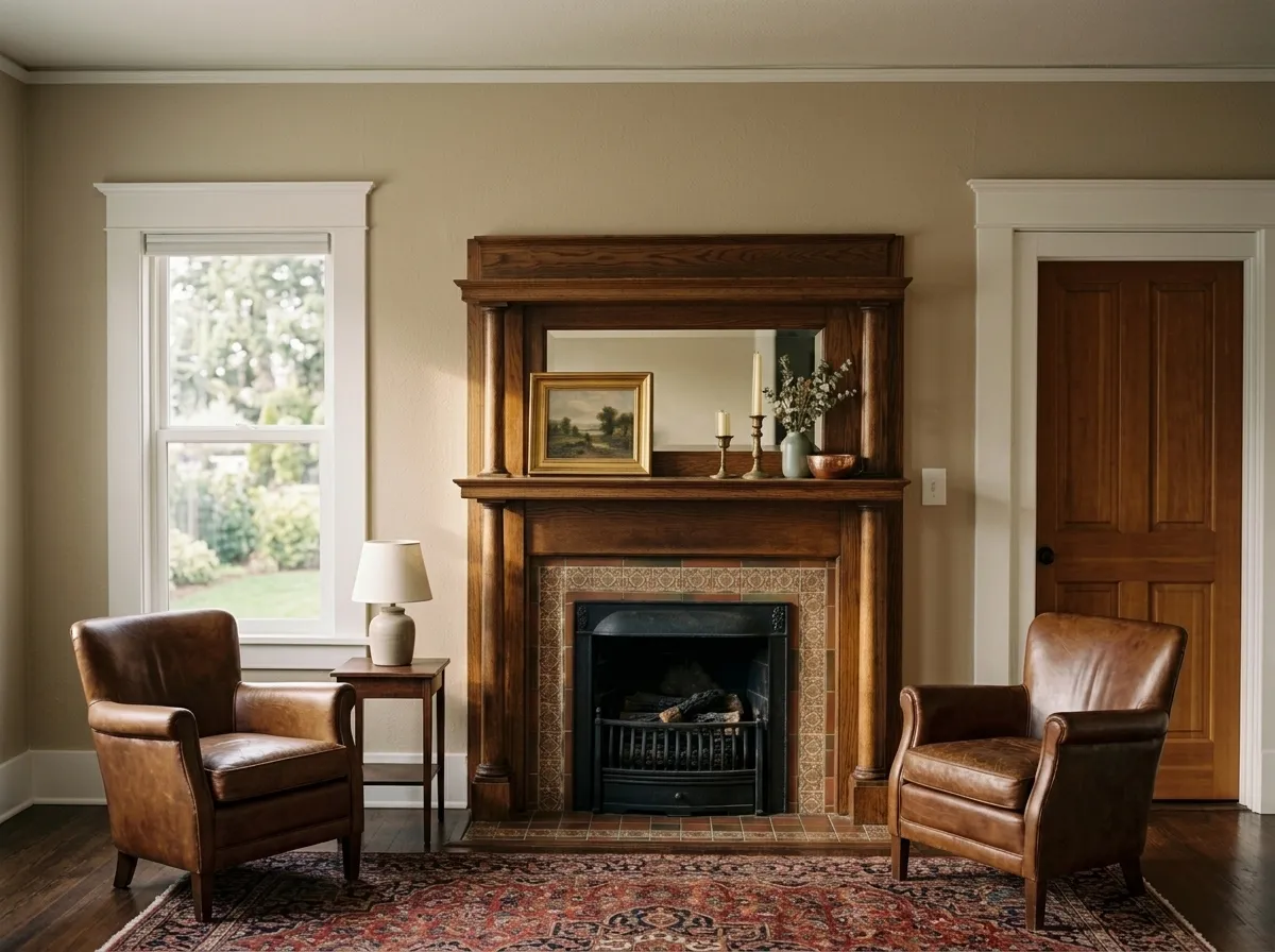
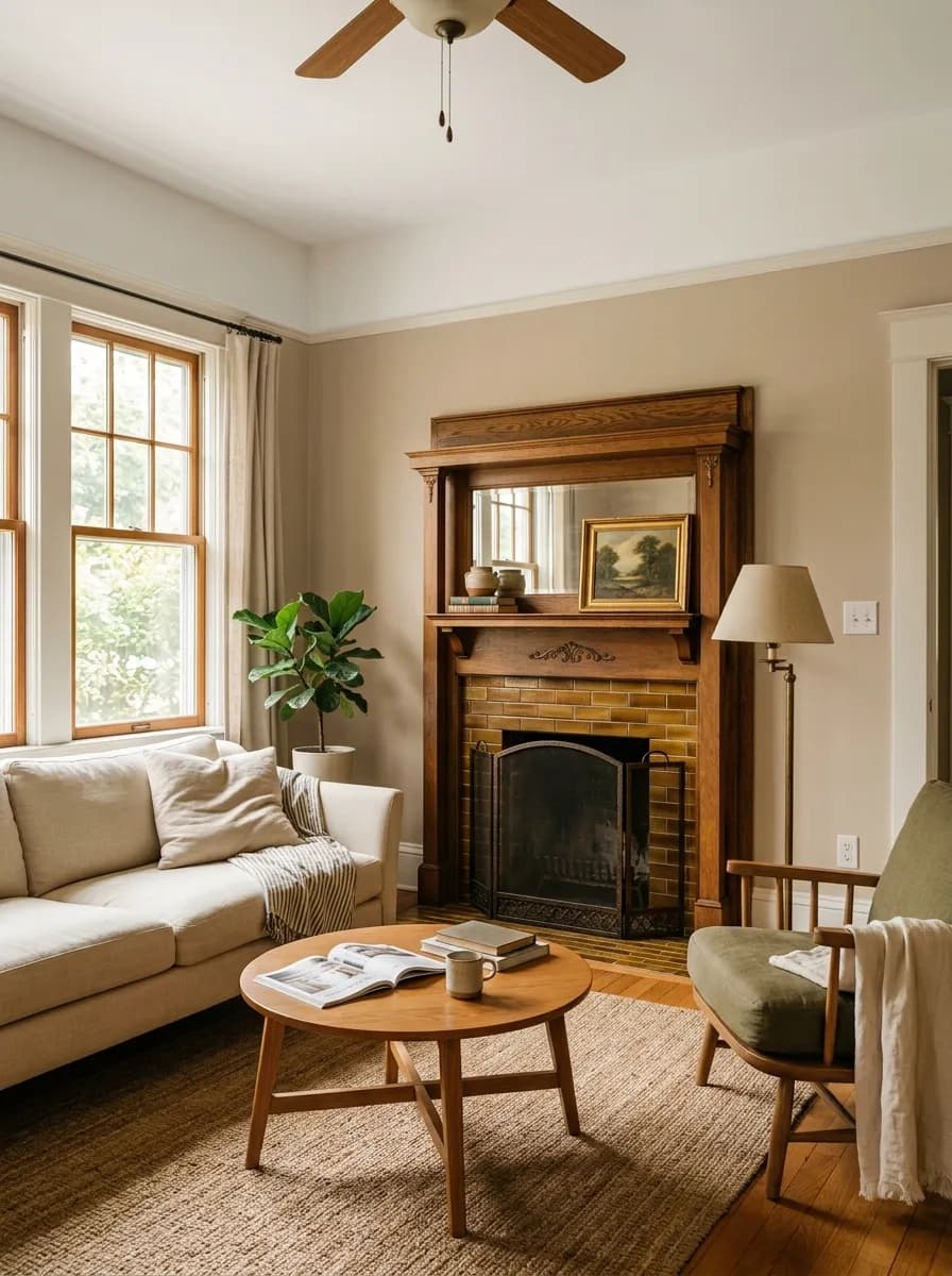
A living room in Bungalow Beige feels settled and welcoming without demanding attention. It gives warm wood furniture and natural fiber rugs a cohesive backdrop. Keep the trim to a warm white like Aesthetic White SW 7035 and the color does most of the work.
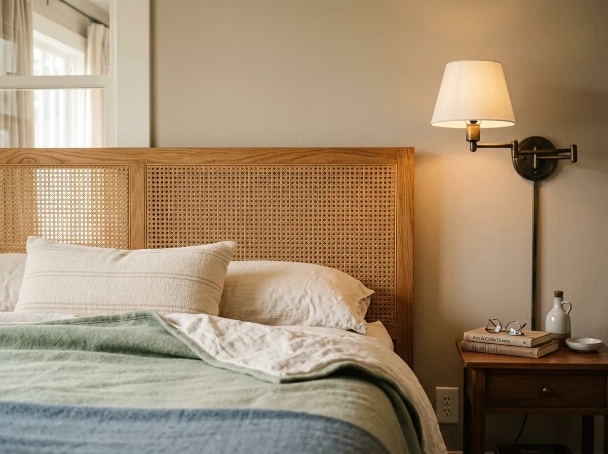
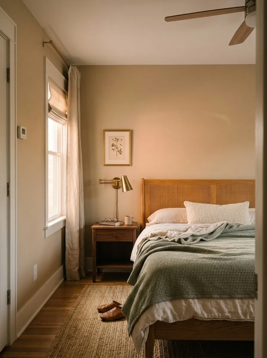
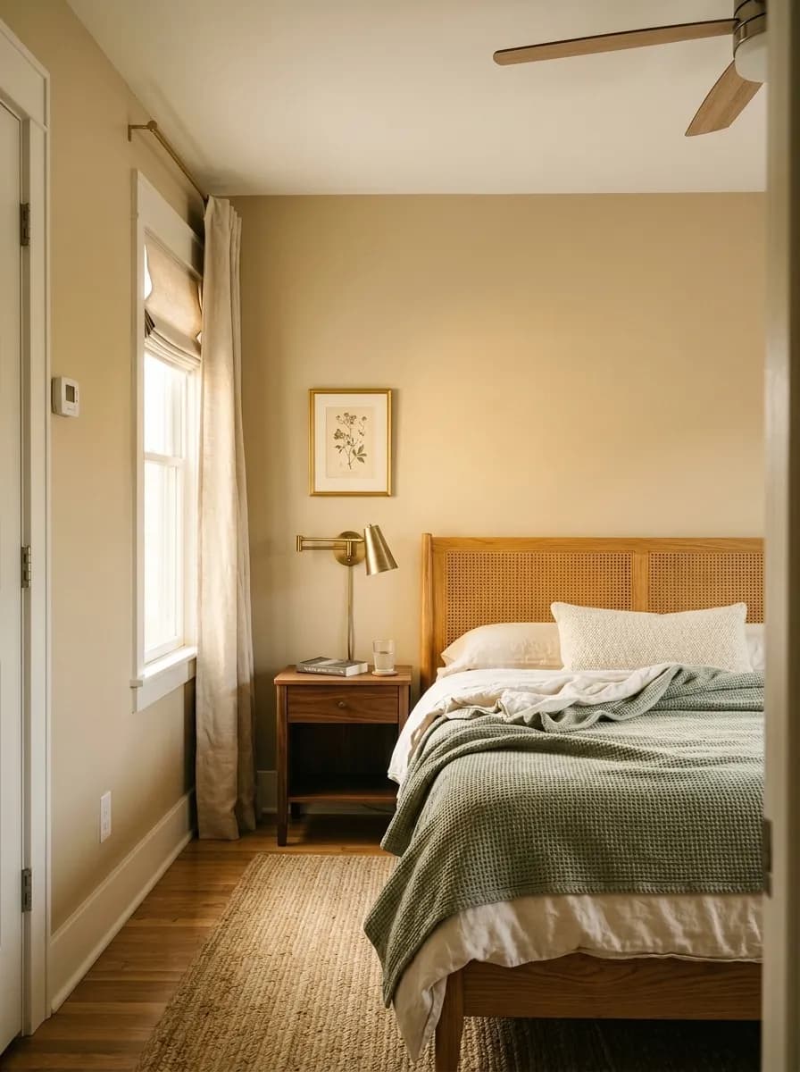
In a bedroom the LRV of 53.3 provides enough lightness to feel calm and restful, not dark or cave-like. It pairs naturally with warm linen bedding, wood nightstands, and soft blue or earthy green textiles. Avoid cool gray or white bedding, which will highlight any tension in the undertone.
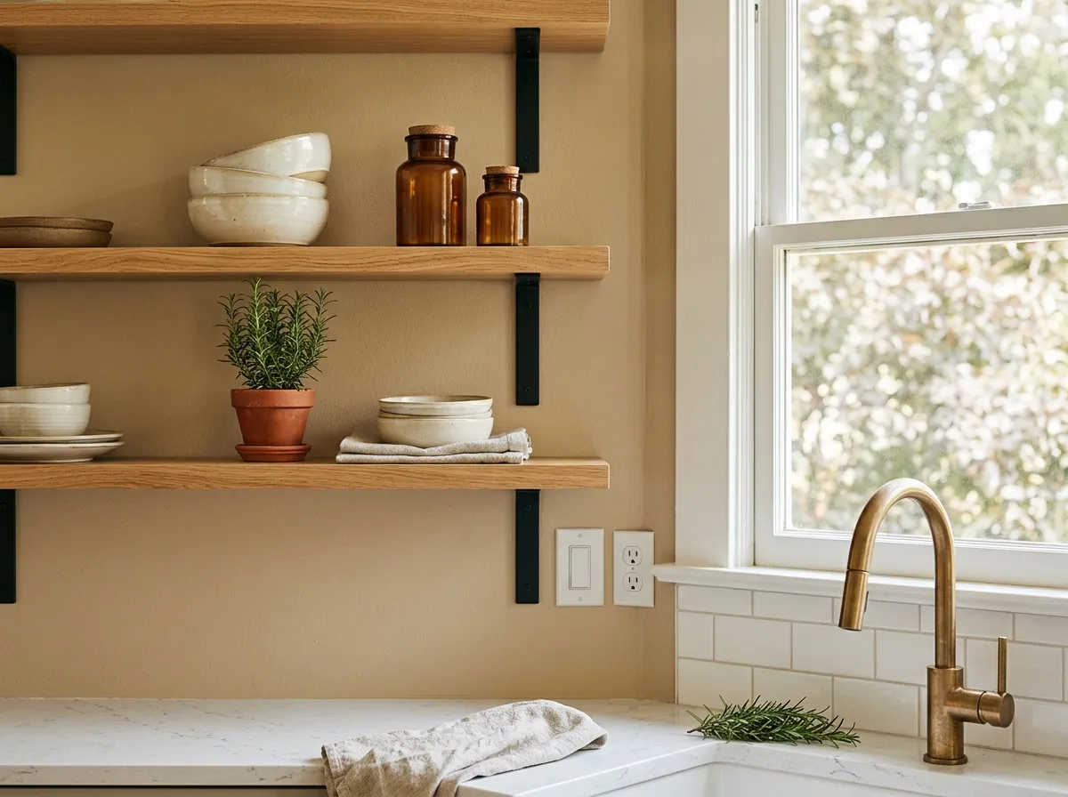
On kitchen walls or cabinets, Bungalow Beige provides a warm, grounded alternative to the gray cabinet trend. It suits kitchens with warm wood accents, brass or unlacquered bronze hardware, and stone or warm quartz countertops. Gray quartz is a harder pairing and often fights the color.
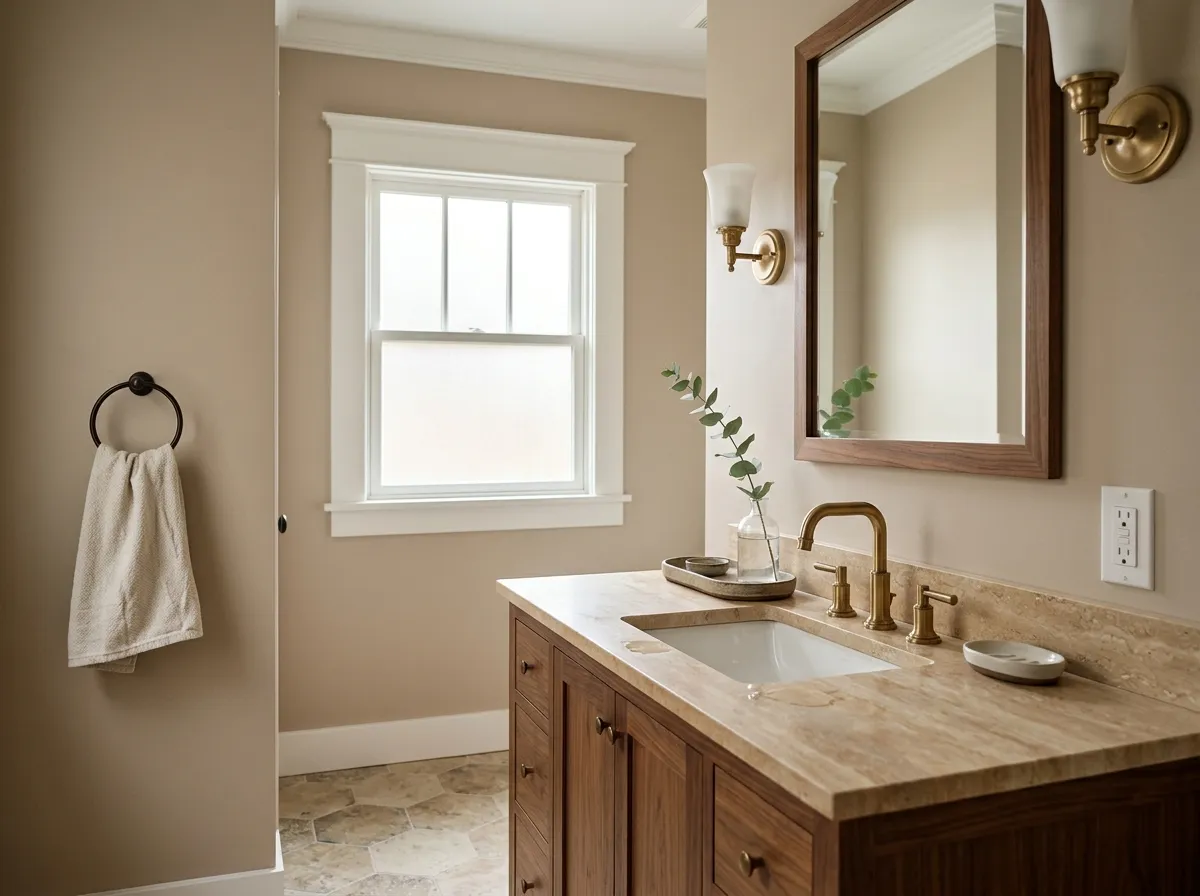
In a bathroom with good light, this beige reads clean and warm rather than dingy. It works well with warm wood vanities, unlacquered brass fixtures, and natural stone tile. In a windowless bathroom, the lower light will mute it, so sample carefully before committing.
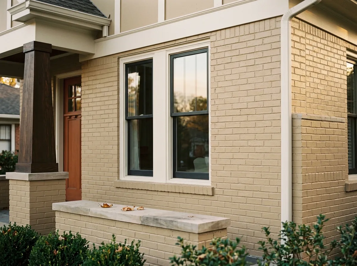
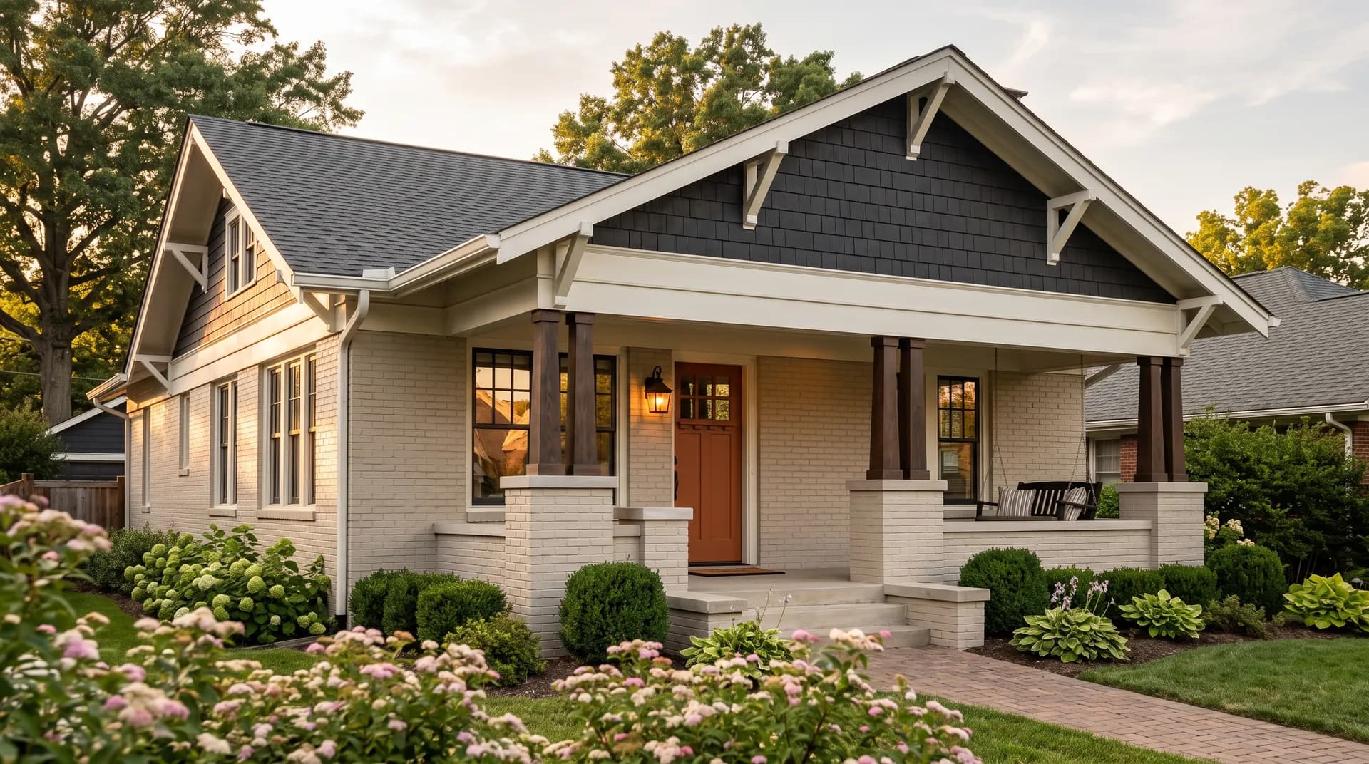
Reviewers use Bungalow Beige on traditional, farmhouse, and craftsman exteriors, especially those with warm brick, stone, or cedar details. It reads as a confident, grounded body color rather than a pale neutral. Pair with a warm white trim and a deep earthy or navy accent on shutters and doors.
Bungalow Beige pairs best with warm materials and colors that share its earthy foundation. For trim and ceilings, Aesthetic White SW 7035 is an excellent match because it has enough warmth to feel cohesive without competing. Avoid crisp, cool whites on trim since the contrast will make the beige look muddier than it is. Warm honey oak and walnut floors are natural companions. Bleached or cool gray floors create friction.
For accents, the color takes contrast well. Soft blues and navy add a classic counterpoint. Forest and earthy greens feel grounded alongside it. Warm terracotta, deep orange, and red work because they share the same golden-red base the color hints at underneath. For a softer palette, lean into creams, warm taupes, and natural linen textures. Vanillin and Copper Harbor are coordinating options worth exploring if you want to layer in more warmth or a richer earthy tone.
Of the seven colors built into this sunroom scene, only two are actual paint: Bungalow Beige covers the walls and wainscot millwork, while Aesthetic White handles the trim, casings, and ceiling. The remaining five represent the room's furnishings and materials, each translated into its closest Sherwin-Williams paint match so you can shop or compare with ease. Hover any pin or swatch to see the name and number.
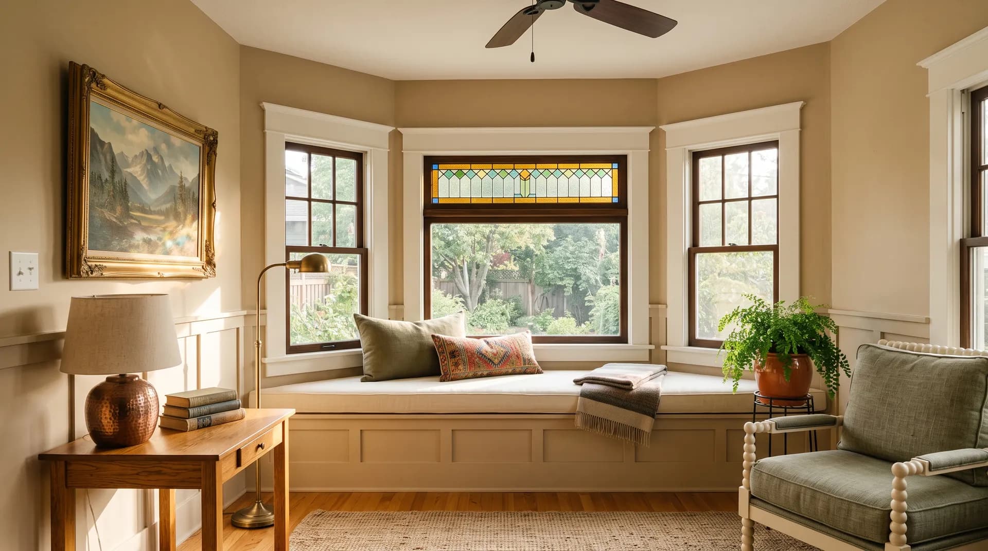
All comparisons are matched against Bungalow Beige at LRV 53.3.
Pairing Bungalow Beige with a crisp, cool white on trim creates a jarring contrast that makes the beige read muddier and heavier than it actually is. Pure White SW 7005 is a specific offender that reviewers call out repeatedly.
Cool gray surfaces pull in the opposite tonal direction from Bungalow Beige's warm gold and tan base. The result is a color tension that makes neither surface look its best, and the beige often ends up reading as dingy or unresolved.
At an LRV of 53.3 this color needs reasonable light to stay open and inviting. In a north-facing room, a basement, or a small hallway with few windows, it can flatten to a dull, lifeless tan that loses all the warmth reviewers love.
It is a warm, mid-tone beige with a soft golden and tan character. With an LRV of 53.3 it sits at a light-medium value, open enough to feel airy but deep enough to read as a real, settled color rather than a barely-there neutral. It does not shift pink, gray, or green under normal lighting conditions.
The primary undertones are warm tan and soft gold over a faint brown base. In bright daylight the golden note is the most visible. Some reviewers also pick up a subtle caramel, warm red, or orange note in lower or warmer light. In north-facing rooms a mild greige lean is possible, though most reviewers say it simply reads more muted and earthy rather than truly cool.
It is warm, consistently and reliably. This is one of its most praised qualities. Reviewers across independent sources agree it does not drift toward cool tones the way many beiges do. Even in north light it stays on the warm side, just with less energy.
The LRV is 53.3, meaning it reflects about half the light in a room. That puts it in the light-medium range. It is bright enough for most well-lit spaces but not the right choice for rooms that are already short on natural light.
The Sherwin-Williams color code is SW 7511. The hex value is #CDBFB0 and the RGB values are 205 red, 191 green, 176 blue.
For trim and ceilings, use warm whites. Aesthetic White SW 7035 is a coordinating option that works well. Avoid cool or crisp whites on trim. For accents, soft blues, navy, forest green, earthy green, terracotta, deep orange, and warm red all pair naturally. Warm wood floors in honey oak or walnut are better companions than bleached or gray floors. For a tonal palette, lean into creams, warm taupes, and natural linens.
Yes to all three. On exteriors it suits traditional, farmhouse, craftsman, and cottage homes, especially those with warm brick, stone, or wood detailing. On cabinets it provides a warm, earthy alternative to gray, pairing best with brass or bronze hardware and warm-toned countertops. On a front door it reads as a confident, grounded neutral that complements a wide range of exterior palettes.