Winter Lake
What Winter Lake Actually Looks Like
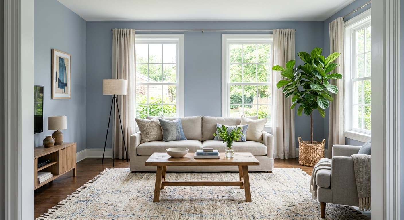
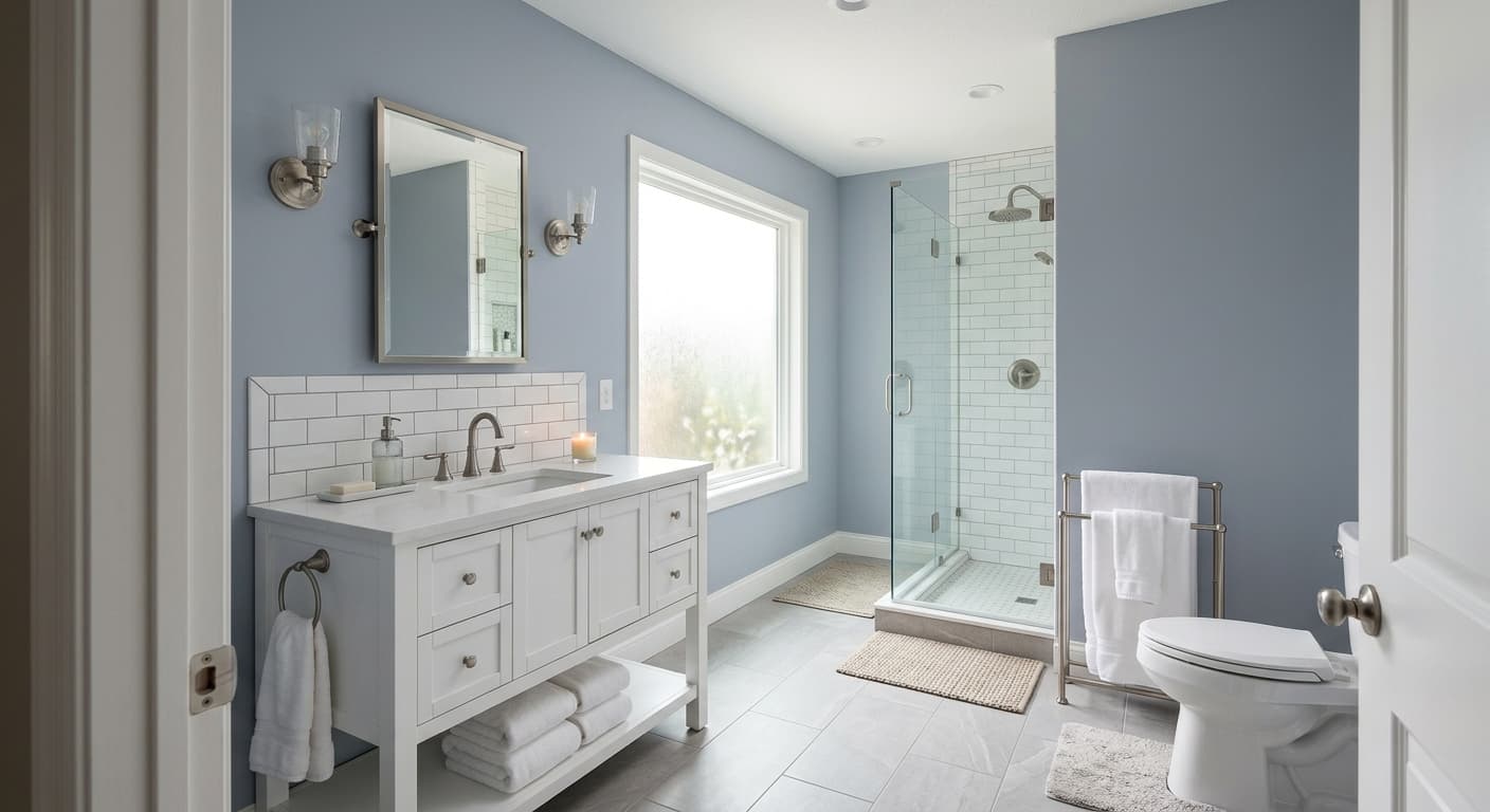
Winter Lake is a soft, muted blue-gray that reads quieter than you might expect from the name. It is not a bold coastal blue, and it is not a moody slate. It sits in that calm middle zone where blue and gray hold hands without either one taking over. On the wall, it feels airy and a little misty, like the color of fog rolling off water at dawn.
The thing to watch with Winter Lake is how it behaves across the day. In bright morning light, you'll see more of its blue character, clean and slightly cool. By late afternoon, especially in rooms with warmer artificial light, it softens toward gray and loses some of that crispness. This shift is part of what makes it interesting to live with, but it also means you should test it on your own walls before committing.
Compared to a lot of blue-grays, Winter Lake stays restrained. It does not push toward periwinkle or lavender, and it does not go icy or sterile. There is a gentleness to it that works in spaces where you want calm without coldness.
Winter Lake Undertones
The dominant undertone here is blue, with a gray base that keeps things grounded. There is a faint cool lean, so be careful pairing it with anything that has strong warm undertones, because the contrast can make Winter Lake look chilly by comparison. If your room gets a lot of warm afternoon sun, that natural warmth will balance the cool nicely.
Undertones matter most when you start choosing trim, flooring, and furniture. A trim with a yellow-cream base can clash against Winter Lake's coolness, so lean toward cleaner whites. Keep an eye on adjacent rooms too, since a warm beige hallway next door can make Winter Lake look more gray than blue through the doorway.
Where Winter Lake Works Best
This color shines in bedrooms, bathrooms, and home offices where you want a restful, focused mood. South-facing rooms are the safest bet because the warm, abundant light keeps Winter Lake from going flat or dreary. North-facing rooms can work, but the cooler natural light will emphasize the gray and the blue, so add warm lighting and warm textiles to compensate.
In smaller spaces, Winter Lake opens things up thanks to its mid-range lightness. In larger, open-plan rooms, it holds up well as a wall color that feels considered rather than loud. Just give it good natural light wherever you use it.
What to Pair With Winter Lake
For trim, reach for a crisp white like Benjamin Moore Chantilly Lace or a slightly softer White Dove if you want less contrast. Both keep the palette clean without fighting the cool undertone. For a deeper companion, Hale Navy makes a confident accent on a door or built-in, while Gray Owl works as a quiet neutral in an adjacent space.
Flooring in medium oak or natural wood tones grounds Winter Lake and adds the warmth it needs. Pale gray-washed floors also work if you want to keep things cool and contemporary. For furnishings, lean into natural linen, warm woods, brass or aged bronze hardware, and the occasional rust or terracotta accent to keep the room from feeling one-note. Texture is your friend here, since flat surfaces can make the color read cold.
Colors That Clash With Winter Lake
Skip pairing Winter Lake with bright, saturated primary blues, which make it look washed out and indecisive. Stay away from heavy gray-beige greiges next to it, because the warm and cool tones argue rather than complement. The most common mistake is using it in a poorly lit, north-facing room with cool LED bulbs, which strips out all its softness and leaves you with a flat, hospital-like gray. Always check it under your actual lighting at different hours.