Chantilly Lace
What Chantilly Lace Actually Looks Like
Chantilly Lace reads as a clean, crisp white in most settings. It has very little color pushing through it, which is why designers reach for it when they want white to actually look white instead of cream or gray. On your walls, it stays bright without tipping into the stark, clinical feeling you get from some pure whites.
Light changes how it behaves. In strong sunlight, it can look almost luminous, picking up a faint cool edge as the day goes on. Under warm bulbs at night, it softens and feels less sharp. North-facing rooms can make it lean slightly cool and crisp, while south and west exposure keeps it warmer and more relaxed.
What makes it distinctive is the lack of obvious yellow or pink. You will notice it next to other whites immediately. Put it beside a creamy white and Chantilly Lace looks fresh and modern. Put it beside a true gray-white and it holds its warmth just enough to stay comfortable.
Chantilly Lace Undertones
Chantilly Lace carries the faintest cool undertone, but it stays close to neutral. This matters because a white with no strong undertone gives you flexibility. It will not fight with your flooring, your countertops, or the colors next to it the way a heavily yellow or blue-based white might.
When you choose trim, adjacent walls, or furnishings, this neutrality works in your favor. You can pair it with warm woods and cool stones without the white clashing. The catch is that next to very warm creams, Chantilly Lace can suddenly look cooler than expected. Always test it against the materials already in your room.
Where Chantilly Lace Works Best
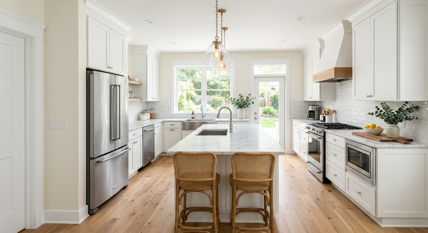
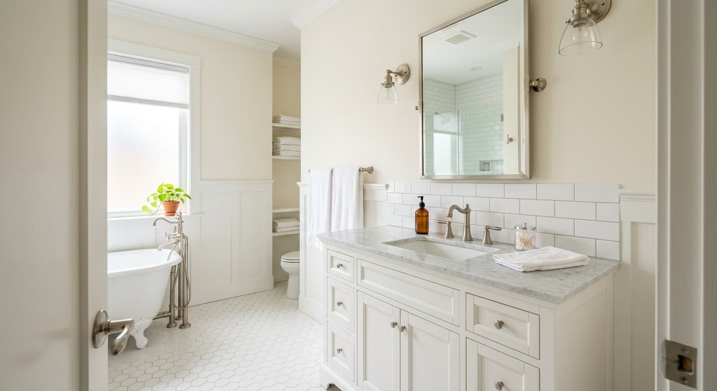
This is a strong all-over white, which means it works on walls, trim, ceilings, and cabinetry, sometimes all in the same room. It shines in kitchens, bathrooms, and spaces where you want brightness and a clean backdrop. Small rooms benefit because the high light reflectance opens them up and pushes the walls back visually.
Orientation does affect the result. South-facing rooms with plenty of natural light let Chantilly Lace look its best, bright and balanced. North-facing rooms will read cooler, so you will want warm lighting and warm accents to keep the space from feeling sterile. In rooms with little natural light, pair it with warmer materials so the cool edge does not take over.
What to Pair With Chantilly Lace
For a monochrome look, use Chantilly Lace on both walls and trim and let texture do the work. If you want contrast, pair it with deeper Benjamin Moore colors like Hale Navy, Kendall Charcoal, or Chelsea Gray. These give you definition without muddying the white. For a softer scheme, warm grays and greige tones like Edgecomb Gray sit comfortably beside it.
Flooring is flexible here. White oak, walnut, and medium-toned woods all work, as do cool gray tile and natural stone. For furniture, both black and brass accents stand out cleanly against it. Rattan, linen, and unfinished wood add warmth if the room feels too cool for your taste.
Colors That Clash With Chantilly Lace
Do not pair Chantilly Lace with creamy, yellow-based whites in the same sightline. The contrast makes Chantilly Lace look gray and the cream look dingy, and neither one wins. Avoid using it in a dark, north-facing room without adding warmth through lighting and materials, since it can turn cold and flat. And resist the urge to assume any white will match. Test it against your existing whites before committing.