Hale Navy
What Hale Navy Actually Looks Like
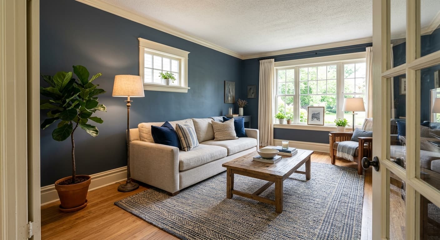
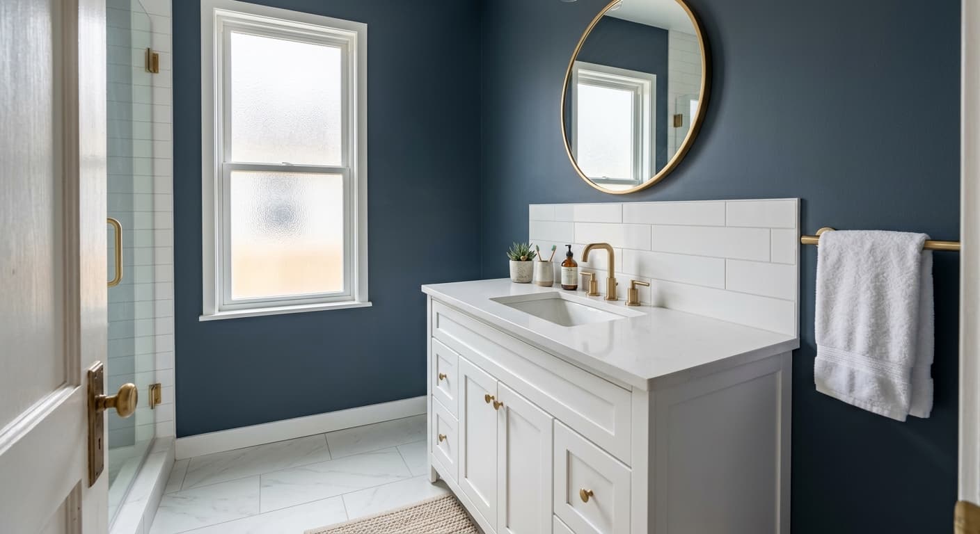
Hale Navy is a deep, muted navy that reads more like a soft black-blue than a bright cobalt. It has weight to it. When you put it on a wall, you will notice it grounds the space without feeling cold or stark the way a true black would.
The color shifts noticeably with light. In bright daylight, you see the blue clearly, and it leans slightly toward a slate or storm-cloud tone. As the light drops in the evening or under warm bulbs, Hale Navy can look almost charcoal, with the blue receding into something darker and quieter. North-facing rooms pull the cooler side forward, while warm artificial light softens it considerably.
What makes it distinctive is the gray undertone running through it. This keeps it from looking juvenile or nautical. It feels more like a tailored, classic navy than a primary-color blue, which is why it works on everything from kitchen islands to front doors to full accent walls.
Hale Navy Undertones
The dominant undertone here is gray, with a faint green-black depth that surfaces in low light. This matters because it changes how your other choices land. Against a crisp white trim, the gray keeps Hale Navy from looking too saturated. Against warmer creams, the green can sneak through, so test it before you commit.
If you are pairing it with cool grays or true whites, the navy stays sharp and clean. Bring in warm beiges or yellow-based whites, and you may notice the color muddy slightly. Always sample a large swatch on the actual wall and watch it across a full day.
Where Hale Navy Works Best
Hale Navy performs well in rooms where you want depth and a sense of enclosure. Think dining rooms, studies, powder rooms, and bedrooms. It also holds up beautifully on cabinetry and kitchen islands, where the matte depth reads as intentional and grounded.
Orientation matters. South-facing rooms get enough light to keep the blue lively and prevent it from going flat. North-facing rooms will pull it darker and moodier, which can be a feature if you lean into it with good lighting. In small spaces, the color creates a cocooning effect rather than shrinking the room, so do not be afraid to use it in a compact powder bath or entry.
What to Pair With Hale Navy
For trim, Benjamin Moore White Dove (OC-17) and Simply White (OC-117) both work well, giving you clean contrast without the harshness of a stark blue-white. If you want softer separation, Chantilly Lace keeps things crisp. For flooring, mid-tone wood like oak or walnut grounds the navy nicely, and natural materials such as rattan, leather, and brass hardware add warmth that balances the cool depth.
For complementary colors, Revere Pewter or Edgecomb Gray make calm transitions in adjoining spaces. Brass and unlacquered gold fixtures pop against the dark backdrop. Cream upholstery, camel leather, and natural linen all sit comfortably next to it. If you want a bolder move, a rust or terracotta accent plays well off the navy's coolness.
Colors That Clash With Hale Navy
Skip pairing Hale Navy with bright, cool-toned grays that have a blue base, since they compete with the navy and flatten the room. Stark, icy whites can make the green undertone look dingy by contrast, so favor whites with a little softness. Avoid heavy use in rooms with poor lighting and no natural light, where the color collapses into a dull near-black. And do not lean too hard into the nautical theme with reds and crisp blues, which pushes this sophisticated navy toward a beachy cliché it was never meant for.