Shadow
What Shadow Actually Looks Like
Shadow is one of those colors that refuses to sit still. At first glance it reads as a deep, dusty purple, but spend a day with it and you'll watch it move. In bright midday sun it softens into a warm mauve-gray. By late afternoon it pulls back into something moodier, almost charcoal with a violet pulse underneath.
This is a dark color, but it doesn't feel heavy the way a true black or navy does. There's a smokiness to it that keeps it from going flat. Think of the color of a ripe plum that's been sitting in low light, or wet slate with a bruise of purple running through it.
The thing to understand about Shadow is that it's chameleonic by design. Put it next to cool grays and it warms up. Put it next to warm beiges and the purple comes forward. You're not choosing one color here. You're choosing a range, and the room decides which part of that range you get.
Shadow Undertones
The dominant undertone is violet, with a gray base that keeps it grounded. This matters more than you might think. Purple undertones can clash hard with anything that leans yellow or green, so your warm-toned oak floors or brass fixtures need to be considered before you commit.
When the light drops, the gray takes over and the purple recedes. That shift means Shadow can feel like two different colors depending on the time of day. Sample it on at least two walls and live with it for a few days before you decide. The undertone you fall in love with at noon may not be the one you get at dinner.
Where Shadow Works Best
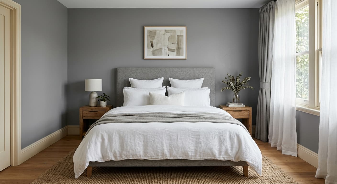
Shadow thrives in rooms where you want intimacy rather than openness. Bedrooms, dining rooms, powder rooms, and studies all suit it well. In a north-facing room the cooler light will emphasize the gray and the violet stays subtle and sophisticated. In a south-facing room with strong warm light, expect the purple to bloom, which can be lovely but isn't for everyone.
Smaller spaces actually benefit from a color this deep. Rather than trying to make a powder room feel bigger with pale paint that always disappoints, lean into the darkness. Shadow wraps a small room in something that feels deliberate and enveloping. In large open rooms, use it on a single feature wall or in an alcove where it can do its work without swallowing the whole space.
What to Pair With Shadow
For trim, a soft white like Benjamin Moore White Dove (OC-17) keeps things crisp without going stark. If you want less contrast and more drama, paint the trim the same Shadow color for a tonal, modern look. Chantilly Lace (OC-65) works if you want maximum brightness against the depth.
For furnishings, warm woods like walnut and dark oak pair beautifully because their brown tones balance the cool violet. Brass and aged bronze hardware feel right. Avoid bright chrome, which can look clinical against this warmth. For complementary wall colors in adjacent rooms, try Revere Pewter (HC-172) or Edgecomb Gray (HC-173) to bridge into lighter spaces. Velvet upholstery in rust, mustard, or deep teal will sing against Shadow.
Colors That Clash With Shadow
Don't pair Shadow with yellow-based beiges or honey-toned floors without a buffer. The clash between warm yellow and cool violet makes both look muddy. Skip cool fluorescent lighting too, which strips the warmth and leaves the color feeling cold and lifeless. The most common mistake is using it in a room with poor natural light and no plan for layered lamps. Shadow needs light to reveal its complexity, and in the dark it just goes gray and gloomy.