London Fog
What London Fog Actually Looks Like
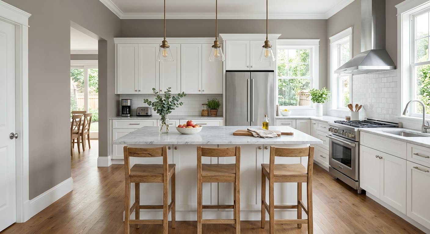
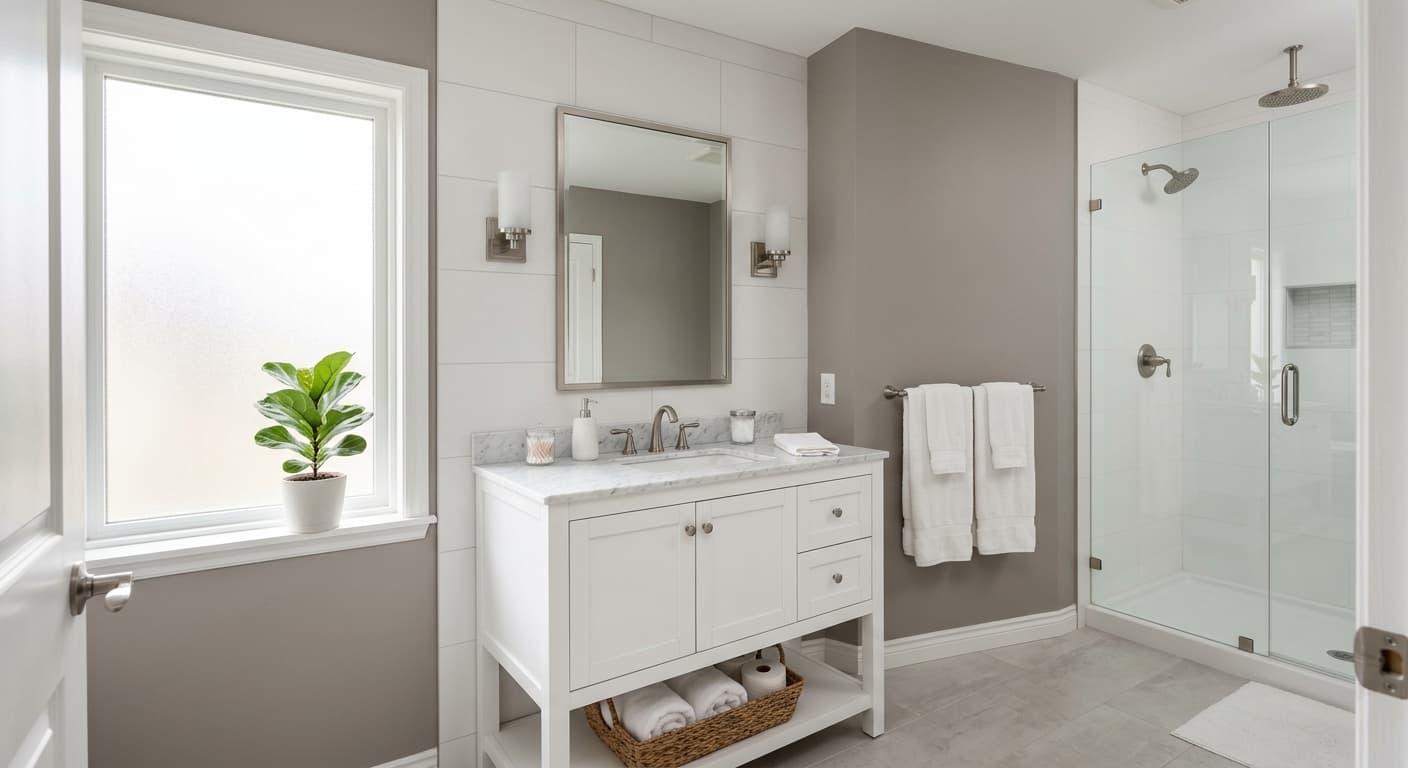
London Fog is a muted greige that sits closer to gray than beige, though the warmth keeps it from feeling cold. Think of it as the color of a wool overcoat left out in soft daylight. There's depth here without heaviness. On a sample card it can read almost taupe, but once it's on a full wall, the gray steps forward and the beige settles into a supporting role.
The way it shifts through the day is what makes it interesting. In strong morning light it leans clean and slightly silvery. By late afternoon, when the light goes warm, you'll notice the beige underpinning come alive and the whole room feels softer. Under artificial light it depends entirely on your bulbs. Warm LED makes it cozy and grounded. Cooler bulbs push it toward a flat, slate-adjacent gray.
What separates London Fog from the dozens of other greiges out there is its restraint. It doesn't go purple in shadow the way some grays do, and it doesn't turn pink under incandescent light the way warmer greiges can. It stays in its lane.
London Fog Undertones
The dominant undertone is a soft gray with a green-gray whisper underneath. That green is subtle, but it's why London Fog feels organic rather than sterile. It pulls the color toward sage territory in certain north light, so pay attention to your exposure before committing.
Undertones matter most when you're choosing what sits next to the wall. A trim with a yellow base will fight the cool gray and make London Fog look dingy. Furnishings with strong orange or red tones will exaggerate the green and make the wall feel murky. Keep your adjacent colors cool to neutral and the undertone behaves.
Where London Fog Works Best
This color thrives in rooms with decent natural light. South and east-facing spaces are the sweet spot, where the warmer light balances the cool gray and keeps it feeling welcoming. In north-facing rooms it can go flat and slightly cold, so reserve those for spaces where you actually want a quiet, retreating feel, like a bedroom or a home office.
Size-wise, London Fog handles both small and large rooms well. In a small powder room it reads as a sophisticated neutral rather than a builder-grade default. In an open-plan living area it provides a calm backdrop that lets your furniture and art do the talking. It's a strong whole-house color if you want continuity from room to room.
What to Pair With London Fog
For trim, go with a clean white that has a touch of softness. Benjamin Moore White Dove (OC-17) is a reliable match, warm enough to feel intentional without clashing. If you want more contrast, Chantilly Lace (OC-65) keeps things crisp. For a tonal look, pair London Fog with a deeper greige or a charcoal like Kendall Charcoal (HC-166) on a feature wall or cabinetry.
Flooring with warm wood tones, white oak especially, grounds the cool wall and adds balance. For furniture, lean into natural linen, putty, taupe, and black accents. Brass and matte black hardware both work. If you want a coordinating color in an adjacent room, Revere Pewter (HC-172) and Edgecomb Gray (HC-173) live in the same family and flow nicely.
Colors That Clash With London Fog
Skip warm yellow-based whites for trim, since they'll make the gray look muddy. Don't pair London Fog with saturated warm tones like terracotta or golden oak unless you want the green undertone to take over. And resist the urge to flood a north-facing room with this color and call it done. Without warm light or warm furnishings to counter it, the space can feel chilly and uninviting. Always test a large swatch on the actual wall before you buy gallons.