Harbor Haze
What Harbor Haze Actually Looks Like
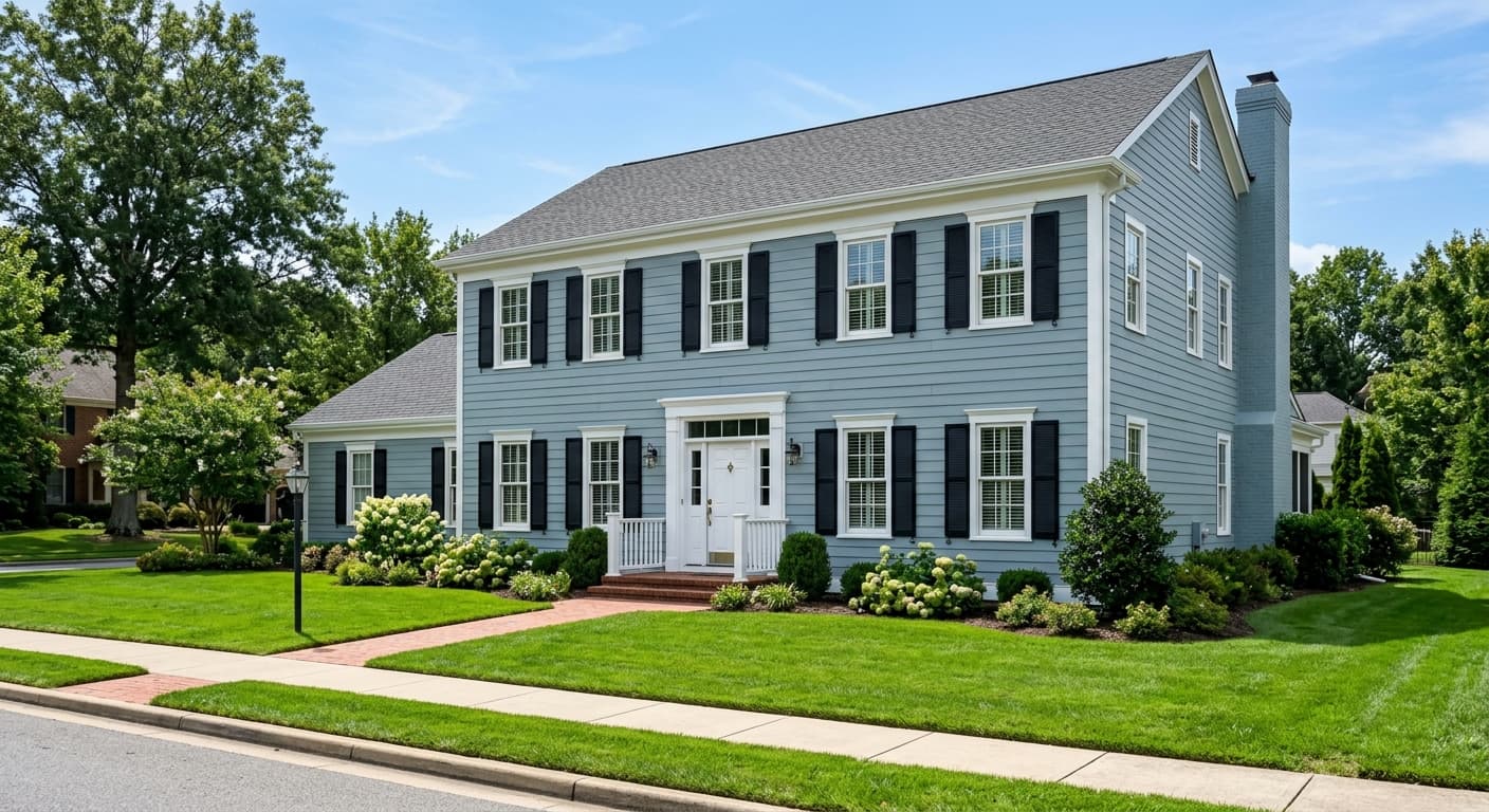
Harbor Haze reads as a quiet, hazy gray with just enough green to keep it from going cold. It sits in that hard-to-name family of grayed sages, the kind of color that looks different depending on how long you stare at it. In bright daylight, the green steps forward and the whole wall feels fresh and slightly silvery. Pull the curtains or wait for an overcast afternoon, and it settles into a soft, dusty gray.
The thing that makes this color worth your attention is its restraint. It never commits hard to one direction, which is exactly what some people want and exactly what frustrates others. You'll notice it picks up the temperature of the room around it. Warm lamplight nudges it toward a putty gray. Cool north light brings out the muted green-gray you probably fell for on the chip.
Compared to louder sages, Harbor Haze stays understated. It is not a statement color. It is a backdrop, and a smart one.
Harbor Haze Undertones
The dominant undertone here is green, but it is softened by gray and carries a faint warmth underneath. That warmth matters more than people expect. It keeps the color from feeling clinical, but it also means you need to watch what you put next to it. Pair it with a stark blue-white trim and the green can suddenly look slightly murky by contrast.
Undertones decide whether your whole scheme feels intentional or just slightly off. With Harbor Haze, lean into the soft green-gray quality rather than fighting it. Choose adjacent colors and furnishings that have a touch of warmth themselves, and the undertones will read as deliberate instead of accidental.
Where Harbor Haze Works Best
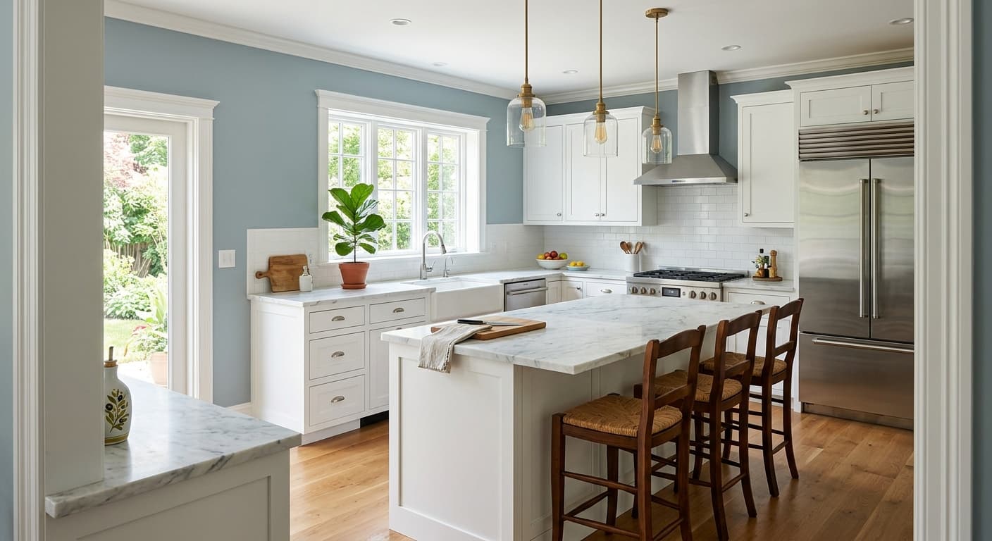
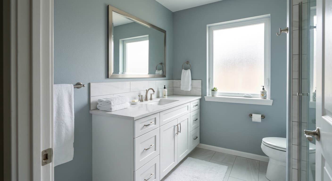
This color does its best work in spaces where you want calm without going fully neutral. Bedrooms are an obvious win. So are living rooms, home offices, and bathrooms where you want a spa-like quiet. It has enough depth to feel grounded but stays light enough to keep a room open.
Orientation changes everything here. In south-facing rooms with strong warm light, Harbor Haze stays balanced and inviting. North-facing rooms cool it down and bring out more gray and green, which can be lovely if that is what you want, or flat if the room already feels dim. In small spaces, its softness helps the walls recede, making the room feel a touch larger.
What to Pair With Harbor Haze
For trim, reach for a soft white rather than a bright one. Benjamin Moore White Dove (OC-17) is a reliable match. It has a gentle warmth that flatters the green-gray without competing. Simply White (OC-117) works too if you want a hair more brightness.
For furnishings, natural materials sing against this color. Think oak flooring in a warm-to-medium tone, linen upholstery, rattan, and aged brass hardware. Black accents give it structure if the room feels too soft. For a coordinated palette, Revere Pewter (HC-172) makes a warm greige companion, and Hale Navy (HC-154) offers a deeper anchor if you want contrast in a cabinet or accent wall.
Colors That Clash With Harbor Haze
Skip pairing it with cool, blue-based grays, which fight the warmth underneath and make everything look slightly dingy. Avoid bright, icy whites on the trim for the same reason. And do not use it in a windowless or very dim room expecting it to brighten things up. Without decent light, Harbor Haze loses its green character and can flatten into a sad, foggy gray. This is a color that needs light to do its job.