Sticks and Stones is a mid-tone greige that earns its name. On the wall it reads as a subdued, earthy taupe with brown and gray notes working together, never tipping hard into either direction. The overall effect is stone-like rather than sandy or tan, which keeps it grounded and prevents it from reading as a typical beige. The low chroma is key: this is not a color that shouts, it settles quietly into a room and lets texture and light do the talking.
With an LRV of 31.5, Sticks and Stones sits firmly in medium territory, on the darker side of neutral. It absorbs more light than it reflects, so it creates a rich, cozy, intimate atmosphere rather than an open, airy one. In a well-lit room that quality reads as depth and warmth. In a dim or north-facing space, it can go heavy and close, so light matters a great deal. Many reviewers note that it photographs warmer than it appears in person, and that in-person it sometimes reads cooler and more stone-gray, especially against very warm finishes nearby.
The undertone story for Sticks and Stones is genuinely layered, and reviewers do not all land in the same place. The dominant read is warm taupe, a mix of brown and gray that gives the color its stone quality. Most people see warmth first, particularly in afternoon light or against cool-white trim, where the brown and beige notes come forward noticeably.
That said, a meaningful number of reviewers report a cooler, grayer pull, especially in north-facing rooms or under cool artificial lighting. The gray undertone is real and it surfaces in those conditions. A few reviewers with warm wood floors or orange-toned cabinetry nearby found that Sticks and Stones pulled noticeably cooler by contrast, which surprised them. This is not a color that reads the same in every context, and that disagreement in the reviews is worth taking seriously. If your space skews warm already, the gray notes may actually balance things well. If your space is cool and you want warmth, you may find the color feels more ambiguous than you expected.
There is no green or purple lurking here, which is one of the things reviewers consistently appreciate. It does not shift into muddy or unexpected territory the way some greiges can. The warmth stays brown-based, and the cool pull stays gray-based, so the color behaves predictably even if the balance between those two shifts with your light.
Sticks and Stones works best in rooms where you want a settled, enveloping quality rather than a bright, reflective one. Living rooms and dining rooms are naturals: the medium depth creates an intimate scale that suits conversation and evening use, and the earthy character plays directly to rooms anchored by natural materials like wood, stone, jute, and linen. Reviewers use it widely in transitional and modern farmhouse spaces precisely because it reads neither too traditional nor too contemporary.
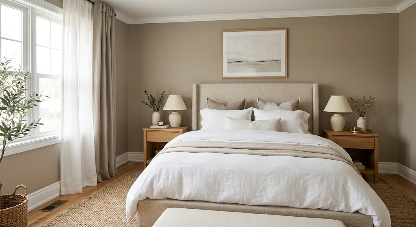
Bedrooms are another strong fit. The low LRV of 31.5 reads as genuinely restful rather than stimulating, and the warm stone quality keeps the room from feeling clinical. For these rooms, south or west orientation gives you the best result, where afternoon light will warm the brown notes and keep the color from going flat. East-facing rooms are workable but will shift cooler in the afternoon. North-facing rooms require the most caution: you will want good artificial lighting and plenty of warm-toned natural materials to prevent the color from reading heavy and gray.
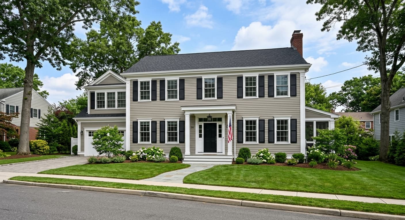
For exteriors, Sticks and Stones performs well as a body color, particularly on homes with stone or brick accents where the earthy undertone ties the palette together. On cabinetry, it creates a sophisticated, non-trendy look that sits between a gray and a taupe without fully committing to either. In both applications, pairing it with a warm white trim color makes a significant difference in keeping the overall palette from looking muddy.
This is where Sticks and Stones performs most consistently well. The medium depth at LRV 31.5 creates a settled, enveloping quality that makes large seating areas feel anchored rather than cavernous. Natural wood furniture, stone accents, and woven textiles all read beautifully against it.
The low reflectance and warm stone quality produce a genuinely restful room without feeling cold or clinical. South or west orientation works best to keep the brown notes alive through the day. Pair with warm white bedding and natural wood for maximum effect.
In a dining room, the depth of Sticks and Stones creates intimacy that suits evening light and candlelight particularly well. The earthy character works with wood dining tables and upholstered chairs in linen or leather. Trim in White Duck (SW 7010) keeps the palette warm and cohesive.
On cabinetry, Sticks and Stones reads as a sophisticated, non-trendy alternative to standard gray or greige cabinet colors. It sits convincingly between the two without looking like an accident. Pair with unlacquered brass hardware and a lighter warm white on the walls for balance.
As an exterior body color, Sticks and Stones ties naturally to stone foundations, brick, and wood trim elements. The LRV of 31.5 gives it enough depth to read intentionally on a facade without going so dark that it feels heavy. Warm white trim is important here to keep the palette from reading muddy.
The coordinating colors Sherwin-Williams pairs with Sticks and Stones are well-chosen for different purposes. White Duck (SW 7010) is a go-to trim and ceiling option: it has enough warmth to echo the brown notes in Sticks and Stones without competing with it, and the contrast is readable without being harsh. Westhighland White (SW 7566) runs slightly lighter and crisper, giving you a cleaner separation that suits more contemporary interiors. Natural Tan (SW 7567) works as a lighter adjacent wall color or as a way to carry the earthy palette into a connected space with a brighter, airier feel.
Beyond those anchors, Sticks and Stones handles deep accents well. A deep gray-brown on cabinets or an accent wall gives the palette real drama and keeps everything in the same warm-stone family. Natural materials carry the palette further than paint alone: wood with warm brown grain, unlacquered brass, matte black iron, raw linen, and woven textures all reinforce what makes this color work. Avoid cool-toned metals like chrome or cool bright whites for trim, both will expose the gray in the undertone and create an unintentional clash.
All comparisons are matched against Sticks and Stones at LRV 31.5.
Pairing Sticks and Stones with a stark or blue-toned white trim exposes the gray in the undertone and creates a disconnect that makes the wall color look unintentionally muddy or cold.
When Sticks and Stones is placed next to strongly orange or honey-toned wood, the contrast pushes the cool gray notes forward and the color can read unexpectedly cold and flat rather than warm.
Chrome, nickel, or cool-toned metals in the same room amplify the gray notes in Sticks and Stones and push the overall palette toward an unintended cool-gray reading that undercuts the earthy warmth.
Sticks and Stones is a mid-tone greige, a subdued earthy taupe that blends warm brown and gray notes. It reads as stone-like rather than tan or sandy, which keeps it grounded and prevents it from drifting into typical beige territory. The overall feel is rich and settled at its LRV of 31.5.
The primary undertones are warm taupe: a mix of brown and gray that gives the color its stone quality. In warm or south-facing light the brown notes come forward more noticeably. In north-facing rooms or under cool artificial light, the gray pulls stronger and the color reads cooler than many people expect. There are no green or purple undertones, so it stays predictable even as the warm-to-cool balance shifts with your lighting.
It is primarily warm, but it carries a real gray note that surfaces in cooler light conditions. Most reviewers land on warm as the dominant read, particularly against cool-white trim where the brown and beige come forward clearly. In north-facing or dimly lit spaces, the gray note becomes more prominent and the color can feel more ambiguous than a straightforwardly warm taupe.
The LRV is 31.5, which places it firmly in medium territory and on the darker side of neutral. That means it absorbs significantly more light than it reflects. It will create a cozy, intimate feel in a room but can go heavy in low-light spaces, so adequate natural or artificial light matters.
The Sherwin-Williams code is SW 7503. The hex value is #a49689, and the RGB is 164 / 150 / 137.
White Duck (SW 7010) and Westhighland White (SW 7566) both work as warm white trim and ceiling options that echo the brown notes without competing. Natural Tan (SW 7567) carries the earthy palette into adjacent lighter spaces. For deeper accents, a warm dark gray-brown on cabinets or a feature wall adds drama while staying in the same stone-and-earth family. Natural wood, stone, jute, linen, and warm metals like unlacquered brass or aged bronze all reinforce what makes the color work.
Yes to all three. On exteriors it reads as a sophisticated stone-neutral body color that ties naturally to masonry, brick, and wood trim, especially with a warm white trim color alongside it. On cabinets it sits convincingly between gray and taupe without looking indecisive, and warm hardware like unlacquered brass reads well against it. As a front door color it is less common but works on homes with stone or natural wood detailing where the earthy quality feels intentional.
