Software SW 7074 reads as a confident, medium-dark gray on the wall. With an LRV of 22.7, it absorbs a fair amount of light without going truly dark, landing in that zone where a room feels anchored and deliberate rather than dim. It is the kind of gray that commands attention while still stepping back enough to let your furnishings do their work.
In person, Software is neither a pale whisper nor a dramatic charcoal. It sits comfortably in the middle register, reading clearly as gray across most conditions. That said, the color is not static. Under bright natural light it can look almost silvery and crisp. In shadowed corners or on an overcast day it deepens noticeably, taking on more weight. That range is part of what makes it interesting and also why a large sample swatch on your actual walls is non-negotiable before you commit.
Photography often distorts it. Images online can make Software look either warmer and greener or cooler and bluer than it appears in real life, so take any photo reference with skepticism. What reviewers consistently agree on is that it never looks flat or muddy. There is a depth to it, a subtle complexity, that keeps it lively whether you are looking at a freshly painted accent wall or a full-room treatment.
This is where Software gets genuinely interesting and where opinions diverge. Sherwin-Williams categorizes it as a warm, balanced neutral gray, and that read is defensible. In warmer light, whether from incandescent bulbs, warm LEDs, or late-afternoon sun, the color does settle into a softer, slightly warmer gray that feels inviting rather than clinical.
However, a meaningful number of independent reviewers see a cool, subtle blue undertone that surfaces especially in north-facing rooms and in cooler daylight. That blue-gray quality is exactly what gives Software its sophistication and depth, but it means the color can shift toward the cool end of the spectrum in the wrong conditions. If your space gets heavy northern or eastern exposure and you are sensitive to blue grays, that undertone can feel more pronounced than you expected.
The honest answer is that both reads are real. Software is not a chameleon that changes dramatically, but it does respond to its environment. Warm finishes nearby, wood tones, brass hardware, and warm-tinted trim all coax out its balanced, neutral side. Cool whites, chrome fixtures, and northern light will tip it toward the blue-gray camp. Plan your palette with both possibilities in mind, and test it at multiple times of day before making a final call.
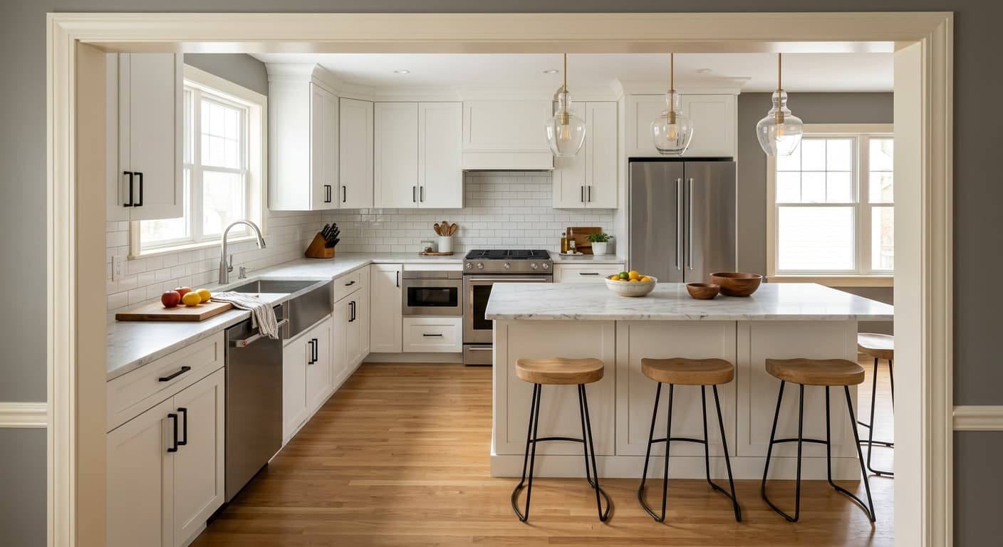
Software is a natural fit for rooms where you want a grounded, sophisticated atmosphere without going full charcoal. Living rooms and bedrooms are where it gets used most often, and for good reason. In a living room it creates a backdrop that makes furniture and art feel intentional. In a bedroom it delivers calm without reading as cold, particularly if you balance it with warm textiles and wood tones.
Studies and home offices are a strong match. The color has a focused, quiet energy that suits spaces where you need to concentrate. Designers frequently cite it for chic, contemporary offices, and that reputation is well earned. It works in minimalist and light industrial interiors too, sitting comfortably alongside exposed concrete, metal accents, and clean-lined furniture. It also translates well to transitional spaces that blend traditional architecture with modern furnishings.
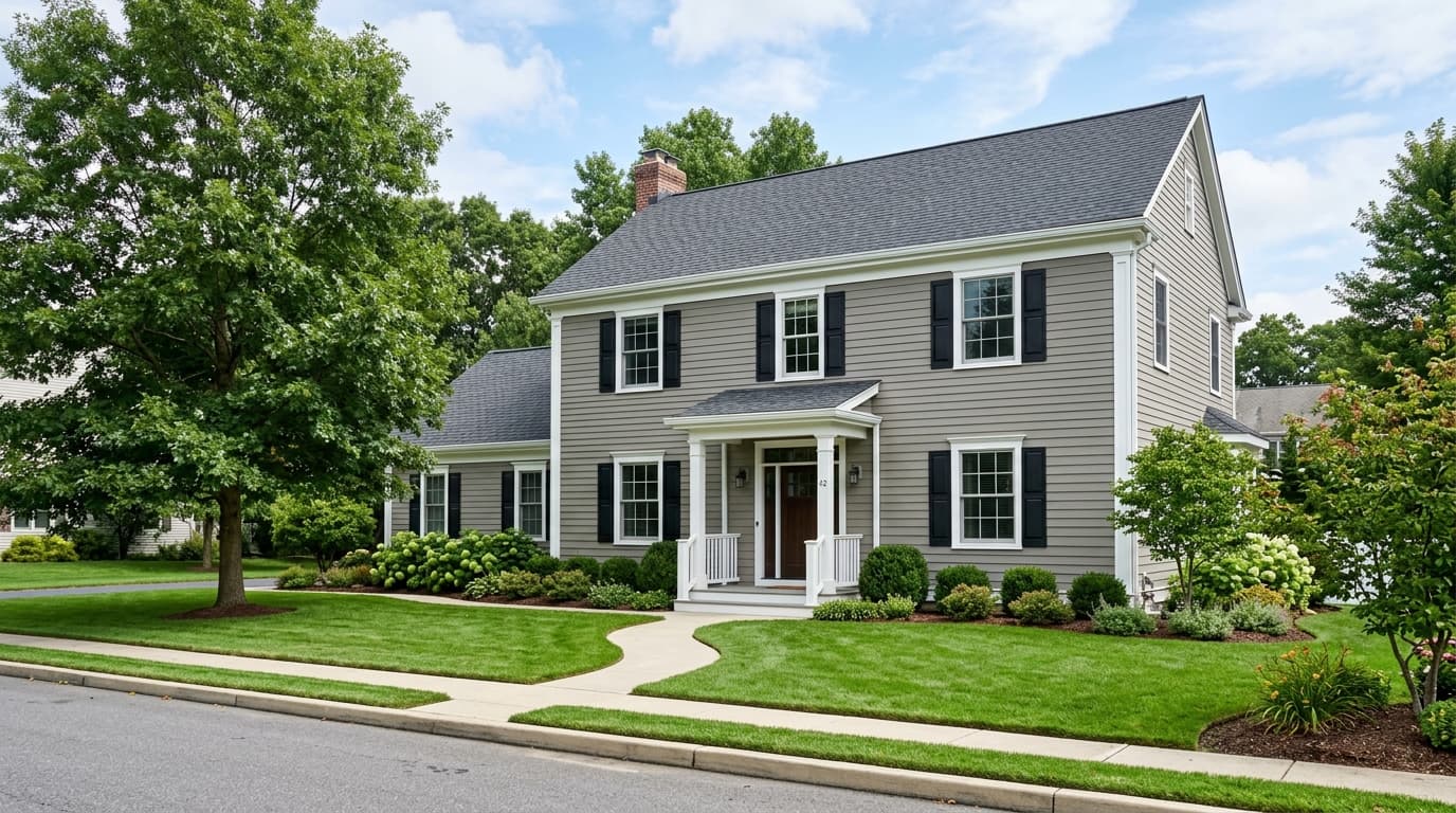
On the exterior, Software holds up as a modern body color. It reads with purpose from the curb, works well with crisp white or warm off-white trim, and pairs naturally with natural wood accents and black or dark metal hardware. One practical note on light and orientation: in north-facing or low-light interiors, Software will lean cooler and feel more blue-gray. In south- or west-facing rooms with plenty of warm natural light, it softens and reads closer to its warm-balanced label. Adjust your trim and accent choices accordingly rather than fighting the light.
Software gives a living room immediate presence without overwhelming the space. At LRV 22.7 it holds its ground as a background color, letting seating and art stand out. Balance it with warm off-white trim like Site White SW 7070 and plenty of warm textile layers to keep the room from feeling too cool.
In a bedroom, Software delivers a calm, settled atmosphere that is easy to wind down in. Pair it with warm wood furniture and linen bedding to offset any cool blue-gray shift in lower light. Warm LED bulbs make a noticeable difference here and pull the color toward its warmer, more neutral side.
This is one of Software's best applications. The color has a quiet, focused quality that suits work-from-home spaces, and it photographs well on video calls without looking washed out. It works in both contemporary and transitional office settings, and coordinates naturally with dark wood desks and metal shelving.
Software reads with purpose as an exterior body color and suits modern, transitional, and craftsman-style homes. Pair it with Toque White SW 7003 on trim for a slightly warmer exterior palette, or go with Site White SW 7070 for a crisper contrast. Black or dark bronze hardware and gutters sharpen the look considerably.
Software plays well with off-whites that have warmth without going yellow. Site White SW 7070 and Toque White SW 7003 are the obvious trim and ceiling partners, and both are shown as coordinating picks for exactly that reason. Site White reads clean and slightly warm, keeping the pairing crisp without introducing a cold contrast. Toque White leans a touch creamier, which softens the overall effect and works especially well in rooms where you want a cozy rather than sharp finish.
Beyond trim, think about the full palette. Warm wood tones, natural linen, aged brass, and matte black all work with Software's depth without pulling it in an awkward direction. If you want to bring in an accent, lean toward warm neutrals or dusty, muted tones rather than anything bright or saturated. Pollen Powder SW 9014 is listed as a coordinate and can bring a subtle warmth as an accent when used carefully. Strong contrast comes naturally from crisp white millwork and dark hardware, so you rarely need to do more than that to make the color feel complete.
All comparisons are matched against Software at LRV 22.7.
Heavy honey-pine floors or orange-toned oak cabinetry can fight with Software's gray depth, creating a muddy visual tension rather than a warm contrast.
A stark, bright white on trim can make Software feel cooler and more severe than intended, amplifying any blue undertone that surfaces in lower or northern light.
Bold, saturated accent colors in warm reds, mustard yellows, or vivid greens tend to fight against Software's quiet sophistication rather than complement it.
Software SW 7074 is a medium-dark gray with warm, balanced undertones. It sits solidly in the mid-tone gray range with an LRV of 22.7, meaning it reflects a moderate amount of light and reads as a grounded, sophisticated neutral rather than a pale or a near-black shade.
Sherwin-Williams describes Software as a warm, balanced neutral gray, but independent reviewers frequently detect a subtle blue-gray undertone that surfaces in cooler or lower light. Both reads are real depending on your room's light exposure, surrounding finishes, and bulb temperature. Warm LED lighting and warm-toned furnishings will coax out the balanced neutral side, while north-facing light or cool whites nearby can tip it toward blue-gray.
It is genuinely in between, which is part of its appeal and part of what makes it tricky. Under warm incandescent or warm LED light it settles into a balanced, neutral gray. In north-facing rooms or under cool daylight it can shift toward a cool blue-gray. Think of it as a balanced gray that responds to its environment rather than a firmly warm or firmly cool color.
The precise LRV is 22.7, which puts it clearly in the medium-dark range. It absorbs more light than it reflects, so it will darken a room compared to a light or mid-light gray, but it is far from a true deep charcoal.
The Sherwin-Williams code is SW 7074. The hex value is #7F8486 and the RGB is 127 / 132 / 134.
For trim and ceilings, Site White SW 7070 and Toque White SW 7003 are the primary coordinating picks, both providing warm off-white contrast without going stark. Warm wood tones in walnut or white oak, aged brass hardware, matte black metal, and muted linen textiles all complement Software well. Avoid bright or high-saturation accents, and lean toward dusty or earthy tones if you want to bring in color.
Yes on all three counts. As an exterior body color it reads modern and grounded and holds up well in both full sun and shade. On a front door it makes a strong, understated statement, particularly with crisp off-white trim and dark hardware. For cabinets, its LRV of 22.7 means it will read as a definitively dark cabinet color, which works well in kitchens or bathrooms where you want contrast against light countertops or walls.
