Silver Lake reads as a soft, muted blue-gray on the wall, the kind of color that genuinely evokes a still lake surface on an overcast morning. It is light but not pale. With an LRV of 52.8, it sits in the medium-light range, which means it reflects enough light to keep a room feeling open and airy while still delivering clear, legible color. You will not mistake it for an off-white or a near-neutral; it holds its blue-gray identity across most conditions.
The color shifts noticeably depending on the light source and time of day. In north-facing rooms or under cool daylight, Silver Lake leans decidedly blue and can feel crisp and almost coastal in character. In south- or west-facing rooms flooded with warm afternoon light, the blue recedes and the gray base comes forward, softening the whole effect into something quieter and more restrained. Artificial lighting matters too: warm incandescent or Edison bulbs push it toward a muted, neutral gray, while cooler LED or daylight-spectrum bulbs bring the blue back out.
The core undertone in Silver Lake is blue sitting over a gray base, and that combination is what most reviewers agree on. Beyond that point, descriptions start to diverge, and the divergence is real and worth taking seriously before you buy. In certain lighting conditions, particularly under cool north light or next to warm creamy whites, Silver Lake can flash faint green or mint. Some reviewers describe this as a pleasant, slightly aquatic quality; others find it unexpected if they were anticipating a cleaner, crisper blue-gray.
There is also a smaller camp of observers who pick up lilac or pale purple, especially in transitional light at dusk or under some fluorescent fixtures. A few note a whisper of pale yellow in very warm direct sunlight, though this reading is less common. The honest takeaway is that Silver Lake is not a single, stable, predictable blue-gray. It is a color that responds to its environment, and what you see on a paint chip or a screen is only one version of it. The gray base keeps it from tipping into anything vivid or saturated, but the blue-green-lilac oscillation is real.
For that reason, sampling on your actual wall is not optional advice here, it is essential. The undertone you experience will depend on your room's orientation, your trim color, your flooring, and your light sources. Placed next to a bright cool white, the blue reads stronger. Next to a warm beige or greige, the green or gray notes become more prominent. Testing a large sample board in both natural and artificial light at different times of day will tell you which version of Silver Lake you are actually getting.
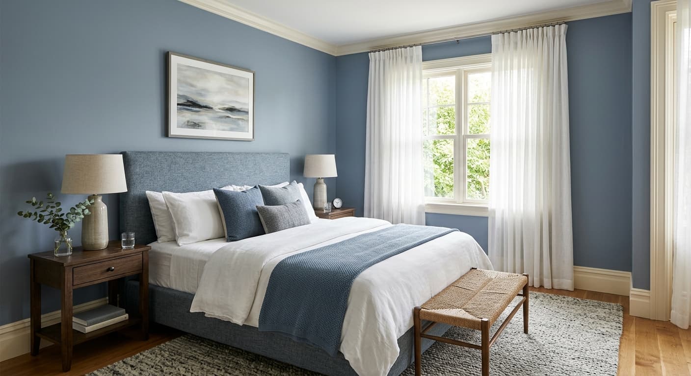

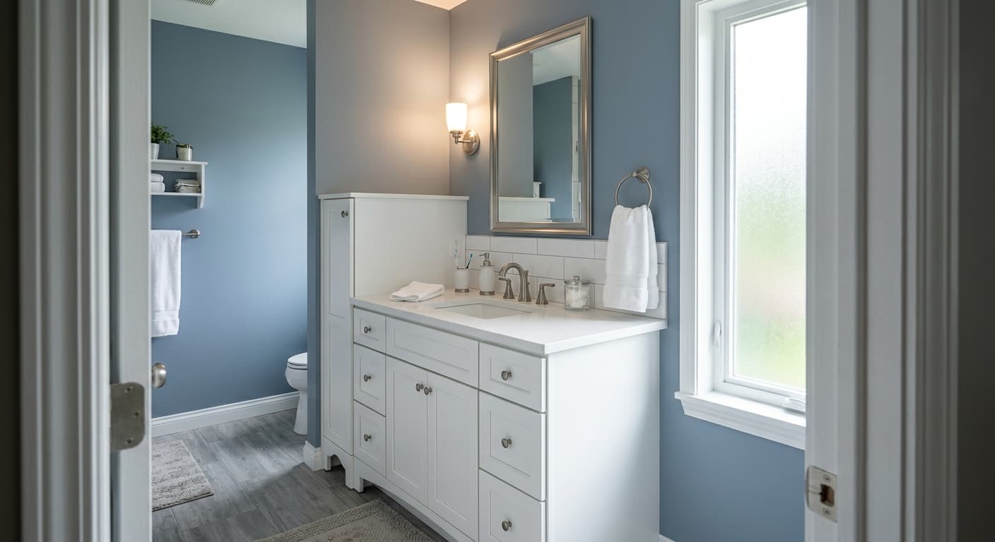
Silver Lake is best suited to rooms where a calming, airy atmosphere is the goal. Bedrooms are a natural fit, particularly as a feature wall color where the cool blue-gray creates a restful backdrop without feeling cold or clinical. Its LRV of 52.8 gives it enough reflectivity to keep a bedroom from feeling heavy, even in rooms that do not get abundant natural light. Bathrooms benefit from the same quality: the color reads clean and fresh without veering into an overly saturated or trendy blue.
Living rooms work well when the orientation and decor support the cooler palette. In a south- or west-facing living room, Silver Lake settles into a softer gray-blue that pairs easily with natural wood tones, linen fabrics, and warm-toned metallics. In north-facing living rooms, the cool blue character is more dominant, which can feel serene and intentional if you lean into it with similarly cool or coastal furnishings, but can feel chilly if your furniture skews warm and earthy. East-facing rooms get the best of both worlds across the course of a day.
On exteriors, Silver Lake earns its place as a classic coastal color. It works on clapboard siding, shingles, and larger facade surfaces where its medium depth gives it enough presence without going dark or intense. Crisp white trim amplifies the coastal read, while a deeper charcoal on shutters or doors grounds it and keeps it from feeling washed out in full sun. It is a legitimate option for front doors as well, where its calm, distinctive blue-gray reads as welcoming without being bold.
Silver Lake is one of the most effective bedroom colors in this range because it is genuinely calming without reading as cold or sterile. Use it on all four walls or as a feature wall behind the bed with White Snow on trim and ceiling. Layer in warm-toned bedding and natural wood furniture to keep the room from feeling too cool.
In a bathroom, Silver Lake reads clean and fresh, closer to a spa-like blue-gray than anything fussy or saturated. It handles both natural light from a window and the cooler light of vanity fixtures well, though you should expect it to lean more gray under warm bulbs. White Snow on trim keeps the space feeling sharp and finished.
Silver Lake works best in living rooms with at least some warm elements in the furnishings to balance its cool base. A south or west orientation softens it toward a quieter gray-blue that pairs easily with linen, leather, and natural wood. In a strict north-facing room with cool decor, it can read chilly, so balance it with warmer textiles and lighting.
On exteriors, Silver Lake delivers a dependable coastal look with enough depth at LRV 52.8 to read clearly on a large facade in full sun. Pair it with White Snow on trim for a clean coastal contrast and Big Dipper on shutters or the front door for grounding. It holds up well on both shingle and clapboard siding.
As a front door color, Silver Lake is distinctive without being loud. It reads as a calm, considered blue-gray that signals personality without overpowering the rest of the exterior. It pairs well with white or off-white siding and dark metal hardware.
Sherwin-Williams pairs Silver Lake with White Snow (SW 9541) as the go-to trim and ceiling white, and it is an easy, reliable choice. White Snow is clean without being stark, so it lets Silver Lake hold its blue-gray identity rather than making it look too cool or washed out by contrast. For a softer, more layered approach on trim or adjacent walls, it works well.
For contrast and warmth, Lotus Petal brings a warm blush neutral into the room that balances Silver Lake's cool tone without fighting it. That pairing reads as collected and intentional, especially in bedrooms and bathrooms where you want warmth without abandoning the calm base the blue-gray provides. Big Dipper anchors the palette on the deep end: use it on an accent wall, cabinetry, or exterior shutters and doors to give Silver Lake something to play against. The charcoal-blue depth of Big Dipper and the medium-light softness of Silver Lake create a range that feels cohesive and grounded rather than flat.
All comparisons are matched against Silver Lake at LRV 52.8.
If your existing trim has a yellow or golden undertone, it will pull Silver Lake's cooler blue-gray toward green or teal in a way that feels unintentional and unsettled rather than complementary.
Deep cherry or orange-toned hardwood floors create a strong simultaneous contrast with Silver Lake's cool base, making the wall color look more aggressively blue or green and the floor look more orange than it actually is.
Silver Lake in a room with cool-white trim, cool-gray flooring, stainless fixtures, and cool LED lighting can compound into a space that feels flat, cold, and uninviting, especially in a north-facing room.
Silver Lake is a light, muted blue-gray with a calm, lake-surface quality. It is not a vivid or saturated blue; it sits in the medium-light range with an LRV of 52.8, which means it shows clear, legible color on the wall while still reflecting a comfortable amount of light. Most people read it as a serene blue-gray that leans coastal without feeling bold.
The primary undertone is blue over a gray base, which is what most observers agree on. Beyond that, Silver Lake can also flash faint green or mint in cool north light, and some reviewers pick up a hint of lilac or pale purple in transitional or fluorescent light. This undertone variability is real and worth testing in your specific room before committing.
Silver Lake is a cool color overall. Its blue and gray base both sit on the cool side of the spectrum, and in north-facing rooms or under cooler light sources, that coolness is very apparent. In warm south or west light, the gray base comes forward and the color softens considerably, but it does not cross into warm territory. Plan your pairings and lighting with a cool-leaning palette in mind.
Silver Lake has an LRV of 52.8, placing it solidly in the medium-light range. It reflects a fair amount of light and helps rooms feel open and airy, but it is well past the threshold where a color starts to look washed out or nearly white. It will read as a real, present color on your wall in most lighting conditions.
Silver Lake's Sherwin-Williams color code is SW 9633. Its hex value is #b6c3c4 and its RGB values are 182, 195, 196.
White Snow (SW 9541) is the most straightforward trim and ceiling pairing, clean and neutral without being stark. For warmth and contrast, Lotus Petal brings a soft blush neutral that balances Silver Lake's cool base in bedrooms and bathrooms. Big Dipper provides a deep charcoal anchor for shutters, doors, or accent walls. In terms of materials, natural wood tones, warm linen fabrics, and brass or bronze hardware all help balance the color's cool character.
Yes on all three. As an exterior color, Silver Lake delivers a classic coastal look with enough depth at LRV 52.8 to read clearly on a large facade. On a front door, it is calm and distinctive without being loud. For cabinets, it works particularly well in bathrooms or kitchens where a soft, cool blue-gray adds character without overwhelming the space, paired with white or warm-wood surroundings to keep it from feeling cold.
