Sandbank
What Sandbank Actually Looks Like
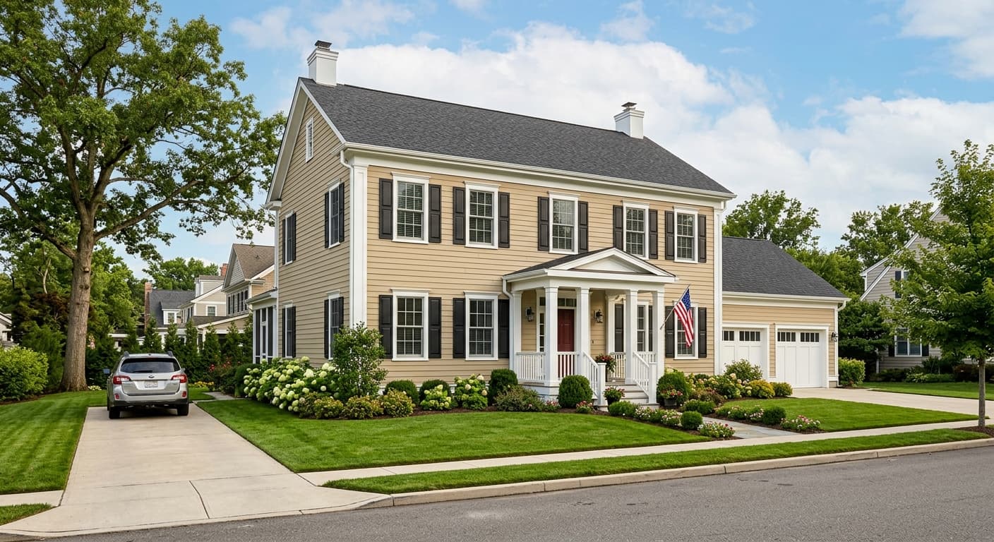
Sandbank reads as a soft, warm greige. That means it sits in the middle ground between beige and gray, leaning just enough toward warmth to keep a room from feeling cold or clinical. On the wall, it looks like a gentle taupe with a sandy quality, hence the name.
The way this color behaves depends heavily on your light. In bright, south-facing rooms, Sandbank warms up and shows more of its beige side. The sandy quality comes forward. In north-facing rooms with cooler light, you will see the gray pull through, and the color settles into something more muted and quiet. Under warm artificial light in the evening, it can turn noticeably golden, so check it after dark before you commit.
What makes Sandbank distinctive is its balance. Plenty of greiges tip too far gray and go flat, or too far beige and feel dated. This one holds steady. It works as a true background color, the kind you stop noticing in the best way, because it lets everything else in the room take center stage.
Sandbank Undertones
Sandbank carries a subtle warm undertone that occasionally flashes a hint of pink or violet in certain light. This matters more than people expect. If you pair it with a trim or adjacent color that has a strong green or blue base, that hidden warmth can clash and make the wall look muddy.
Test your undertones together, not in isolation. Hold your trim sample, your flooring sample, and a Sandbank swatch side by side on the actual wall. If the warmth in Sandbank starts fighting your other choices, you will see it immediately, and you will save yourself a costly repaint.
Where Sandbank Works Best
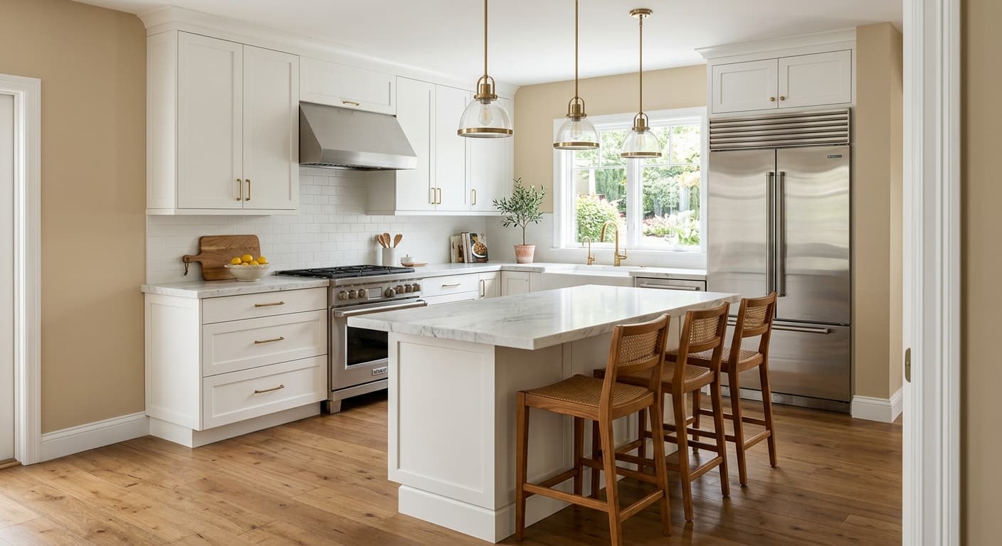
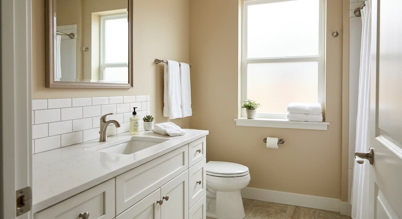
This is a workhorse for open-concept living areas, bedrooms, and hallways where you want continuity without commitment to a bold statement. It handles large spaces well because its warmth keeps an expansive room from feeling hollow. In smaller rooms, it adds coziness without darkening things.
South and west-facing rooms get the most flattering version of Sandbank, where natural light brings out its sandy warmth. North-facing spaces still work, but go in knowing the color will read cooler and grayer there. If that worries you, layer in warm lighting and warm textiles to compensate.
What to Pair With Sandbank
For trim, a clean creamy white like Sherwin-Williams Alabaster (SW 7008) keeps the warmth consistent and avoids the stark contrast a bright white would create. If you want a little more crispness, Pure White (SW 7005) works without going cold.
For coordinating wall colors, look at Accessible Beige (SW 7036) for a closely related neutral, or step up to a deeper anchor like Urbane Bronze (SW 7048) for an accent wall or built-ins. On flooring, Sandbank gets along beautifully with warm and medium-toned woods, oak and walnut especially. Furniture in natural linen, soft caramel leather, and warm woods all reinforce the relaxed, grounded feeling. Add black hardware or matte brass for definition.
Colors That Clash With Sandbank
Steer clear of pairing Sandbank with cool gray-blue trims or icy whites, which expose the pink undertone and make the wall look dingy. Avoid stark high-contrast schemes too, since this color is meant to recede, not compete. And do not assume it will look the same in every room of your house. North and south light will give you two different colors, so sample in each space individually rather than picking one swatch and rolling it everywhere.