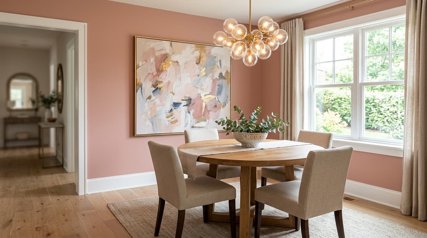
Romance SW 6323 is a light blush with an LRV of 66.4, which means it bounces back a lot of light and keeps a room feeling open and soft rather than heavy. On the wall it reads as a warm peach-pink with low chroma, so the color is present and unmistakably rosy, but it never shouts. Think of it as a dusted-down blush, gentle and slightly creamy, rather than anything vivid or candy-bright.
The way it shifts through the day is worth knowing before you commit. In natural daylight it leans warmer and more peachy, picking up the golden notes in its base. In the evening under incandescent or warm LED light it settles into a quieter, more muted pink with a hint of intimacy. That range is part of its appeal in rooms meant for relaxing, but it is also why a large sample on the actual wall is non-negotiable. A 2x3 chip will not tell you the whole story.
The undertone picture with Romance is layered, and reviewers do not all land in the same place, so it is worth unpacking. The clearest read is warm peach-pink: the color sits at the intersection of blush and peach rather than being purely one or the other. A beige undercurrent pulls it toward near-neutral territory, which is what gives it that dusty, grounded quality and keeps it from reading as a sweet or juvenile pink.
A second camp describes a mauve influence, a soft reddish-gray that adds a rosy depth without cooling the color all the way down. This is where some disagreement lives. Whether you see it as more peachy-warm or more mauve-dusty can depend on your wall orientation, your light source, and what colors sit adjacent to it. North-facing rooms with cool daylight can coax out a slightly more muted, grayer reading. South or west-facing rooms will push the peach warmth forward. Both outcomes are flattering in the right context, but they are different enough that you should test the color in your specific conditions before buying a full gallon.
Romance is listed for bedrooms, bathrooms, and dining rooms, and those categories make sense. In a bedroom the warm, low-chroma blush creates a restful envelope without being clinical or cold. It suits both contemporary and traditional interiors, so it can work with a linen upholstered bed and natural wood furniture just as well as with a more ornate antique aesthetic. The dusty quality keeps it from feeling overdone.
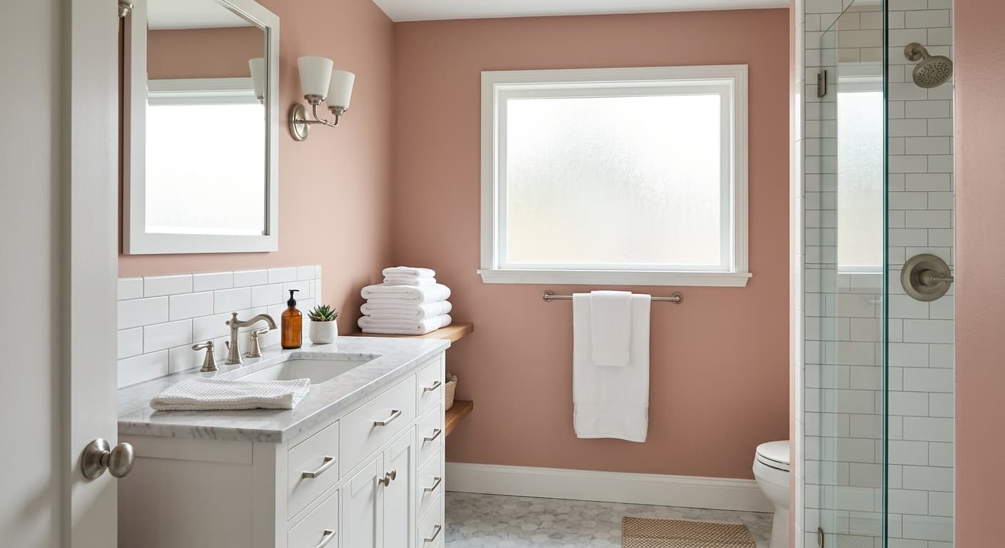
In a bathroom it performs well on all four walls because the enclosed space lets the color read fully rather than getting diluted. Good natural light will keep it from going muddy, so aim for bathrooms with a window rather than purely artificial lighting. In a dining room the warmth in the blush becomes an asset at dinnertime, when low or candlelit conditions let it settle into that more intimate pink register mentioned in the undertone section.
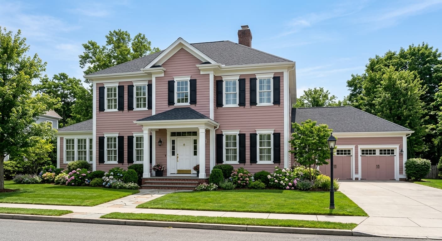
Because it is available in both interior and exterior finishes, Romance can also work on an exterior surface where a soft, warm blush reads well: think a cottage-style facade, a front door, or a covered porch ceiling. On exteriors in strong sunlight the high LRV of 66.4 keeps it from darkening dramatically, so the softness holds.
Romance was practically made for a bedroom. The warm dusty blush creates a calm, cocooning atmosphere without reading dark or heavy at LRV 66.4. Pair it with warm white trim and natural wood furniture to keep the palette grounded.
On all four walls of a bathroom, Romance gains presence and the rosy warmth becomes more apparent. A window is helpful here so the color does not tip muddy under purely artificial light. Warm-toned fixtures and aged brass hardware complement it well.
The shift Romance makes in lower evening light is an advantage at the dinner table, where it settles into a quieter, more intimate pink. It suits both formal and casual dining rooms, and pairs well with a deeper terracotta or rojo accent in textiles or artwork.
The muted, dusty quality of Romance makes it a more sophisticated choice than a bright bubblegum pink, and the high LRV keeps the room light. It reads gentle rather than babyish, so it can grow with a child.
Available in exterior finishes, Romance can work on a cottage-style facade, a covered porch ceiling, or a front door. The LRV of 66.4 means it stays relatively pale even in direct sun, holding its soft character without washing out.
Romance pairs most naturally with warm whites and soft greiges that share its warm base. Intimate White (SW 6322) is the closest step, a creamy off-white that keeps the palette in the same warm family without creating stark contrast. It works well as trim, ceiling, or an adjoining room color. Requisite Gray (SW 7023) is a soft warm greige that grounds the blush without cooling it down, useful for introducing a more neutral anchor in furniture, cabinetry, or an accent wall.
For more contrast, deeper terracotta and rojo tones make Romance feel richer and more layered. Rojo Dust adds a saturated earthy-red note that references the color family Romance belongs to, creating depth while staying tonally consistent. On the finish and material side, natural wood tones, aged brass hardware, and warm-toned textiles in linen or blush velvet all read well against this color.
All comparisons are matched against Romance at LRV 66.4.
Cool gray or blue-gray trim pulls against the warm peach-pink in Romance and can make the wall color look washed out or slightly off, because the opposing undertones fight each other rather than harmonizing.
A ceiling white with a clear blue or cool bias will create a jarring visual ceiling above a warm blush wall, making the transition feel abrupt and the room feel slightly off-kilter.
Deep cool colors, think cobalt, emerald with a blue bias, or cool purple, in large quantities as rugs, upholstery, or adjacent walls compete with Romance rather than supporting it, draining the warmth out of the blush.
Romance is a light, dusty blush with an LRV of 66.4. It reads as a warm peach-pink with low chroma, meaning the color is soft and muted rather than vivid or bright. It has a slightly creamy, near-neutral quality that keeps it from looking sweet or juvenile.
Romance carries layered undertones. The primary read is warm peach-pink, grounded by a beige base that gives it a near-neutral, dusty quality. A secondary mauve influence adds a rosy depth. Reviewers do not all land in the same place: some read it as more peachy and warm, others as more mauve-dusty. Your light conditions and wall orientation will influence which undertone comes forward.
Romance is firmly warm. Its base leans toward peach-pink rather than any cool or blue-pink register, and a beige undertone reinforces that warmth. It does not read as a cool or mauve-dominant pink in most light conditions, though in north-facing rooms with cool daylight it can appear slightly more muted and gray-adjacent.
Romance has an LRV of 66.4, which is relatively high. It reflects a substantial amount of light, keeping rooms feeling open and airy rather than enclosed. This high LRV also means the color can shift noticeably between daylight and evening artificial light, so sampling on your actual wall is important.
The Sherwin-Williams color code is SW 6323. The hex value is #EBCFC3 and the RGB values are 235, 207, 195.
Romance pairs well with warm whites like Intimate White (SW 6322) for trim and ceilings, and with soft warm greiges like Requisite Gray (SW 7023) as a grounding neutral in furniture or adjacent walls. For contrast, deeper terracotta and rojo tones work because they share the warm color family. Warm-toned materials like natural wood, aged brass hardware, and linen textiles also read well alongside it.
Yes. Romance is available in both interior and exterior finishes, so it is a legitimate option for a facade, porch ceiling, or front door. Its LRV of 66.4 keeps it relatively pale even in direct sunlight, maintaining a soft character outdoors. For cabinets, the dusty blush can work well in a bathroom or bedroom vanity context, though it is a more niche choice for a kitchen where a neutral or white cabinet is more common.
