Pressed Flower reads as a muted, mid-tone rose on the wall. It is not a pastel and not a saturated red. Think of a blush that has been quieted by a generous dose of gray, landing somewhere between dusty mauve and soft pink-red with real color presence. At LRV 34.6 it is dark enough to make a statement on all four walls, yet the gray content keeps it from ever feeling heavy or aggressive.
The hex tells the story well: 195 red, 147 green, 147 blue. That equal green-blue pairing is what desaturates the pink and gives the color its distinctive dusty quality. The result is a color that looks mature rather than juvenile, warm rather than bright. In midday natural light it leans visibly rosy. In lower light or on a north-facing wall the gray comes forward and the whole room shifts toward mauve, which can be a very appealing effect in a bedroom or bath.
Reviewers consistently call out that Pressed Flower avoids the bubblegum trap. The gray content is exactly what keeps it from tipping into sweet nursery pink. It feels calm and grown-up, the kind of color that adds warmth without demanding attention, and that is a harder thing to achieve in the rose-pink family than it sounds.
The undertone picture for Pressed Flower is honestly layered, and independent reviewers reflect that. The dominant read is pink-rose, which is what you see first in most lighting. But the gray sits right underneath it, always visible, and is the reason the color earns words like "dusty" and "mauve" rather than simply "pink." Sherwin-Williams places it in the red family, and in warm incandescent or golden-hour light you can feel that red warmth coming through more clearly.
Where reviewers split is on the mauve question. Some describe it as clearly mauve and read the undertones as leaning cooler and grayer, especially in rooms with north or east light. Others keep it firmly in the warm rose camp and find the red ancestry more visible, particularly under warm artificial light or in south-facing spaces. Both camps are seeing the same color; they are just in different lighting conditions. The gray undertone shifts depending on what surrounds it: pair it with a cool bright white trim and the gray pops and the whole color reads chalkier. Pair it with a cream or warm white and the rose steps forward.
The practical takeaway is this: Pressed Flower is not definitively warm or cool. It lives at a careful meeting point where its gray content gives it a cool, muted quality and its pink-red base gives it warmth. The balance tips based on your light source, your wall orientation, and your surrounding finishes. Sample it in your specific room and check it morning, midday, and evening before committing.
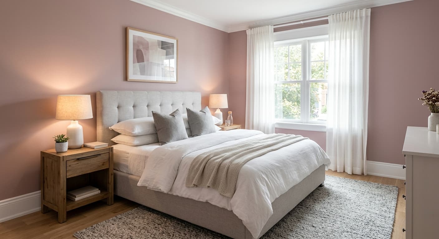
Pressed Flower was designed with bedrooms in mind and that is where it earns the most praise. A primary bedroom with warm-toned wood furniture, aged brass hardware, and cream or linen bedding is a natural fit. The dusty rose quality adds intimacy and calm without making a space feel small, which is a direct result of the gray content lifting the color away from heavy or oppressive territory. At LRV 34.6 it does absorb more light than a pale neutral, so pairing it with reflective surfaces and warm artificial lighting in a bedroom setting helps the room feel open.
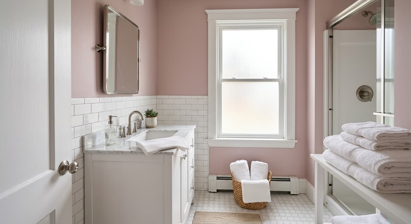
Bathrooms and powder rooms are another strong application. A powder room with Pressed Flower on all four walls, warm white trim, and aged brass fixtures will feel intentional and collected. The muted quality keeps it from looking costume-y or overly feminine. Primary bathrooms work well too, especially if they get warm natural light. In a bathroom that skews cool or north-facing, the mauve tendency increases, which some people love and others find a bit flat, so orientation matters.
Nurseries are in the official room list, and Pressed Flower earns that placement specifically because it avoids the pastel softness of a conventional baby pink. If the goal is a nursery that will not feel dated or childish as kids grow up, the gray-tempered dusty rose is a smarter choice than a lighter, sweeter pink. It is warm enough to feel nurturing and muted enough to feel considered. Reviewers also note it is beginner-friendly to apply, covering well in one to two coats, which matters when you are painting around a crib.
Pressed Flower on all four walls of a primary bedroom creates a cocooning, calm atmosphere without going dark or dramatic. Pair it with warm white trim, linen bedding, and aged brass hardware and the dusty rose reads intimate and considered. Warm incandescent or soft LED bulbs are your friend here since they tip the color toward its warmer rose side.
A powder room or guest bath in Pressed Flower feels collected and intentional, especially with warm white trim and brass or unlacquered fixtures. In a south or west-facing bathroom the color stays warm and rosy. In a north-facing bathroom the mauve tendency increases, which can be atmospheric if you layer in warm towels and candlelight.
Pressed Flower avoids the sweetness trap that sinks conventional nursery pinks. The gray content makes it feel grown-up enough to age with the child over the years. Pair it with natural wood furniture and cream accents rather than bright white to keep the warmth consistent and avoid chalking out the color.
If a primary bedroom carries Pressed Flower, running Pussywillow SW 7643 in the connecting hallway creates a smooth warm transition. The rose does not overwhelm a narrow hallway at LRV 34.6, but it is present enough to make the space feel purposeful rather than leftover.
A home office in Pressed Flower is less common but works well when the goal is calm focus rather than energizing contrast. The muted quality reduces visual noise and the warmth keeps the room from feeling sterile. Good task lighting is important since the color absorbs enough light that a dim space can start to feel heavy.
Pressed Flower pairs best with finishes that lean warm rather than crisp and cool. Ibis White SW 7000 is the natural trim choice: it is a clean, slightly warm white that stops short of cream, keeping the pairing fresh without introducing the chalky clash that a stark cool white can cause against a dusty rose. Pussywillow SW 7643, a warm greige, works beautifully as a companion in adjacent rooms or as a hallway color that transitions naturally into a Pressed Flower bedroom. It grounds the palette and adds an earthy, organic quality that keeps the rose from feeling isolated.
For tonal depth, Carley's Rose SW 9002 is worth knowing. It is a deeper, dustier rose that reads as a natural darker sibling to Pressed Flower. Use it as an accent on a single wall, in soft furnishings, or in a connected space to create a monochromatic layered look. Beyond paint, warm woods, aged brass, and cream or terracotta textiles all reinforce the color's dusty warmth. Cool metals like chrome or high-contrast black can work as accents but should be used sparingly, since they tend to pull the gray undertone forward and flatten the rose.
All comparisons are matched against Pressed Flower at LRV 34.6.
Pairing Pressed Flower with a stark, cool-toned white on trim and ceilings pulls the gray undertone forward aggressively and makes the wall color look chalky and washed out rather than dusty and warm.
Cool metals compete with the gray undertone and flatten the pink-rose warmth, which makes the overall palette feel unresolved and slightly clinical.
Strong cool-toned accents like navy or slate blue pull hard against the warm rose and make Pressed Flower look muddy or confused rather than sophisticated.
Pressed Flower SW 6304 is a muted, mid-tone dusty rose. It sits between a soft pink-red and a mauve, quieted by a significant gray component that keeps it from reading sweet or pastel. It has real color presence on the wall and works especially well in bedrooms, bathrooms, and nurseries.
The undertones are pink-rose and gray, with a soft mauve quality that emerges in cooler or lower light. In warm light and south-facing rooms the red-rose warmth is more visible. In north-facing or cooler spaces the gray comes forward and the color shifts toward mauve. The balance between those two readings is what makes it a nuanced color rather than a straightforward pink.
It sits at the intersection of both. The pink-red base is warm, but the gray content gives it a cool, muted quality. Most reviewers land on calling it a warm color overall, but the gray undertone is always present. Your room's light and your surrounding finishes will tip it one way or the other, which is why sampling in place before committing matters.
The precise LRV is 34.6. That puts it solidly in the mid-tone range: dark enough to make a real statement and create a cocooning atmosphere, but not so dark that it overwhelms a reasonably sized room. Because it absorbs a meaningful amount of light, good lighting, warm if possible, helps keep the room feeling open.
The Sherwin-Williams paint code is SW 6304. The hex is #C39393 and the RGB values are 195 red, 147 green, 147 blue. That equal green-blue pairing in the RGB is exactly what creates the gray-muted, dusty quality rather than a clear saturated pink.
Ibis White SW 7000 is a natural trim and ceiling choice, warm enough to avoid chalking out the rose. Pussywillow SW 7643, a warm greige, works well in adjacent rooms or as a grounding companion. Carley's Rose SW 9002 offers tonal contrast as a deeper, dustier rose for an accent wall or connected space. In finishes, aged brass, warm wood, and cream or terracotta textiles all reinforce the color's dusty warmth. Avoid cool bright whites and chrome, since both pull the gray undertone forward in ways that flatten the rose.
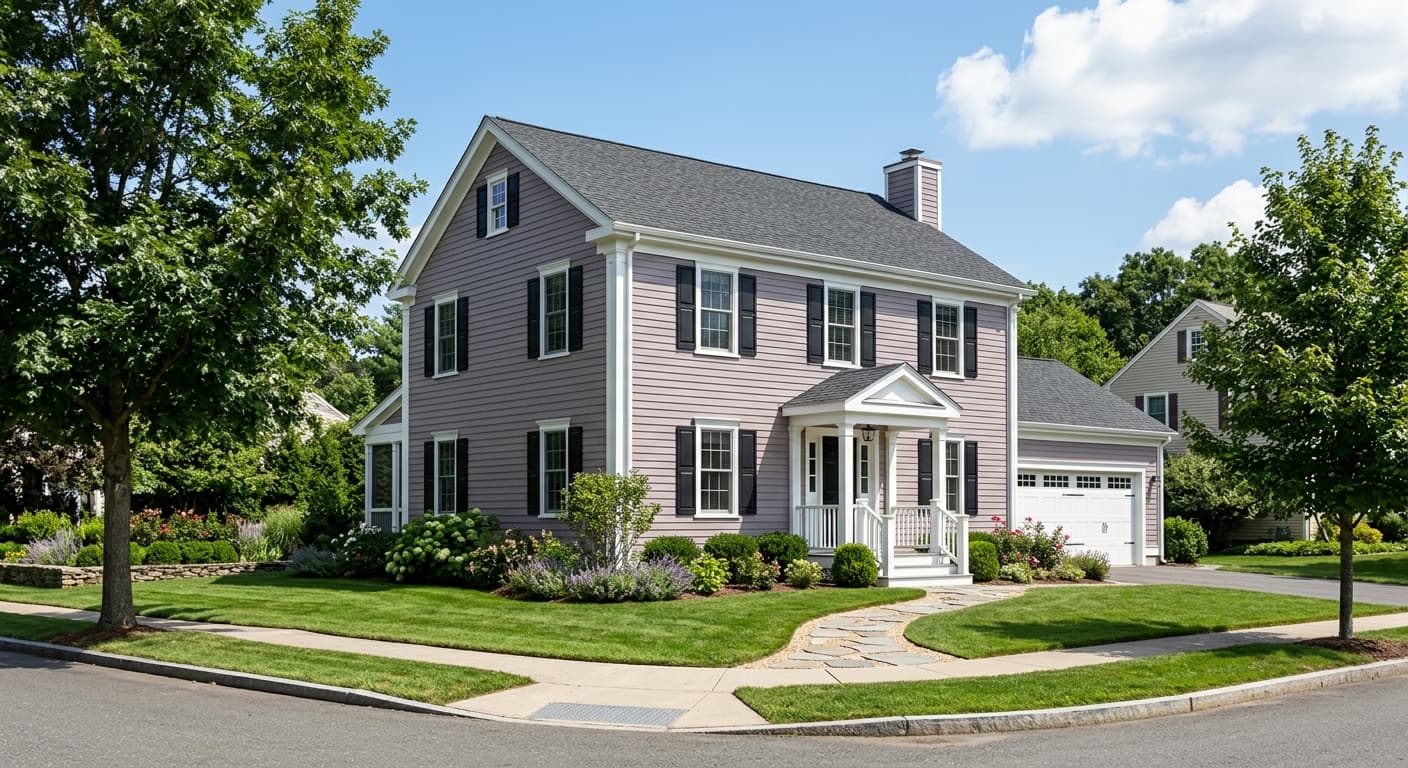
Pressed Flower is available in both interior and exterior formulas, so it is technically usable on exteriors. That said, it is optimized for interior applications, and independent reviewers focus entirely on bedroom, bathroom, and nursery uses. On a front door or exterior facade the dusty rose quality can be appealing in the right context, a cottage or Victorian-style home for example, but it is worth knowing that exterior light is much harsher than interior light and will shift how the gray and pink read depending on sun exposure and the surrounding landscape. For cabinets, the mid-tone value and warm dusty quality can work in a bathroom vanity context where the surrounding palette is already warm, but it is not a conventional cabinet color choice.
