
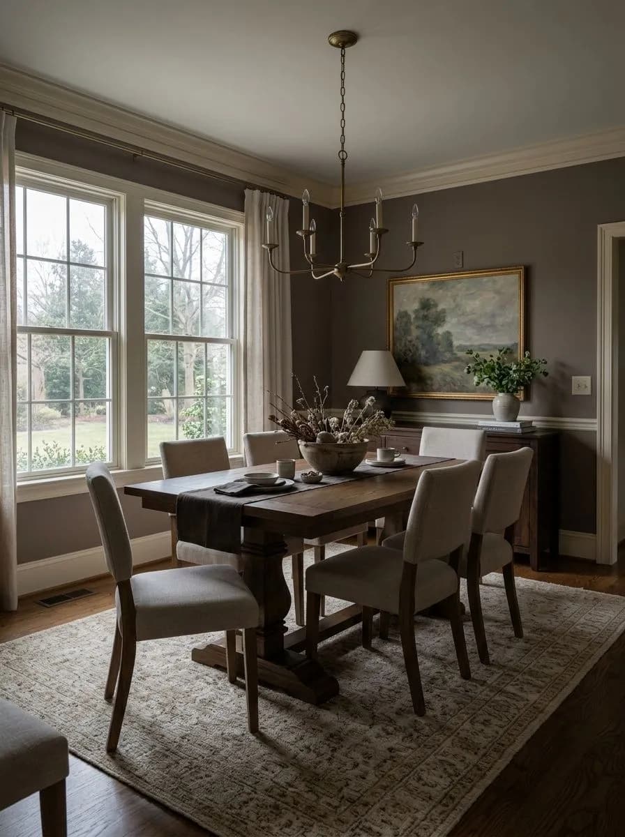
MorningQuietest · brown-gray base dominant
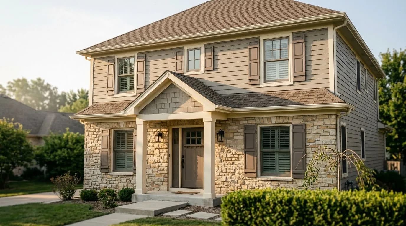
A warm, medium-deep taupe with a brown-gray base — enveloping and grounded, it holds its taupe by day and warms to a quiet romantic depth by lamplight. See which personality it shows in your room.
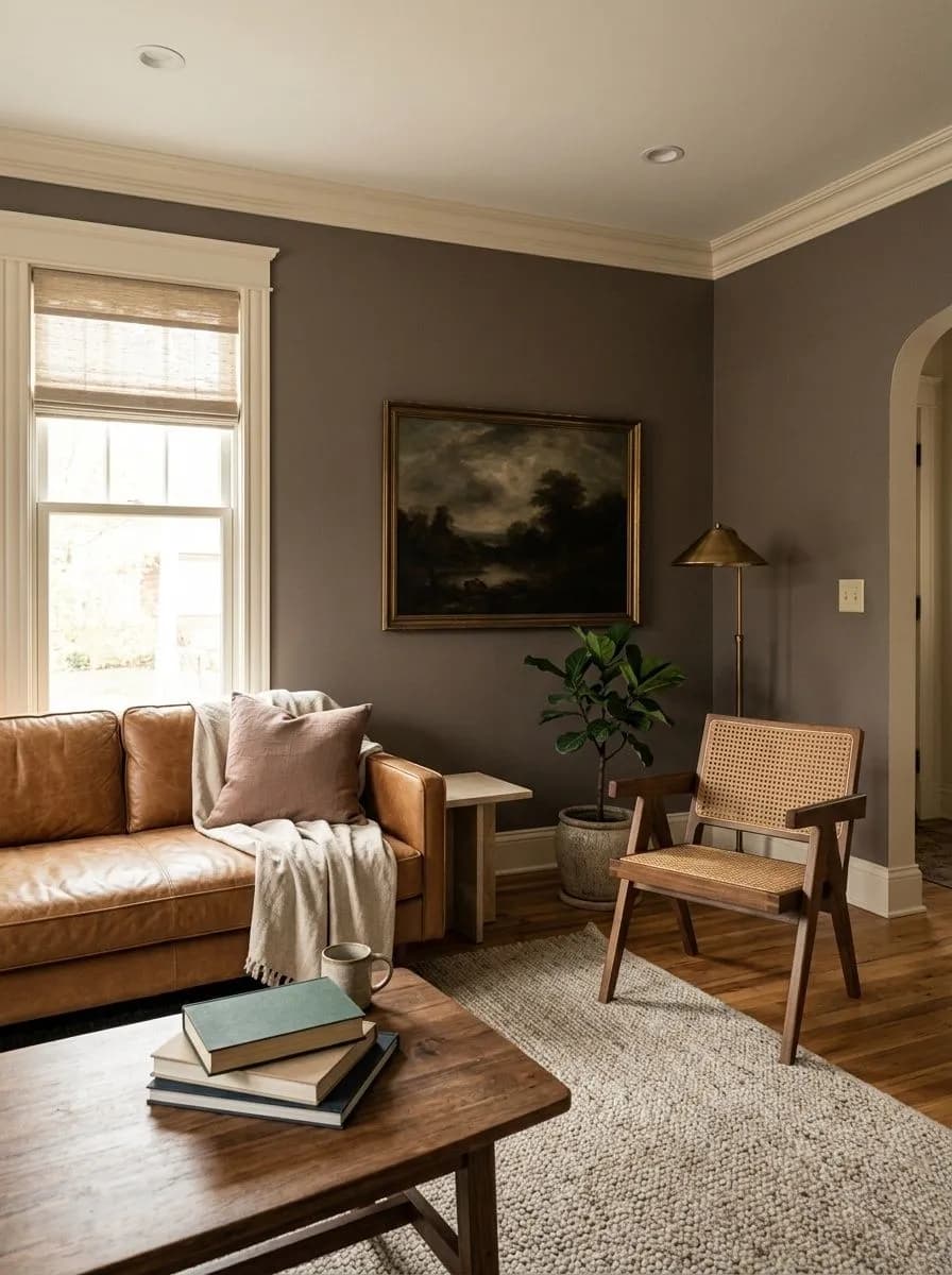
Mink SW 6004 is a medium-deep, warm greige-taupe that reads as enveloping and grounded rather than light or airy. Its LRV of 20.5 puts it solidly in the deeper half of the neutral spectrum, so it brings genuine depth to a wall without crossing into charcoal territory. Most people looking at it in person describe a grayish-brown with a brown base that gray quietly tempers, keeping the overall character earthy and restrained rather than muddy.
What makes Mink interesting is a secondary quality that not every reviewer notices right away. Sherwin-Williams places it in both a Trendsetter and a Cool Neutrals collection, which hints at its dual personality. In certain light, especially softer or warmer artificial light, a subtle pink or mauve undertone surfaces and gives the color a slightly blush, romantic quality. In brighter or cooler light it pulls back toward a more straightforward brown-gray taupe. This duality means the same wall can look meaningfully different morning to evening, which is part of the appeal and part of why some buyers are surprised when they bring it home.
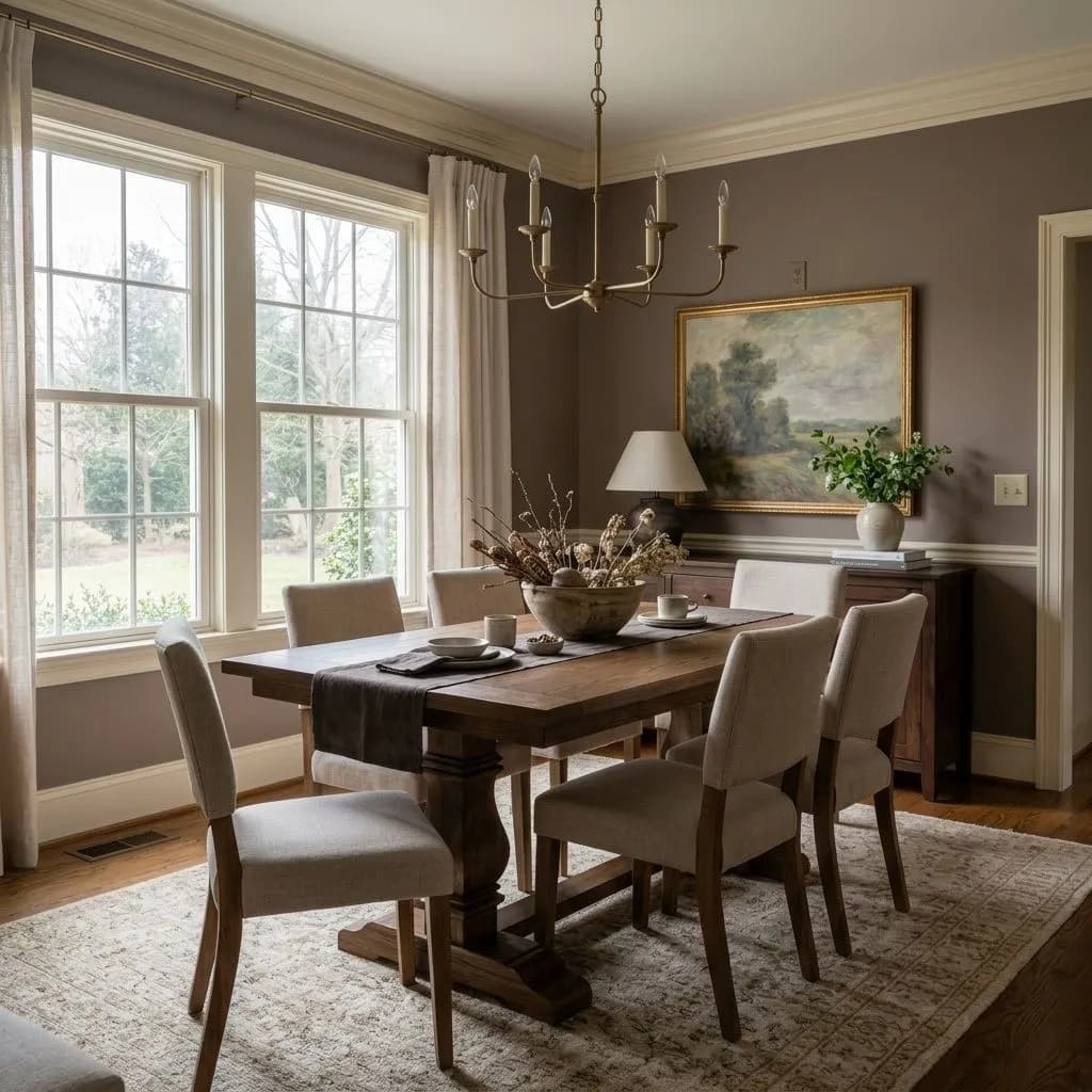
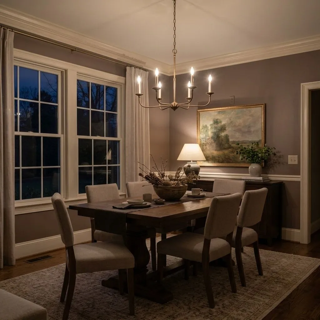
The undertone conversation around Mink is genuinely split, and it is worth holding both sides honestly. The dominant read across reviews is warm, with a brown-gray base that sits closer to taupe than to a cool greige. Most people would call it warm on first glance without hesitation. The gray component is present but subordinate, softening the brown rather than cooling it into beige territory.
The more contested layer is the pink or mauve cast. Sherwin-Williams editorial tags it with a pink undertone, and a portion of real-world reviewers confirm they see it, particularly under incandescent or warm LED lighting and against white trim. Others do not notice it at all in their specific rooms and call it simply a warm brown-gray. Neither group is wrong. The pink reads when conditions favor it: warm light sources, white or very pale surrounding colors, and south- or west-facing rooms where afternoon sun shifts the warmth. In north-facing rooms under cooler daylight the brown-gray base tends to dominate and the mauve quality recedes. This is exactly the kind of undertone behavior that makes a sample test non-negotiable. Paint a large swatch, live with it through a full day, and check it against your trim and your specific light sources before committing.
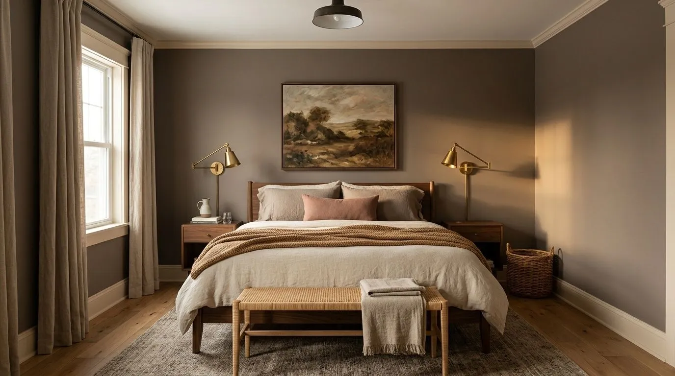
Mink is built for rooms where you want a cocooning, restful atmosphere rather than a bright or expansive one. Bedrooms are the most consistent success story across reviews. The combination of warm depth and that occasional blush lean gives it a romantic, intimate quality that works especially well in rooms with warm wood floors or furniture, soft textiles, and low to moderate natural light. It does not fight for attention; it sets a mood.
Living rooms with a layered, comfortable aesthetic are another strong use case. Paired with natural wood tones, stone, leather, and soft upholstery it reads as sophisticated without being cold or trendy. Bathrooms benefit from its spa-adjacent warmth, particularly when natural stone tile or warm-toned hardware is in play. Because the LRV is 20.5, plan your lighting carefully in windowless or small bathrooms; supplemental warm artificial light will bring out the best qualities here.
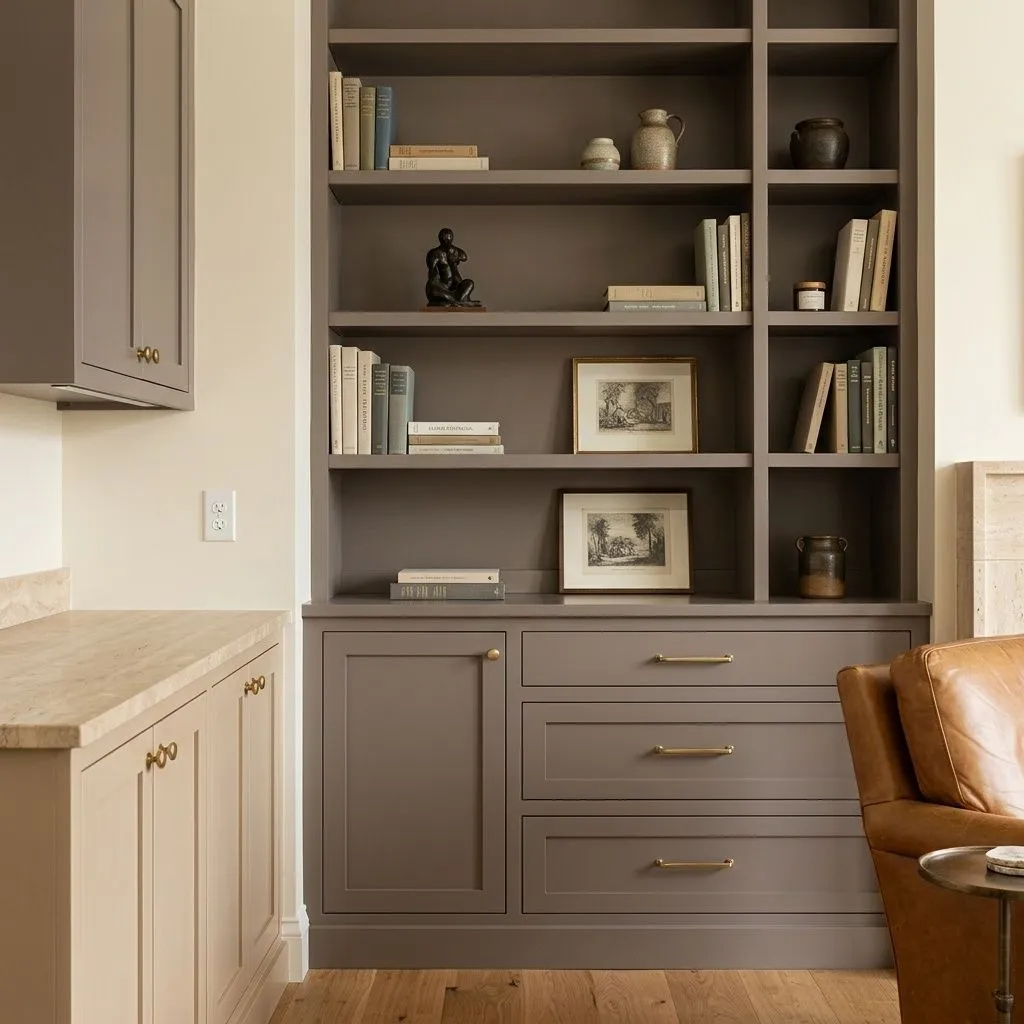
Beyond walls, reviewers and designers also call out Mink for cabinetry and millwork. On kitchen or bathroom cabinets it delivers a grounded, dramatic look that pairs naturally with brass or unlacquered hardware and wood-toned shelving. It is available in both interior and exterior formulas, and some use it on exterior trim or a front door for a warm, earthy statement. For any application with limited natural light, sampling first is not optional; it is the only reliable way to know which personality this color will show you.
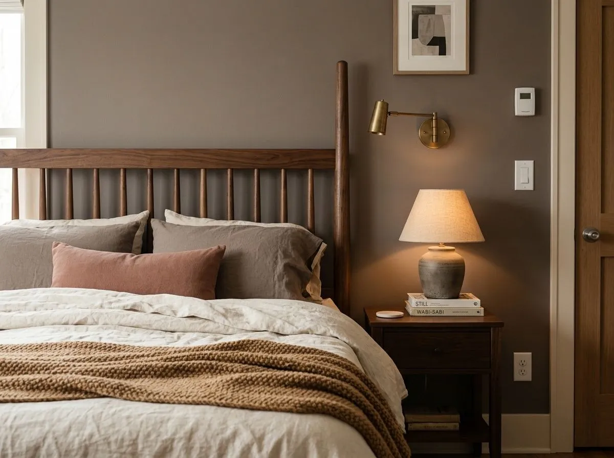
Mink is the color's strongest room. The warm depth and occasional blush quality create a cocooning atmosphere that reads as restful and intimate. Pair it with warm wood furniture, linen bedding in ivory or dusty rose, and warm-toned lighting to bring out the mauve layer at its most appealing.
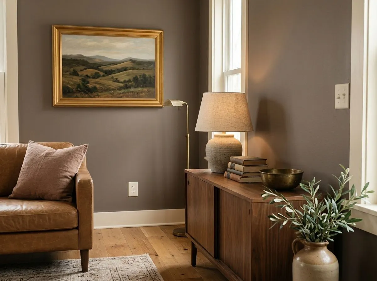
In a living room, Mink grounds the space and gives layered furniture arrangements something to anchor against. It works particularly well with leather seating, natural wood tones, and stone accents, delivering depth without heaviness. Keep trim in Snowfall or Biscuit to maintain warmth through the contrast.
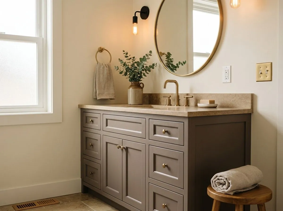
Mink turns a bathroom into a warm retreat rather than a clinical white box. It pairs well with warm stone tile, brushed brass or matte black fixtures, and wood vanities. In bathrooms without windows, lean on warm-toned artificial lighting to pull out the color's best qualities rather than letting cooler light flatten it.
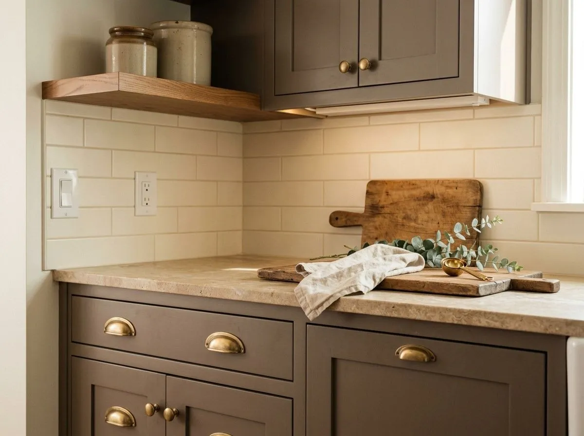
On cabinetry, Mink delivers a grounded, dramatic look that feels intentional and current. It pairs naturally with unlacquered brass hardware, open wood shelving, and stone countertops in warm beige or soft gray. This application works in both kitchens and bathrooms.
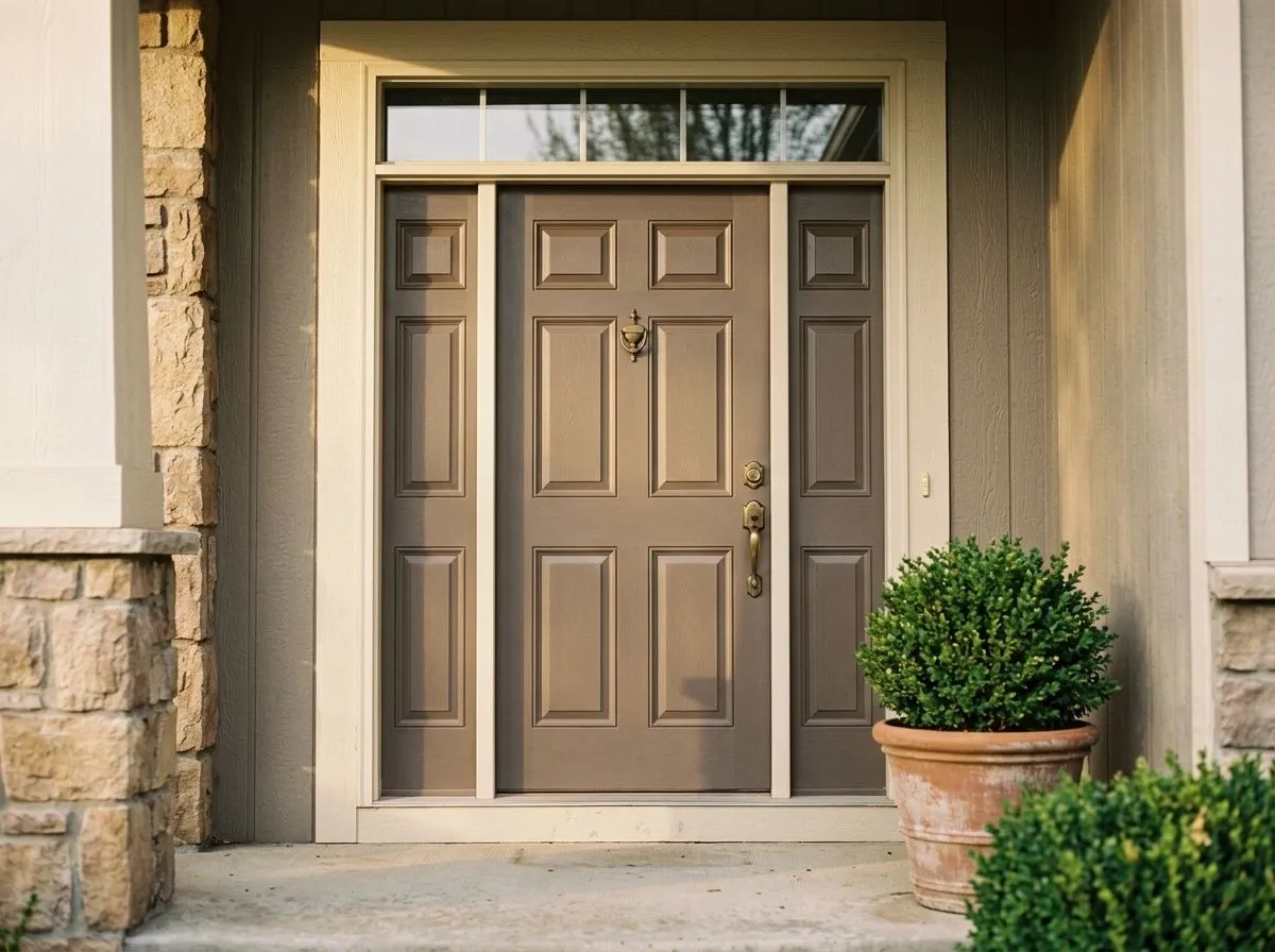
Mink is available in an exterior formula, and some homeowners use it on front doors or exterior trim for a warm, earthy statement that stands apart from the standard black or navy. It reads richest in natural light with warm-toned stone or brick surrounds.
Mink's coordinating palette leans into contrast through lightness rather than hue shifts. Snowfall is the natural companion for trim, ceilings, and adjacent rooms: a soft white that keeps the pairing warm and does not create a harsh edge against Mink's deeper value. Biscuit brings a creamy, warmer off-white quality that reinforces the blush-brown character of Mink and works especially well for trim in rooms with warm wood tones. Tatami Tan steps in when you want a warmer, earthier contrast, useful for an adjoining room or accent element that grounds the palette without cooling it down.
Beyond the coordinating colors, Mink responds well to natural materials. Warm-toned wood, rattan, linen, and unlacquered brass all pull out the earthy warmth. Stone countertops in warm beige or soft gray read beautifully against it in kitchens and bathrooms. For bedding, upholstery, and textiles, dusty rose, warm ivory, caramel, and soft clay all reinforce the romantic, restrained character without clashing.
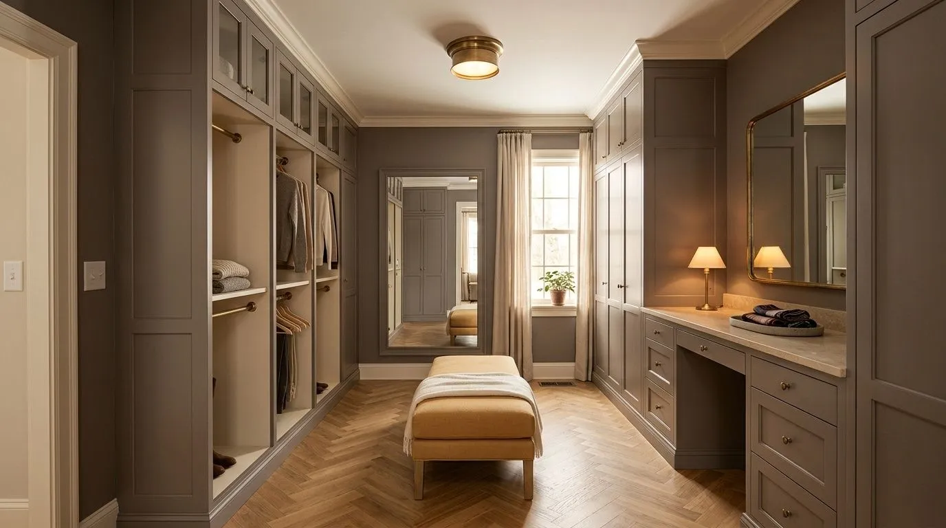
Recreating this cocooning dressing room is straightforward when the whole palette is gathered in one place, so that is exactly what this room does. Two of the seven colors are actual paint: Mink goes on the walls and built-in wardrobe cabinetry as a warm taupe drench, while Biscuit covers the trim, crown, ceiling, and wardrobe interiors as a warm creamy white. The remaining five colors represent the room's furnishings and materials, each shown as its closest Sherwin-Williams paint match, and hovering any pin or swatch will tell you exactly what it is.
All comparisons are matched against Mink at LRV 20.5.
A stark, blue-leaning white on trim will pull out any cool gray in Mink and make the pink undertone look unintentional rather than romantic, creating an uneasy contrast.
Pairing Mink with a cool gray or blue-gray in an adjoining room creates a temperature clash that makes Mink look muddy or vaguely purple rather than warm and settled.
Saturated accent colors like bright navy, deep emerald, or true red compete with Mink rather than complementing it, overwhelming the color's quiet, restrained character.
Mink is a medium-deep warm greige-taupe with an LRV of 20.5. It reads as an earthy, cozy neutral that sits between a warm brown-gray and a soft taupe, with a subtle pink or mauve cast that can surface under warm light. It is richer and deeper than a typical light neutral, giving it a grounded, enveloping quality on the wall.
Mink carries warm, pink, and gray undertones, but how prominently each reads depends on your room's light and surrounding finishes. The dominant character is warm brown-gray taupe. The pink or mauve layer is real but conditional: it surfaces most clearly under incandescent or warm LED lighting and against white trim, and recedes in cooler or north-facing light. Some reviewers see it readily; others in different rooms never notice it. Sampling on your specific walls is the only reliable way to know which version you will live with.
Mink is primarily warm. Its brown-gray base and pink undertone both sit on the warm side of the neutral spectrum. Sherwin-Williams does place it in a Cool Neutrals collection, which reflects the gray component, but the overall impression in most lighting is warm and earthy rather than cool or blue-leaning.
Mink has an LRV of 20.5, which puts it in the medium-deep range. Colors below 25 LRV are generally considered deeper neutrals that absorb significant light rather than reflecting it. At 20.5, Mink creates a cocooning, moody atmosphere rather than a bright or expansive one, so it works best where that depth is an asset, and it rewards thoughtful artificial lighting in rooms with limited natural light.
Mink's coordinating colors include Snowfall for soft warm white trim and ceilings, Biscuit for a creamier warm white that reinforces the brown-pink character, and Tatami Tan for a warmer earthy contrast in adjacent spaces or accents. Beyond those, it pairs well with natural wood tones, warm stone, brushed brass and unlacquered hardware, and textiles in dusty rose, warm ivory, caramel, and soft clay.
Mink's Sherwin-Williams color code is SW 6004. The hex value is #847B77 and the RGB is 132, 123, 119. Its LRV is 20.5.
Yes on all three. Mink is available in both interior and exterior formulas. On a front door or exterior trim it reads as a warm, earthy statement that works well with brick, stone, or warm-toned siding. On kitchen or bathroom cabinets it delivers a grounded, dramatic effect that pairs naturally with brass hardware and wood or stone accents. For any of these applications, request the appropriate exterior or cabinet-specific finish formula from your Sherwin-Williams store.