Backdrop SW 7025 reads as a warm, mid-dark greige on the wall, sitting right at that crossroads where gray and beige dissolve into each other and produce something richer than either one alone. At LRV 20.2 it is medium to medium-dark, deep enough to feel enveloping and deliberate without crossing into heavy or oppressive territory. In a room with good natural light it holds a soft, brown-leaning warmth that feels grounded and settled.
The color shifts noticeably across the day. In bright daylight, especially from a south- or west-facing window, the beige and taupe notes dominate and the wall reads almost like a warm stone or tawny neutral. As light fades or under incandescent lamps, the gray undercurrent steps forward and the whole room takes on a quieter, more atmospheric quality. That responsiveness is part of its appeal: you effectively get two slightly different looks depending on the hour.
At full saturation on four walls it creates a cocooning effect that designers often describe as the goal for a relaxed, pulled-together room. It does not shout, but it is not a whisper either. Reviewers consistently note that it photographs darker than it appears in person, so if you have seen it on a screen and it looks too deep, it will likely feel lighter once you live with it.
Taupe leads the undertone story in Backdrop, and that is where most reviewers land without much debate. The color is fundamentally a taupe-based greige with a warm, brown-adjacent quality that keeps it from ever feeling clinical or cold. Gray is present as a secondary note, and it is what prevents the color from sliding all the way into beige territory and keeps it feeling current rather than dated.
Where reviewers diverge is in the secondary and tertiary reads. Some describe a faint olive or earthy green that surfaces in certain light conditions, particularly in rooms with cool north-facing light or when the surrounding decor leans toward natural, organic materials. Others pick up a whisper of pale pink or even a soft lavender in low light, which is the kind of subtle warm-purple shift that taupe-based colors sometimes produce when they interact with shadows. A smaller number of observers notice a fleeting mint quality, though this is far less commonly reported and may depend heavily on the specific light source in the room.
The practical upshot is that Backdrop is warm but complex. It is not a simple warm gray, and it is not a standard beige. That complexity is exactly what makes it work well in layered, textured spaces, but it also means you need to sample it carefully. Pull a large sample card and view it against your trim, flooring, and fabrics in both morning light and evening artificial light before committing. The undertone you see most will depend more on your specific room conditions than on any single definitive read.
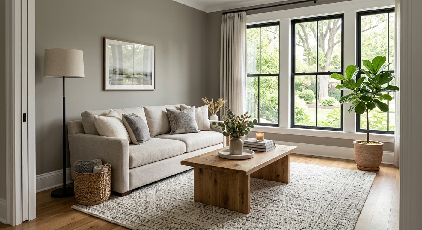
Backdrop is used most often in living rooms, bedrooms, and studies, the spaces where a color at LRV 20.2 earns its keep by creating a sense of warmth and enclosure without feeling like you have painted yourself into a cave. In a living room with warm wood floors and a cream or soft white ceiling, it acts as a grounding anchor that makes furniture and textiles look more intentional. In a bedroom it produces the kind of quiet, settled atmosphere that makes unwinding feel effortless.
Light orientation matters. South- and west-facing rooms with plenty of natural light are where Backdrop performs most confidently, keeping its warm taupe character well into the afternoon. In north-facing or east-facing rooms the gray undertone becomes more dominant, which can read as sophisticated and moody if that is what you want, but can also feel a touch cool if your room lacks warm light sources. In those orientations, balancing with warm incandescent or warm-toned LED bulbs, along with warm-toned textiles, helps pull the beige and taupe notes back to the front.
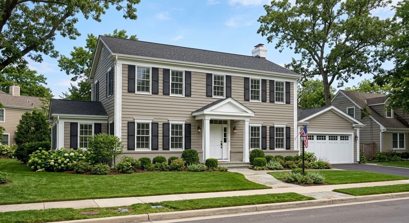
Backdrop also works on exteriors, where reviewers note it reads as a warm, earthy neutral that complements stone, brick, and natural wood siding. For front doors or shutters, pairing it with deeper values in the same warm family or contrasting it with a bright warm white trim gives clean, traditional results. On cabinets it brings the same warmth it delivers on walls, working especially well in a kitchen or home office where you want depth without the starkness of a cool gray.
At LRV 20.2, Backdrop on all four walls in a living room creates a warm, enveloping backdrop for seating arrangements without feeling dark if the room has decent natural light. It grounds warm wood floors and makes cream upholstery read richer. Pair trim in Simple White SW 7021 and keep lighting warm-toned to maintain the taupe-forward quality through the evening.
Backdrop is a strong choice for a bedroom where the goal is a cocooning, restful atmosphere. Its mid-dark value absorbs ambient light and reduces the visual busyness that lighter neutrals can carry. Warm linen bedding, natural wood furniture, and layered soft textiles in camel or rust play directly into its warmth.
In a study, Backdrop's depth encourages focus and keeps the room from feeling sterile. Bookshelves with warm wood and leather against these walls look deliberate and collected. Because studies often have one or two windows rather than full natural light, plan your artificial lighting carefully so the gray undertone does not dominate during working hours.
On exterior siding, Backdrop reads as a warm, earthy taupe that pairs well with natural stone foundations, dark window trim, and warm white fascia. Reviewers note it holds its warmth well in full sun and does not gray out the way cooler mid-dark neutrals can. It suits craftsman, farmhouse, and transitional architectural styles particularly well.
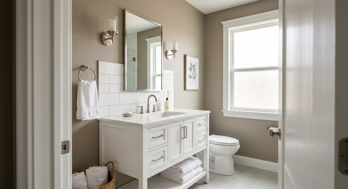
Backdrop on kitchen or bathroom cabinets delivers depth and warmth without the heaviness of a true dark color. Against a warm white wall and brass or oil-rubbed bronze hardware it looks intentional and earthy. Keep the countertop in a warm stone or wood tone to stay consistent with the color's inherent brown-leaning quality.
Backdrop pairs most naturally with warm whites for trim and ceilings. Simple White SW 7021 is the go-to from its coordinating palette, offering enough warmth to keep the contrast from feeling harsh while its brightness still cleanly separates trim from wall. City Loft SW 7631 works as an adjacent neutral in open-plan spaces where you need an adjoining room to feel cohesive but slightly distinct. For a soft color accent that stays well within the same earthy, relaxed register, Blithe Blue SW 9052 provides a muted, dusty note that complements without competing.
Beyond the coordinating palette, natural wood tones in honey, walnut, and oak speak directly to Backdrop's warm brown undertone and make the overall scheme feel organic and layered. Warm metals like brass and aged bronze carry the warmth forward in hardware and lighting. If you want to work in textiles, reach for terracotta, rust, dusty sage, or camel. Crisp cool-white trim or highly saturated accent colors will pick up the gray and potentially the pale lavender undertone, so if that is not the look you want, stay in the warmer end of the white spectrum for all your surrounding fixed elements.
All comparisons are matched against Backdrop at LRV 20.2.
If an adjacent room or the same open-plan space contains a cool blue-gray, Backdrop's warm taupe undertone will look muddy and brownish by comparison, and the cool gray will look dingy against it.
A high-contrast, blue-white trim color against Backdrop will pull out the gray and any latent lavender undertone, making the walls look cooler and less intentional than they should.
Gray stone tile, cool concrete floors, or blue-gray carpet will compete with Backdrop's warmth and flatten the whole room into a muddy, indeterminate neutral that reads neither warm nor cool.
Backdrop is a warm, mid-dark greige, a blend of gray and beige with a leading taupe undertone and a soft brown-leaning warmth. At LRV 20.2 it sits in the medium to medium-dark range, deep enough to feel cocooning and deliberate on walls while still reading as a flexible, whole-room neutral.
Taupe leads, supported by warm gray and beige. Reviewers also report subtle secondary reads including a faint olive or earthy green in cool north-facing light, a whisper of pale pink or soft lavender in low artificial light, and occasionally a mild mint quality. Which undertone surfaces most depends on your room's specific light conditions, so sampling in context is essential.
Backdrop is fundamentally warm. Its taupe-beige foundation keeps it on the warm side of greige in most light conditions. In dim light or cool north-facing rooms the gray notes push forward and it reads slightly cooler, but it never crosses into a true cool gray. Most reviewers categorize it as a warm neutral.
Backdrop's LRV is 20.2, which places it in the medium to medium-dark range. It will make a room feel cozy and enveloping rather than airy, so if you rely heavily on natural light or want a bright space, plan your artificial lighting accordingly.
Backdrop's Sherwin-Williams color code is SW 7025. Its hex value is #867A6F and its RGB breakdown is 134 red, 122 green, 111 blue.
Backdrop pairs well with warm whites for trim and ceilings, with Simple White SW 7021 being its primary coordinating white. City Loft SW 7631 works as a companion neutral in adjacent spaces. For a soft accent, Blithe Blue SW 9052 provides a muted, earthy blue note that stays in the same relaxed register. Natural wood tones, warm metals like brass and aged bronze, and textiles in camel, rust, dusty sage, or terracotta all complement it well.
Yes on all three. On exterior siding it reads as a warm, earthy taupe that holds its warmth in full sun and suits craftsman, farmhouse, and transitional styles. On a front door it works well paired with warm white trim and natural stone or wood details. On cabinets it delivers depth and warmth without heaviness, especially when combined with brass or oil-rubbed bronze hardware and warm stone or wood countertops.
