Interesting Aqua
What Interesting Aqua Actually Looks Like
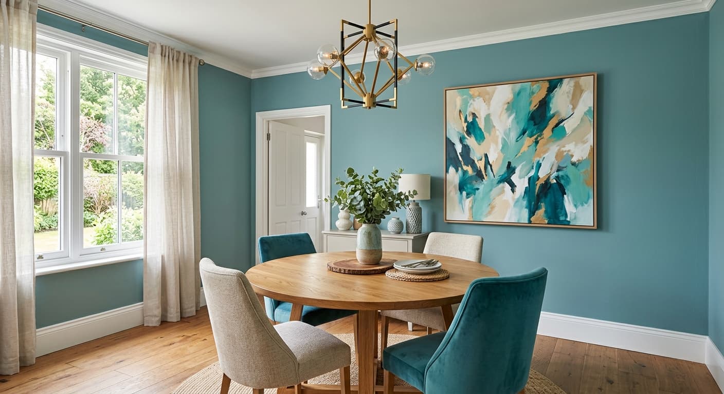
Interesting Aqua sits in that confident middle ground between blue and green, leaning teal without committing fully to either side. It reads as a saturated, mid-to-deep color that holds its own on a wall. This is not a tint you will squint at and wonder if it took. You see it the moment you walk in.
In bright daylight, the green starts to show itself, and the color feels fresh and slightly tropical. Pull the curtains or move into evening light and it deepens, turning moodier and more blue. Under warm incandescent bulbs, expect the teal to soften and warm up a touch. Under cooler LED light, it sharpens and the blue side takes over.
What makes it distinctive is its versatility within a fairly bold range. You get a color with real personality that still behaves like a neutral cousin in the right setting. It is dramatic, but it is not loud.
Interesting Aqua Undertones
The dominant undertone here is green-blue, with a faint gray that keeps it from going neon or cartoonish. That gray is your friend. It is the reason this color feels grounded rather than playful, and it is why Interesting Aqua works in grown-up spaces.
Because the undertone shifts between blue and green depending on light, test it on the actual wall before you commit. A north-facing room will cool it down and push it blue. South light warms and greens it. The undertone matters most when you choose trim and adjacent colors, since a too-cool white next to it can make the teal look harsh, while a warmer companion softens the whole effect.
Where Interesting Aqua Works Best
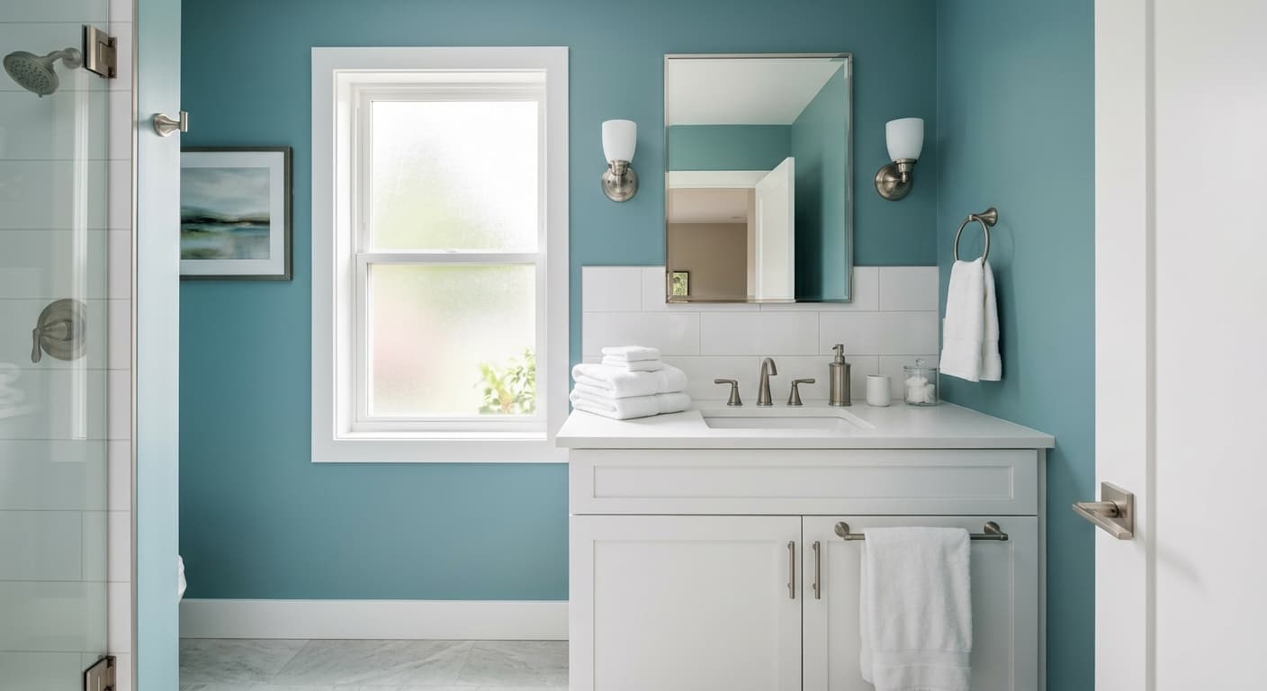
This color thrives in rooms where you want depth and a little drama. Dining rooms, powder baths, home offices, and feature walls behind a bed all suit it well. It also works beautifully in kitchens on lower cabinets or an island, where the saturation reads as intentional and sophisticated.
South and west-facing rooms get the most out of it, since warm light brings out its richness without dulling the color. In north-facing spaces, the teal can feel slightly cold, so layer in warm wood and soft textiles to balance that. Small rooms can absolutely handle this much color. A powder room drenched in Interesting Aqua feels like a jewel box, not a closet.
What to Pair With Interesting Aqua
For trim, reach for a soft white like Sherwin-Williams Alabaster (SW-7008) or Greek Villa (SW-7551). These warm whites keep the contrast crisp without going stark. If you want something quieter, a creamy off-white tones the whole scheme down nicely.
Bring in natural wood flooring in medium to warm tones, since oak and walnut both flatter this teal. Brass and aged gold hardware look excellent against it, and so do warm leather furnishings in cognac or caramel. For a coordinating wall, consider a warm greige like Accessible Beige (SW-7036) or a deeper charcoal for contrast. Want more color? A muted terracotta or warm clay across the room creates a balanced, collected look.
Colors That Clash With Interesting Aqua
Steer clear of cool gray pairings, which fight the teal and leave the room feeling flat and cold. Bright, blue-based whites can make the trim look dingy next to this saturation, so skip them. Avoid going matchy with other blue-greens, since a near-miss shade reads as a mistake rather than a choice. And do not pair it with heavy black accents in a small, dark room, or the space will close in on you.