Grayish lands in that middle zone where a color is clearly light but not washed out. With an LRV of 59.7, it reflects a solid amount of light and reads airy rather than heavy, but it never flattens into a stark, almost-white gray. On the wall it looks like a real color with real depth, which is part of what makes it so interesting and, for some people, so unexpected.
What reviewers consistently say is that Grayish does not sit still. In a bright, south-facing room flooded with warm natural light, it behaves like a calm, near-neutral light gray, almost understated. Move into a north-facing room, dim the overheads, or switch from daylight to artificial light at night, and the color steps forward with noticeable purple and cool-violet character. The shift is dramatic enough that people who tested it in the store or on a small chip are sometimes surprised when it goes on the walls. That behavior is not a flaw, but it is the central thing to know before you commit.
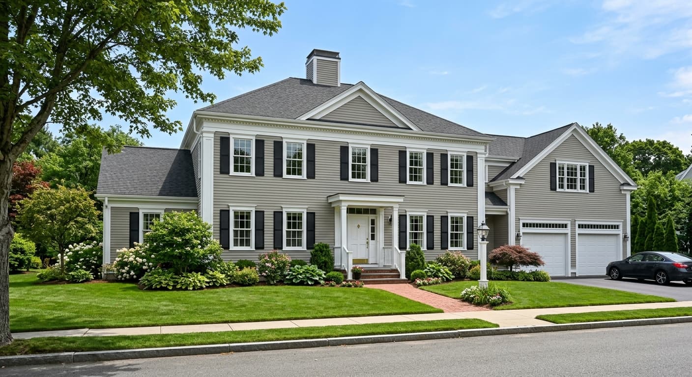
Outdoors, the sunlight tends to pull the color toward a warmer, more inviting read, and exterior applications come up repeatedly as a strong use case. The takeaway is that this is a light gray that earns attention without being loud, as long as you understand that the lighting in your specific space is essentially a co-author of what the color becomes.
The undertone conversation around Grayish is worth taking seriously, because it diverges from what the color family label might suggest. Independent reviewers describe the dominant undertone as purple or violet, often softened by a faint pink or red warmth that keeps it from reading icy or stark. Several people describe it as a soft mauve cast. That read is notably different from a straight cool blue-gray, and it is also different from what a green undertone expectation would produce.
There is some disagreement, and it is worth carrying honestly. Some observers read blue as a secondary note alongside the purple. The pink-red warmth that others identify is real but subtle, and it is enough to classify Grayish as cool overall while stopping short of feeling clinical. Compared to typical greiges, it sits on the cooler side. Compared to a clean blue-gray, the purple-mauve quality gives it a slightly softer, more complex character.
The practical implication of all this undertone nuance is straightforward: Grayish can surprise you by looking too purple or too blue in your specific room and lighting. Warm tile, warm wood tones, or warm-toned finishes in the same space can make the cool purple cast feel less harmonious. Clean, crisp white trim is widely recommended to keep the color reading as intentional rather than accidental. Large samples tested across different times of day and different light sources are not optional here. They are the only way to know what Grayish will actually do in your home.
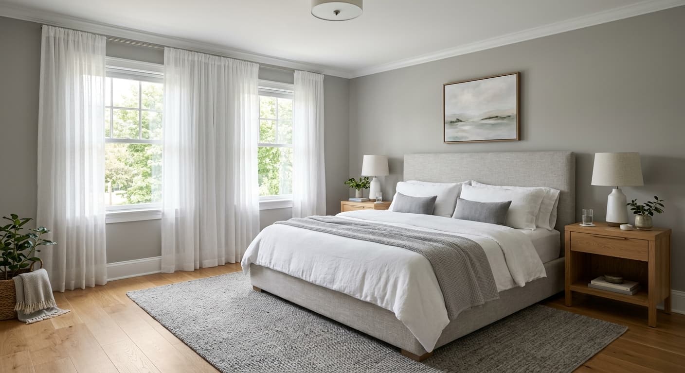
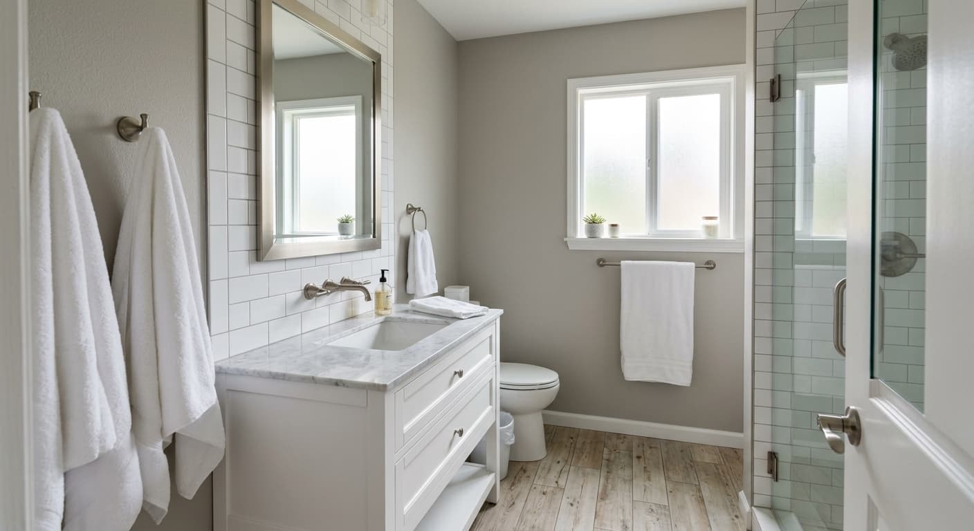
Grayish works well in spaces where a cool, airy neutral is the goal and where you want something with a little more character than a standard off-white or greige. Guest bedrooms and primary bedrooms come up often in reviews, and it makes sense: the soft purple-gray quality is restful without being dull, and the LRV of 59.7 keeps the room from feeling dark even in lower-light conditions. Bathrooms are another strong fit, including small bathrooms and even windowless basement bathrooms where reviewers specifically note it reads well.
Living rooms and dining rooms also work, particularly when the space gets reasonable natural light during the day. In those conditions, the color shifts between its calmer neutral daytime read and its more character-forward evening read, which gives the space a different feel at different hours. Kitchens and kitchen cabinets appear in reviewer recommendations, and the cool gray quality pairs naturally with stone countertops and clean white uppers or lowers. Home offices are another use case where the airy, focused quality of a cool light gray pays off.
Exterior applications are one of the standout uses. Reviewers praise it repeatedly for exterior work, where sunlight warms the color and the house reads as inviting and cohesive rather than cold. For whole-house color schemes, the LRV of 59.7 and the relatively neutral base make it adaptable across rooms as long as the trim and accent choices are chosen to complement the cool, slightly purple lean rather than fight it. North-facing rooms require the most attention since those are the conditions that push the purple furthest forward.
In a living room with decent natural light, Grayish shifts appealingly between a calm neutral during the day and a cooler, more purple-leaning gray in the evening under artificial light. That range keeps the space feeling dynamic without demanding much from your decor. Pair it with clean white trim and warm-toned furniture to balance the cool undertone.
Guest bedrooms and primary bedrooms are among the most-endorsed uses for Grayish, and the soft purple-gray quality is restful without being heavy. The LRV of 59.7 keeps the room light enough that it does not feel closed in. Choose crisp white bedding and natural wood or warm metal accents to keep the cool undertone from going too cold.
Grayish holds up well in bathrooms, including small ones and lower-light spaces where many colors turn muddy. The airy LRV of 59.7 helps even windowless baths feel open. Keep tile and fixture choices on the cooler or neutral side to avoid a clash with the color's purple-violet lean.
On kitchen walls or cabinets, the cool gray reads clean and contemporary, pairing naturally with stone or quartz countertops and crisp white upper cabinets or shelving. Reviewers call out charcoal blue or dark cabinet colors as strong contrast partners for an island or lower run. Avoid warm honey-toned wood if the purple undertone is already strong in your light conditions.
Exterior use is one of the highest-praised applications for Grayish, where sunlight warms the color and it reads as inviting and cohesive rather than cold. The LRV of 59.7 gives it enough presence to read clearly on a facade without going dark. White trim and a darker door color give it a clean, complete look.
Grayish is coordinated with Roman Column, a warmer off-white with enough substance to anchor trim, millwork, or adjacent walls without competing with the cool gray character of the main color. That warm-cool contrast is intentional and grounding. The two other coordinating colors in the Sherwin-Williams system are not publicly published, but the palette direction is clear: Grayish benefits from companions that have warmth or softness rather than sharpness.
Beyond the official coordinates, reviewers point consistently to crisp, clean whites for trim as essential, specifically to keep the purple-gray read looking deliberate. Soft blues and greens work well as accent or adjacent room colors, leaning into the cool family without clashing. Warm neutrals provide contrast and balance, while darker charcoal blues or deep brown-blacks on cabinets or furniture give the scheme an anchor. Stone and natural wood accents read well with it because their organic variation complements rather than competes with the color's undertone complexity.
All comparisons are matched against Grayish at LRV 59.7.
Grayish's cool purple-violet undertone can read as an uncomfortable mismatch against warm beige or terracotta tile, warm travertine, or golden-veined stone. The two temperature camps pull against each other visually rather than settling into a cohesive whole.
Golden oak floors, honey-stained cabinets, or warm pine millwork amplify the purple cast in Grayish rather than softening it, making the color look more lavender-heavy than it does in isolation.
Pairing Grayish with a warm, creamy, or yellow-based white on trim and ceilings creates a visible undertone collision. The warmth of the white amplifies the coolness of the gray and makes both colors look off rather than complementary.
Grayish is a light cool gray with a noticeable purple-violet undertone and a faint pink warmth that keeps it from reading icy. It has an LRV of 59.7, so it reflects a solid amount of light and reads airy on the wall. Despite the understated name, it is a chameleon that shifts meaningfully with light conditions, leaning closer to a soft mauve-gray in low or artificial light and a calmer neutral gray in bright natural light.
The dominant undertone that independent reviewers identify is purple or violet, often described as a soft mauve cast. A secondary note of faint pink or red adds subtle warmth, and some reviewers also read blue. This undertone profile is the headline characteristic of Grayish and the main reason it can surprise people who expect a straightforward neutral gray. The cool classification is accurate overall, but it is the purple quality, not a blue or green lean, that defines how it reads on the wall.
Grayish is classified as cool. It sits cooler than typical greiges and noticeably cooler than warm grays like Agreeable Gray. The faint pink-red warmth in the undertone prevents it from feeling cold or clinical, but the overall temperature read is definitively cool, driven primarily by that purple-violet base.
The precise LRV of Grayish SW 6001 is 59.7. That puts it in solid light gray territory, reflecting enough light to read airy and spacious without approaching the near-white range above 70. It works in rooms with moderate to good natural light, and even in lower-light spaces like windowless bathrooms, reviewers say it holds up without going dark or muddy.
Clean, crisp whites for trim are the most consistently recommended pairing, keeping the purple-gray read looking deliberate rather than accidental. The Sherwin-Williams coordinating palette includes Roman Column for a warmer off-white companion. Soft blues and greens work as accent or adjacent room colors. Warm neutrals provide temperature contrast and balance. Darker charcoal blues or deep brown-blacks on cabinets, furniture, or front doors give the scheme a grounded anchor. Natural stone and cool-toned wood finishes round out the palette.
The Sherwin-Williams code is SW 6001. The hex value is #CFCAC7 and the RGB breakdown is 207 / 202 / 199. The LRV is 59.7.
Exteriors are one of the most praised applications for Grayish. Sunlight warms the color on a facade, pulling it toward a more inviting, cohesive read. Reviewers specifically call out exterior work as a standout use. For cabinets, particularly kitchen cabinets, it reads clean and contemporary and pairs well with stone countertops and crisp white uppers. Front doors in a darker complementary color, such as a deep charcoal blue or dark brown-black, give the exterior a complete look with good contrast.
