
MorningCooler · purple surfaces
A warm medium-dark gray with a genuine brown and taupe base, Dovetail sits at LRV 25.8 and moves more than most people expect. Sample it in your light before you commit.
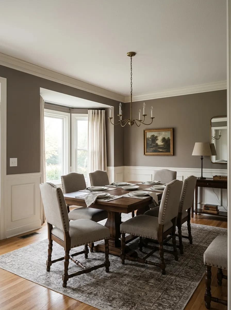
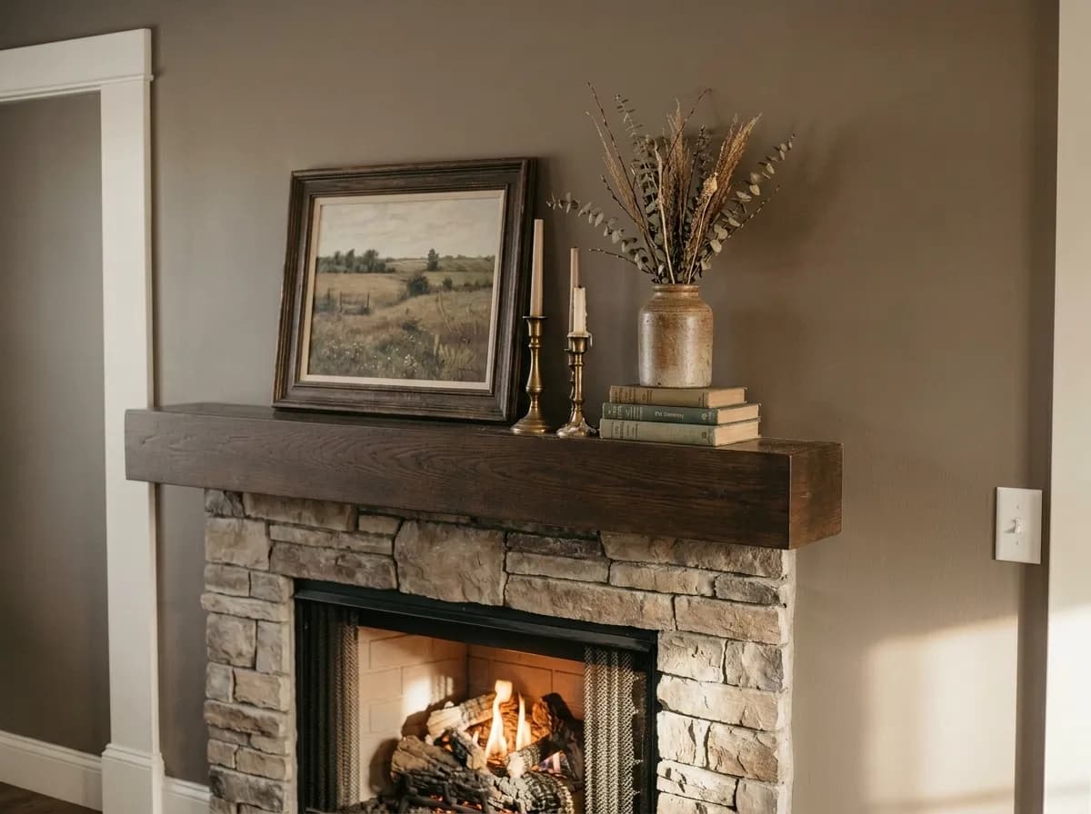
Dovetail SW 7018 is a warm medium-dark gray that sits right at LRV 25.8, which means it absorbs considerably more light than it reflects. On the wall it reads as a grounded, earthy gray with a brown or taupe quality that keeps it from feeling stark or cold. It has genuine depth and a quiet moodiness that makes a room feel deliberate and composed rather than simply dark.
What makes Dovetail interesting is how much it moves through the day. In warm afternoon light, especially in south- or west-facing rooms, it softens and the warm brown base comes forward. In lower light or on a north-facing wall, it cools and reads more as a true gray. The color does not stay fixed, and that range is part of the reason so many reviewers find it versatile across very different rooms and homes.
At this LRV, Dovetail is not a background note. It asserts itself. On cabinets and interior doors it creates a solid, confident anchor. On exterior walls it holds up well in direct sun and gives traditional homes a refined, serious presence. If you want a warm gray that does actual work in a space, this is the kind of color that delivers it.

The base of Dovetail is warm gray, and that part is not in dispute. Reviewers across the board describe the brown and taupe quality that lifts it away from a flat or cool gray and gives it an earthy, grounded feel. Paired with natural wood tones or warm metallics, that base reads clearly and cohesively.
The more contested layer is a subtle purple or violet undertone that sits underneath the warmth. Many reviewers say it is nearly invisible in bright natural light and only surfaces in low light or at certain times of day. Others find it comes forward more strongly outdoors, and at least one homeowner reported the color reading noticeably purple on their home's exterior. Some reviewers also pick up a faint blue note that softens the gray, and occasionally a whisper of green. These are secondary and tertiary reads that most people will not notice until the light shifts, but they are real and worth taking seriously.
The practical consequence is that Dovetail can behave very differently depending on your exposure. North-facing rooms and exterior elevations that receive morning or diffuse light are the situations where the purple is most likely to surface. South- and west-facing applications tend to stay warmer and more squarely brown-gray. Because this undertone disagreement is genuine and not just theoretical, every reviewer who has written seriously about this color says the same thing: sample it in your actual space, in your actual lighting, across multiple times of day before committing. That advice is especially urgent for exterior projects.
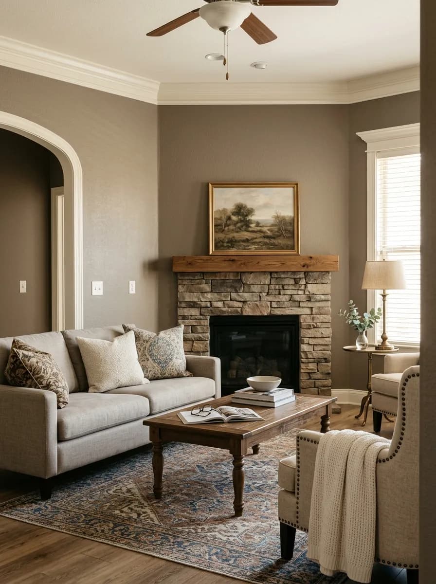
Dovetail works across a wide range of rooms, and independent reviewers have used it successfully in living rooms, bedrooms, dining rooms, bathrooms, and on accent walls. It brings enough depth to anchor a room without closing it in, provided you give it enough contrast at the trim and ceiling. That is the key condition: pair it with a clearly lighter trim color and the room breathes. Skip the contrast and the walls can feel heavy.
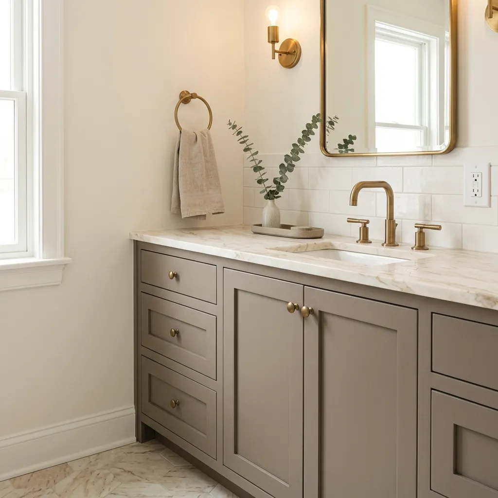
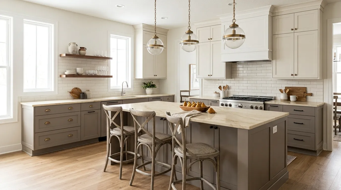
Kitchens are a strong use case. On cabinets and islands, Dovetail reads as a sophisticated, warm alternative to the stark grays and near-blacks that have dominated kitchen design. The brown undertone keeps it from feeling industrial, and it works naturally alongside warm wood open shelving, brass or gold hardware, and warm-toned countertops. The specific warning here is cool-toned quartz or marble: bluish or stark white countertops can pull the undertone in an unflattering direction and make the gray feel muddier than it should.
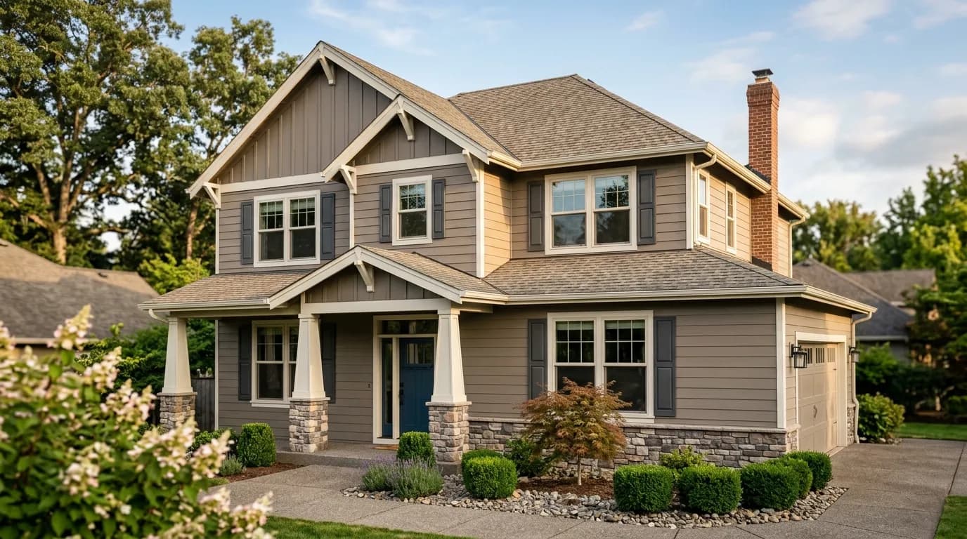
For exteriors, Dovetail has a dedicated following, particularly on colonial and traditional homes. It holds up well in direct sun and gives a classic facade a deliberate, composed look. Reviewers use it on the body with bright white or warm off-white trim, and it works well alongside red brick or natural stone. The caveat is the purple undertone, which is more likely to appear on exterior elevations than anywhere else. Sampling on the actual facade, observed at different times of day, is not optional for exterior use.
In a living room, Dovetail creates a settled, composed atmosphere that makes the space feel curated without feeling heavy, especially with warm white trim and natural wood or textile accents. South- and west-facing living rooms will bring out the warmest read. North-facing rooms will lean cooler and grayer, which can still work well but calls for warmer furnishings to compensate.
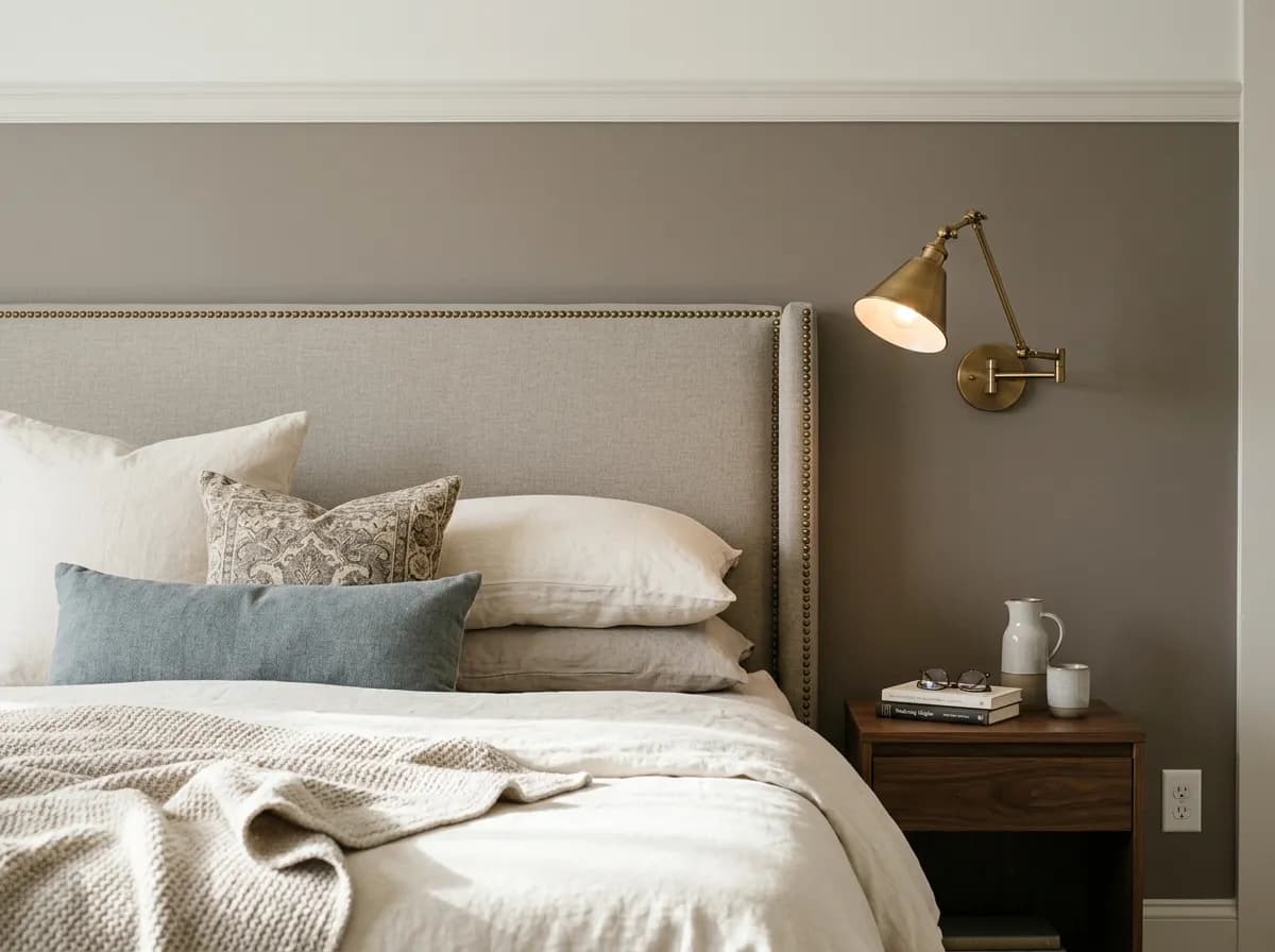
Reviewers use Dovetail in bedrooms specifically for the depth and quiet moodiness it brings, qualities that work in favor of a restful space. It pairs naturally with warm wood furniture, linen bedding, and brass hardware. Keep the trim clearly lighter to avoid the room reading as a single dark block.
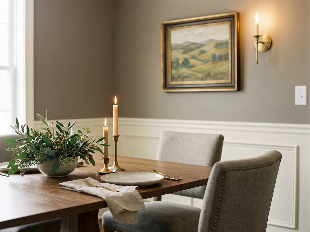
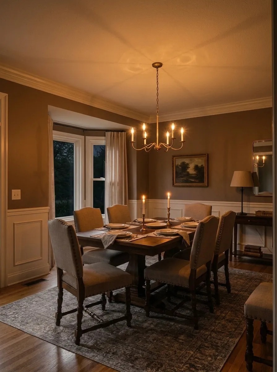
A dining room is one of the better applications for a color at LRV 25.8 because lower light is acceptable and even desirable at evening meals. Dovetail gives a dining room a grounded, deliberate quality, and it responds well to candlelight and warm artificial light, which tend to suppress the cooler undertones and pull the brown warmth forward.
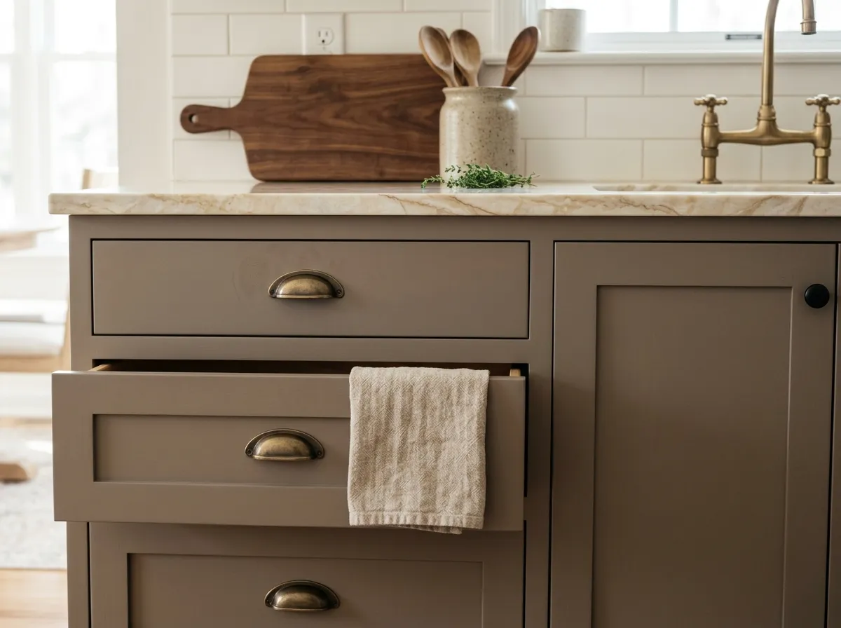
On cabinets and islands, Dovetail is a warm alternative to the cooler charcoals that dominate kitchen trends. It reads well alongside brass or gold hardware and warm wood tones. Avoid pairing it with cool-toned white or blue-veined quartz countertops, which can make the gray feel muddy.
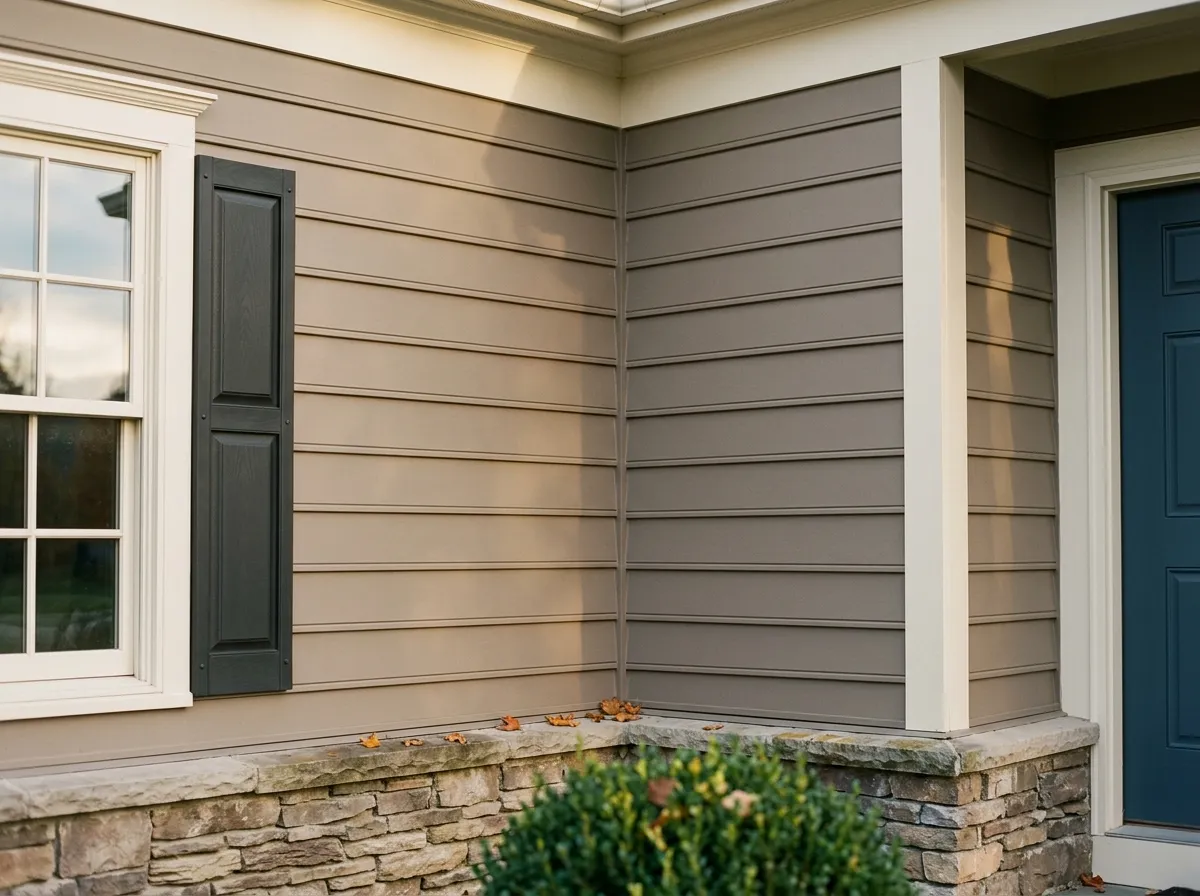
Dovetail has a strong track record on colonial and traditional exteriors, where it gives the facade a serious, refined presence. It holds color well in direct sunlight. The purple undertone is a real risk on exterior applications, so testing a large sample on the actual wall and observing it at multiple times of day is essential before committing.
Dovetail's warm brown-gray base is forgiving with a range of trim and accent colors, but it does best with warmth on both sides of the relationship. Eider White (SW 7014) is a natural first choice for trim and ceilings: it is a warm, slightly creamy white that echoes Dovetail's warmth without competing with it. Skyline Steel (SW 1015) works as a complementary mid-tone if you are layering grays in an open plan or exterior scheme. For an accent with real punch, Inky Blue (SW 9149) brings a deep, rich contrast that plays directly off the blue-gray quality that some reviewers detect in Dovetail.
Beyond the official coordinates, reviewers consistently point to warm wood tones, natural linen, red brick, and warm metallics like brass and gold as the material pairings that let Dovetail do its best work. Cooler or more silvery finishes can fight the undertones rather than reinforce them. Grounded earth tones and darker greens read as cohesive companions, and blue-gray textiles or upholstery in the same warmth register tend to feel intentional rather than accidental next to this color.
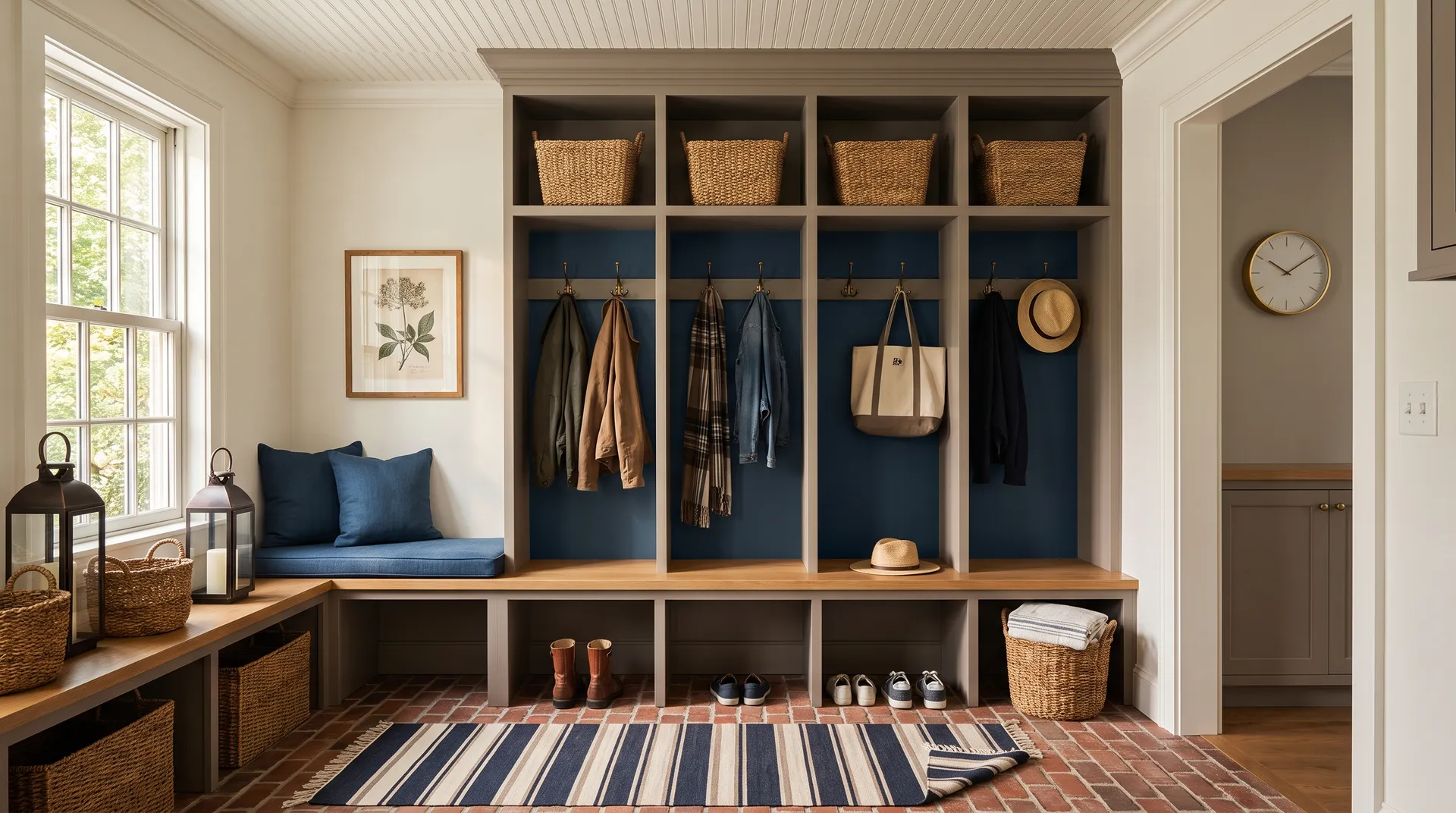
Three of the seven colors here are paint: Dovetail anchors the built-in lockers and bench, Eider White covers the walls, trim, and beadboard ceiling, and Skyline Steel layers onto the adjacent laundry wall. The remaining four colors come from the room's materials and furnishings, each matched to its closest Sherwin-Williams equivalent so you can shop or replicate with confidence. Hover any pin or swatch to see the exact name and number.
All comparisons are matched against Dovetail at LRV 25.8.
Bluish or stark white quartz, cool marble, and blue-gray tile can pull Dovetail's undertones in an unflattering direction, making the gray appear muddy or inconsistent rather than warm and grounded.
In open plans, placing Dovetail next to a lighter, cooler gray or a cool greige without a strong visual break creates an uncomfortable undertone clash that makes both colors look off.
Brushed nickel, chrome, or cool stainless finishes tend to amplify the cooler and more purple-adjacent undertones in Dovetail, making the color read less warm and more unresolved.
Dovetail is a warm medium-dark gray with brown and taupe undertones that give it an earthy, grounded quality. At LRV 25.8 it absorbs more light than it reflects, reading as a genuine mid-depth gray that sits somewhere between a classic charcoal and a lighter greige. It is not a flat or cold gray: the warmth is present from the start, though the color shifts noticeably depending on light.
The primary undertones are warm brown and taupe, which give Dovetail its earthy, grounded feel. Layered underneath is a subtle purple or violet note that is easy to miss in bright light but can surface in low light, in north-facing rooms, or on exterior elevations. Some reviewers also detect a faint blue that softens the gray, and occasionally a whisper of green. Because these secondary undertones behave differently depending on your light exposure, sampling in your specific space is strongly advised.
Dovetail reads warm in most conditions, anchored by its brown and taupe base. In south- or west-facing rooms with afternoon light, that warmth is obvious. In north-facing rooms or low light, it cools and reads more as a traditional gray, and the purple undertone is more likely to come forward. It is best understood as a warm gray that can shift toward cooler territory depending on your light, rather than a firmly warm or firmly cool color.
Dovetail's LRV is 25.8. That places it in medium-dark territory, absorbing significantly more light than it reflects. It will make a room feel more intimate and anchored than a mid-range gray, so pay attention to contrast at your trim and ceiling to keep the space from feeling closed in.
The Sherwin-Williams color code is SW 7018. The hex value is #908A83, and the RGB breakdown is 144 red, 138 green, 131 blue.
Eider White (SW 7014) is a warm off-white that works well for trim and ceilings. Skyline Steel (SW 1015) pairs with it for layered neutral schemes. For a bold accent, Inky Blue (SW 9149) plays off the blue-gray notes some reviewers detect in Dovetail. Beyond those, reviewers recommend warm wood tones, natural linens, red brick, earthy stone, and warm metallics like brass and gold. Cooler or silvery finishes tend to fight the undertones rather than complement them.
Yes on all three, with one caveat for exteriors. On cabinets and interior doors, Dovetail is a well-reviewed choice that delivers warmth and depth without the harshness of a near-black. For exteriors and front doors, it holds up well in direct sun and suits colonial and traditional homes particularly well. The risk is the purple undertone, which is more likely to surface on exterior elevations than in interior applications. Sample a large patch on your actual facade and evaluate it at multiple times of day before committing.