Clove
What Clove Actually Looks Like
Clove is one of those colors that refuses to sit still. At first glance it reads as a soft, muted brown, the kind you might call "greige" if you weren't paying attention. Look longer and the green starts to surface. There's a mushroom quality to it, a dusty earthiness that feels like it has been around for a while.
In bright daylight, the gray and green elements come forward and Clove looks lighter and more sophisticated than the chip suggests. By late afternoon, when the light goes warm, it deepens into something closer to a true brown with cozy, almost cocoa-like warmth. Under incandescent or warm LED bulbs at night, it can lean noticeably toward taupe.
What makes it distinctive is that balance. It is not a flat neutral and it is not a bold statement color. It occupies the middle ground where a lot of expensive-looking interiors live. The color shifts enough to keep a room interesting without ever feeling busy.
Clove Undertones
Clove carries a green-gray undertone underneath its brown base. This matters more than people expect. When you put it next to a cool gray, the green reads strongly and can look slightly olive. Next to a warm cream or beige, the brown takes over and the green nearly disappears.
Because of this shifting personality, test it against anything you plan to keep in the room. Hold a sample up to your existing flooring, your sofa, your trim. If your space has a lot of cool blue-grays already, Clove may clash or look muddy. Pair it with warm woods and natural materials and the undertone settles into something grounded and intentional.
Where Clove Works Best
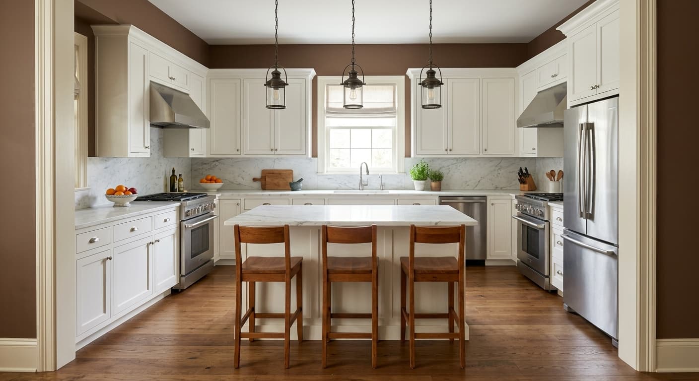
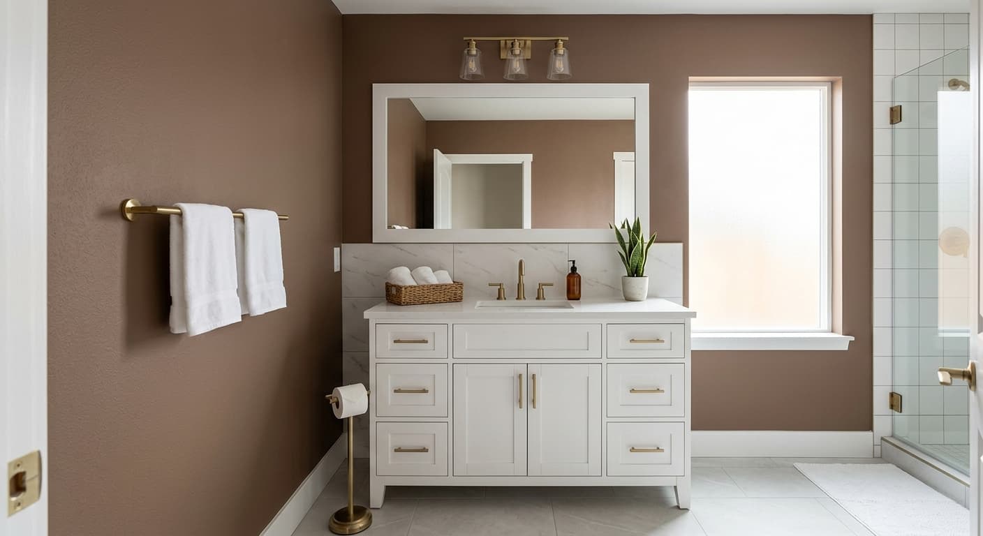
Clove thrives in rooms where you want warmth and a sense of enclosure. Bedrooms, dining rooms, studies, and powder rooms all suit it well. It wraps a space rather than opening it up, so lean into that rather than fighting it.
Orientation makes a real difference here. In south-facing and west-facing rooms, the warm light flatters Clove and brings out its richer brown tones. North-facing rooms, which get cooler light, will pull the green-gray forward and can make the color feel slightly drab, so add warm lighting and warm textiles to compensate. In small rooms it creates an intimate, den-like feel. In large rooms with good light it stays surprisingly versatile.
What to Pair With Clove
For trim, a soft warm white works better than a stark bright white. Try Sherwin-Williams Alabaster (SW 7008) or Greek Villa (SW 7551) to keep things in the same warm family. A crisp pure white will make Clove look dingy by contrast, so avoid that pairing.
For furnishings, Clove loves natural materials. Think oak, rattan, leather in cognac or tan, and linen in cream or oatmeal. Brass and aged bronze hardware look excellent against it. For complementary wall colors, Accessible Beige (SW 7036) makes a smooth transition in open layouts, and Urbane Bronze (SW 7048) pairs with it for a deeper, layered scheme. If you want contrast, a muted terracotta or a dusty blue both work as accent tones.
Colors That Clash With Clove
Do not pair Clove with cool, blue-based grays or anything with a pink undertone, since both fight the green-brown base and create a muddy, uncertain look. Skip stark white trim. Avoid using it in a dim north-facing room without warm lighting, because the color can flatten into something dreary fast. And resist the urge to use it on every surface in a small space with little natural light. That much warm depth with no relief can feel closed-in and heavy.