After the Storm
What After the Storm Actually Looks Like
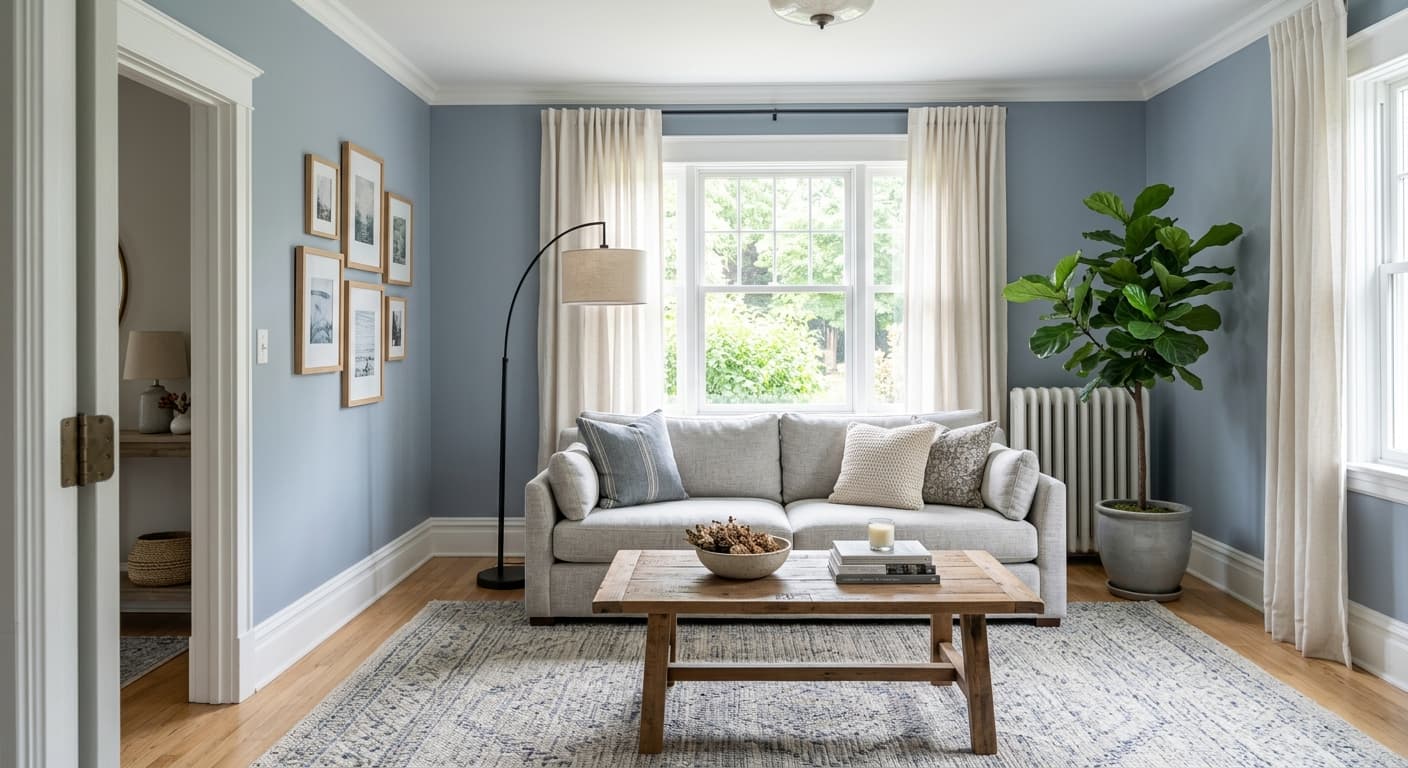
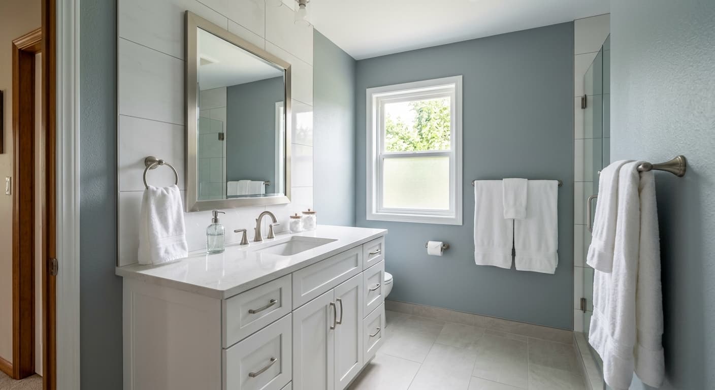
After the Storm is a deep, slate-leaning blue that earns its name. Think of the sky right as the rain clears, when the clouds still hold weight but light starts breaking through. That is the mood this color carries into a room.
In bright daylight, you will see the blue come forward and read cleaner, almost denim-like. As the light fades through the afternoon, the gray takes over and the whole wall settles into something quieter and more grounded. Under warm artificial light, expect it to soften and lose a little of its crispness. Under cool LED bulbs, the blue sharpens and the color feels more contemporary.
What makes it distinctive is the balance. It is not a baby blue, and it is not a charcoal pretending to be blue. It sits in the middle, which gives it a versatility that most colors this saturated do not have.
After the Storm Undertones
The dominant undertone here is gray, with a steel-blue character riding on top. Depending on your space, you may also catch a faint green-gray shift in low light, which is common with blues that have a cool base. This matters because it dictates what sits next to it without clashing.
Pay attention to your existing fixed elements. If your flooring or stone has warm yellow or red tones, After the Storm will look colder by contrast, and you will need warm accents to bridge the gap. Test it against your trim before committing, because a slightly creamy white will fight the cool undertone in a way a clean white will not.
Where After the Storm Works Best
This color thrives in spaces where you want depth and a bit of drama. Bedrooms, studies, dining rooms, and powder rooms all suit it well. It also works as a single accent wall when a full room feels like too much commitment.
Orientation is the deciding factor. In south-facing rooms with plenty of warm light, After the Storm holds its blue and stays lively all day. In north-facing rooms, the cool light will pull it darker and grayer, so go in knowing it will read moodier than the swatch suggests. It handles larger rooms gracefully, but in small spaces it can either feel cozy and enveloping or cramped, depending on your natural light. More light, more enveloping. Less light, more cave-like.
What to Pair With After the Storm
For trim, a clean white like Sherwin-Williams Pure White or Extra White keeps the contrast crisp and lets the color do its job. If you want something softer, Alabaster works, but only in warmer rooms where the slight warmth reads as intentional rather than muddy.
For pairings, lean into natural materials. White oak and walnut flooring both look right under it. Brass and aged bronze hardware add warmth and stop the room from feeling clinical. For complementary wall colors elsewhere in the home, consider Repose Gray for a neutral transition, Naval if you want to go deeper in an adjacent room, or a warm greige like Accessible Beige to balance the cool. Linen, leather, and rattan furnishings all sit comfortably against it.
Colors That Clash With After the Storm
Skip pure black trim, which flattens the depth and makes the whole thing feel heavy. Avoid pairing it with cool gray flooring, since the two cools blend into a dreary, washed-out result with no contrast to hold interest. Stay away from icy or stark white furnishings in a north-facing room, because they exaggerate the cold and the space starts to feel unwelcoming. And do not commit without sampling. This is exactly the kind of color that looks completely different on the wall than it does on the chip.