Weekend Getaway
What Weekend Getaway Actually Looks Like
Weekend Getaway is one of those colors that refuses to sit still. In bright daylight it reads as a pale, watery blue with a distinct gray softening underneath. By late afternoon, when the light goes warm and low, it can pull almost dove gray, holding onto just a whisper of blue. That shift is part of its appeal, but it also means you need to test it before you commit.
This is not a saturated, confident blue. Think of the color of fog over water, or the inside of a seashell tilted toward the light. It has presence without weight. On a large wall it feels expansive and quiet rather than bold.
What makes it distinctive is the balance between the blue and the gray. Too many soft blues tip either icy or muddy. Weekend Getaway lands in the middle, which is harder to find than you might expect. It stays clean without going clinical.
Weekend Getaway Undertones
The dominant undertone here is cool, with a blue-gray base that occasionally flashes a hint of green depending on your light and surroundings. That green flash usually shows up next to warm wood tones or under incandescent bulbs. Knowing this matters because your trim and adjacent colors will either calm that cool undertone or amplify it.
If you want the blue to stay crisp, lean into cooler neutrals around it. If you want it to feel softer and warmer, surround it with creamy whites and natural materials. The color responds to its company, so plan the whole palette, not just the wall.
Where Weekend Getaway Works Best
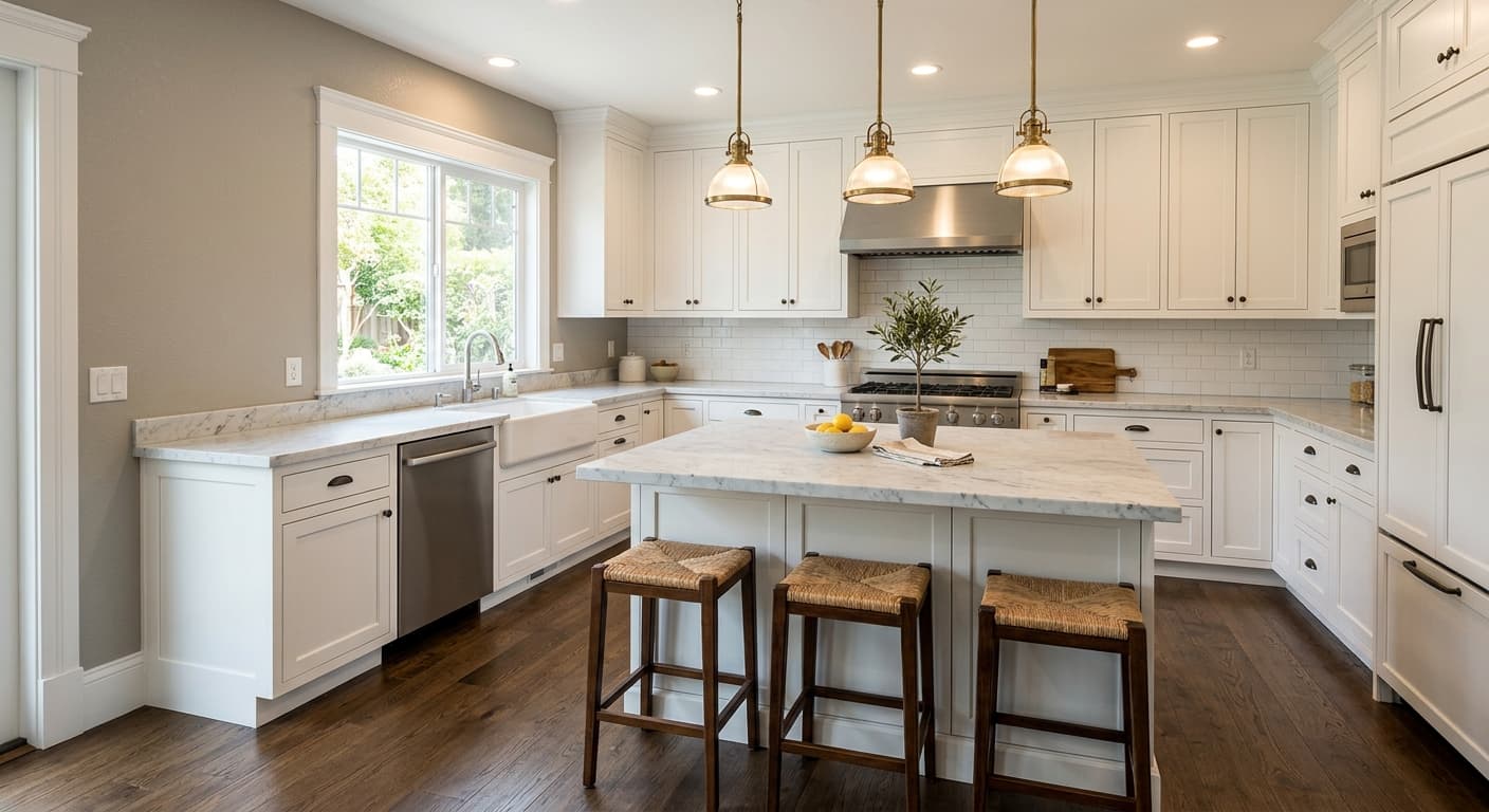
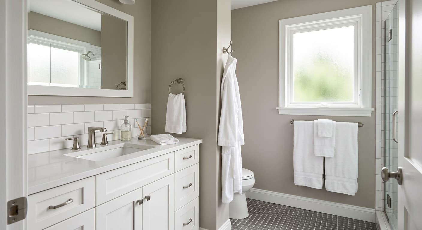
Weekend Getaway shines in bedrooms and bathrooms, where its restful quality does real work. It also suits home offices when you want focus without sterility. In south-facing rooms, the warmer light grounds the color and keeps it from feeling chilly. In north-facing rooms, expect it to read cooler and grayer, which can be lovely if that is the mood you want, or a problem if you were hoping for something brighter.
Small spaces benefit from its high light reflectance, which keeps things feeling open. Larger rooms hold it well too, especially with plenty of natural light bouncing around. Avoid using it as your only color in a windowless space, where it tends to flatten and lose its life.
What to Pair With Weekend Getaway
For trim, a soft white like Benjamin Moore White Dove (OC-17) keeps things warm and unfussy. If you want crisper contrast, Chantilly Lace (OC-65) gives you a cleaner edge. Both let the color breathe without competing.
For adjacent walls or connecting spaces, Gray Owl (OC-52) and Stonington Gray (HC-170) bridge nicely because they share that cool, balanced quality. On the warmer side, pair it with natural oak flooring, linen upholstery, and brushed brass hardware to soften the cool and add a little earthiness. Navy accents, through a throw pillow or a piece of art, deepen the palette without overwhelming it. Avoid stark black furniture unless you want a sharper, more modern feel.
Colors That Clash With Weekend Getaway
Skip pairing it with yellow-based or beige whites that fight the cool undertone and make the wall look dingy. Heavy warm woods like cherry or red oak can clash and push the blue toward an unflattering gray. Do not pair it with other muddy mid-tones, since the result reads tired rather than serene. And resist using it in a dim room hoping it will brighten things up. It needs light to perform.