Tranquility
What Tranquility Actually Looks Like
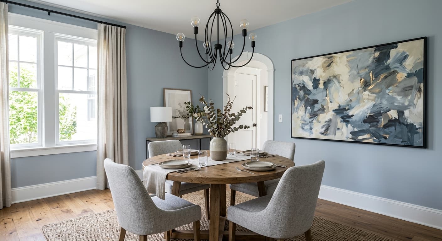
Tranquility is a pale blue that doesn't fully commit to being blue. Look at it on a chip and you'll read it as soft sky. Put it on a full wall and something quieter happens. The color settles into a hazy gray-blue that feels more like atmosphere than pigment.
In strong morning light it leans cooler and the blue comes forward. By late afternoon, especially in warmer artificial light, it can soften toward a pale gray with just a whisper of color left. This shift is the whole personality of the paint. You're not buying a bold statement. You're buying a backdrop that changes mood through the day.
What makes it distinctive is how clean it stays. Some pale blues go chalky or turn baby-nursery sweet. Tranquility holds a slightly grayed quality that keeps it feeling grown up and current, even in a traditional room.
Tranquility Undertones
The dominant undertone here is gray, with a secondary green-blue that depends entirely on your light. North-facing rooms will pull out the cooler, slightly grayer side. Rooms with warm western or southern exposure will let the blue read a touch softer and friendlier.
This matters because your trim and adjacent colors will either calm those undertones or fight them. Pair Tranquility with a cool, crisp white and you reinforce the airy blue. Pair it with a creamy white and you risk the wall reading a little dingy or uncertain. Test before you commit, because this color reacts more than people expect.
Where Tranquility Works Best
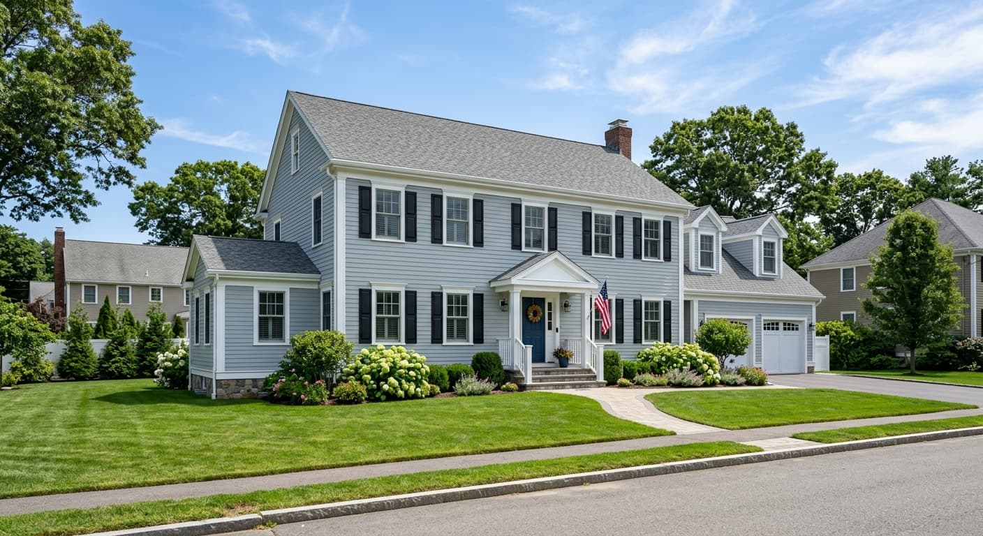
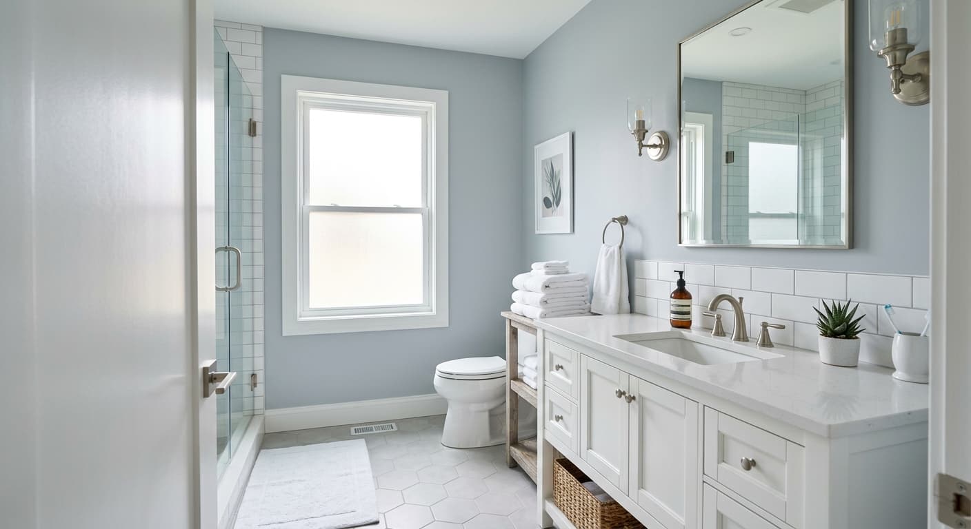
Tranquility shines in bathrooms, bedrooms, and home offices where you want a sense of calm without going stark. It's a natural fit for spaces meant to wind down. In a small bathroom with decent light, it expands the room and keeps things fresh.
South and east-facing rooms get the most flattering version of this color, where natural light keeps the blue alive without flattening it to gray. In north-facing spaces it still works, but lean into the coolness rather than fighting it. Large open rooms can carry Tranquility well too, since its lightness prevents any heavy or closed-in feeling.
What to Pair With Tranquility
For trim, reach for a clean white like Chantilly Lace or Decorator's White. Both keep the blue reading crisp without adding warmth that muddies the wall. If you want softer contrast, White Dove works, though it nudges the room gently warmer.
For furnishings, natural wood tones like white oak and ash look excellent against it. Warm woods such as walnut create a nice tension between cool wall and warm furniture. On flooring, pale to medium oak keeps the room light and grounded. For a coordinated palette, Quiet Moments adds a deeper green-blue for an accent wall, and Gray Owl makes a smart transitional neutral for adjoining hallways. Soft brass hardware warms the whole scheme up without clashing.
Colors That Clash With Tranquility
Don't pair Tranquility with heavy beige or yellow-based creams. The clash makes the blue look cold and the cream look dirty. Avoid stacking it next to true cool grays with violet undertones, since they drain the life out of each other. And skip the high-gloss finish on walls. The reflectivity exaggerates every undertone shift and turns a calm color into a restless one. Matte or eggshell keeps it grounded.