Soot
What Soot Actually Looks Like
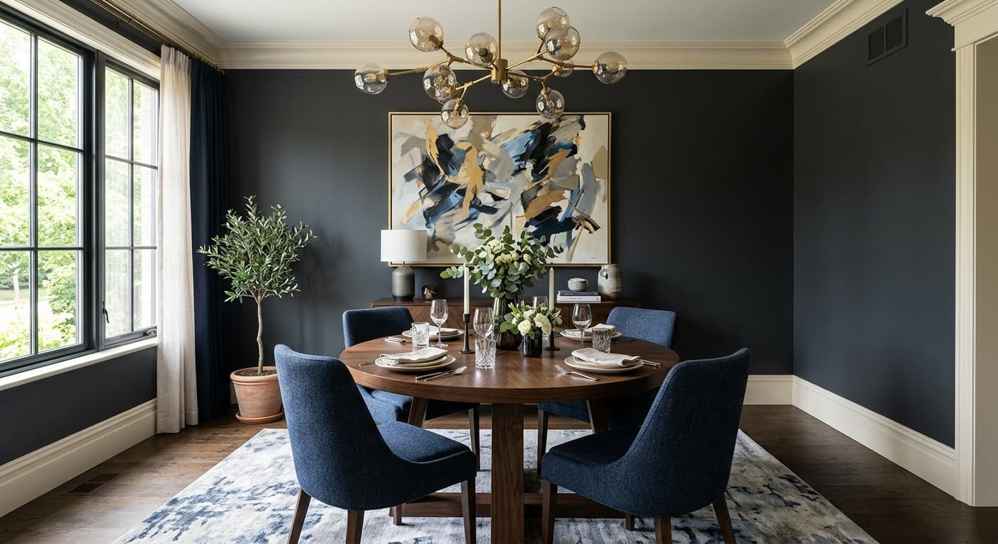
Soot reads as a deep blue-black that lives closer to black than blue in most rooms. In low light or at night, you will see almost pure charcoal. The blue stays hidden until daylight hits it, and then the color opens up and shows its cooler character.
This is the kind of color that changes depending on where you stand. Near a window, Soot picks up a smoky navy quality. Move into a darker corner and it collapses back into something that looks nearly black. That shift is what keeps it from feeling flat the way a true black often does.
Texture matters here too. On a flat finish, Soot absorbs light and feels dense and moody. Put it on cabinets or a door in a satin or semi-gloss, and the sheen catches light along the edges, which lets more of the blue come through. You get a different color depending on the finish you choose.
Soot Undertones
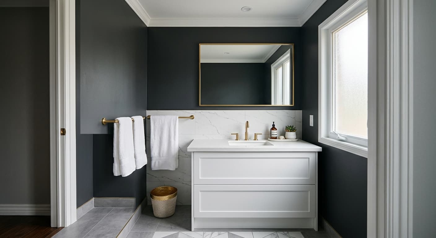
The undertone is a muted blue, sometimes leaning slightly toward gray. It is not a bright or saturated blue, so do not expect it to look like navy in a paint chip. This matters because the blue can clash with warm-toned woods and yellow-based whites. If you put a creamy trim next to it, the contrast can pull the undertone toward green or muddy it.
When you choose adjacent colors, lean cool or neutral to let the blue settle. A crisp white trim keeps Soot looking clean and intentional. Warm beiges and golden tones fight the undertone, so test those carefully before committing.
Where Soot Works Best
Soot does its best work on accent walls, front doors, kitchen islands, and built-in cabinetry. It also holds up as a full-room color in spaces where you want drama, like a study, a powder room, or a bedroom you want to feel enclosed. In a north-facing room, the cool light pushes the blue forward and can make the space feel chilly, so balance it with warm lighting and textiles. In a south-facing room, the warmer light softens the color and brings out more of its black depth.
Small rooms can carry this color well because the darkness makes the walls recede and feel intimate rather than cramped. In large open spaces, use it on a single architectural element rather than every wall, unless you have plenty of natural light to work with.
What to Pair With Soot
For trim, Chantilly Lace (OC-65) gives you the sharpest contrast and keeps everything crisp. If you want something softer, Simply White (OC-117) works without going too warm. Brass and matte black hardware both look right against Soot, depending on whether you want warmth or a monochrome feel. White oak flooring grounds the color and adds warmth underfoot, while walnut tones bring a richer, more traditional pairing.
For complementary Benjamin Moore colors, look at Pale Oak (OC-20) or Classic Gray (OC-23) on adjacent walls to give the eye a place to rest. Stone-colored upholstery, natural linen, and cool grays all sit comfortably alongside Soot without competing with it.
Colors That Clash With Soot
Do not pair Soot with heavy yellow-based creams or golden beiges, since those drag the undertone into murky territory. Skip warm-toned woods like orange-leaning oak or cherry unless you want the blue to read green. Avoid using it across every wall in a dark, north-facing room with poor lighting, because the result feels like a cave rather than a cocoon. And resist the urge to combine it with several other strong colors at once. Soot wants room to breathe.