Rodeo
What Rodeo Actually Looks Like
Rodeo is one of those grays that refuses to sit still. In a bright room at midday, it reads as a clean, slightly cool gray with just enough warmth to keep it from going clinical. By late afternoon, when the light softens, you'll notice a quiet mauve or taupe quality creeping in. That shift is the whole personality of this color.
It's a mid-tone, which means it has real presence without going dark or heavy. On a large wall, Rodeo feels grounded and calm. It pairs the steadiness of a true gray with a barely-there blush that keeps the room feeling lived-in rather than sterile.
What makes it distinctive is that balance. A lot of grays commit hard to either cool blue or warm beige. Rodeo lands in the middle and stays flexible, which is exactly why it works in so many homes and also why it can surprise you if you don't test it first.
Rodeo Undertones
The undertone here is a soft mauve-taupe, and it matters more than you'd expect. In north-facing rooms with cooler natural light, that mauve gets pulled forward and the color can lean almost lavender-gray. In warmer southern light, the taupe takes over and it reads more neutral.
Because of this, the colors around Rodeo will tug it one direction or another. Put it next to a yellow-beige and the gray looks cleaner. Set it beside a true cool gray and the warmth becomes obvious. Test your trim, your flooring, and any large furniture against it before committing. The undertone is subtle, but it's the difference between Rodeo feeling intentional and feeling muddy.
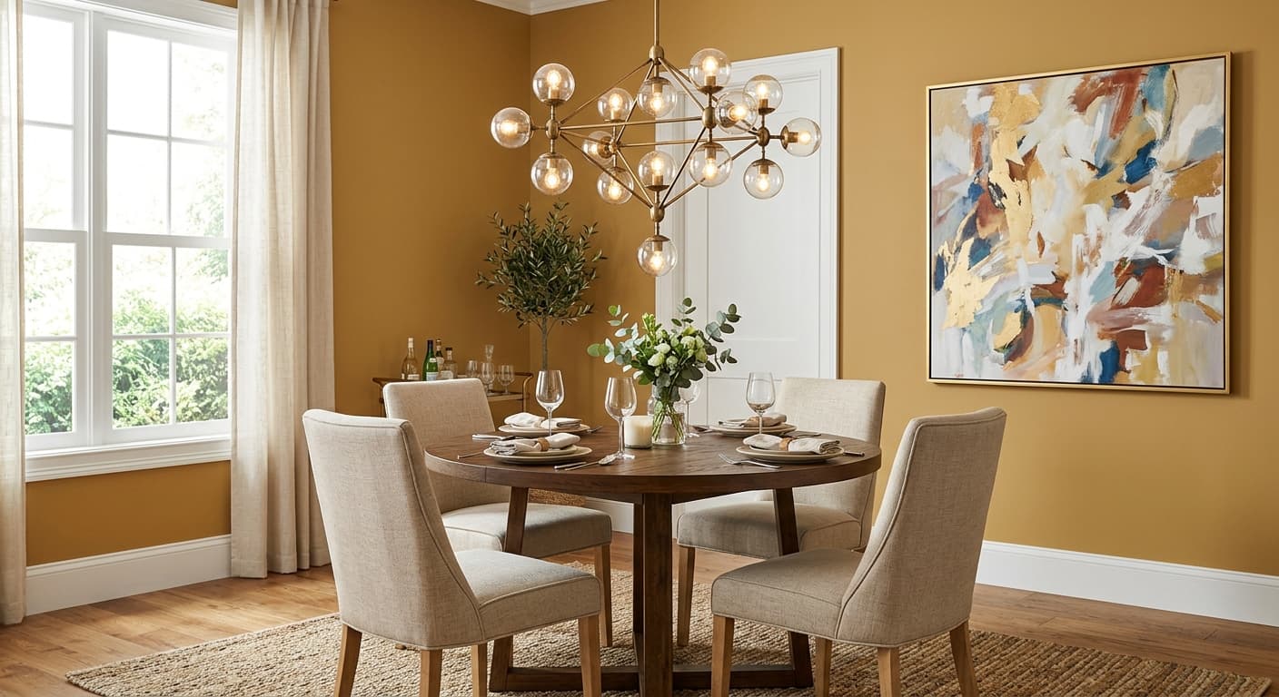
Where Rodeo Works Best
Rodeo shines in bedrooms, living rooms, and home offices where you want a calm, enveloping backdrop. It has enough depth to feel cozy in a smaller space without closing it in, and enough lightness to keep a larger room from feeling cavernous.
South and west-facing rooms are the sweet spot. The warmer light brings out the best of its taupe side and keeps the mauve in check. In north-facing rooms, go in with your eyes open: you may love the cooler, moodier version, but it won't be the same color you saw on the chip. Avoid using it in spaces with very little natural light unless you're committed to good layered lighting, because Rodeo can flatten and gray out in the dark.
What to Pair With Rodeo
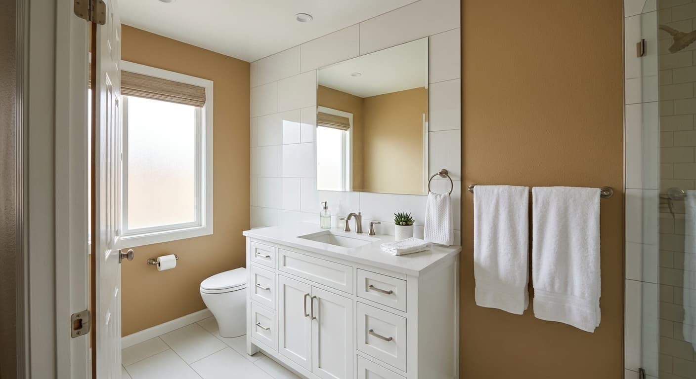
For trim, a soft white like Benjamin Moore White Dove (OC-17) keeps things warm and cohesive without creating a harsh contrast. If you want a little more crispness, Simply White (OC-117) works too, though it pushes Rodeo slightly cooler.
For flooring, mid-tone wood with warm undertones balances the gray nicely. Think oak with a honey or natural finish rather than gray-washed planks, which can compete. For furniture, lean into warm neutrals: camel leather, oatmeal linen, aged brass. If you want a coordinating wall or accent, Edgecomb Gray (HC-173) or Revere Pewter (HC-172) sit comfortably alongside Rodeo in the same warm-gray family.
Colors That Clash With Rodeo
Don't pair Rodeo with stark, blue-based cool grays or bright white trim with blue undertones. That combination drags out the mauve and makes the whole room feel slightly off, like a bruise. Skip cool, gray-washed flooring for the same reason. And resist the urge to layer it with other muddy mid-tones, because Rodeo needs some contrast or crispness nearby to look deliberate rather than dingy.